LeBron’s High-Usage Shooting Efficiency (Featuring Adrian Dantley)

As anyone (statistically-inclined or not) can tell you, LeBron James is having a pretty good year. His 26.8 points, 8 rebounds and 7.3 assists per game (through 81) makes for another entry in his already stunning portfolio of versatile seasons: This will be his 6th time hitting 25/7/7+, a feat that has only been accomplished 8 times since the merger:

Totals Shooting Per Game
Rk Player Season Age Tm G FGA FG% 3P% FT% PTS TRB AST TS%
1 LeBron James 2012-13 28 MIA 76 1354 .565 .406 .753 26.8 8.0 7.3 .640
2 Michael Jordan* 1988-89 25 CHI 81 1795 .538 .276 .850 32.5 8.0 8.0 .614
3 Larry Bird* 1986-87 30 BOS 74 1497 .525 .400 .910 28.1 9.2 7.6 .612
4 LeBron James 2009-10 25 CLE 76 1528 .503 .333 .767 29.7 7.3 8.6 .604
5 LeBron James 2010-11 26 MIA 79 1485 .510 .330 .759 26.7 7.5 7.0 .594
6 LeBron James 2008-09 24 CLE 81 1613 .489 .344 .780 28.4 7.6 7.2 .591
7 LeBron James 2007-08 23 CLE 75 1642 .484 .315 .712 30.0 7.9 7.2 .568
8 LeBron James 2004-05 20 CLE 80 1684 .472 .351 .750 27.2 7.4 7.2 .554
Provided by Basketball-Reference.com: View Original Table
(Generated 4/17/2013.)

But the thing that sticks out (which stat-heads have been going berserk about) is his shooting, which has been by far the most efficient of his career.  Indeed, it may be one of the greatest shooting efficiency seasons of all time.

While his raw shooting % wouldn’t break the top 100 seasons, and his “true” shooting % (adjusted for free throws and 3 point shots made) would still only rank about 60th, the key here is that James’ shooting efficiency is remarkable for someone with his role as both a primary option and a shooter of last resort.  Generally, when you increase a player’s shot-taking responsibilities, it comes at the cost of marginal shot efficiency. This doesn’t mean this is a bad decision or that the player is doing anything wrong—what may be a bad shot “for them” may be a great shot under the circumstances in which they are asked to take it (like when the shot clock is running down, etc).

While there’s no simple stat that describes the degree to which someone is a “shot creator,” we can use usage rate as a decent (though obviously imperfect) proxy. There have been around 150 seasons in which one player “used” >=30% of their team’s possessions:

Usage >30% vs. TS%

All player seasons with USG% >= 30. LeBron’s in red.

As we would expect, the best shooting percentages decline as the players’ usage rates get larger and larger.  The red points are LeBron’s seasons (which are pretty excellent across the board) and as we can see from this scatter, his 2012-13 campaign is about to set the record for this group (though we should note that it’s NOT a Rodman-esqe outlier).

Amazingly, the previous record-holder was Adrian Dantley! Dantley is a Hall of Fameer who I had practically never heard of until his name kept popping up in my historical research as possibly one of the most underrated players ever.

Dantley never made an All-NBA first team or won an NBA championship, but he does extremely well in a variety of plus-minus and statistical plus-minus style metrics. While he didn’t have the all-around game of a LeBron James (though he did average a respectable 6-7 rebounds and 3-4 assists in his prime), Dantley was an extremely efficient high-usage shooter. For example, if we look at the top True Shooting seasons among players with a Usage Rate of greater than 27.5%, guess who occupies fully 5 of the top 10 spots:

Totals Shooting Advanced
Rk Player Season Age Tm G FG FGA PTS FG% TS% USG%
1 Amare Stoudemire 2007-08 25 PHO 79 714 1211 1989 .590 .656 28.2
2 Adrian Dantley* 1983-84 27 UTA 79 802 1438 2418 .558 .652 28.2
3 Kevin Durant 2012-13 24 OKC 81 731 1433 2280 .510 .647 29.8
4 LeBron James 2012-13 28 MIA 76 765 1354 2036 .565 .640 30.1
5 Charles Barkley* 1990-91 27 PHI 67 665 1167 1849 .570 .635 29.1
6 Adrian Dantley* 1979-80 23 UTA 68 730 1267 1903 .576 .635 27.8
7 Adrian Dantley* 1981-82 25 UTA 81 904 1586 2457 .570 .631 27.9
8 Adrian Dantley* 1985-86 29 UTA 76 818 1453 2267 .563 .629 30.0
9 Karl Malone* 1989-90 26 UTA 82 914 1627 2540 .562 .626 32.6
10 Adrian Dantley* 1980-81 24 UTA 80 909 1627 2452 .559 .622 28.4
Provided by Basketball-Reference.com: View Original Table
(Generated 4/17/2013.)

Dantley was also in the news a bit last month for working part-time as a crossing guard:


Key quotes from that story:

“It’s not a big thing to me … I just do it. I have a routine. I exercise, I go to work, I go home. I have a spring break next week. I have a summer off, just like when I was a basketball player.”

“I just did it for the kids … I just didn’t want to sit around the house all day.”

“I’ve definitely saved two lives. I’ve almost gotten hit by a car twice. And I would say 70 percent of the people who go across my route are on their telephone or on their BlackBerry, text-messaging. I never would have seen that if I had not been on the post.”

What a character!

Graph of the Day: Second Look at Stan Van?

Granted, “of the Day” isn’t really accurate considering how often I post, but I found it amusing enough to share:

Red is years coached by Stan Van Gundy.

Win % in games played by Dwight Howard. Red years were with Stan Van Gundy coaching.

This came up in a discussion about the possibility that Dwight Howard might not be leveraged optimally on teams that aren’t comprised mostly of small 3 point shooters. That would have interesting implications.

Don’t Play Baseball With Bill Belichick

[Note: I apologize for missing last Wednesday and Friday in my posting schedule. I had some important business-y things going on Wed and then went to Canada for a wedding over the weekend.]

Last week I came across this ESPN article (citing this Forbes article) about how Bill Belichick is the highest-paid coach in American sports:

Bill Belichick tops the list for the second year in a row following the retirement of Phil Jackson, the only coach to have ever made an eight-figure salary. Belichick is believed to make $7.5 million per year. Doc Rivers is the highest-paid NBA coach at $7 million.

Congrats to Belichick for a worthy accomplishment! Though I still think it probably under-states his actual value, at least relative to NFL players. As I tweeted:

Of course, coaches’ salaries are different from players’: they aren’t constrained by the salary cap, nor are they boosted by the mandatory revenue-sharing in the players’ collective bargaining agreement.  Yet, for comparison, this season Belichick will make a bit more than a third of what Peyton Manning will in Denver. As I’ve said before, I think Belichick and Manning have been (almost indisputably) the most powerful forces in the modern NFL (maybe ever). Here’s the key visual from my earlier post, updated to include last season (press play):

The x axis is wins in season n, y axis is wins in season n+1.

Naturally, Belichick has benefited from having Tom Brady on his team. However, Brady makes about twice as much as Belichick does, and I think you would be hard-pressed to argue that he’s twice as valuable—and I think top QB’s are probably underpaid relative to their value anyway.

But being high on Bill Belichick is about more than just his results. He is well-loved in the analytical community, particularly for some of his high-profile 4th down and other in-game tactical decisions.  But I think those flashy calls are merely a symptom of his broader commitment to making intelligent win-maximizing decisions—a commitment that is probably even more evident in the decisions he has made and strategies he has pursued in his role as the Patriots’ General Manager.

But rather than sorting through everything Belichick has done that I like, I want to take a quick look at one recent adjustment that really impressed me: the Patriots out-of-character machinations in the 2012 draft.

The New Rookie Salary Structure

One of the unheralded elements to the Patriots’ success—perhaps rivaling Tom Brady himself in actual importance—is their penchant for stock-piling draft-picks in the “sweet spot” of the NFL draft (late 1st to mid-2nd round), where picks have the most surplus value. Once again, here’s the killer graph from the famous Massey-Thaler study on the topic:

In the 11 drafts since Belichick took over, the Patriots have made 17 picks between numbers 20 and 50 overall, the most in the NFL (the next-most is SF with 15, league average is obv 11). To illustrate how unusual their draft strategy has been, here’s a plot of their 2nd round draft position vs. their total wins over the same period:

Despite New England having the highest win percentage (not to mention most Super Bowl wins and appearances) over the period, there are 15 teams with lower average draft positions in the 2nd round. For comparison, they have the 2nd lowest average draft position in the 1st round and 7th lowest in the third.

Of course, the new collective bargaining agreement includes a rookie salary scale. Without going into all the details (in part because they’re extremely complicated and not entirely public), the key points are that it keeps total rookie compensation relatively stable while flattening the scale at the top, reducing guaranteed money, and shortening the maximum number of years for each deal.

These changes should all theoretically flatten out the “value curve” above. Here’s a rough sketch of what the changes seem to be attempting:

Since the original study was published, the dollar values have gone up and the top end has gotten more skewed. I adjusted the Y-axis to reflect the new top, but didn’t adjust the curve itself, so it should actually be somewhat steeper than it appears.  I tried to make the new curves as conceptually accurate as I could, but they’re not empirical and should be considered more of an “artist’s rendition” of what I think the NFL is aiming for.

With a couple of years of data, this should be a very interesting issue to revisit.  But, for now, I think it’s unlikely that the curve will actually be flattened very much. If I had to guess, I think it may end up “dual-peaked”: By far the greatest drop in guaranteed money will be for top QB prospects taken with the first few picks. These players already provide the most value, and are the main reason the original M/T performance graph inclines so steeply on the left. Additionally, they provide an opportunity for continued surplus value beyond the length of the initial contract. This should make the top of the draft extremely attractive, at least in years with top QB prospects.

On the other hand, I think the bulk of the effect on the rest of the surplus-value curve will be to shift it to the left. My reasons for thinking this are much more complicated, and include my belief that the original Massey/Thaler study has problems with its valuation model, but the extremely short version is that I have reason to believe that people systematically overvalue upper/middle 1st round picks.

How the Patriots Responded

Since I’ve been following the Patriots’ 2nd-round-oriented drafting strategy for years now, naturally my first thoughts after seeing the details of the new deal went to how this could kill their edge. Here’s a question I tweeted at the Sloan conference:

Actually, my concern about the Patriots drafting strategy was two-fold:

  1. The Patriots favorite place to draft could obviously lose its comparative value under the new system. If they left their strategy as-is, it could lead to their picking sub-optimally. At the very least, it should eliminate their exploitation opportunity.
  2. Though a secondary issue for this post, at some point  taking an extreme bang-for-your-buck approach to player value can run into diminishing returns and cause stagnation. Since you can only have so many players on your roster or on the field at a time, your ability to hoard and exploit “cheap” talent is constrained. This is a particularly big concern for teams that are already pretty good, especially if they already have good “value” players in a lot of positions: At some point, you need players who are less cheap but higher quality, even if their value per dollar is lower than the alternative.

Of course, if you followed the draft, you know that the Patriots, entering the draft with far fewer picks than usual, still traded up in the 1st round, twice.

Taken out of context, these moves seem extremely out of character for the Patriots. Yet the moves are perfectly consistent with an approach that understands and attacks my concerns: Making fewer, higher-quality picks is essentially the correct solution, and if the value-curve has indeed shifted up as I expect it has, the new epicenter of the Patriots’ draft activity may be directly on top of the new sweet spot.

Baseball

The entire affair reminds me of an old piece of poker wisdom that goes something like this: In a mixed game with one truly expert poker player and a bunch of completely outclassed amateurs, the expert’s biggest edge wouldn’t come in the poker variant with which he has the most expertise, but in some ridiculous spontaneous variant with tons of complicated made-up rules.

I forget where I first read the concept, but I know it has been addressed in various ways by many authors, ranging from Mike Caro to David Sklansky. I believe it was the latter (though please correct me if I’m wrong), who specifically suggested a Stud variant some of us remember fondly from childhood:

Several different games played only in low-stakes home games are called Baseball, and generally involve many wild cards (often 3s and 9s), paying the pot for wild cards, being dealt an extra upcard upon receiving a 4, and many other ad-hoc rules (for example, the appearance of the queen of spades is called a “rainout” and ends the hand, or that either red 7 dealt face-up is a rainout, but if one player has both red 7s in the hole, that outranks everything, even a 5 of a kind). These same rules can be applied to no peek, in which case the game is called “night baseball”.

The main ideas are that A) the expert would be able to adapt to the new rules much more quickly, and B) all those complicated rules make it much more likely that he would be able to find profitable exploitations (for Baseball in particular, there’s the added virtue of having several betting rounds per hand).

It will take a while to see how this plays out, and of course the abnormal outcome could just be a circumstances-driven coincidence rather than an explicit shift in the Patriots’ approach. But if my intuitions about the situation are right, Belichick may deserve extra credit for making deft adjustments in a changing landscape, much as you would expect from the Baseball-playing shark.

Sports Geek Mecca: Recap and Thoughts, Part 2

This is part 2 of my “recap” of the Sloan Sports Analytics Conference that I attended in March (part 1 is here), mostly covering Day 2 of the event, but also featuring my petty way-too-long rant about Bill James (which I’ve moved to the end).

Day Two

First I attended the Football Analytics despite finding it disappointing last year, and, alas, it wasn’t any better. Eric Mangini must be the only former NFL coach willing to attend, b/c they keep bringing him back:

Overall, I spent more time in day 2 going to niche panels, research paper presentations and talking to people.

The last, in particular, was great. For example, I had a fun conversation with Henry Abbott about Kobe Bryant’s lack of “clutch.” This is one of Abbott’s pet issues, and I admit he makes a good case, particularly that the Lakers are net losers in “clutch” situations (yes, relative to other teams), even over the periods where they have been dominant otherwise.

Kobe is kind of a pivotal case in analytics, I think. First, I’m a big believer in “Count the Rings, Son” analysis: That is, leading a team to multiple championships is really hard, and only really great players do it. I also think he stands at a kind of nexus, in that stats like PER give spray shooters like him an unfair advantage, but more finely tuned advanced metrics probably over-punish the same. Part of the burden of Kobe’s role is that he has to take a lot of bad shots—the relevant question is how good he is at his job.

Abbott also mentioned that he liked one of my tweets, but didn’t know if he could retweet the non-family-friendly “WTF”:

I also had a fun conversation with Neil Paine of Basketball Reference. He seemed like a very smart guy, but this may be attributable to the fact that we seemed to be on the same page about so many things. Additionally, we discussed a very fun hypo: How far back in time would you have to go for the Charlotte Bobcats to be the odds-on favorites to win the NBA Championship?

As for the “sideshow” panels, they’re generally more fruitful and interesting than the ESPN-moderated super-panels, but they offer fewer easy targets for easy blog-griping. If you’re really interested in what went down, there is a ton of info at the SSAC website. The agenda can be found here. Information on the speakers is here. And, most importantly, videos of the various panels can be found here.

Box Score Rebooted

Featuring Dean Oliver, Bill James, and others.

This was a somewhat interesting, though I think slightly off-target, panel. They spent a lot of time talking about new data and metrics and pooh-poohing things like RBI (and even OPS), and the brave new world of play-by-play and video tracking, etc. But too much of this was discussing a different granularity of data than what can be improved in the current granularity levels. Or, in other words:

James acquitted himself a bit on this subject, arguing that boatloads of new data isn’t useful if it isn’t boiled down into useful metrics. But a more general way of looking at this is: If we were starting over from scratch, with a box-score-sized space to report a statistical game summary, and a similar degree of game-scoring resources, what kinds of things would we want to include (or not) that are different from what we have now?  I can think of a few:

  1. In basketball, it’s archaic that free-throws aren’t broken down into bonus free throws and shot-replacing free throws.
  2. In football, I’d like to see passing stats by down and distance, or at least in a few key categories like 3rd and long.
  3. In baseball, I’d like to see “runs relative to par” for pitchers (though this can be computed easily enough from existing box scores).

In this panel, Dean Oliver took the opportunity to plug ESPN’s bizarre proprietary Total Quarterback Rating. They actually had another panel devoted just to this topic, but I didn’t go, so I’ll put a couple of thoughts here.

First, I don’t understand why ESPN is pushing this as a proprietary stat. Sure, no-one knows how to calculate regular old-fashioned quarterback ratings, but there’s a certain comfort in at least knowing it’s a real thing. It’s a bit like Terms of Service agreements, which people regularly sign without reading: at least you know the terms are out there, so someone actually cares enough to read them, and presumably they would raise a stink if you had to sign away your soul.

As for what we do know, I may write more on this come football season, but I have a couple of problems:

One, I hate the “clutch effect.” TQBR makes a special adjustment to value clutch performance even more than its generic contribution to winning. If anything, clutch situations in football are so bizarre that they should count less. In fact, when I’ve done NFL analysis, I’ve often just cut the 4th quarter entirely, and I’ve found I get better results. That may sound crazy, but it’s a bit like how some very advanced Soccer analysts have cut goal-scoring from their models, instead just focusing on how well a player advances the ball toward his goal: even if the former matters more, its unreliability may make it less useful.

Two, I’m disappointed in the way they “assign credit” for play outcomes:

Division of credit is the next step. Dividing credit among teammates is one of the most difficult but important aspects of sports. Teammates rely upon each other and, as the cliché goes, a team might not be the sum of its parts. By dividing credit, we are forcing the parts to sum up to the team, understanding the limitations but knowing that it is the best way statistically for the rating.

I’m personally very interested in this topic (and have discussed it with various ESPN analytics guys since long before TQBR was released). This is basically an attempt to address the entanglement problem that permeates football statistics.  ESPN’s published explanation is pretty cryptic, and it didn’t seem clear to me whether they were profiling individual players and situations or had created credit-distribution algorithms league-wide.

At the conference, I had a chance to talk with their analytics guy who designed this part of the metric (his name escapes me), and I confirmed that they modeled credit distribution for the entire league and are applying it in a blanket way.  Technically, I guess this is a step in the right direction, but it’s purely a reduction of noise and doesn’t address the real issue.  What I’d really like to see is like a recursive model that imputes how much credit various players deserve broadly, then uses those numbers to re-assign credit for particular outcomes (rinse and repeat).

Deconstructing the Rebound With Optical Tracking Data

Rajiv Maheswaran, and other nerds.

This presentation was so awesome that I offered them a hedge bet for the “Best Research Paper” award. That is, I would bet on them at even money, so that if they lost, at least they would receive a consolation prize. They declined. And won. Their findings are too numerous and interesting to list, so you should really check it out for yourself.

Obviously my work on the Dennis Rodman mystery makes me particularly interested in their theories of why certain players get more rebounds than others, as I tweeted in this insta-hypothesis:

Following the presentation, I got the chance to talk with Rajiv for quite a while, which was amazing. Obviously they don’t have any data on Dennis Rodman directly, but Rajiv was also interested in him and had watched a lot of Rodman video. Though anecdotal, he did say that his observations somewhat confirmed the theory that a big part of Rodman’s rebounding advantage seemed to come from handling space very well:

  1. Even when away from the basket, Rodman typically moved to the open space immediately following a shot. This is a bit different from how people often think about rebounding as aggressively attacking the ball (or as being able to near-psychically predict where the ball is going to come down.
  2. Also rather than simply attacking the board directly, Rodman’s first inclination was to insert himself between the nearest opponent and the basket. In theory, this might slightly decrease the chances of getting the ball when it heads in toward his previous position, but would make up for it by dramatically increasing his chances of getting the ball when it went toward the other guy.
  3. Though a little less purely strategical, Rajiv also thought that Rodman was just incredibly good at #2. That is, he was just exceptionally good at jockeying for position.

To some extent, I guess this is just rebounding fundamentals, but I still think it’s very interesting to think about the indirect probabilistic side of the rebounding game.

Live B.S. Report with Bill James

Quick tangent: At one point, I thought Neil Paine summed me up pretty well as a “contrarian to the contrarians.”  Of course, I’m don’t think I’m contrary for the sake of contrariness, or that I’m a negative person (I don’t know how many times I’ve explained to my wife that just because I hated a movie doesn’t mean I didn’t enjoy it!), it’s just that my mind is naturally inclined toward considering the limitations of whatever is put in front of it. Sometimes that means criticizing the status quo, and sometimes that means criticizing its critics.

So, with that in mind, I thought Bill James’s showing at the conference was pretty disappointing, particularly his interview with Bill Simmons.

I have a lot of respect for James.  I read his Historical Baseball Abstract and enjoyed it considerably more than Moneyball.  He has a very intuitive and logical mind. He doesn’t say a bunch of shit that’s not true, and he sees beyond the obvious. In Saturday’s “Rebooting the Box-score” panel, he made an observation that having 3 of 5 people on the panel named John implied that the panel was [likely] older than the rest of the room.  This got a nice laugh from the attendees, but I don’t think he was kidding.  And whether he was or not, he still gets 10 kudos from me for making the closest thing to a Bayesian argument I heard all weekend.  And I dutifully snuck in for a pic with him:

James was somewhat ahead of his time, and perhaps he’s still one of the better sports analytic minds out there, but in this interview we didn’t really get to hear him analyze anything, you know, sportsy. This interview was all about Bill James and his bio and how awesome he was and how great he is and how hard it was for him to get recognized and how much he has changed the game and how, without him, the world would be a cold, dark place where ignorance reigned and nobody had ever heard of “win maximization.”

Bill Simmons going this route in a podcast interview doesn’t surprise me: his audience is obviously much broader than the geeks in the room, and Simmons knows his audience’s expectations better than anyone. What got to me was James’s willingness to play along, and everyone else’s willingness to eat it up. Here’s an example of both, from the conference’s official Twitter account:

Perhaps it’s because I never really liked baseball, and I didn’t really know anyone did any of this stuff until recently, but I’m pretty certain that Bill James had virtually zero impact on my own development as a sports data-cruncher.  When I made my first PRABS-style basketball formula in the early 1990’s (which was absolutely terrible, but is still more predictive than PER), I had no idea that any sports stats other than the box score even existed. By the time I first heard the word “sabermetrics,” I was deep into my own research, and didn’t bother really looking into it deeply until maybe a few months ago.

Which is not to say I had no guidance or inspiration.  For me, a big epiphanous turning point in my approach to the analysis of games did take place—after I read David Sklansky’s Theory of Poker. While ToP itself was published in 1994, Sklansky’s similar offerings date back to the 70s, so I don’t think any broader causal pictures are possible.

More broadly, I think the claim that sports analytics wouldn’t have developed without Bill James is preposterous. Especially if, as i assume we do, we firmly believe we’re right.  This isn’t like L. Ron Hubbard and Incident II: being for sports analytics isn’t like having faith in a person or his religion. It simply means trying to think more rigorously about sports, and using all of the available analytical techniques we can to gain an advantage. Eventually, those who embrace the right will win out, as we’ve seen begin to happen in sports, and as has already happened in nearly every other discipline.

Indeed, by his own admission, James liked to stir controversy, piss people off, and talk down to the old guard whenever possible. As far as we know, he may have set the cause of sports analytics back, either by alienating the people who could have helped it gain acceptance, or by setting an arrogant and confrontational tone for his disciples (e.g., the uplifting “don’t feel the need to explain yourself” message in Moneyball). I’m not saying that this is the case or even a likely possibility, I’m just trying to illustrate that giving someone credit for all that follows—even a pioneer like James—is a dicey game that I’d rather not participate in, and that he definitely shouldn’t.

On a more technical note, one of his oft-quoted and re-tweeted pearls of wisdom goes as follows:

Sounds great, right? I mean, not really, I don’t get the metaphor: if the sea is full of ignorance, why are you collecting water from it with a bucket rather than some kind of filtration system? But more importantly, his argument in defense of this claim is amazingly weak. When Simmons asked what kinds of things he’s talking about, he repeatedly emphasized that we have no idea whether a college sophomore will turn out to be a great Major League pitcher.  True, but, um, we never will. There are too many variables, the input and outputs are too far apart in time, and the contexts are too different.  This isn’t the sea of ignorance, it’s a sea of unknowns.

Which gets at one of my big complaints about stats-types generally.  A lot of people seem to think that stats are all about making exciting discoveries and answering questions that were previously unanswerable. Yes, sometimes you get lucky and uncover some relationship that leads to a killer new strategy or to some game-altering new dynamic. But most of the time, you’ll find static. A good statistical thinker doesn’t try to reject the static, but tries to understand it: Figuring out what you can’t know is just as important as figuring out what you can know.

On Twitter I used this analogy:

Success comes with knowing more true things and fewer false things than the other guy.

Graphs of the Day: Bird vs. Bron

One of my favorite stat-nuggets ever is that “Larry Bird never had a losing month.” So, yesterday, I figured it was about time to check whether or not it’s, you know, true.

To do this, I first had to figure out which Celtics games Bird actually played in. The problem there is that his career began well before 1986, meaning the box score data aren’t in Basketball Reference’s database. But they do have images of the actual box scores, like so:

Fortunately, Bird played in every game in his first two seasons, so figuring this out was just a matter of poring through 4 years of these pics: Easy peasy! (I’ve done more grueling work for even more trivial questions, to be sure.) But results on that later.

Independently, I was trying to come up with a fun way to illustrate the fact that LeBron James won a lot more games in his last two seasons on the lowly Cleveland Cavaliers than he has so far on the perma-hyped Miami Heat:

So that graph reflects every game of LeBron’s career, including the regular season and playoffs (through last night). It’s pretty straightforward: With LeBron an 18-year-old rookie, the Cavs (though much improved) were still pretty shaky, and they pretty much got better and better each year. After a slight decline from their soaring 2008 performance, LeBron left to join the latest Big 3—which is a solid contender, but no threat to the greatest Big 3. (BTW, I would like to thank the Heat for becoming Exhibit A for my long-time contention that having multiple “primary” options is less valuable than having a well-designed supporting cast—even one with considerably less talent.)

But with Mr. Trifecta on my mind (not to mention overloading my browser history), I thought it might be fun to compare the two leading contenders for the small forward spot on any NBA GOAT team. So here’s Larry:

Wow, pretty crazy consistent, yes? Keep in mind that, despite the Celtics long winning tradition, they only won 29 games the year before Bird’s arrival.  Note the practically opposite gradient from LeBron’s: Bird started out hot, and basically stayed hot until injuries cooled him down.

As for the results of the original inquiry: It turns out Bird’s Celtics started the season 2-4 in November 1988, just before Bird had season-ending ankle surgery (of course, Bird’s 1988 games ARE in my database, so this was a bit of a “Doh!” finding). And, of course, he also had losing months in the playoffs.

His worst full month in the regular season, however, was indeed exactly .500: He went 8-8 in March of 1982. So, properly qualified (like, “In the regular season, Bird never had a losing month in which he played more than 6 games”), the claim holds up. If I were a political fact-checker, I would deem it “Mostly True.”

In case you’re interested, here is the complete list of months in Larry Bird’s career:

[table “10” not found /]

The Case Against the Case for Dennis Rodman: Initial Volleys

When I began writing about Dennis Rodman, I was so terrified that I would miss something and the whole argument would come crashing down that I kept pushing it further and further and further, until a piece I initially planned to be about 10 pages of material ended up being more like 150. [BTW, this whole post may be a bit too inside-baseball if you haven’t actually read—or at least skimmed—my original “Case for Dennis Rodman.” If so, that link has a helpful guide.]

The downside of this, I assumed, is that the extra material should open up many angles of attack. It was a conscious trade-off, knowing that individual parts in the argument would be more vulnerable, but the Case as a whole would be thorough and redundant enough to survive any battles I might end up losing.

Ultimately, however, I’ve been a bit disappointed in the critical response. Most reactions I’ve seen have been either extremely complimentary or extremely dismissive.

So a while ago, I decided that if no one really wanted to take on the task, I would do it myself. In one of the Rodman posts, I wrote:

Give me an academic who creates an interesting and meaningful model, and then immediately devotes their best efforts to tearing it apart!

And thus The Case Against the Case for Dennis Rodman is born.

Before starting, here are a few qualifying points:

  1. I’m not a lawyer, so I have no intention of arguing things I don’t believe. I’m calling this “The Case Against the Case For Dennis Rodman,” because I cannot in good faith (barring some new evidence or argument I am as yet unfamiliar with) write The Case Against Dennis Rodman.
  2. Similarly, where I think an argument is worth being raised and discussed but ultimately fails, I will make the defense immediately (much like “Objections and Replies”).
  3. I don’t have an over-arching anti-Case hypothesis to prove, so don’t expect this series to be a systematic takedown of the entire enterprise. Rather, I will point out weaknesses as I consider them, so they may not come in any kind of predictable order.
  4. If you were paying attention, of course you noticed that The Case For Dennis Rodman was really (or at least concurrently) about demonstrating how player valuation is much more dynamic and complicated than either conventional or unconventional wisdom gives it credit for. But, for now, The Case Against the Case will focus mainly on the Dennis Rodman part.

Ok, so with this mission in mind, let me start with a bit of what’s out there already:

A Not-Completely-Stupid Forum Discussion

I admit, I spend a fair amount of time following back links to my blog. Some of that is just ego-surfing, but I’m also desperate to find worthy counter-arguments.

As I said above, that search is sometimes more fruitless than I would like. Even the more intelligent discussions usually include a lot of uninspired drivel. For example, let’s look at a recent thread on RealGM. After one person lays out a decent (though imperfect) summary of my argument, there are several responses along the lines of poster “SVictor”s:

I won’t pay attention to any study that states that [Rodman might be more valuable than Michael Jordan].

Actually, I’m pretty sympathetic to this kind of objection. There can be a bayesian ring of truth to “that is just absurd on its face” arguments (I once made a similar argument against an advanced NFL stat after it claimed Neil O’Donnell was the best QB in football). However, it’s not really a counter-argument, it’s more a meta-argument, and I think I’ve considered most of those to death. Besides, I don’t actually make the claim in question, I merely suggest it as something worth considering.

A much more detailed and interesting response comes from poster “mysticbb.” Now, he starts out pretty insultingly:

The argumentation is biased, it is pretty obvious, which makes it really sad, because I know how much effort someone has to put into such analysis.

I cannot say affirmatively that I have no biases, or that bias never affects my work. Study after study shows that this is virtually impossible. But I can say that I am completely and fundamentally committed to identifying it and stamping it out wherever I can. So, please—as I asked in my conclusion—please point out where the bias is evident and I will do everything in my power to fix it.

Oddly, though, mysticbb seems to endorse (almost verbatim) the proposition that I set out to prove:

Let me start with saying that Dennis Rodman seems to be underrated by a lot of people. He was a great player and deserved to be in the HOF, I have no doubt about that. He had great impact on the game and really improved his team while playing.

(People get so easily distracted: You write one article about a role-player maybe being better than Michael Jordan, and they forget that your overall claim is more modest.)

Of course, my analysis could just be way off, particularly in ways that favor Rodman. To that end, mysticbb raises several valid points, though with various degrees of significance.

Here he is on Rodman’s rebounding:

Let me start with the rebounding aspect. From 1991 to 1998 Rodman was leading the league in TRB% in each season. He had 17.7 ORB%, 33 DRB% and overall 25.4 TRB%. Those are AWESOME numbers, if we ignore context. Let us take a look at the numbers for the playoffs during the same timespan: 15.9 ORB%, 27.6 DRB% and 21.6 TRB%. Still great numbers, but obviously clearly worse than his regular season numbers. Why? Well, Rodman had the tendency to pad his rebounding stats in the regular season against weaker teams, while ignoring defensive assignments and fighting his teammates for rebounds. All that was eliminated during the playoffs and his numbers took a hit.

Now, I don’t know how much I talked about the playoffs per se, but I definitely discussed—and even argued myself—that Rodman’s rebounding numbers are likely inflated. But I also argued that if that IS the case, it probably means Rodman was even more valuable overall (see that same link for more detail). He continues:

Especially when we look at the defensive rebounding part, during the regular season he is clearly ahead of Duncan or Garnett, but in the playoffs they are all basically tied. Now imagine, Rodman brings his value via rebounding, what does that say about him, if that value is matched by players like Duncan or Garnett who both are also great defenders and obviously clearly better offensive players?

Now, as I noted at the outset Rodman’s career offensive rebounding percentage is approximately equal to Kevin Garnett’s career overall rebounding percentage, so I think Mystic is making a false equivalency based on a few cherry-picked stats.

But, for a moment, let’s assume it were true that Garnett/Duncan had similar rebounding numbers to Rodman, so what? Rodman’s crazy rebounding numbers cohere nicely with the rest of the puzzle as an explanation of why he was so valuable—his absurd rebounding stats make his absurd impact stats more plausible and vice versa—but they’re technically incidental. Indeed, they’re even incidental to his rebounding contribution: The number (or even percent) of rebounds a player gets does not correlate very strongly with the number of rebounds he has actually added to his team (nor does a player’s offensive “production” correlate very strongly with improvement in a team’s offense), and it does so the most on the extremes.

But I give the objection credit in this regard: The playoff/regular season disparity in Rodman’s rebounding numbers (though let’s not overstate the case, Rodman has 3 of the top 4 TRB%’s in playoff history) do serve to highlight how dynamic basketball statistics are. The original Case For Dennis Rodman is perhaps too willing to draw straight causal lines, and that may be worth looking into. Also, a more thorough examination of Rodman’s playoff performance may be in order as well.

On the indirect side of The Case, mysticbb has this to say:

[T]he high difference between the team performance in games with Rodman and without Rodman is also caused by a difference in terms of strength of schedule, HCA and other injured players.

I definitely agree that my crude calculation of Win % differentials does not control for a number of things that could be giving Rodman, or any other player, a boost. Controlling for some of these things is probably possible, if more difficult than you might think. This is certainly an area where I would like to implement some more robust comparison methods (and I’m slowly working on it).

But, ultimately, all of the factors mysticbb mentions are noise. Circumstances vary and lots of things happen when players miss games, and there are a lot of players and a lot of circumstances in the sample that Rodman is compared to: everyone has a chance to get lucky. That chance is reflected in my statistical significance calculations.

Mysticbb makes some assertions about Rodman having a particularly favorable schedule, but cites only the 1997 Bulls, and it’s pretty thin gruel:

If we look at the 12 games with Kukoc instead of Rodman we are getting 11.0 SRS. So, Rodman over Kukoc made about 0.5 points.

Of course, if there is evidence that Rodman was especially lucky over his career, I would like to see it. But, hmm, since I’m working on the Case Against myself, I guess that’s my responsibility as well. Fair enough, I’ll look into it.

Finally, mysticbb argues:

The last point which needs to be considered is the offcourt issues Rodman caused, which effected the outcome of games. Take the 1995 Spurs for example, when Rodman refused to guard Horry on the perimeter leading to multiple open 3pt shots for Horry including the later neck-breaker in game 6. The Spurs one year later without Rodman played as good as in 1995 with him.

I don’t really have much to say on the first part of this. As I noted at the outset, there’s some chance that Rodman caused problems on his team, but I feel completely incompetent to judge that sort of thing. But the other part is interesting: It’s true that the Spurs were only 5% worse in 95-96 than they were in 94-95 (OFC, they would be worse measuring only against games Rodman played in), but cross-season comparisons are obviously tricky, for a number of reasons. And if they did exist, I’m not sure they would break the way suggested. For example, the 2nd Bulls 3-peat teams were about as much better than the first Bulls 3-peat as the first Bulls 3-peat was better than the 93-95 teams that were sans Michael Jordan.

That said, I actually do find multi-season comparisons to be a valid area for exploration. So, e.g., I’ve spent some time looking at rookie impact and how predictive it is of future success (answer: probably more than you think).

Finally, a poster named “parapooper” makes some points that he credits to me, including:

He also admits that Rodman actually has a big advantage in this calculation because he missed probably more games than any other player due to reasons other than health and age.

I don’t actually remember making this point, at least this explicitly, but it is a valid concern IMO. A lot of the In/Out numbers my system generated include seasons where players were old or infirm, which disadvantages them. In fact, I initially tried to excise these seasons, and tried accounting for them in a variety of ways, such as comparing “best periods” to “best periods”, etc. But I found such attempts to be pretty unwieldy and arbitrary, and they shrunk the sample size more than I thought they were worth, without affecting the bottom line: Rodman just comes out on top of a smaller pile. That said, some advantage to Rodman relative to others must exist, and quantifying that advantage is a worthy goal.

A similar problem that “para” didn’t mention specifically is that a number of the in/out periods for players include spots where the player was traded. In subsequent analysis, I’ve confirmed what common sense would probably indicate: A player’s differential stats in trade scenarios are much less reliable. Future versions of the differential comparison should account for this, one way or another.

The differential analysis in the series does seem to be the area that most needs upgrading, though the constant trade-off between more information and higher quality information means it will never be as conclusive as we might want it to be. Not mentioned in this thread (that I saw), but what I will certainly deal with myself, are broader objections to the differential comparisons as an enterprise. So, you know. Stay tuned.

Stat Geek Smackdown 2012, Round 1: Odds and Ends

So in case any of you haven’t been following, the 2012 edition of the ESPN True Hoop Stat Geek Smackdown  is underway.  Now, obviously this competition shouldn’t be taken too seriously, as it’s roughly the equivalent of picking a weekend’s worth of NFL games, and last year I won only after picking against my actual opinion in the Finals (with good reason, of course).  That said, it’s still a lot of fun to track, and basketball is a deterministic-enough sport that I do think skill is relevant. At least enough that I will talk shit if I win again.

To that end, the first round is going pretty well for me so far.  Like last year, the experts are mostly in agreement. While there is a fair amount of variation in the series length predictions, there are only two matchups that had any dissent as to the likely winner: the 6 actual stat geeks split 4-2 in favor of the Lakers over the Nuggets, and 3-3 between the Clippers and the Grizzlies.  As it happens, I have both Los Angeles teams (yes, I am from Homer), as does Matthew Stahlhut (though my having the Lakers in 5 instead of 7 gives me a slight edge for the moment).  No one has gained any points on anyone else yet, but here is my rough account of possible scenarios:

[table “9” not found /]

On to some odds and ends:

The Particular Challenges of Predicting 2012

Making picks this year was a bit harder than in years past.  At one point I seriously considered picking Dallas against OKC (in part for strategic purposes), before reason got the better of me.  Abbott only published part of my comment on the series, so here’s the full version I sent him:

Throughout NBA history, defending champions have massively over-performed in the playoffs relative to their regular season records, so I wouldn’t count Dallas out.  In fact, the spot Dallas finds itself in is quite similar to Houston’s in 1995, and this season’s short lead -time and compressed schedule should make us particularly wary of the usual battery of predictive models.

Thus, if I had to pick which of these teams is more likely to win the championship, I might take Dallas (or at least it would be a closer call).  But that’s a far different question from who is most likely to win this particular series: Oklahoma City is simply too solid and Dallas too shaky to justify an upset pick. E.g., my generic model makes OKC a >90% favorite, so even a 50:50 chance that Dallas really is the sleeping giant Mark Cuban dreams about probably wouldn’t put them over the top.

That last little bit is important: The “paper gap” between Dallas and OKC is so great that even if Dallas were considerably better than they appeared during the regular season, that would only make them competitive, while if they were about as good as they appeared, they would be a huge dog (this kind of situation should be very familiar to any serious poker players out there).

But why on earth would I think Dallas might be any good in the first place? Well, I’ll discuss more below why champions should never be ignored, but the “paper difference” this year should be particularly inscrutable.  The normal methods for predicting playoff performance (both my own and others) are particularly ill-suited for the peculiar circumstances of this season:

  1. Perhaps most obviously, fewer regular season games means smaller sample sizes.  In turn, this means that sample-sensitive indicators (like regular season statistics) should have less persuasive value relative to non-sensitive ones (like championship pedigree).  It also affects things like head to head record, which is probably more valuable than a lot of stats people think, though less valuable than a lot of non-stats people think.  I’ve been working on some research about this, but for an example, look at this post about how I thought there seemed to be a market error w/r/t Dallas vs. Miami in game 6, partly b/c of the bayesian value of Dallas’s head to head advantage.
  2. Injuries are a bigger factor. This is not just that there are more of them (which is debatable), but there is less flexibility to effectively manage them: e.g., there’s obv less time to rehab players, but also less time to develop new line-ups and workarounds or make other necessary adjustments. In other words, a very good team might be hurt more by a role-player being injured than usual.
  3. What is the most reliable data? Two things I discussed last year were that (contra unconventional wisdom) Win% is more reliable for post-season predictions than MOV-type stats, and that (contra conventional wisdom) early season performance is typically more predictive than late season performance.  But both of these are undermined by the short season.  The fundamental value of MOV is as a proxy for W% that is more accurate for smaller sample sizes. And the predictive power of early-season performance most likely stems from its being more representative of playoff basketball: e.g., players are more rested and everyone tries their hardest.  However, not only are these playoffs not your normal playoffs, but this season was thrown together so quickly that a lot of teams had barely figured out their lineups by the quarter-pole. While late-season records have the same problems as usual, they may be more predictive just from being more similar to years past.
  4. Finally, it’s not just the nature of the data, but the nature of the underlying game as well. For example, in a lockout year, teams concerned with injury may be quicker to pull starting players in less lopsided scenarios than usual, making MOV less useful, etc. I won’t go into every possible difference, but here’s a related Twitter exchange:


Which brings us to the next topic:

The Simplest Playoff Model You’ll Never Beat

The thing that Henry Abbott most highlighted from my Smackdown picks (which he quoted at least 3 times in 3 different places) was my little piece of dicta about the Spurs:

I have a ‘big pot’ playoff model (no matchups, no simulations, just stats and history for each playoff team as input) that produces some quirky results that have historically out-predicted my more conventional models. It currently puts San Antonio above 50 percent. Not just against Utah, but against the field. Not saying I believe it, but there you go.

I really didn’t mean for this to be taken so seriously: it’s just one model.  And no, I’m not going to post it. It’s experimental, and it’s old and needs updating (e.g., I haven’t adjusted it to account for last season yet).

But I can explain why it loves the Spurs so much: it weights championship pedigree very strongly, and the Spurs this year are the only team near the top that has any.

Now some stats-loving people argue that the “has won a championship” variable is unreliable, but I think they are precisely wrong.  Perhaps this will change going forward, but, historically, there are no two ways to cut it: No matter how awesomely designed and complicated your models/simulations are, if you don’t account for championship experience, you will lose to even the most rudimentary model that does.

So case in point, I came up with this 2-step method for picking NBA Champions:

  1. If there are any teams within 5 games of the best record that have won a title within the past 5 years, pick the most recent.
  2. Otherwise, pick the team with the best record.

Following this method, you would correctly pick the eventual NBA Champion in 64.3% of years since the league moved to a 16-team playoff in 1984 (with due respect to the slayer, I call this my “5-by-5” model ).

Of course, thinking back, it seems like picking the winner is sometimes easy, as the league often has an obvious “best team” that is extremely unlikely to ever lose a 7 game series.  So perhaps the better question to ask is: How much do you gain by including the championship test in step 1?

The answer is: a lot. Over the same period, the team with the league’s best record has won only 10/28 championships, or ~35%. So the 5-by-5 model almost doubles your hit rate.

And in case you’re wondering, using Margin of Victory, SRS, or any other advanced stat instead of W-L record doesn’t help: other methods vary from doing slightly worse to slightly better. While there may still be room to beef up the complexity of your predictive model (such as advanced stats, situational simulations, etc), your gains will be (comparatively) marginal at best. Moreover, there is also room for improvement on the other side: by setting up a more formal and balanced tradeoff between regular season performance and championship history, the macro-model can get up to 70+% without danger of significant over-fitting.

In fairness, I should note that the 5-by-5 model has had a bit of a rough patch recently—but, in its defense, so has every other model. The NBA has had some wacky results recently, but there is no indication that stats have supplanted history. Indeed, if you break the historical record into groups of more-predictable and less-predictable seasons, the 5-by-5 model trumps pure statistical models in all of them.

Uncertainty and Series Lengths

Finally, I’d like to quickly address the complete botching of series-length analysis that I put forward last year. Not only did I make a really elementary mistake in my explanation (that an emailer thankfully pointed out), but I’ve come to reject my ultimate conclusion as well.

Aside from strategic considerations, I’m now fairly certain that picking the home team in 5 or the away team in 6 is always right, no matter how close you think the series is. I first found this result when running playoff simulations that included margin for error (in other words, accounting for the fact that teams may be better or worse than their stats would indicate, or that they may match up more or less favorably than the underlying records would suggest), but I had some difficulty getting this result to comport with the empirical data, which still showed “home team in 6” as the most common outcome.  But now I think I’ve figured this problem out, and it has to do with the fact that a lot of those outcomes came in spots where you should have picked the other team, etc. But despite the extremely simple-sounding outcome,  it’s a rich and interesting topic, so I’ll save the bulk of it for another day.

Sports Geek Mecca: Recap and Thoughts, Part 1

So, over the weekend, I attended my second MIT Sloan Sports Analytics Conference. My experience was much different than in 2011: Last year, I went into this thing barely knowing that other people were into the same things I was. An anecdote: In late 2010, I was telling my dad how I was about to have a 6th or 7th round interview for a pretty sweet job in sports analysis, when he speculated, “How many people can there even be in that business? 10? 20?” A couple of months later, of course, I would learn.

A lot has happened in my life since then: I finished my Rodman series, won the ESPN Stat Geek Smackdown (which, though I am obviously happy to have won, is not really that big a deal—all told, the scope of the competition is about the same as picking a week’s worth of NFL games), my wife and I had a baby, and, oh yeah, I learned a ton about the breadth, depth, and nature of the sports analytics community.

For the most part, I used Twitter as sort of my de facto notebook for the conference.  Thus, I’m sorry if I’m missing a bunch of lengthier quotes and/or if I repeat a bunch of things you already saw in my live coverage, but I will try to explain a few things in a bit more detail.

For the most part, I’ll keep the recap chronological.  I’ve split this into two parts: Part 1 covers Friday, up to but not including the Bill Simmons/Bill James interview.  Part 2 covers that interview and all of Saturday.

Opening Remarks:

From the pregame tweets, John Hollinger observed that 28 NBA teams sent representatives (that we know of) this year.  I also noticed that the New England Revolution sent 2 people, while the New England Patriots sent none, so I’m not sure that number of official representatives reliably indicates much.

The conference started with some bland opening remarks by Dean David Schmittlein.  Tangent: I feel like political-speak (thank everybody and say nothing) seems to get more and more widespread every year. I blame it on fear of the internet. E.g., in this intro segment, somebody made yet another boring joke about how there were no women present (personally, I thought there were significantly more than last year), and was followed shortly thereafter by a female speaker, understandably creating a tiny bit of awkwardness. If that person had been more important (like, if I could remember his name to slam him), I doubt he would have made that joke, or any other joke. He would have just thanked everyone and said nothing.

The Evolution of Sports Leagues

Featuring Gary Bettman (NHL), Rob Manfred (MLB), Adam Silver (NBA), Steve Tisch (NYG) and Michael Wilbon moderating.

This panel really didn’t have much of a theme, it was mostly Wilbon creatively folding a bunch of predictable questions into arbitrary league issues.  E.g.: ” “What do you think about Jeremy Lin?!? And, you know, overseas expansion blah blah.”

I don’t get the massive cultural significance of Jeremy Lin, personally.  I mean, he’s not the first ethnically Chinese player to have NBA success (though he is perhaps the first short one).  The discussion of China, however, was interesting for other reasons. Adam Silver claimed that Basketball is already more popular in China than soccer, with over 300 million Chinese people playing it.  Those numbers, if true, are pretty mind-boggling.

Finally, there was a whole part about labor negotiations that was pretty well summed up by this tweet:

Hockey Analytics

Featuring Brian Burke, Peter Chiarelli, Mike Milbury and others.

The panel started with Peter Chiarelli being asked how the world champion Boston Bruins use analytics, and in an ominous sign, he rambled on for a while about how, when it comes to scouting, they’ve learned that weight is probably more important than height.

Overall, it was a bit like any scene from the Moneyball war room, with Michael Schuckers (the only pro-stats guy) playing the part of Jonah Hill, but without Brad Pitt to protect him.

When I think of Brian Burke, I usually think of Advanced NFL Stats, but apparently there’s one in Hockey as well.  Burke is GM/President of the Toronto Maple Leafs. At one point he was railing about how teams that use analytics have never won anything, which confused me since I haven’t seen Toronto hoisting any Stanley Cups recently, but apparently he did win a championship with the Mighty Ducks in 2007, so he clearly speaks with absolute authority.

This guy was a walking talking quote machine for the old school. I didn’t take note of all the hilarious and/or non-sensical things he said, but for some examples, try searching Twitter for “#SSAC Brian Burke.” To give an extent of how extreme, someone tweeted this quote at me, and I have no idea if he actually said it or if this guy was kidding.

In other words, Burke was literally too over the top to effectively parody.

On the other hand, in the discussion of concussions, I thought Burke had sort of a folksy realism that seemed pretty accurate to me.  I think his general point is right, if a bit insensitive: If we really changed hockey so much as to eliminate concussions entirely, it would be a whole different sport (which he also claimed no one would watch, an assertion which is more debatable imo).  At the end of the day, I think professional sports mess people up, including in the head.  But, of course, we can’t ignore the problem, so we have to keep proceeding toward some nebulous goal.

Mike Milbury, presently a card-carrying member of the media, seemed to mostly embrace the alarmist media narrative, though he did raise at least one decent point about how the increase in concussions—which most people are attributing to an increase in diagnoses—may relate to recent rules changes that have sped up the game.

But for all that, the part that frustrated me the most was when Michael Schuckers, the legitimate hockey statistician at the table, was finally given the opportunity to talk.  90% of the things that came out of his mouth were various snarky ways of asserting that face-offs don’t matter.  I mean, I assume he’s 100% right, but just had no clue how to talk to these guys.  Find common ground: you both care about scoring goals, defending goals, and winning.  Good face-off skill get you the puck more often in the right situations. The question is how many extra possessions you get and how valuable those possessions are? And finally, what’s the actual decision in question?

Baseball Analytics

Featuring Scott Boras, Scott Boras, Scott Boras, some other guys, Scott Boras, and, oh yeah, Bill James.

In stark constrast to the Hockey panel, the Baseball guys pretty much bent over backwards to embrace analytics as much as possible.  As I tweeted at the time:

Scott Boras seems to like hearing Scott Boras talk.  Which is not so bad, because Scott Boras actually did seem pretty smart and well informed: Among other things, Scott Boras apparently has a secret internal analytics team. To what end, I’m not entirely sure, since Scott Boras also seemed to say that most GM’s overvalue players relative to what Scott Boras’s people tell Scott Boras.

At this point, my mind wandered:

How awesome would that be, right?

Anyway, in between Scott Boras’s insights, someone asked this Bill James guy about his vision for the future of baseball analytics, and he gave two answers:

  1. Evaluating players from a variety of contexts other than the minor leagues (like college ball, overseas, Cubans, etc).
  2. Analytics will expand to look at the needs of the entire enterprise, not just individual players or teams.

Meh, I’m a bit underwhelmed.  He talked a bit about #1 in his one-on-one with Bill Simmons, so I’ll look at that a bit more in my review of that discussion. As for #2, I think he’s just way way off: The business side of sports is already doing tons of sophisticated analytics—almost certainly way more than the competition side—because, you know, it’s business.

E.g., in the first panel, there was a fair amount of discussion of how the NBA used “sophisticated modeling” for many different lockout-related analyses (I didn’t catch the Ticketing Analytics panel, but from its reputation, and from related discussions on other panels, it sounds like that discipline has some of the nerdiest analysis of all).

Scott Boras let Bill James talk about a few other things as well:  E.g., James is not a fan of new draft regulations, analogizing them to government regulations that “any economist would agree” inevitably lead to market distortions and bursting bubbles.  While I can’t say I entirely disagree, I’m going to go out on a limb and guess that his political leanings are probably a bit Libertarian?

Basketball Analytics

Featuring Jeff Van Gundy, Mike Zarren, John Hollinger, and Mark Cuban Dean Oliver.

If every one of these panels was Mark Cuban + foil, it would be just about the most awesome weekend ever (though you might not learn the most about analytics). So I was excited about this one, which, unfortunately, Cuban missed. Filling in on zero/short notice was Dean Oliver.  Overall, here’s Nathan Walker’s take:

This panel actually had some pretty interesting discussions, but they flew by pretty fast and often followed predictable patterns, something like this:

  1. Hollinger says something pro-stats, though likely way out of his depth.
  2. Zarren brags about how they’re already doing that and more on the Celtics.
  3. Oliver says something smart and nuanced that attempts to get at the underlying issues and difficulties.
  4. Jeff Van Gundy uses forceful pronouncements and “common sense” to dismiss his strawman version of what the others have been saying.

E.g.:

Zarren talked about how there is practically more data these days than they know what to do with.  This seems true and I think it has interesting implications. I’ll discuss it a little more in Part 2 re: the “Rebooting the Box Score” talk.

There was also an interesting discussion of trades, and whether they’re more a result of information asymmetry (in other words, teams trying to fleece each other), or more a result of efficient trade opportunities (in other words, teams trying to help each other).  Though it really shouldn’t matter—you trade when you think it will help you, whether it helps your trade partner is mostly irrelevant—Oliver endorsed the latter.  He makes the point that, with such a broad universe of trade possibilities, looking for mutually beneficial situations is the easiest way to find actionable deals.  Fair enough.

Coaching Analytics

Featuring coaching superstars Jeff Van Gundy, Eric Mangini, and Bill Simmons.  Moderated by Daryl Morey.

OK, can I make the obvious point that Simmons and Morey apparently accidentally switched role cards?  As a result, this talk featured a lot of Simmons attacking coaches and Van Gundy defending them.  I honestly didn’t remember Mangini was on this panel until looking back at the book (which is saying something, b/c Mangini usually makes my blood boil).

There was almost nothing on, say, how to evaluate coaches, say, by analyzing how well their various decisions comported with the tenets of win maximization.  There was a lengthy (and almost entirely non-analytical) discussion of that all-important question of whether an NBA coach should foul or not up by 3 with little time left.  Fouling probably has a tiny edge, but I think it’s too close and too infrequent to be very interesting (though obviously not as rare, it reminds me a bit of the impassioned debates you used to see on Poker forums about whether you should fast-play or slow-play flopped quads in limit hold’em).

There was what I thought was a funny moment when Bill Simmons was complaining about how teams seem to recycle mediocre older coaches rather than try out young, fresh talent. But when challenged by Van Gundy, Simmons drew a blank and couldn’t think of anyone.  So, Bill, this is for you.  Here’s a table of NBA coaches who have coached at least 1000 games for at least 3 different teams, while winning fewer than 60% of their games and without winning any championships:

[table “8” not found /]

Note that I’m not necessarily agreeing with Simmons: Winning championships in the NBA is hard, especially if your team lacks uber-stars (you know, Michael Jordan, Magic Johnson, Dennis Rodman, et al).

Part 2 coming soon!

Honestly, I got a little carried away with my detailed analysis/screed on Bill James, and I may have to do a little revising. So due to some other pressing writing commitments, you can probably expect Part 2 to come out this Saturday (Friday at the earliest).

Graph of the Day: Quarterbacks v. Coaches, Draft Edition

[Note: With the recent amazing addition to my office, I’ve considered just turning this site into a full-on baby photo-blog (much like my Twitter feed).  While that would probably mean a more steady stream of content, it would also probably require a new name, a re-design, and massive structural changes.  Which, in turn, would raise a whole bevy of ontological issues that I’m too tired to deal with at the moment. So I guess back to sports analysis!]

In “A History of Hall of Fame QB-Coach Entanglement,” I talked a bit about the difficulty of “detangling” QB and coach accomplishments.  For a slightly more amusing historical take, here’s a graph illustrating how first round draft picks have gotten a much better return on investment (a full order of magnitude better vs. non-#1 overalls) when traded for head coaches than when used to draft quarterbacks:

Note: Since 1950. List of #1 Overall QB’s is here.  Other 1st Round QB’s here.  Other drafted QB’s here.  Super Bowl starters here.  QB’s that were immediately traded count for the team that got them.

Note*: . . that I know of. I googled around looking for coaches that cost their teams at least one first round draft pick to acquire, and I could only find 3: Bill Parcells (Patriots -> Jets), Bill Belichick (Jets -> Patriots), and Jon Gruden (Raiders -> Bucs).  If I’m missing anyone, please let me know.

Sample, schmample.

But seriously, the other 3 bars are interesting too.

Thoughts on the Packers Yardage Anomaly

In their win over Detroit on Sunday, Green Bay once again managed to emerge victorious despite giving up more yards than they gained. This is practically old hat for them, as it’s the 10th time that they’ve done it this year. Over the course of the season, the 15-1 Packers gave up a stunning 6585 yards, while gaining “just” 6482—thus losing the yardage battle despite being the league’s most dominant team.

This anomaly certainly captures the imagination, and I’ve received multiple requests for comment.  E.g., a friend from my old poker game emails:

Just heard that the Packers have given up more yards than they’ve gained and was wondering how to explain this.  Obviously the Packers’ defense is going to be underrated by Yards Per Game metrics since they get big leads and score quickly yada yada, but I don’t see how this has anything to do with the fact they’re being outgained.  I assume they get better starting field position by a significant amount relative to their opponents so they can have more scoring drives than their opponents while still giving up more yards than they gain, but is that backed up by the stats?

Last week Advanced NFL Stats posted a link to this article from Smart Football looking into the issue in a bit more depth. That author does a good job examining what this stat means, and whether or not it implies that Green Bay isn’t as good as they seem (he more or less concludes that it doesn’t).

But that doesn’t really answer the question of how the anomaly is even possible, much less how or why it came to be.  With that in mind, I set out to solve the problem.  Unfortunately, after having looked at the issue from a number of angles, and having let it marinate in my head for a week, I simply haven’t found an answer that I find satisfying.  But, what the hell, one of my resolutions is to pull the trigger on this sort of thing, so I figure I should post what I’ve got.

How Anomalous?

The first thing to do when you come across something that seems “crazy on its face” is to investigate how crazy it actually is (frequently the best explanation for something unusual is that it needs no explanation).  In this case, however, I think the Packers’ yardage anomaly is, indeed, “pretty crazy.”  Not otherworldly crazy, but, say, on a scale of 1 to “Kurt Warner being the 2000 MVP,” it’s at least a 6.

First, I was surprised to discover that just last year, the New England Patriots also had the league’s best record (14-2), and also managed to lose the yardage battle.  But despite such a recent example of a similar anomaly, it is still statistically pretty extreme.  Here’s a plot of more or less every NFL team season from 1936 through the present, excluding seasons where the relevant stats weren’t available or were too incomplete to be useful (N=1647):

The green diamond is the Packers net yardage vs. Win%, and the yellow triangle is their net yardage vs. Margin of Victory (net points).  While not exactly Rodman-esque outliers, these do turn out to be very historically unusual:

Win %

Using the trendline equation on the graph above (plus basic algebra), we can use a team’s season Win percentage to calculate their expected yardage differential.  With that prediction in hand, we can compare how much each team over or under-performed its “expectation”:

Both the 2011 Packers and the 2010 Patriots are in the top 5 all-time, and I should note that the 1939 New York Giants disparity is slightly overstated, because I excluded tie games entirely (ties cause problems elsewhere b/c of perfect correlation with MOV).

Margin of Victory

Toward the conclusion of that Smart Football article, the author notes that Green Bay’s Margin of Victory isn’t as strong as their overall record, noting that the Packers “Pythagorian Record” (expectation computed from points scored and points allowed) is more like 11-5 or 12-4 than 15-1 (note that getting from extremely high Win % to very high MOV is incidental: 15-win teams are usually 11 or 12 win teams that have experienced good fortune).  Green Bay’s MOV of 12.5 is a bit lower than the historical average for 15-1 teams (13.8) but don’t let this mislead you: the disparity between the yardage differential that we would expect based on Green Bay’s MOV and their actual result (using a linear projection, as above) is every bit as extreme as what we saw from Win %:

And here, in histogram form:

So, while not the most unusual thing to ever happen in sports, this anomaly is certainly unusual enough to look into.

For the record, the Packers’ MOV -> yard diff error is 3.23 standard deviations above the mean, while the Win% -> yard diff is 3.28.  But since MOV correlates more strongly with the target stat (note an average error of only 125 yards instead of 170), a similar degree of abnormality leaves it as the more stable and useful metric to look at.

Thus, the problem can be framed as follows: The 2011 Packers fell around 2000 yards (the 125.7 above * 16 games) short of their expected yardage differential.  Where did that 2000 yard gap come from?

Possible Factors and/or Explanations

Before getting started, I should note that, out of necessity, some of these “explanations” are more descriptive than actually explanatory, and even the ones that seem plausible and significant are hopelessly mixed up with one another.  At the end of the day, I think the question of “What happened?” is addressable, though still somewhat unclear.  The question of “Why did it happen?” remains largely a mystery: The most substantial claim that I’m willing to make with any confidence is that none of the obvious possibilities are sufficient explanations by themselves.

While I’m somewhat disappointed with this outcome, it makes sense in a kind of Fermi Paradox, “Why Aren’t They Here Yet?” kind of way.  I.e., if any of the straightforward explanations (e.g., that their stats were skewed by turnovers or “garbage time” distortions) could actually create an anomaly of this magnitude, we’d expect it to have happened more often.

And indeed, the data is actually consistent with a number of different factors (granted, with significant overlap) being present at once.

Line of Scrimmage, and Friends

As suggested in the email above, one theoretical explanation for the anomaly could be the Packers’ presumably superior field position advantage.  I.e., with their offense facing comparatively shorter fields than their opponents, they could have literally had fewer yards available to gain.  This is an interesting idea, but it turns out to be kind of a bust.

The Packers did enjoy a reciprocal field position advantage of about 5 yards.  But, unfortunately, there doesn’t seem to be a noticeable relationship between average starting field position and average yards gained per drive (which would have to be true ex ante for this “explanation” to have any meaning):

Note: Data is from the Football Outsiders drive stats.

This graph plots both offenses and defenses from 2011.  I didn’t look at more historical data, but it’s not really necessary: Even if a larger dataset revealed a statistically significant relationship, the large error rate (which converges quickly) means that it couldn’t alter expectation in an individual case by more than a fraction of a yard or so per possession.  Since Green Bay only traded 175ish possessions this season, it couldn’t even make a dent in our 2000 missing yards (again, that’s if it existed at all).

On the other hand, one thing in the F.O. drive stats that almost certainly IS a factor, is that the Packers had a net of 10 fewer possessions this season than their opponents.  As Green Bay averaged 39.5 yards per possession, this difference alone could account for around 400 yards, or about 20% of what we’re looking for.

Moreover, 5 of those 10 possessions come from a disparity in “zero yard touchdowns,” or net touchdowns scored by their defense and special teams: The Packers scored 7 of these (5 from turnovers, 2 from returns) while only allowing 2 (one fumble recovery and one punt return).  Such scores widen a team’s MOV without affecting their total yardage gap.

[Warning: this next point is a bit abstract, so feel free to skip to the end.] Logically, however, this doesn’t quite get us where we want to go.  The relevant question is “What would the yardage differential have been if the Packers had the same number of possessions as their opponents?”  Some percentage of our 10 counterfactual drives would result in touchdowns regardless.  Now, the Packers scored touchdowns on 37% of their actual drives, but scored touchdowns on at least 50% of their counterfactual drives (the ones that we can actually account for via the “zero yard touchdown” differential).  Since touchdown drives are, on average, longer than non-touchdown drives, this means that the ~400 yards that can be attributed to the possession gap is at least somewhat understated.

Garbage Time

When considering this issue, probably the first thing that springs to minds is that the Packers have won a lot of games easily.  It seems highly plausible that, having rushed out to so many big leads, the Packers must have played a huge amount of “garbage time,” in which their defense could have given up a lot of “meaningless” yards that had no real consequence other than to confound statisticians.

The proportion of yards on each side of the ball that came after Packers games got out of hand should be empirically checkable—but, unfortunately, I haven’t added 2011 Play-by-Play data to my database yet.  That’s okay, though, because there are other ways—perhaps even more interesting ways—to attack the problem.

In fact, it’s pretty much right up my alley: Essentially, what we are looking for here is yet another permutation of “Reverse Clutch” (first discussed in my Rodman series, elaborated in “Tim Tebow and the Taxonomy of Clutch”). Playing soft in garbage time is a great way for a team to “underperform” in statistical proxies for true strength.  In football, there are even a number of sound tactical and strategic reasons why you should explicitly sacrifice yards in order to maximize your chances of winning.  For example, if you have a late lead, you should be more willing to soften up your defense of non-sideline runs and short passes—even if it means giving up more yards on average than a conventional defense would—since those types of plays hasten the end of the game.  And the converse is true on offense:  With a late lead, you want to run plays that avoid turnovers and keep the clock moving, even if it means you’ll be more predictable and easier to defend.

So how might we expect this scenario to play out statistically?  Recall, by definition, “clutch” and “reverse clutch” look the same in a stat sheet.  So what kind of stats—or relationships between stats—normally indicate “clutchness”?  As it turns out, Brian Burke at Advanced NFL Stats has two metrics pretty much at the core of everything he does: Expected Points Added, and Win Percentage Added.  The first of these (EPA) takes the down and distance before and after each play and uses historical empirical data to model how much that result normally affects a team’s point differential.  WPA adds time and score to the equation, and attempts to model the impact each play has on the team’s chances of winning.

A team with “clutch” results—whether by design or by chance—might be expected to perform better in WPA (which ultimately just adds up to their number of wins) than in EPA (which basically measures generic efficiency).

For most aspects of the game, the relationship between these two is strong enough to make such comparisons possible.  Here are plots of this comparison for each of the 4 major categories (2011 NFL, Green Bay in green), starting with passing offense (note that the comparison is technically between wins added overall and expected points per play):

And here’s passing defense:

Rushing offense:

And rushing defense:

Obviously there’s nothing strikingly abnormal about Green Bay’s results in these graphs, but there are small deviations that are perfectly consistent with the garbage time/reverse clutch theory.  For the passing game (offense and defense), Green Bay seems to hew pretty close to expectation.  But in the rushing game they do have small but noticeable disparities on both sides of the ball.  Note that in the scenario I described where a team intentionally trades efficiency for win potential, we would expect the difference to be most acute in the running game (which would be under-defended on defense and overused on offense).

Specifically: Green Bay’s offensive running game has a WPA of 1.1, despite having an EPA per play of zero (which corresponds to a WPA of .25).  On defense, the Packers’ EPA/p is .07, which should correspond to an expected WPA of 1.0, while their actual result is .59.

Clearly, both of these effects are small, considering there isn’t a perfect correlation.  But before dismissing them entirely, I should note that we don’t immediately know how much of the variation in the graphs above is due to variance for a given team and how much is due to variation between teams.  Moreover, without knowing the balance, the fact that both variance and variation contribute to the “entropy” of the observed relationship between EPA/p and WPA, the actual relationship between the two is likely to be stronger than these graphs would make it seem.

The other potential problem is that this comparison is between wins and points, while the broader question is comparing points to yards.  But there’s one other statistical angle that helps bridge the two, while supporting the speculated scenario to boot: Green Bay gained 3.9 yards per attempt on offense, and allowed 4.7 yards per attempt on defense—while the league average is 4.3 yards per attempt.  So, at least in terms of raw yardage, Green Bay performed “below average” in the running game by about .4 yards/attempt on each side of the ball.  Yet, the combined WPA for the Packers running game is positive! Their net rushing WPA is +.5, despite having an expected combined WPA (actually based on their EPA) of -.75.

So, if we thought this wasn’t a statistical artifact, there would be two obvious possible explanations: 1) That Green Bay has a sub-par running game that has happened to be very effective in important spots, or 2) that Green Bay actually has an average (or better) running game that has appeared ineffective (especially as measured by yards gained/allowed) in less important spots. Q.E.D.

For the sake of this analysis, let’s assume that the observed difference for Green Bay here really is a product of strategic adjustments stemming from (or at least related to) their winning ways, how much of our 2000 yard disparity could it account for?

So let’s try a crazy, wildly speculative, back-of-the-envelope calculation: Give Green Bay and its opponents the same number of rushing attempts that they had this season, but with both sides gaining an average number of yards per attempt.  The Packers had 395 attempts and their opponents had 383, so at .4 yards each, the yardage differential would swing by 311 yards.  So again, interesting and plausibly significant, but doesn’t even come close to explaining our anomaly on its own.

Turnover Effect?

One of the more notable features of the Packers season is their incredible +22 turnover margin.  How they managed that and whether it was simply variance or something more meaningful could be its own issue.  But in this context, give them the +22, how helpful is that as an explanation for the yardage disparity?  Turnovers affect scores and outcomes a ton, but are relatively neutral w/r/t yards, so surely this margin is relevant.  But exactly how much does it neutralize the problem?

Here, again, we can look at the historical data.  To predict yardage differential based on MOV and turnover differential, we can set up an extremely basic linear regression:

The R-Square value of .725 means that this model is pretty accurate (MOV alone achieved around .66).  Both variables are extremely significant (from p value, or absolute value of t-stat).  Based on these coefficients, the resulting predictive equation is

YardsDiff = 7.84*MOV – 23.3*TOdiff/gm

Running the dataset through the same process as above (comparing predictions with actual results and calculating the total error), here’s how the new rankings turns out:

In other words, if we account for turnovers in our predictions, the expected/actual yardage discrepancy drops from ~125 to ~70 yards per game.  This obv makes the results somewhat less extreme, though still pretty significant: 11th of 1647.  Or, in histogram form:

So what’s the bottom line?  At 69.5 yards per game, the total “missing” yardage drops to around 1100.  Therefore, inasmuch as we accept it as an “explanation,” Green Bay’s turnover differential seems to account for about 900 yards.

It’s probably obvious, but important enough to say anyway, that there is extensive overlap between this “explanation” and our others above: E.g., the interception differential contributes to the possession differential, and is exacerbated by garbage time strategy, which causes the EPA/WPA differential, etc.

“Bend But Don’t Break”

Finally, I have to address a potential cause of this anomaly that I would almost rather not: The elusive “Bend But Don’t Break” defense.  It’s a bit like the Dark Matter of this scenario: I can prove it exists, and estimate about how much is there, but that doesn’t mean I have any idea what it is or where it comes from, and it’s almost certainly not as sexy as people think it is.

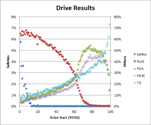
Typically, “Bend But Don’t Break” is the description that NFL analysts use for bad defenses that get lucky.  As a logical and empirical matter, they mostly don’t make sense: Pretty much every team in history (save, possibly, the 2007 New England Patriots) has a steeply inclined expected points by field position curve.  See, e.g., the “Drive Results” chart in this post.  Any time you “bend” enough to give up first downs, you’re giving up expected points. In other words, barring special circumstances, there is simply no way to trade significant yards for a decreased chance of scoring.

Of course, you can have defenses that are stronger at defending various parts of the field, or certain down/distance combinations, which could have the net effect of allowing fewer points than you would expect based on yards allowed, but that’s not some magical defensive rope-a-dope strategy, it’s just being better at some things than others.

But for whatever reason, on a drive-by-drive basis, did the Green Bay defense “bend” more than it “broke”? In other words, did they give up fewer points than expected?

And the answer is “yes.”  Which should be unsurprising, since it’s basically a minor variant of the original problem.  In other words, it begs the question.

In fact, with everything that we’ve looked at so far, this is pretty much all that is left: if there weren’t a significant “Bend But Don’t Break” effect observable, the yardage anomaly would be literally impossible.

And, in fact, this observation “accounts” for about 650 yards, which, combined with everything else we’ve looked at (and assuming a modest amount of overlap), puts us in the ballpark of our initial 2000 yard discrepancy.

Extremely Speculative Conclusions

Some of the things that seem speculative above must be true, because there has to be an accounting: even if it’s completely random, dumb luck with no special properties and no elements of design, there still has to be an avenue for the anomaly to manifest.

So, given that some speculation is necessary, the best I can do is offer a sort of “death by a thousand cuts” explanation.  If we take the yardage explained by turnovers, the “dark matter” yards of “bend but don’t break”, and then roughly half of our speculated consequences of the fewer drives/zero yard TD’s and the “Garbage Time” reverse-clutch effect (to account for overlap), you actually end up with around 2100 yards, with a breakdown like so:

So why cut drives and reverse clutch in half instead of the others?  Mostly just to be conservative. We have to account for overlap somewhere, and I’d rather leave more in the unknown than in the known.

At the end of the day, the stars definitely had to align for this anomaly to happen: Any one of the contributing factors may have been slightly unusual, but combine them and you get something rare.