[For ease of reference—with apologies to those of you who sat through or otherwise already read my NFL Live Blog from this Sunday—I’m once again splitting a few of the topics I covered out into individual posts. I’ve made mostly made only cosmetic adjustments (additional comments are in brackets or at the end), so apologies if these posts aren’t quite as clean or detailed as a regular article. For flavor and context, I still recommend reading the whole thing.]
[See also my Addendum below.]
Random stat from my PBP database: For home teams, 19% of drives starting with a kickoff end in a touchdown, for away teams, just under 17%. But on the first drive of a game, home teams score TD’s on 22%, away teams just 16%.
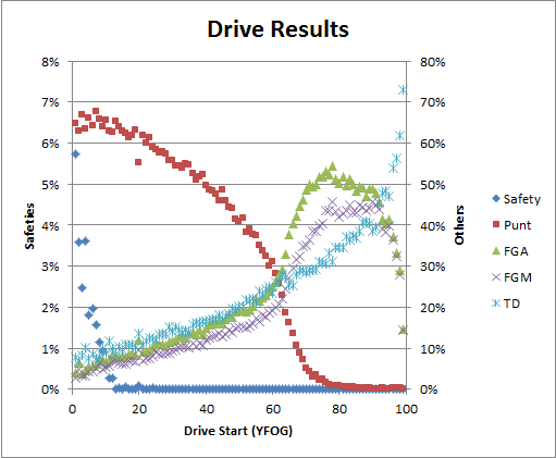
Any time I start wading through PBP stuff, I get easily distracted. There’s something new and fascinating around every corner! [E.g.], here’s what should be considered a pretty basic graph, but it has some interesting subtleties to it:
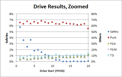
One of the most interesting parts is what’s going on in the first 20 yards:
So what’s interesting about this? Well, that aside from safeties, these particular results are very linear. I think many people would expect that being backed into your endzone makes executing your offense a lot harder — but aside from the occasional safety, the outcomes are really no worse than what you would expect from just being more yards back (turnovers aren’t shown b/c of data mashing issues, but there’s not a massive jump for them either).
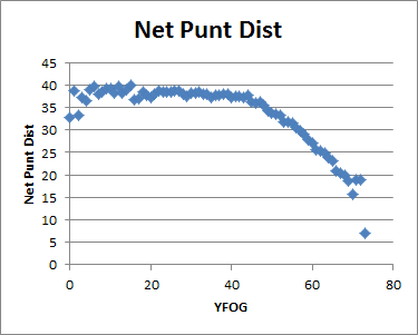
Of course, another important factor [is the effect on punting]:
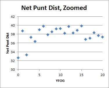
And, the corresponding graph limited to your own 20:
So the take-homes from the above graphs are that the situation gets significantly better/worse within the 5 yard line, accelerating as you approach the goal line. [Though the effect may not be as apparently strong as some probably thought,] this is why kicking field goals from the 1 is terrible even in situations where it has some tactical benefit. Obv this is nothing new to anyone even slightly informed about “expected value” in football (it’s basically the prototypical example), but to break it down clearly: If you don’t score on your 4th down play, trapping your opponent in that spot is valuable 4 ways:
- Natural field position advantage vs. giving your opponent the ball on the 20 after a made field goal.
- Significantly increased chance of a safety.
- Increased chance of good field position b/c of short opponent punts.
- Your subsequent field position also starts to hit the increasing part of your Touchdown/Expected Points curve (i.e., it has value in addition to the generic value of better expected field position).
Though it should be noted that the last 3 effects are much stronger on the 1 than on the 5.
Matt notes:
I was just able to use the drive expectancy chart to check on a Chris Collinsworth comment, love all the graphs and tools. BTW the comment was about the value of getting the ball on the 2-3 vs the half yard line, if I read the graph right the odds of a safety double at the 1 yard line vs the three yard line. Still only 6% but a big enough difference to care.
Yes, there’s a significant difference between the two, and it gets more and more dramatic the closer you get to the plane: there’s a pretty significant difference from being at the 1 and being at the 1/2, etc. It’s also true on the other side of the field: all kinds of wacky things happen as you approach the Endzone, and they’re not all intuitive.
In fact, one of the big difficulties with building a [Win Percentage Added] model is accounting for these kinds of situations empirically, because 1) they behave abnormally, and 2) they’re either rare (e.g., being right at your own end zone), or extremely specific (e.g., some of the things that happen around the 11-12 yard line in the Red Zone), and thus have some of the smallest sample sizes for observation.
Addendum:
David Myers (of Code and Football) also comments:
Why ask? I think the result is important, and I was curious how reliable the data set was. 9 years is a lot of data [note: it’s actually 10 years].
A further explanation would be this: I’m curious why the expected points curves of, say, Keith Goldner and Bill Connelly and Romer/Burke are different. I’ve speculated on the difference here. Your plot suggests that different drive scoring has to be at the root of those differences, as safeties alone can’t account for the first and 10 expected points curves I’ve seen.
Yes, this is what I was getting at in that last paragraph. It’s a bit like physics: it’s easy to build models that explain all the common and relatively simple situations. But it gets much more difficult in the extremes, which can be more complicated, often have less data to analyze, and what data is available is often less reliable.


