If you’re a hardcore follower of this blog, you know that one of things I have frequently complained about is the failure of NBA play-by-play data to include the shot clock. It’s so obviously important and—relative to other play-by-play data—so easy to track, that it’s a complete mystery to me why doing so isn’t completely standard. OTOH, I see stats broken down by “early” and “late” in the shot clock all the time, so someone must have this information.
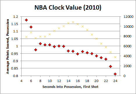
In the meantime, I went through the 2010 play-by-play dataset and kluged a proxy stat from the actual clock, reflecting the number of seconds passed since a team took possession. Here’s a chart summarizing the number and outcomes of possessions of various lengths:
The orange X’s represent the number of league-wide possessions in which the first shot took place at the indicated time. The red diamonds represent the average number of points scored on those possessions (including from any subsequent shots following an offensive rebound, etc).
We should expect there to be a constant trade-off at any given time between taking a shot “now” and waiting for a better one to open up: the deeper you get into a possession, the more your shot standards should drop. And, indeed, this is reflected in the graph by the downward-sloping curve.
For now, I’m just throwing this out there. Though it represents a very basic idea, it is difficult to overstate its importance:
- Accounting for the clock can help evaluate players where standard efficiency ratings break down. Most simply, you can take the results of each shot and compare them to the expected value of a shot taken under the same amount of time-pressure. E.g., if someone averages .9 points per attempt with only a couple of seconds left, you can spot value where normal efficiency calculations wouldn’t.
- Actually, I’ve calculated just such preliminary “value-added” shooting for the entire league (with pretty interesting results), but I’d like to see more accurate data before posting or basing any substantial analysis on it. Among other problems, I think the right side of the curve is overly generous, as it includes possessions where it took a while to get the clock started (a process that is, unfortunately, highly variable), or where time was added and the cause wasn’t scored (also disappointingly common).
- Examining this information can tell you some things about the league generally: For example, it’s interesting to me that there’s a noticeable dip right around where the most shots actually take place (14 to 16 seconds in). Though speculative, I suspect that this is when players are most likely to settle for mediocre 2 point jumpers. Similarly, but a bit more difficultly, you can compare the actual curve with a derived curve to examine whether NBA players, on the whole, seem to wait too long (or not long enough) to pull the trigger.
With better data, the possibilities would open up further (even moreso when combined with other play-by-play information, like shot type, position, defense, etc). For example, you could look at the curve for individual players and impute whether they should be more or less aggressive with their shot selection.
So, yeah, if any of you can direct me to a dataset that has what I want, please let me know.

There was a thread over at APBR a while back on this topic. http://www.apbr.org/metrics/viewtopic.php?f=2&t=7866
Thanks, I’ll take a look. I’ve been meaning to see what’s on APBR for a while now, but it’s kind of fun coming up with stuff on my own first.
Yes, I have seen that exact chart (in the thread/paper Evan linked to). It is an interesting subject, requiring some fairly intricate math.
I have a question that I hope you can help me answer that is sort of tangentially related to this kind of thing. A lost of all in one metrics have a “break even” point. WP has a particularly high point which punishes players with middling efficiency put high usage like Carmelo Anthony. The justification for this is that his production, especially in late shot clock situations, can be replaced because the average TS% is around what he shoots at. So my question is this. Do you think its fair to say that any shot can simply be replaced by a league average efficiency? And are other factors raising the average TS% (I.E we cant always take a Ray Allen corner three or a Tyson Chandler dunk and high usage players like Durant, Lebron, and Kobe are disproportionately affecting the average TS%) so that they are obscuring what the true average of a “bad” shot is . I guess the question I’m really asking is can we find out what the average efficiency of a “bad” shot as well as the average TS% of a truly average player since I don’t think that is accurately represented by league average TS%.
I’ve been reading through some articles here and find your analysis really interesting!
I know this post is old, but in case you ever come back and look at this, I had a question about your analysis.
The trend line definitely makes sense. The more time you have in the possession, the choosier you can be. But arent’t there other plausible explanations. For example, we might expect that a team that is poor offensively and/or facing a strong defensive team would have fewer points per first shot than average. That same team would also likely have fewer “good” shot opportunities per possession. So wouldn’t it makes sense that those teams would find themselves stuck shooting late in the clock more often? Conversely, a good offensive team may be able to make it happen in the last few seconds of a possession, but, as a result of being good offensively, may just find themselves in that position much less often.