Is Randy Moss the Greatest?

So apparently San Francisco backup wide receiver Randy Moss made some headlines at Super Bowl media day by expressing the opinion that he is the greatest receiver of all time.

Much of the response I’ve seen on Twitter has looked like this:

The ESPN article similarly emphasizes Jerry Rice’s superior numbers:

[Moss] has 982 catches for 15,292 yards and 156 touchdowns in his 14-season career.

Hall of Famer Jerry Rice, who now is an ESPN NFL analyst, leads the all-time lists in those three categories with 1,549 receptions, 22,895 yards and 197 touchdown receptions.

Elsewhere, they do note that Jerry Rice played 20 seasons.

Mike Sando has some analysis and a round-up of analyst and fan reactions, including several similar points under heading “The Stats”, and this slightly snarky caption:

Randy Moss says he’s the greatest WR of all time. @JerryRice: “Put my numbers up against his numbers.” We did –>

So when I first saw this story, I kind of laughed it off (generally I’m against claims of greatness that don’t come with 150-page proofs), but then I saw what Randy Moss actually said:

“I don’t really live on numbers, I really live on impact and what you’re able to do out on the field,” he said Tuesday. “I really think I’m the greatest receiver to ever play this game.”

From this, I think the only logical conclusion is that Randy Moss clearly reads this blog.

As any of my ultra-long-time readers know, I’ve written about Randy Moss before. “Quantum Randy Moss—An Introduction to Entanglement” was one of my earliest posts (and probably my first ever to be read by anyone other than friends and family).

Cliff’s Notes version: I think Moss is right that yards and touchdowns and other production “numbers” don’t matter as much as “impact”, or what a player’s actual affect is on his team’s ability to move the ball, score points, and ultimately win games. Unfortunately, isolating a player’s “true value” can be virtually impossible in the NFL, since everyone’s stats are highly “entangled.” However, Randy Moss may come the closest to having a robust data set that’s actually on point, since, for a variety of reasons, he has played with a LOT of different quarterbacks. When I wrote that article, it was clear that all of them played *much* better with Moss than without him.

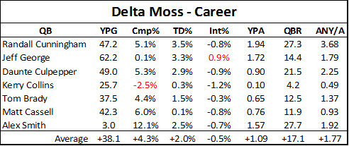
Given this latest “controversy,” I thought I’d take a quick chance to update my old data. After all, Tom Brady and Matt Cassell have played some more seasons since I did my original analysis. Also, while it may or may not be relevant given Moss’s more limited role and lower statistical production, Alex Smith now actually qualifies under my original criteria (playing at least 9 games with Randy Moss in a single season). So, for what it’s worth, I’ve included him as well. Here’s the updated comparison of seasons with Randy Moss vs. career without him (for more details, read the original article):

Note: I calculated these numbers a tiny bit differently than before. specifically, I cut out all performance stats from seasons in which a QB didn’t play at least 4 games.

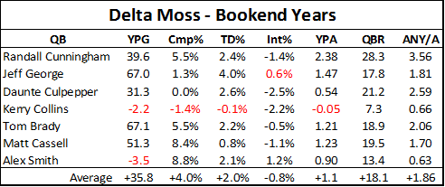
Of course, Alex Smith had a much better season last year than he has previously in his career, so that got me thinking it might be worth trying to make a slightly more apples-to-apples comparison for all 7 quarterbacks. So I filtered the data to compare seasons with Randy Moss only against “Bookend” seasons—that is, each quarterback’s seasons immediately before or after playing with Moss (if applicable):

Here we can see a little bit more variability, as we would expect considering the smaller sample of seasons for comparison, but the bottom line is unchanged. On average, the “Moss effect” even appears to be slightly larger overall. Adjusted Net Yards Per Attempt is probably the best single metric for measuring QB/passing game efficiency, and a difference of 1.77 is about what separates QB’s like Aaron Rodgers from Shaun Hill (7.54 v. 5.68), or a Peyton Manning from a Gus Frerotte (7.11 v. 5.27).

This magnitude of difference is down slightly from the calculations I did in 2010. This is partly because of a change in method (see “note” above), but (in fairness), also partly because Tom Brady’s “non Moss” numbers have improved a bit in the last couple of seasons. On the other hand, the samples are also larger, which makes the unambiguous end result a bit more reliable.

Even Smith clearly still had better statistics this season with Moss (not to mention Colin Kaepearnick seems to be doing OK as well).  Whether that improvement is due to Moss (or more likely, the fear of Moss), who knows. For any particular case(s), there may be/probably are other factors at play: By no means am I saying these are all fair comparisons. But better results in this type of comparison are more likely to occur the better the player actually was. Thus, as a Bayesian matter, extreme results like these make it likely that Randy Moss was extremely good.

So does this mean I think Moss is right? Really, I have no idea. “Greatness” is a subjective term, and Rice clearly had a longer and more fruitful (3 Super Bowl rings) career. But for actual “impact” on the game: If I were a betting man (and I am), I’d say that the quality and strength of evidence in Moss’s favor makes him the most likely “best ever” candidate.

[1/31 Edit: Made some minor clarifying changes throughout.]
Graph of the Day: Quarterbacks v. Coaches, Draft Edition

[Note: With the recent amazing addition to my office, I’ve considered just turning this site into a full-on baby photo-blog (much like my Twitter feed).  While that would probably mean a more steady stream of content, it would also probably require a new name, a re-design, and massive structural changes.  Which, in turn, would raise a whole bevy of ontological issues that I’m too tired to deal with at the moment. So I guess back to sports analysis!]

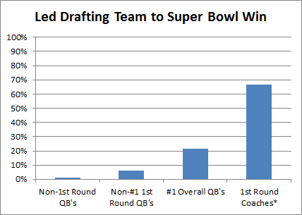
In “A History of Hall of Fame QB-Coach Entanglement,” I talked a bit about the difficulty of “detangling” QB and coach accomplishments.  For a slightly more amusing historical take, here’s a graph illustrating how first round draft picks have gotten a much better return on investment (a full order of magnitude better vs. non-#1 overalls) when traded for head coaches than when used to draft quarterbacks:

Note: Since 1950. List of #1 Overall QB’s is here.  Other 1st Round QB’s here.  Other drafted QB’s here.  Super Bowl starters here.  QB’s that were immediately traded count for the team that got them.

Note*: . . that I know of. I googled around looking for coaches that cost their teams at least one first round draft pick to acquire, and I could only find 3: Bill Parcells (Patriots -> Jets), Bill Belichick (Jets -> Patriots), and Jon Gruden (Raiders -> Bucs).  If I’m missing anyone, please let me know.

Sample, schmample.

But seriously, the other 3 bars are interesting too.

Graph of the Day: NBA Player Stats v. Team Differentials (Follow-Up)

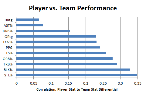
In this post from my Rodman series, I speculated that “individual TRB% probably has a more causative effect on team TRB% than individual PPG does on team PPG.”  Now, using player/team differential statistics (first deployed in my last Rodman post), I think I can finally test this hypothesis:

image

Note: As before, this dataset includes all regular season NBA games from 1986-2010.  For each player who both played and missed at least 20 games in the same season (and averaged at least 20 minutes per game played), differentials are calculated for each team stat with the player in and out of the lineup, weighted by the smaller of games played or games missed that season.  The filtered data includes 1341 seasons and a total of 39,162 weighted games.

This graph compares individual player statistics to his in/out differential for each corresponding team statistic.  For example, a player’s points per game is correlated to his team’s points per game with him in the lineup minus their points per game with him out of the lineup.  Unlike direct correlations to team statistics, this technique tells us how much a player’s performance for a given metric actually causes his team to be better at the thing that metric measures.

Lower values on this scale can potentially indicate a number of things, particularly two of my favorites: duplicability (stat reflects player “contributions” that could have happened anyway—likely what’s going on with Defensive Rebounding %), and/or entanglement (stat is caused by team performance more than it contributes to team performance—likely what’s going on with Assist %).

In any case, the data definitely appears to support my hypothesis: Player TRB% does seem to have a stronger causative effect on team TRB% than player PPG does on team PPG.

A History of Hall of Fame QB-Coach Entanglement

Last week on PTI, Dan LeBatard mentioned an interesting stat that I had never heard before: that 13 of 14 Hall of Fame coaches had Hall of Fame QB’s play for them.  LeBatard’s point was that he thought great quarterbacks make their coaches look like geniuses, and he was none-too-subtle about the implication that coaches get too much credit.  My first thought was, of course: Entanglement, anyone? That is to say, why should he conclude that the QB’s are making their coaches look better than they are instead of the other way around?  Good QB’s help their teams win, for sure, but winning teams also make their QB’s look good.  Thus – at best – LeBatard’s stat doesn’t really imply that HoF Coaches piggyback off of their QB’s success, it implies that the Coach and QB’s successes are highly entangled.  By itself, this analysis might be enough material for a tweet, but when I went to look up these 13/14 HoF coach/QB pairs, I found the history to be a little more interesting than I expected.

First, I’m still not sure exactly which 14 HoF coaches LeBatard was talking about.  According the the official website, there are 21 people in the HoF as coaches.  From what I can tell, 6 of these (Curly Lambeau, Ray Flaherty, Earle Neale, Jimmy Conzelman, Guy Chamberlain and Steve Owen) coached before the passing era, so that leaves 15 to work with.  A good deal of George Halas’s coaching career was pre-pass as well, but he didn’t quit until 1967 – 5 years later than Paul Brown – and he coached a Hall of Fame QB anyway (Sid Luckman).  Of the 15, 14 did indeed coach HoF QB’s, at least technically.

To break the list down a little, I applied two threshold tests:  1) Did the coach win any Super Bowls (or league championships before the SB era) without their HoF QB?  And 2) In the course of his career, did the coach have more than one HoF QB?  A ‘yes’ answer to either of these questions I think precludes the stereotype of a coach piggybacking off his star player (of course, having coached 2 or more Hall of Famer’s might just mean that coach got extra lucky, but subjectively I think the proxy is fairly accurate).  Here is the list of coaches eliminated by these questions:

[table “5” not found /]
Joe Gibbs wins the outlier prize by a mile: not only did he win 3 championships “on his own,” he did it with 3 different non-HoF QB’s.  Don Shula had 3 separate eras of greatness, and I think would have been a lock for the hall even with the Griese era excluded.  George Allen never won a championship, but he never really had a HoF QB either: Jurgensen (HoF) served as Billy Kilmer (non-HoF)’s backup for the 4 years he played under Allen.  Sid Gillman had a long career, his sole AFL championship coming with the Chargers in 1963 – with Tobin Rote (non-HoF) under center.  Weeb Ewbank won 2 NFL championships in Baltimore with Johnny Unitas, and of course won the Super Bowl against Baltimore and Unitas with Joe Namath.  Finally, George Halas won championships with Pard Pearce (5’5”, non-HoF), Carl Brumbaugh (career passer rating: 34.9, non-HoF), Sid Luckman (HoF) and Billy Wade (non-HoF).  Plus, you know, he’s George Halas.
[table “1” not found /]
Though Chuck Noll won all of his championships with Terry Bradshaw (HoF), those Steel Curtain teams weren’t exactly carried by the QB position (e.g., in the 1974 championship season, Bradshaw averaged less than 100 passing yards per game).  Bill Walsh is a bit more borderline: not only did all of his championships come with Joe Montana, but Montana also won a Super Bowl without him.  However, considering Walsh’s reputation as an innovator, and especially considering his incredible coaching tree (which has won nearly half of all the Super Bowls since Walsh retired in 1989), I’m willing to give him credit for his own notoriety.  Finally, Vince Lombardi, well, you know, he’s Vince Lombardi.

Which brings us to the list of the truly entangled:
[table “4” not found /]
I waffled a little on Paul Brown, as he is generally considered an architect of the modern league (and, you know, a team is named after him), but unlike Lombardi, Walsh and Knoll, Brown’s non-Otto-Graham-entangled accomplishments are mostly unrelated to coaching.  I’m sure various arguments could be made about individual names (like, “You crazy, Tom Landry is awesome”), but the point of this list isn’t to denigrate these individuals, it’s simply to say that these are the HoF coaches whose coaching successes are the most difficult to isolate from their quarterback’s.

I don’t really want to speculate about any broader implications, both because the sample is too small to make generalizations, and because my intuition is that coaches probably do get too much credit for their good fortune (whether QB-related or not).  But regardless, I think it’s clear that LeBatard’s 13/14 number is highly misleading.

Quantum Randy Moss—An Introduction to Entanglement

[Update: This post from 2010 has been getting some renewed attention in response to Randy Moss’s mildly notorious statement in New Orleans. I’ve posted a follow-up with more recent data here: “Is Randy Moss the Greatest?” For discussion of the broader idea, however, you’re in the right place.]

As we all know, even the best-intentioned single-player statistical metrics will always be imperfect indicators of a player’s skill.  They will always be impacted by external factors such as variance, strength of opponents, team dynamics, and coaching decisions.  For example, a player’s shooting % in basketball is a function of many variables – such as where he takes his shots, when he takes his shots, how often he is double-teamed, whether the team has perimeter shooters or big space-occupying centers, how often his team plays Oklahoma, etc – only one of which is that player’s actual shooting ability.  Some external factors will tend to even out in the long-run (like opponent strength in baseball).  Others persist if left unaccounted for, but are relatively easy to model (such as the extra value of made 3 pointers, which has long been incorporated into “true shooting percentage”).  Some can be extremely difficult to work with, but should at least be possible to model in theory (such as adjusting a running back’s yards per carry based on the run-blocking skill of their offensive line).  But some factors can be impossible (or at least practically impossible) to isolate, thus creating systematic bias that cannot be accurately measured.  One of these near-impossible external factors is what I call “entanglement,” a phenomenon that occurs when more than one player’s statistics determine and depend on each other.  Thus, when it comes to evaluating one of the players involved, you run into an information black hole when it comes to the entangled statistic, because it can be literally impossible to determine which player was responsible for the relevant outcomes.

While this problem exists to varying degrees in all team sports, it is most pernicious in football.  As a result, I am extremely skeptical of all statistical player evaluations for that sport, from the most basic to the most advanced.  For a prime example, no matter how detailed or comprehensive your model is, you will not be able to detangle a quarterback’s statistics from those of his other offensive skill position players, particularly his wide receivers.  You may be able to measure the degree of entanglement, for example by examining how much various statistics vary when players change teams.  You may even be able to make reasonable inferences about how likely it is that one player or another should get more credit, for example by comparing the careers of Joe Montana with Kansas City and Jerry Rice with Steve Young (and later Oakland), and using that information to guess who was more responsible for their success together.  But even the best statistics-based guess in that kind of scenario is ultimately only going to give you a probability (rather than an answer), and will be based on a miniscule sample.

Of course, though stats may never be the ultimate arbiter we might want them to be, they can still tell us a lot in particular situations.  For example, if only one element (e.g., a new player) in a system changes, corresponding with a significant change in results, it may be highly likely that that player deserves the credit (note: this may be true whether or not it is reflected directly in his stats).  The same may be true if a player changes teams or situations repeatedly with similar outcomes each time.  With that in mind, let’s turn to one of the great entanglement case-studies in NFL history: Randy Moss.
I’ve often quipped to my friends or other sports enthusiasts that I can prove that Randy Moss is probably the best receiver of all time in 13 words or less.  The proof goes like this:

Chad Pennington, Randall Cunningham, Jeff George, Daunte Culpepper, Tom Brady, and Matt Cassell.

The entanglement between QB and WR is so strong that I don’t think I am overstating the case at all by saying that, while a receiver needs a good quarterback to throw to him, ultimately his skill-level may have more impact on his quarterback’s statistics than on his own.  This is especially true when coaches or defenses key on him, which may open up the field substantially despite having a negative impact on his stat-line.  Conversely, a beneficial implication of such high entanglement is that a quarterback’s numbers may actually provide more insight into a wide receiver’s abilities than the receiver’s own – especially if you have had many quarterbacks throwing to the same receiver with comparable success, as Randy Moss has.

Before crunching the data, I would like to throw some bullet points out there:

  • There have been 6 quarterbacks who have started 9 or more games in a season with Randy Moss as one of their receivers (for obvious reasons, I have replaced Chad Pennington with Kerry Collins for this analysis).
  • Only two of them had starting jobs in the seasons immediately prior to those with Moss (Kerry Collins, Tom Brady).
  • Only one of them had a starting job in the season immediately following those with Moss (Matt Cassell).
  • Pro Bowl appearances of quarterbacks throwing to Moss: 6.  Pro-Bowl appearances of quarterbacks after throwing to Moss: 0.
  • Daunte Culpepper made the Pro Bowl 3 times in his 5 seasons throwing to Moss.  He has won a combined 5 games as a starting quarterback in 5 seasons since.

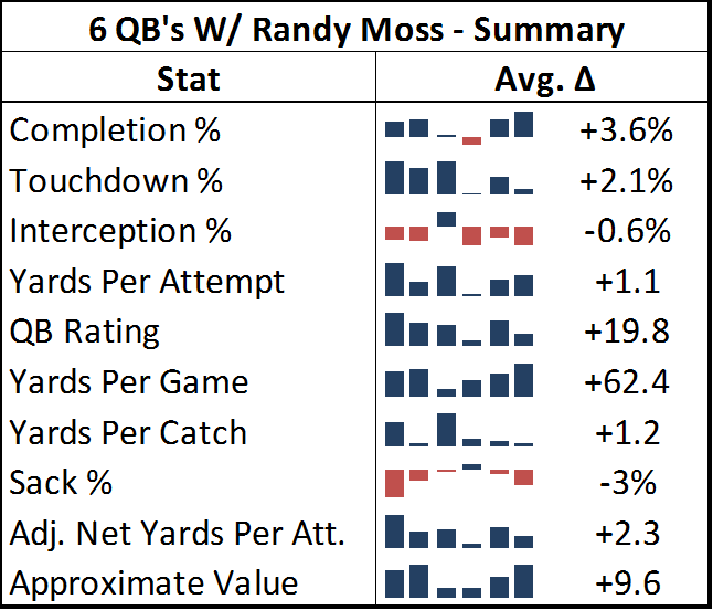
With the exception of Kerry Collins, all of the QB’s who have thrown to Moss have had “career” years with him (Collins improved, but not by as much at the others).  To illustrate this point, I’ve compiled a number of popular statistics for each quarterback for their Moss years and their other years, in order to figure out the average affect Moss has had.  To qualify as a “Moss year,” they had to have been his quarterback for at least 9 games.  I have excluded all seasons where the quarterback was primarily a reserve, or was only the starting quarterback for a few games.  The “other” seasons include all of that QB’s data in seasons without Moss on his team.  This is not meant to bias the statistics, the reason I exclude partial seasons in one case and not the other is that I don’t believe occasional sub work or participation in a QB controversy accurately reflects the benefit of throwing to Moss, but those things reflect the cost of not having Moss just fine.  In any case, to be as fair as possible, I’ve included the two Daunte Culpepper seasons where he was seemingly hampered by injury, and the Kerry Collins season where Oakland seemed to be in turmoil, all three of which could arguably not be very representative.

As you can see in the table below, the quarterbacks throwing to Moss posted significantly better numbers across the board:

Randy Moss_20110_image001[Edit to note: in this table’s sparklines and in the charts below, the 2nd and third positions are actually transposed from their chronological order.  Jeff George was Moss’s 2nd quarterback and Culpepper was his 3rd, rather than vice versa.  This happened because I initially sorted the seasons by year and team, forgetting that George and Culpepper both came to Minnesota at the same time.]

Note: Adjusted Net Yards Per Attempt incorporates yardage lost due to sacks, plus gives bonuses for TD’s and penalties for interceptions.  Approximate Value is an advanced stat from Pro Football Reference that attempts to summarize all seasons for comparison across positions.  Details here.

Out of 60 metrics, only 3 times did one of these quarterbacks fail to post better numbers throwing to Moss than in the rest of his career:  Kerry Collins had a slightly lower completion percentage and slightly higher sack percentage, and Jeff George had a slightly higher interception percentage for his 10-game campaign in 1999 (though this was still his highest-rated season of his career).  For many of these stats, the difference is practically mind-boggling:  QB Rating may be an imperfect statistic overall, but it is a fairly accurate composite of the passing statistics that the broader football audience cares the most about, and 19.8 points is about the difference in career rating between Peyton Manning and J.P. Losman.

Though obviously Randy Moss is a great player, I still maintain that we can never truly measure exactly how much of this success was a direct result of Moss’s contribution and how much was a result of other factors.  But I think it is very important to remember that, as far as highly entangled statistics like this go, independent variables are rare, and this is just about the most robust data you’ll ever get.  Thus, while I can’t say for certain that Randy Moss is the greatest receiver in NFL History, I think it is unquestionably true that there is more statistical evidence of Randy Moss’s greatness than there is for any other receiver.

Full graphs for all 10 stats after the jump:

Read the rest of this entry »

The 1-15 Rams and the Salary Cap—Watch Me Crush My Own Hypothesis

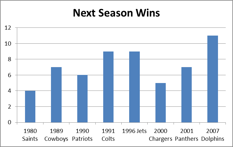
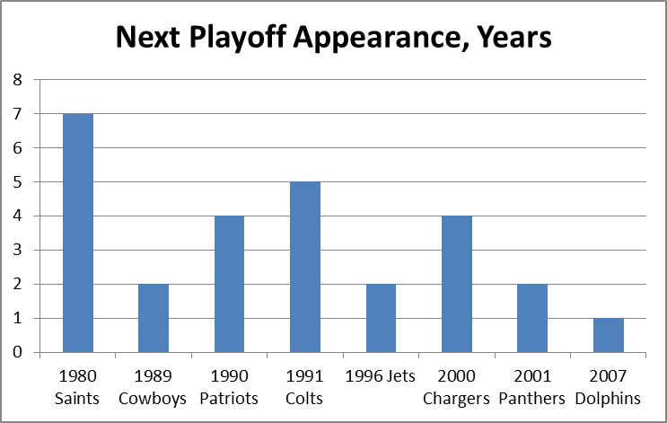
It is a quirky little fact that 1-15 teams have tended to bounce back fairly well.  Since expanding to 16 games in 1978, 9 teams have hit the ignoble mark, including last year’s St. Louis Rams.  Of the 8 that did it prior to 2009, all but the 1980 Saints made it back to the playoffs within 5 years, and 4 of the 8 eventually went on to win Super Bowls, combining for 8 total.  The median number of wins for a 1-15 team in their next season is 7:

1-15 teams_23234_image001

1-15 teams_23234_image003

My grand hypothesis about this was that the implementation of the salary cap after the 1993-94 season, combined with some of the advantages I discuss below (especially 2 and 3), has been a driving force behind this small-but-sexy phenomenon: note that at least for these 8 data points, there seems to be an upward trend for wins and downward trend for years until next playoff appearance.  Obviously, this sample is way too tiny to generate any conclusions, but before looking at harder data, I’d like to speculate a bit about various factors that could be at play.  In addition to normally-expected regression to the mean, the chain of consequences resulting from being horrendously bad is somewhat favorable:

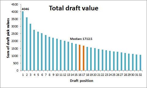
  1. The primary advantages are explicitly structural:  Your team picks at the top of each round in the NFL draft.  According to ESPN’s “standard” draft-pick value chart, the #1 spot in the draft is worth over twice as much as the 16th pick [side note: I don’t actually buy this chart for a second.  It massively overvalue 1st round picks and undervalues 2nd round picks, particularly when it comes to value added (see a good discussion here)]:image
  2. The other primary benefit, at least for one year, comes from the way the NFL sets team schedules: 14 games are played in-division and against common divisional opponents, but the last two games are set between teams that finished in equal positions the previous year (this has obviously changed many times, but there have always been similar advantages).  Thus, a bottom-feeder should get a slightly easier schedule, as evidenced by the Rams having the 2nd-easiest schedule for this coming season.
  3. There are also reliable secondary benefits to being terrible, some of which get greater the worse you are.  A huge one is that, because NFL statistics are incredibly entangled (i.e., practically every player on the team has an effect on every other player’s statistics), having a bad team tends to drag everyone’s numbers down.  Since the sports market – and the NFL’s in particular – is stats-based on practically every level, this means you can pay your players less than what they’re worth going forward.  Under the salary cap, this leaves you more room to sign and retain key players, or go for quick fixes in free agency (which is generally unwise, but may boost your performance for a season or two).
  4. A major tertiary effect – one that especially applies to 1-15 teams, is that embarrassed clubs tend to “clean house,” meaning, they fire coaches, get rid of old and over-priced veterans, make tough decisions about star players that they might not normally be able to make, etc.  Typically they “go young,” which is advantageous not just for long-term team-building purposes, but because young players are typically the best value in the short term as well.
  5. An undervalued quaternary effect is that new personnel and new coaching staff, in addition to hopefully being better at their jobs than their predecessors, also make your team harder to prepare for, just by virtue of being new (much like the “backup quarterback effect,” but for your whole team).
  6. A super-important quinary effect is that. . .  Ok, sorry, I can’t do it.

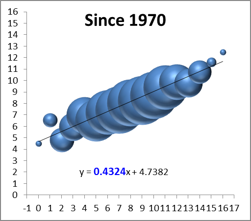
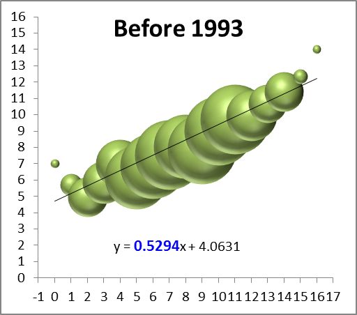
Of course, most of these effects are relevant to more than just 1-15 teams, so perhaps it would be better to expand the inquiry a tiny bit.  For this purpose, I’ve compiled the records of every team since the merger, so beginning in 1970, and compared them to their record the following season (though it only affects one data point, I’ve treated the first Ravens season as a Browns season, and treated the new Browns as an expansion team).  I counted ties as .5 wins, and normalized each season to 16 games (and rounded).  I then grouped the data by wins in the initial season and plotted it on a “3D Bubble Chart.”  This is basically a scatter-plot where the size of each data-point is determined by the number of examples (e.g., only 2 teams have gone undefeated, so the top-right bubble is very small).  The 3D is not just for looks: the size of each sphere is determined by using the weights for volume, which makes it much less “blobby” than 2D, and it allows you to see the overlapping data points instead of just one big ink-blot:

season wins_31685_image001

*Note: again, the x-axis on this graph is wins in year n, and the y axis is wins in year n+1. Also, note that while there are only 16 “bubbles,” they represent well over a thousand data points, so this is a fairly healthy sample.

The first thing I can see is that there’s a reasonably big and fat outlier there for 1-15 teams (the 2nd bubble from the left)!  But that’s hardly a surprise considering we started this inquiry knowing that group had been doing well, and there are other issues at play: First, we can see that the graph is strikingly linear.  The equation at the bottom means that to predict a team’s wins for one year, you should multiply their previous season’s win total by ~.43 and add ~4.7 (e.g.’s: an 8-win team should average about 8 wins the next year, a 4-win team should average around 6.5, and a 12-win team should average around 10).  The number highlighted in blue tells you how important the previous season’s win’s are as a predictor: the higher the number, the more predictive.

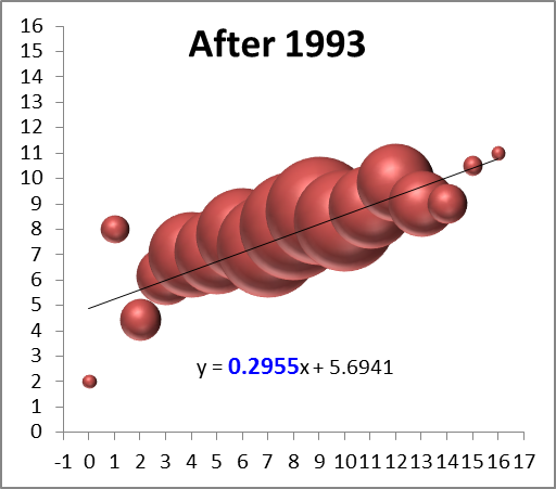
So naturally the next thing to see is a breakdown of these numbers between the pre- and post-salary cap eras:

season wins_31685_image003

season wins_31685_image005

Again, these are not small sample-sets, and they both visually and numerically confirm that the salary-cap era has greatly increased parity: while there are still plenty of excellent and terrible teams overall, the better teams regress and the worse teams get better, faster.  The equations after the split lead to the following predictions for 4, 8, and 12 win teams (rounded to the nearest .25):

W Pre-SC Post-SC
4 6.25 7
8 8.25 8
12 10.5 9.25
Yes, the difference in expected wins between a 4-win team and a 12-win team in the post-cap era is only just over 2 wins, down from over 4.

While this finding may be mildly interesting in its own right, sadly this entire endeavor was a complete and utter failure, as the graphs failed to support my hypothesis that the salary cap has made the difference for 1-15 teams specifically.  As this is an uncapped season, however, I guess what’s bad news for me is good news for the Rams.

The Case for Dennis Rodman, Part 1/4 (a)—Rodman v. Jordan

For reasons which should become obvious shortly, I’ve split Part 1 of this series into sub-parts. This section will focus on rating Rodman’s accomplishments as a rebounder (in painstaking detail), while the next section(s) will deal with the counterarguments I mentioned in my original outline.

For the uninitiated, the main stat I will be using for this analysis is “rebound rate,” or “rebound percentage,” which represents the percentage of available rebounds that the player grabbed while he was on the floor.  Obviously, because there are 10 players on the floor for any given rebound, the league average is 10%.  The defensive team typically grabs 70-75% of rebounds overall, meaning the average rates for offensive and defensive rebounds are approximately 5% and 15% respectively.  This stat is a much better indicator of rebounding skill than rebounds per game, which is highly sensitive to factors like minutes played, possessions per game, and team shooting and shooting defense.  Unlike many other “advanced” stats out there, it also makes perfect sense intuitively (indeed, I think the only thing stopping it from going completely mainstream is that the presently available data can technically only provide highly accurate “estimates” for this stat.  When historical play-by-play data becomes more widespread, I predict this will become a much more popular metric).

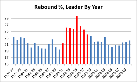
Dennis Rodman has dominated this stat like few players have dominated any stat.  For overall rebound % by season, not only does he hold the career record, he led the league 8 times, and holds the top 7 spots on the all-time list (red bars are Rodman):

Note this chart only goes back as far as the NBA/ABA merger in 1976, but going back further makes no difference for the purposes of this argument.  As I will explain in my discussion of the “Wilt Chamberlain and Bill Russell Were Rebounding Gods” myth, the rebounding rates for the best rebounders tend to get worse as you go back in time, especially before Moses Malone.
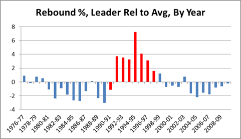
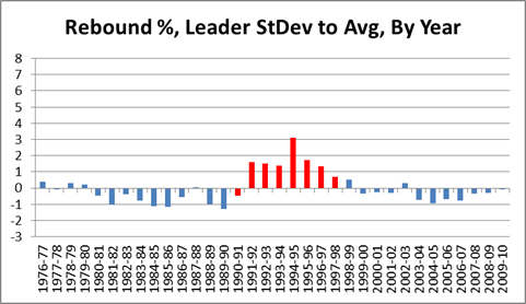
As visually impressive as that chart may seem, it is only the beginning of the story.  Obviously we can see that the Rodman-era tower is the tallest in the skyline, but our frame of reference is still arbitrary: e.g., if the bottom of the chart started at 19 instead of 15, his numbers would look even more impressive.  So one thing we can do to eliminate bias is put the average in the middle, and count percentage points above or below, like so:

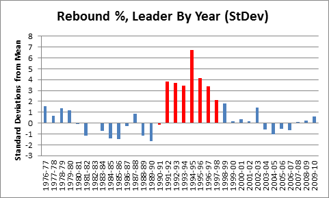
With this we get a better visual sense of the relative greatness of each season.  But we’re still left with percentage points as our unit of measurement, which is also arbitrary: e.g., how much better is “6%” better?  To answer this question, in addition to the average, we need to calculate the standard deviation of the sample (if you’re normally not comfortable working with standard deviations, just think of them as standardized units of measurement that can be used to compare stats of different types, such as shooting percentages against points per game).  Then we re-do the graph using standard deviations above or below the mean, like so:

Note this graph is actually exactly the same shape as the one above, it’s just compressed to fit on a scale from –3 to +8 for easy comparison with subsequent graphs.  The SD for this graph is 2.35%.
There is one further, major, problem with our graph: As strange as it may sound, Dennis Rodman’s own stats are skewing the data in a way that biases the comparison against him.  Specifically, with the mean and standard deviation set where they are, Rodman is being compared to himself as well as to others.  E.g., notice that most of the blue bars in the graph are below the average line: this is because the average includes Rodman.  For most purposes, this bias doesn’t matter much, but Rodman is so dominant that he raises the league average by over a percent, and he is such an outlier that he alone nearly doubles the standard deviation.  Thus, for the remaining graphs targeting individual players, I’ve calculated the average and standard deviations for the samples from the other players only:

Note that a negative number in this graph is not exactly a bad thing: that person still led the league in rebounding % that year.  The SD for this graph is 1.22%.
But not all rebounding is created equal: Despite the fact that they get lumped together in both conventional rebounding averages and in player efficiency ratings, offensive rebounding is worth considerably more than defensive rebounding.  From a team perspective, there is not much difference (although not necessarily *no* difference – I suspect, though I haven’t yet proved, that possessions beginning with offensive rebounds have higher expected values than those beginning with defensive rebounds), but from an individual perspective, the difference is huge.  This is because of what I call “duplicability”: simply put, if you failed to get a defensive rebound, there’s a good chance that your team would have gotten it anyway.  Conversely, if you failed to get an offensive rebound, the chances of your team having gotten it anyway are fairly small.  This effect can be very crudely approximated by taking the league averages for offensive and defensive rebounding, multiplying by .8, and subtracting from 1.  The .8 comes from there being 4 other players on your team, and the subtraction from 1 gives you the value added for each rebound: The league averages are typically around 25% and 75%, so, very crudely, you should expect your team to get around 20% of the offensive and 60% of the defensive rebounds that you don’t.  Thus, each offensive rebound is adding about .8 rebounds to your team’s total, and each defensive rebound is adding about .4.  There are various factors that can affect the exact values one way or the other, but on balance I think it is fair to assume that offensive rebounds are about twice as valuable overall.

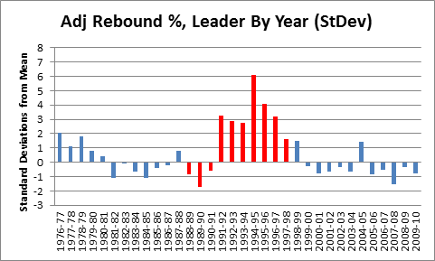
To that end, I calculated an adjusted rebounding % for every player since 1976 using the formula (2ORB% + DRB%)/3, and then ran it through all of the same steps as above:

Mindblowing, really.  But before putting this graph in context, a quick mathematical aside:  If these outcomes were normally distributed, a 6 standard deviation event like Rodman’s 1994-1995 season would theoretically happen only about once every billion seasons.  But because each data point on this chart actually represents a maximum of a large sample of (mostly) normally distributed seasonal rebounding rates, they should instead be governed by the Gumbel distribution for extreme values: this leads to a much more manageable expected frequency of approximately once every 400 years (of course, that pertains to the odds of someone like Rodman coming along in the first place; now that we’ve had Rodman, the odds of another one showing up are substantially higher).  In reality, there are so many variables at play from era to era, season to season, or even team to team, that a probability model probably doesn’t tell us as much as we would like (also, though standard deviations converge fairly quickly, the sample size is relatively modest).

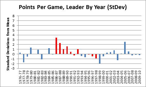
Rather than asking how abstractly probable or improbable Rodman’s accomplishments were, it may be easier to get a sense of his rebounding skill by comparing this result to results of the same process for other statistics.  To start with, note that weighting the offensive rebounding more heavily cuts both ways for Rodman: after the adjustment, he only holds the top 6 spots in NBA history, rather than the top 7.  On the other hand, he led the league in this category 10 times instead of 8, which is perfect for comparing him to another NBA player who led a major statistical category 10 times — Michael Jordan:

Red bars are Jordan.  Mean and standard deviation are calculated from 1976, excluding MJ, as with Rodman above.

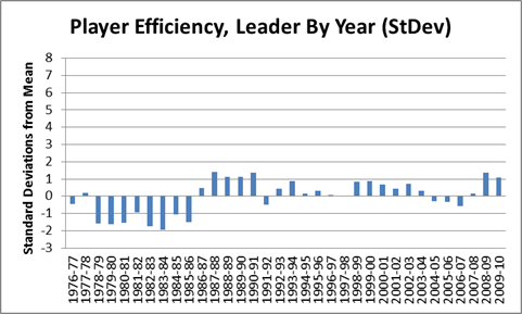
As you can see, the data suggests that Rodman was a better rebounder than Jordan was a scorer.  Of course, points per game isn’t a rate stat, and probably isn’t as reliable as rebounding %, but that cuts in Rodman’s favor.  Points per game should be more susceptible to varying circumstances that lead to extreme values.  Compare, say, to a much more stable stat, Hollinger’s player efficiency rating:

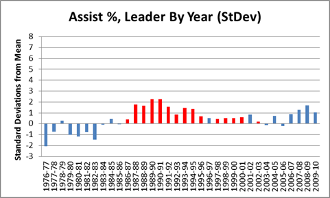
Actually, it is hard to find any significant stat where someone has dominated as thoroughly as Rodman.  One of the closest I could find is John Stockton and the extremely obscure “Assist %” stat:

Red bars are Stockton, mean and SD are calculated from the rest.

Stockton amazingly led the league in this category 15 times, though he didn’t dominate individual seasons to the extent that Rodman did.  This stat is also somewhat difficult to “detangle” (another term/concept I will use frequently on this blog), since assists always involve more than one player.  Regardless, though, this graph is the main reason John Stockton is (rightfully) in the Hall of Fame today.  Hmm…