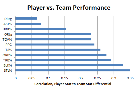
In this post from my Rodman series, I speculated that “individual TRB% probably has a more causative effect on team TRB% than individual PPG does on team PPG.” Now, using player/team differential statistics (first deployed in my last Rodman post), I think I can finally test this hypothesis:
Note: As before, this dataset includes all regular season NBA games from 1986-2010. For each player who both played and missed at least 20 games in the same season (and averaged at least 20 minutes per game played), differentials are calculated for each team stat with the player in and out of the lineup, weighted by the smaller of games played or games missed that season. The filtered data includes 1341 seasons and a total of 39,162 weighted games.
This graph compares individual player statistics to his in/out differential for each corresponding team statistic. For example, a player’s points per game is correlated to his team’s points per game with him in the lineup minus their points per game with him out of the lineup. Unlike direct correlations to team statistics, this technique tells us how much a player’s performance for a given metric actually causes his team to be better at the thing that metric measures.
Lower values on this scale can potentially indicate a number of things, particularly two of my favorites: duplicability (stat reflects player “contributions” that could have happened anyway—likely what’s going on with Defensive Rebounding %), and/or entanglement (stat is caused by team performance more than it contributes to team performance—likely what’s going on with Assist %).
In any case, the data definitely appears to support my hypothesis: Player TRB% does seem to have a stronger causative effect on team TRB% than player PPG does on team PPG.
