LeBron’s High-Usage Shooting Efficiency (Featuring Adrian Dantley)

As anyone (statistically-inclined or not) can tell you, LeBron James is having a pretty good year. His 26.8 points, 8 rebounds and 7.3 assists per game (through 81) makes for another entry in his already stunning portfolio of versatile seasons: This will be his 6th time hitting 25/7/7+, a feat that has only been accomplished 8 times since the merger:

Totals Shooting Per Game
Rk Player Season Age Tm G FGA FG% 3P% FT% PTS TRB AST TS%
1 LeBron James 2012-13 28 MIA 76 1354 .565 .406 .753 26.8 8.0 7.3 .640
2 Michael Jordan* 1988-89 25 CHI 81 1795 .538 .276 .850 32.5 8.0 8.0 .614
3 Larry Bird* 1986-87 30 BOS 74 1497 .525 .400 .910 28.1 9.2 7.6 .612
4 LeBron James 2009-10 25 CLE 76 1528 .503 .333 .767 29.7 7.3 8.6 .604
5 LeBron James 2010-11 26 MIA 79 1485 .510 .330 .759 26.7 7.5 7.0 .594
6 LeBron James 2008-09 24 CLE 81 1613 .489 .344 .780 28.4 7.6 7.2 .591
7 LeBron James 2007-08 23 CLE 75 1642 .484 .315 .712 30.0 7.9 7.2 .568
8 LeBron James 2004-05 20 CLE 80 1684 .472 .351 .750 27.2 7.4 7.2 .554
Provided by Basketball-Reference.com: View Original Table
(Generated 4/17/2013.)

But the thing that sticks out (which stat-heads have been going berserk about) is his shooting, which has been by far the most efficient of his career.  Indeed, it may be one of the greatest shooting efficiency seasons of all time.

While his raw shooting % wouldn’t break the top 100 seasons, and his “true” shooting % (adjusted for free throws and 3 point shots made) would still only rank about 60th, the key here is that James’ shooting efficiency is remarkable for someone with his role as both a primary option and a shooter of last resort.  Generally, when you increase a player’s shot-taking responsibilities, it comes at the cost of marginal shot efficiency. This doesn’t mean this is a bad decision or that the player is doing anything wrong—what may be a bad shot “for them” may be a great shot under the circumstances in which they are asked to take it (like when the shot clock is running down, etc).

While there’s no simple stat that describes the degree to which someone is a “shot creator,” we can use usage rate as a decent (though obviously imperfect) proxy. There have been around 150 seasons in which one player “used” >=30% of their team’s possessions:

Usage >30% vs. TS%

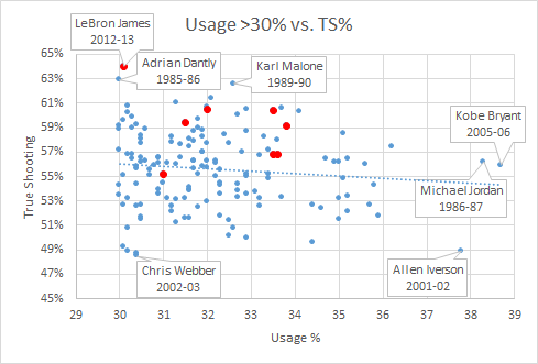
All player seasons with USG% >= 30. LeBron’s in red.

As we would expect, the best shooting percentages decline as the players’ usage rates get larger and larger.  The red points are LeBron’s seasons (which are pretty excellent across the board) and as we can see from this scatter, his 2012-13 campaign is about to set the record for this group (though we should note that it’s NOT a Rodman-esqe outlier).

Amazingly, the previous record-holder was Adrian Dantley! Dantley is a Hall of Fameer who I had practically never heard of until his name kept popping up in my historical research as possibly one of the most underrated players ever.

Dantley never made an All-NBA first team or won an NBA championship, but he does extremely well in a variety of plus-minus and statistical plus-minus style metrics. While he didn’t have the all-around game of a LeBron James (though he did average a respectable 6-7 rebounds and 3-4 assists in his prime), Dantley was an extremely efficient high-usage shooter. For example, if we look at the top True Shooting seasons among players with a Usage Rate of greater than 27.5%, guess who occupies fully 5 of the top 10 spots:

Totals Shooting Advanced
Rk Player Season Age Tm G FG FGA PTS FG% TS% USG%
1 Amare Stoudemire 2007-08 25 PHO 79 714 1211 1989 .590 .656 28.2
2 Adrian Dantley* 1983-84 27 UTA 79 802 1438 2418 .558 .652 28.2
3 Kevin Durant 2012-13 24 OKC 81 731 1433 2280 .510 .647 29.8
4 LeBron James 2012-13 28 MIA 76 765 1354 2036 .565 .640 30.1
5 Charles Barkley* 1990-91 27 PHI 67 665 1167 1849 .570 .635 29.1
6 Adrian Dantley* 1979-80 23 UTA 68 730 1267 1903 .576 .635 27.8
7 Adrian Dantley* 1981-82 25 UTA 81 904 1586 2457 .570 .631 27.9
8 Adrian Dantley* 1985-86 29 UTA 76 818 1453 2267 .563 .629 30.0
9 Karl Malone* 1989-90 26 UTA 82 914 1627 2540 .562 .626 32.6
10 Adrian Dantley* 1980-81 24 UTA 80 909 1627 2452 .559 .622 28.4
Provided by Basketball-Reference.com: View Original Table
(Generated 4/17/2013.)

Dantley was also in the news a bit last month for working part-time as a crossing guard:


Key quotes from that story:

“It’s not a big thing to me … I just do it. I have a routine. I exercise, I go to work, I go home. I have a spring break next week. I have a summer off, just like when I was a basketball player.”

“I just did it for the kids … I just didn’t want to sit around the house all day.”

“I’ve definitely saved two lives. I’ve almost gotten hit by a car twice. And I would say 70 percent of the people who go across my route are on their telephone or on their BlackBerry, text-messaging. I never would have seen that if I had not been on the post.”

What a character!

Graph of the Day: Second Look at Stan Van?

Granted, “of the Day” isn’t really accurate considering how often I post, but I found it amusing enough to share:

Red is years coached by Stan Van Gundy.

Win % in games played by Dwight Howard. Red years were with Stan Van Gundy coaching.

This came up in a discussion about the possibility that Dwight Howard might not be leveraged optimally on teams that aren’t comprised mostly of small 3 point shooters. That would have interesting implications.

Graphs of the Day: Bird vs. Bron

One of my favorite stat-nuggets ever is that “Larry Bird never had a losing month.” So, yesterday, I figured it was about time to check whether or not it’s, you know, true.

To do this, I first had to figure out which Celtics games Bird actually played in. The problem there is that his career began well before 1986, meaning the box score data aren’t in Basketball Reference’s database. But they do have images of the actual box scores, like so:

Fortunately, Bird played in every game in his first two seasons, so figuring this out was just a matter of poring through 4 years of these pics: Easy peasy! (I’ve done more grueling work for even more trivial questions, to be sure.) But results on that later.

Independently, I was trying to come up with a fun way to illustrate the fact that LeBron James won a lot more games in his last two seasons on the lowly Cleveland Cavaliers than he has so far on the perma-hyped Miami Heat:

So that graph reflects every game of LeBron’s career, including the regular season and playoffs (through last night). It’s pretty straightforward: With LeBron an 18-year-old rookie, the Cavs (though much improved) were still pretty shaky, and they pretty much got better and better each year. After a slight decline from their soaring 2008 performance, LeBron left to join the latest Big 3—which is a solid contender, but no threat to the greatest Big 3. (BTW, I would like to thank the Heat for becoming Exhibit A for my long-time contention that having multiple “primary” options is less valuable than having a well-designed supporting cast—even one with considerably less talent.)

But with Mr. Trifecta on my mind (not to mention overloading my browser history), I thought it might be fun to compare the two leading contenders for the small forward spot on any NBA GOAT team. So here’s Larry:

Wow, pretty crazy consistent, yes? Keep in mind that, despite the Celtics long winning tradition, they only won 29 games the year before Bird’s arrival.  Note the practically opposite gradient from LeBron’s: Bird started out hot, and basically stayed hot until injuries cooled him down.

As for the results of the original inquiry: It turns out Bird’s Celtics started the season 2-4 in November 1988, just before Bird had season-ending ankle surgery (of course, Bird’s 1988 games ARE in my database, so this was a bit of a “Doh!” finding). And, of course, he also had losing months in the playoffs.

His worst full month in the regular season, however, was indeed exactly .500: He went 8-8 in March of 1982. So, properly qualified (like, “In the regular season, Bird never had a losing month in which he played more than 6 games”), the claim holds up. If I were a political fact-checker, I would deem it “Mostly True.”

In case you’re interested, here is the complete list of months in Larry Bird’s career:

[table “10” not found /]

Graph of the Day: Quarterbacks v. Coaches, Draft Edition

[Note: With the recent amazing addition to my office, I’ve considered just turning this site into a full-on baby photo-blog (much like my Twitter feed).  While that would probably mean a more steady stream of content, it would also probably require a new name, a re-design, and massive structural changes.  Which, in turn, would raise a whole bevy of ontological issues that I’m too tired to deal with at the moment. So I guess back to sports analysis!]

In “A History of Hall of Fame QB-Coach Entanglement,” I talked a bit about the difficulty of “detangling” QB and coach accomplishments.  For a slightly more amusing historical take, here’s a graph illustrating how first round draft picks have gotten a much better return on investment (a full order of magnitude better vs. non-#1 overalls) when traded for head coaches than when used to draft quarterbacks:

Note: Since 1950. List of #1 Overall QB’s is here.  Other 1st Round QB’s here.  Other drafted QB’s here.  Super Bowl starters here.  QB’s that were immediately traded count for the team that got them.

Note*: . . that I know of. I googled around looking for coaches that cost their teams at least one first round draft pick to acquire, and I could only find 3: Bill Parcells (Patriots -> Jets), Bill Belichick (Jets -> Patriots), and Jon Gruden (Raiders -> Bucs).  If I’m missing anyone, please let me know.

Sample, schmample.

But seriously, the other 3 bars are interesting too.

Non-Sports Graph of the Day: National Debt v. Stock Market

I’m not really into finance, I’m not an economist, and I’m not trying to be Nate Silver, but I was messing around with some data and thought this was pretty interesting:

The blue line is based on the Wilshire 5000, which tracks the total market capitalization (share price times number of shares) of all publicly traded U.S.-based companies.  Data points for both measures are as of the close of the fiscal year.  The bright red dot is the projected national debt at the end of FY 2012, assuming no new budget deals are reached.

Graph of the Day: Alanis Loves Rookie Quarterbacks

Last season I did some analysis of rookie starting quarterbacks and which of their stats are most predictive of future NFL success. One of the most fun and interesting results I found is that rookie interception % is a statistically significant positive indicator—that is, all else being equal, QB’s who throw more interceptions as rookies tend to have more successful careers.  I’ve been going back over this work recently with an eye towards posting something on the blog (coming soon!), and while playing around with examples I stumbled into this:

Note: Data points are QB’s in the Super Bowl era who were drafted #1 overall and started at least half of their team’s games as rookies (excluding Matthew Stafford and Sam Bradford for lack of ripeness). Peyton Manning and Jim Plunkett each threw 4.9% interceptions and won one Super Bowl, so I slightly adjusted their numbers to make them both visible, though the R-squared value of .7287 is accurate to the original (a linear trend actually performs slightly better—with an R-squared of .7411—but I prefer the logarithmic one aesthetically).

Notice the relationship is almost perfectly ironic: Excluding Steve Bartowski (5.9%), no QB with a lower interception percentage has won more Super Bowls than any QB with a higher one. Overall (including Steve B.), the seven QB’s with the highest rates have 12 Super Bowl rings, or an average of 1.7 per (and obv the remaining six have none).  And it’s not just Super Bowls: those seven also have 36 career Pro Bowl selections between them (average of 5.1), to just seven for the remainder (average of 1.2).

As for significance, obviously the sample is tiny, but it’s large enough that it would be an astounding statistical artifact if there were actually nothing behind it (though I should note that the symmetricality of the result would be remarkable even with an adequate explanation for its “ironic” nature).  I have some broader ideas about the underlying dynamics and implications at play, but I’ll wait to examine those in a more robust context. Besides, rank speculation is fun, so here are a few possible factors that spring to mind:

  1. Potential for selection effect: Most rookie QB’s who throw a lot of interceptions get benched.  Teams may be more likely to let their QB continue playing when they have more confidence in his abilities—and presumably such confidence correlates (at least to some degree) with actually having greater abilities.
  2. The San Antonio gambit: Famously, David Robinson missed most of the ’96-97 NBA season with back and foot injuries, allowing the Spurs to bomb their way into getting Tim Duncan, sending the most coveted draft pick in many years to a team that, when healthy, was already somewhat of a contender (also preventing a drool-worthy Iverson/Duncan duo in Philadelphia).  Similarly, if a quality QB prospect bombs out in his rookie campaign—for whatever reason, including just “running bad”—his team may get all of the structural and competitive advantages of a true bottom-feeder (such as higher draft position), despite actually having 1/3 of a quality team (i.e., a good quarterback) in place.
  3. Gunslingers are just better:  This is my favorite possible explanation, natch.  There are a lot of variations, but the most basic idea goes like this: While ultimately a good QB on a good team will end up having lower interception rates, interceptions are not necessarily bad.  Much like going for it on 4th down, often the best win-maximizing choice that a QB can make is to “gamble”—that is, to risking turning the ball over when the reward is appropriate. This can be play-dependent (like deep passes with high upsides and low downsides), or situation-dependent (like when you’re way behind and need to give yourself the chance to get lucky to have a chance to win).  E.g.: In defense of Brett Favre—who, in crunch time, could basically be counted on to deliver you either a win or multiple “ugly” INT’s—I’ve quipped: If a QB loses a game without throwing 4 interceptions, he probably isn’t trying hard enough.  And, of course, this latter scenario should come up a lot for the crappy teams that just drafted #1 overall:  I.e., when your rookie QB is going 4-12 and isn’t throwing 20 interceptions, he’s probably doing something wrong.

[Edit (9/24/2011) to add: Considering David Meyer’s comment below, I thought I should make clear that, while my interests and tastes lie with #3 above, I don’t mean to suggest that I endorse it as the most likely or most significant factor contributing to this particular phenomenon (or even the broader one regarding predictivity of rookie INT%).  While I do find it meaningful and relevant that this result is consistent with and supportive of some of my wilder thoughts about interceptions, risk-taking, and quarterbacking, overall I think that macroscopic factors are more likely to be the driving force in this instance.]

For the record, here are the 13 QB’s and their relevant stats:

[table “7” not found /]

Graph of the Day: NBA Player Stats v. Team Differentials (Follow-Up)

In this post from my Rodman series, I speculated that “individual TRB% probably has a more causative effect on team TRB% than individual PPG does on team PPG.”  Now, using player/team differential statistics (first deployed in my last Rodman post), I think I can finally test this hypothesis:

image

Note: As before, this dataset includes all regular season NBA games from 1986-2010.  For each player who both played and missed at least 20 games in the same season (and averaged at least 20 minutes per game played), differentials are calculated for each team stat with the player in and out of the lineup, weighted by the smaller of games played or games missed that season.  The filtered data includes 1341 seasons and a total of 39,162 weighted games.

This graph compares individual player statistics to his in/out differential for each corresponding team statistic.  For example, a player’s points per game is correlated to his team’s points per game with him in the lineup minus their points per game with him out of the lineup.  Unlike direct correlations to team statistics, this technique tells us how much a player’s performance for a given metric actually causes his team to be better at the thing that metric measures.

Lower values on this scale can potentially indicate a number of things, particularly two of my favorites: duplicability (stat reflects player “contributions” that could have happened anyway—likely what’s going on with Defensive Rebounding %), and/or entanglement (stat is caused by team performance more than it contributes to team performance—likely what’s going on with Assist %).

In any case, the data definitely appears to support my hypothesis: Player TRB% does seem to have a stronger causative effect on team TRB% than player PPG does on team PPG.

Graph of the Day: Tim Duncan’s Erstwhile(?) Consistency

While San Antonio is having a great season, Tim Duncan is on the verge of posting career lows in scoring and rebounding (by wide margins).  He’s getting a bit older and playing fewer minutes, for sure, but before this year he was one of the most consistent players in NBA history:

image

Note: Data excludes any seasons where player started fewer than 42 games.

If that graph is kind of confusing, ignore the axes:  more flat means more consistent.  Spikes don’t necessarily represent decline, as a bad/great year can come at any time.  Question mark is where Duncan projects for 2010-11.