The Case for Dennis Rodman, Part 2/4 (b)—With or Without Worm

I recently realized that if I don’t speed up my posting of this series, Rodman might actually be in the Hall of Fame before I’m done.  Therefore, I’m going to post this section now, and Part 3 (which will probably only be one post) in the next few days.

This blog is called “Skeptical” Sports Analysis for a reason: I’m generally wary of our ability to understand anything definitively, and I believe that most people who confidently claim to know a lot of things other than facts—whether in sports, academics, or life—are either lying, exaggerating, or wrong.  I don’t accept this as an a priori philosophical tenet (in college I was actually very resistant to the skeptics), but as an empirical conclusion based on many years of engaging and analyzing various people’s claims of knowledge.  As any of you who happen to know me will attest, if I have any talent on this earth, it is finding fault with such claims (even when they are my own).

Keeping that in mind—and keeping in mind that, unlike most sports commentators, I don’t offer broadly conclusive superlatives very often—I offer this broadly conclusive superlative:  Dennis Rodman was the greatest rebounder of all time. If there has been any loose end in the arguments I’ve made already, it is this: based on the evidence I’ve presented so far, Rodman’s otherworldly rebounding statistics could, theoretically, be a result of shenanigans.  That is, he could simply have been playing at the role of rebounder on his teams, ignoring all else and unnaturally inflating his rebounding stats, while only marginally (or even negatively) contributing to his team’s performance.  Thus, the final piece of this puzzle is showing that his rebounding actually helped his teams.  If that could be demonstrated, then even my perversely skeptical mind would be satisfied on the point—else there be no hope for knowledge.

This is where “The Case for Dennis Rodman Was a Great Rebounder” and “The Case for Dennis Rodman” join paths: Showing that Rodman got a lot of rebounds without also showing that this significantly improved his teams proves neither that he was a great player nor that he was a great rebounder.  Unfortunately, as I discussed in the last two sections, player value can be hard to measure, and the most common conventional and unconventional valuation methods are deeply flawed (not to mention unkind toward Rodman).  Thus, in this post and the next, I will take a different approach.

Differential (Indirect) Statistics

For this analysis, I will not be looking at Dennis Rodman’s (or any other player’s) statistics directly at all.  Instead, I will be looking at his team’s statistics, comparing the games in which he played to the games that he missed. I used a similar (though simpler) method in my mildly popular Quantum Randy Moss post last fall, which Brian Burke dubbed WOWRM, or “With or Without Randy Moss.”  So, now I present that post’s homophonic cousin: WOWWorm, or “With or Without Worm.”

The main advantages to indirect statistics are that they are all-inclusive (everything good or bad that a player does is accounted for, whether it is reflected in the box score or not), empirical (what we do or don’t know about the importance of various factors doesn’t matter), and they can get you about as close as possible in this business to isolating actual cause and effect.  These features make the approach especially trenchant for general hypothesis-testing and broader studies of predictivity that include league-wide data.

The main disadvantage for individual player analysis, however, is that the samples are almost always too small to be conclusive (in my dream universe, every player would be forced to sit out half of their team’s regular-season games at random).  They are also subject to bias based on quality of the player’s team (it is harder to have a big impact on a good team), or based on the quality of their backup—though I think the latter effect is much smaller in the basketball than in football or baseball.  In the NBA, teams rotate in many different players and normally have a lot of different looks, so when a starter goes out, they’re rarely just replaced by one person—the whole roster (even the whole gameplan) may shift around to exploit the remaining talent.  This is one reason you almost never hear of an NBA bench player finally “getting his shot” because the player in front of them was injured—if someone has exploitable skills, they are probably going to get playing time regardless.  Fortunately, Dennis Rodman missed his fair share of games—aided by his proclivity for suspensions—and the five seasons in which he missed at least 15 games came on four different teams.

Note, for the past few years, more complete data has allowed people to look at minute-by-minute or play-by-play +/- in basketball (as has been done for some time in hockey).  This basically eliminates the sample size problem, though it introduces a number of potential rotational, strategic and role-based biases.  Nevertheless, it definitely makes for a myriad of exciting analytical possibilities.

Margin of Victory

For structural reasons, I’m going to hold off on Rodman’s Win % differentials until my next post in this series.  In this post, however, I will look at everything else, starting with team point differential differential—a.k.a. “Margin of Victory”:

image

Note: Table is only the top 25 players in the dataset.

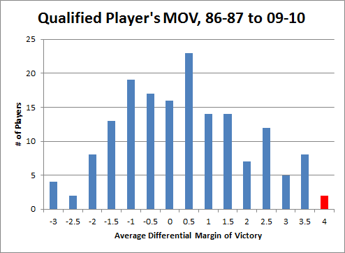
First, the nitty-gritty:  This data goes back to 1986, starting with all players who missed and played at least 15 games in a single season while averaging at least 20 minutes per game played.  The “qualifying games” in a season is the smaller of games played or games missed.  E.g., if someone played 62 games and missed 20, that counts as 20 qualifying games, the same as if someone played 20 games and missed 62.  Their “qualifying minutes” are then their average of minutes per game played multiplied by their total number of qualifying games.  For the sample, I set the bar at 3000 qualifying minutes, or roughly the equivalent of a full season for a typical starter (82 games * 36 minutes/game is 2952 minutes), which leaves 164 qualifying players.  I then calculated differentials for each team-season:  I.e., per-game averages were calculated separately for the set of games played and the set of games missed by each player from within a particular season, and each season’s “differentials” were created for each stat simply by subtracting the second from the first.  Finally, I averaged the per-season differentials for each qualifying season for each player.  This is necessarily different from how multiple-season per-game stats are usually calculated (which is just to sum up the stats from the various seasons and divide by total games).  As qualifying games may come from different teams and different circumstances, to isolate a player’s impact it is crucially important that (as much as possible) their presence or absence is the only variable that changes, which is not even remotely possible across multiple seasons.  In case anyone is interested, here is the complete table with all differential stats for all 164 qualified players.

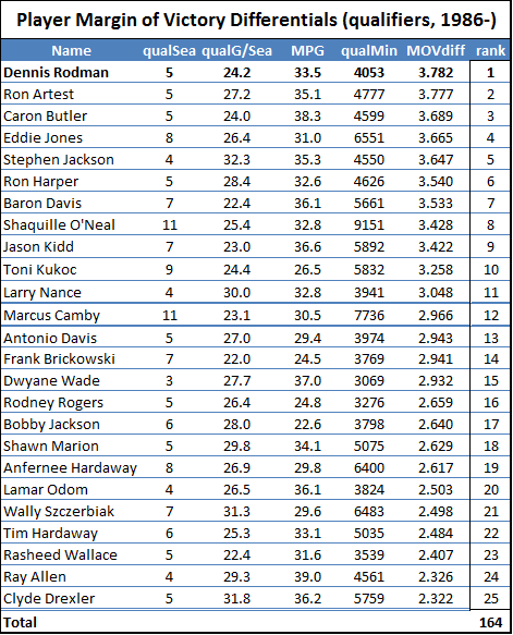
I first ran the differentials for Dennis Rodman quite some time ago, so I knew his numbers were very good.  But when I set out to do the same thing for the entire league, I had no idea that Rodman would end up literally on top.  Here is a histogram of the MOV-differential distribution for all qualified players (rounded to the nearest .5):

image

Note: Red is Dennis Rodman (and Ron Artest).

3.8 points per game may not sound like much compared to league-leading scorers who score 30+, but that’s both the beauty of this method and the curse of conventional statistics:  When a player’s true impact is actually only a few points difference per night (max), you know that the vast majority of the “production” reflected in their score line doesn’t actually contribute to their team’s margin.

This deserves a little teasing out, as the implications can be non-obvious: If a player who scores 30 points per game is only actually contributing 1 or 2 points to his team’s average margin, that essentially means that at least 28 of those points are either 1) redundant or 2) offset by other deficiencies.  With such a low signal-to-noise ratio, you should be able to see how how it is that pervasive metrics like PER can be so unreliable: If a player only scores 10 points a night, but 4 of them are points his team couldn’t have scored otherwise, he could be contributing as much as Shaquille O’Neal.  Conversely, someone on the league leaderboard who scores 25 points per game could be gaining his team 2 or 3 points a night with his shooting, but then be giving it all back if he’s also good for a couple of unnecessary turnovers.

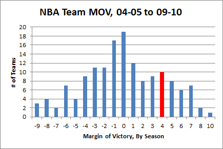
Professional basketball is a relatively low-variance sport, but winners are still determined by very small margins.  Last year’s championship Lakers team had an average margin of victory of just 4.7 points.  For the past 5 years, roughly three quarters of teams have had lower MOV’s than Dennis Rodman’s differential in his 5 qualifying seasons:
image

Now, I don’t want to suggest too much with this, but I would be derelict if I didn’t mention the many Hall of Fame-caliber players who qualified for this list below Rodman (my apologies if I missed anyone):

In HoF already:

  • Hakeem Olajuwon
  • Scottie Pippen<
  • Clyde Drexler
  • Dominique Wilkins

HoF locks:

  • Shaquille O’Nea
  • Dwyane Wade
  • Jason Kidd
  • Allen Iverson
  • Ray Allen

HoF possible:

  • Yao Ming
  • Pau Gasol
  • Marcus Camby
  • Carlos Boozer
  • Alonzo Mourning

Not in HoF but probably should be:

  • Toni Kukoc
  • Chris Mullin
  • Tim Hardaway
  • Dikembe Mutumbo

The master list also likely includes many players that are NOT stars but who quietly contributed a lot more to their teams than people realize.  Add the fact that Rodman managed to post these differentials while playing mostly for extremely good, contending, teams (where it is harder to have a measurable impact), and was never ostensibly the lynchpin of his team’s strategy—as many players on this list certainly were—and it is really quite an amazing outcome.

Now, I do not mean to suggest that Rodman is actually the most valuable player to lace up sneakers in the past 25 years, or even that he was the most valuable player on this list: 1) It doesn’t prove that, and 2) I don’t think that.  Other more direct analysis that I’ve done typically places him “only” in the top 5% or so of starting players.  There is a lot of variance in differential statistics, and there are a lot of different stories and circumstances involved for each player. But, at the very least, this should be a wake-up call for those who ignore Rodman for his lack of scoring, and for those who dismiss him as “merely” a role-player.

Where Does His Margin Come From?

As I have discussed previously, one of the main defenses of conventional statistics—particularly vis a vis their failures w/r/t Dennis Rodman—is that they don’t account for defense or “intangibles.”  As stated in the Wikipedia entry for PER:

Neither PER nor per-game statistics take into account such intangible elements as competitive drive, leadership, durability, conditioning, hustle, or WIM (wanting it more), largely because there is no real way to quantitatively measure these things.

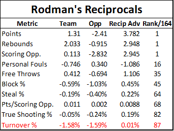
This is true, for the most part—but not so much for Rodman.  He does very well with indirect statistics, which actually DO account for all of these things as part of the gestalt that goes into MOV or Win% differentials.  But these stats also give us a very detailed picture of where those differences likely come from.  Here is a table summarizing a number of Rodman’s differential statistics, both for his teams and their opponents.  The “reciprocal advantage” is the difference between his team’s differential and their opponent’s differential for the same statistic:

image

Note: Some of the reciprocals were calculated in this table, and others are taken from the dataset (like margin of victory).  In the latter case, they may not necessarily match up perfectly, but this is for a number of technical and mathematical reasons that have no significant bearing on the final outcomes.

Rodman’s Margin of Victory differential comes in part from his teams scoring more points on offense and in part from their allowing fewer points on defense.  Superficially, this may look like the majority of Rodman’s impact is coming on the defensive side (-2.4 vs. + 1.3), but that’s deceptive.  As you can find in the master table, Rodman also has a significant negative effect on “Pace”—or number of possessions per game—which basically applies equally to both teams.  This is almost certainly due to his large number of possession-extending offensive rebounds, especially as he was known (and sometimes criticized) for “kicking it out” and resetting the offense rather than trying to shoot it himself or draw a foul.  “Scoring opportunities” are total possessions plus offensive rebounds.  As you might expect intuitively, his teams generally had about the same number of these with or without him, because the possessions weren’t actually lost, they were only restarted.

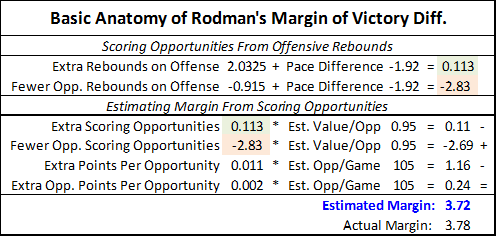
As we can see from the reciprocal table, Rodman had a slightly positive effect on his teams scoring efficiency (points per opportunity), but also had a small positive (though nearly negligible) effect on his opponents’.  Thus, combining the effect his rebounding had on number of scoring opportunities with any other effects he had on each side’s scoring efficiency, we can get a fairly accurate anatomy of his overall margin.  In case that confused you, here it is broken down step-by-step:

image

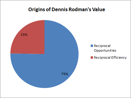
So, roughly speaking, his 3.7ish margin of victory breaks down to roughly 2.8 points from effect on offensive and defensive scoring opportunities and .9 points from the actual value of those opportunities—or, visually:

image

Furthermore, at least part of that extra offensive efficiency likely stems from the fact that a larger proportion of those scoring opportunities began as offensive rebounds, and post-offensive-rebound “possessions” are typically worth slightly more than normal (though this may actually be less true with Rodman due to the “kicking”).  Otherwise, the exact source of the efficiency differences is much more uncertain, especially as the smaller margins in the other statistics are that much more unreliable because of the sample-size issues inherent in this method.

The next-strongest reciprocal effects on the list above appear to be personal fouls and their corresponding free throws: with him in the lineup, his teams had fewer fouls and more free throws, and his opponents the opposite.  This is particularly peculiar because Rodman himself got a lot of fouls and was a terrible free throw shooter (note: this is yet another reason why including personal fouls in your player valuation method—yes, I’m looking at you, PER—is ridiculous).

Whether Rodman was a “role player” or not is irrelevant: whatever his role, he did it well enough to contribute more to his teams than the vast majority of NBA players (role players or not) contributed to theirs. For some reason, this simple concept seems to be better understood in other sports: No-one would say that Mariano Rivera hasn’t contributed much to the Yankees winning because he is “merely” a closer (though I do think he could contribute more if he pitched more innings), just as no-one would say that Darrelle Revis hasn’t contributed much to the Jets because he is “merely” a cornerback.

So does this mean I am conceding that Rodman was just a very good, but one-dimensional, player?  Not that there would be anything wrong with that, but definitely not.  That is how I would describe it if he had hurt his team in other areas, but then made up for it—and then some—through excellent rebounding. This is actually probably how most people would predict that Rodman’s differentials would break down (including, initially, myself), but they don’t.  E.g., the fact that his presence on the court didn’t hurt his team’s offensive efficiency, despite hardly ever scoring himself, is solid evidence that he was actually an excellent offensive player.  Even if you take the direct effects of his rebounds out of the equation entirely, he still seems to have made three different championship contenders—including one of the greatest teams of all time—better.  While the majority of his value added—that which enabled him to significantly improve already great teams—came from his ability to grab rebounds that no one else would have gotten, the full realization of that value was made possible by his not hurting those teams significantly in any other way.

As it wasn’t mystical intangibles or conveniently immeasurable defensive ability that made Rodman so valuable, I think it is time we rescind the free pass given to the various player valuation metrics that have relied on that excuse for getting this one so wrong for so long.  However, this does not prove that even a perfectly-designed metric would necessarily be able to identify this added value directly.  Though I think valuation metrics can be greatly improved (and I’m trying to do so myself), I can’t say for certain that my methods or any others will definitely be able to identify which rebounds actually helped a team get more rebounds and which points actually helped a team score more points.  Indeed, a bench player who scores 8 points per game could be incredibly valuable if they were the right 8 points, even if there were no other direct indications (incidentally, this possibility has been supported by separate research I’ve been doing on play-by-play statistics from the last few seasons, in which I’ve found that a number of bench players have contributed much more to their teams than most people would have guessed possible).  But rather than throwing our hands in the air and defending inadequate pre-existing approaches, we should be trying to figure out how and whether these sorts of problems can be addressed.

Defensive Stalwart or Offensive Juggernaut?

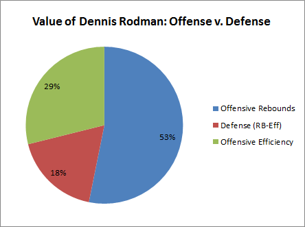
As an amusing but relevant aside, you may have already noticed that the data—at least superficially—doesn’t even seem to support the conventional wisdom that, aside from his rebounding, Rodman was primarily a defensive player.  Most obviously, his own team’s points per scoring opportunity improved, but his opponents’ improved slightly as well.  If his impact were primarily felt on the defensive side, we would probably expect the opposite.  Breaking down the main components above into their offensive and defensive parts, our value-source pie-chart would look like this.

image

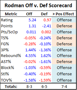
The red is actually slightly smaller than his contribution from defensive rebounds alone, as technically defensive efficiency was slightly lower with Rodman in the games.  For fun, I’ve broken this down a bit further into an Offense vs. Defense “Tale of the Tape,” including a few more statistics not seen above:

image

Note: Differentials that help their respective side are highlighted in blue, and those that hurt their respective side are highlighted in Red.  The values for steals and blocks are each transposed from their team and opponent versions above, as these are defensive statistics to begin with.

Based on this completely ridiculous and ad-hoc analysis, it would seem that Rodman was more of an offensive player than a defensive one.

Including rebounding, I suspect it is true that Rodman’s overall contribution was greater on offense than defense.  However, I wouldn’t read too much into the breakdowns for each side.  Rodman’s opponents scoring slightly more per opportunity with him in the game does NOT prove that he was a below-average defender.  Basketball is an extremely dynamic game, and the effects of success in one area may easily be realized in others.  For example, a strong defensive presence may free up other players to focus on their team’s offense, in which case the statistical consequences could be seen on the opposite side of the floor from where the benefit actually originated.

There are potential hints of this kind of possibility in this data, such as:  Why on earth would Rodman’s teams shoot better from behind the arc, considering that he was only a .231 career 3-point shooter himself?  This could obviously just be noise, but it’s also possible that some underlying story exists in which more quality long-range shots opened up as a result of Rodman’s successes in other assignments.  Ultimately, I don’t think we can draw any conclusions on the issue, but the fact that this is even a debatable question has interesting implications, both for Dennis Rodman and for basketball analytics broadly.

Conclusions

While I am the first to admit that the dataset this analysis is based on might not be sufficiently robust to settle the entire “Case” on its own, I still believe these results are powerful evidence of the truth of my previous inferences—and for very specific reasons:

Assessing the probability of propositions that have a pre-conceived likelihood of being true in light of new evidence can be tricky business.  In this case, the story goes like this: I developed a number of highly plausible conclusions about Rodman’s value based on a number of reasonable observations and empirical inquiries, such as: 1) the fact that his rebounding prowess was not just great, but truly extreme, 2) the fact that his teams always seemed to do extremely well on both ends of the floor, and 3) my analysis (conducted for reasons greater than just this series) suggesting that A) scoring is broadly overrated, B) rebounding is broadly underrated, and C) that rebounding has increasing marginal returns (or is exponentially predictive).  Then, to further examine these propositions, I employed a completely independent method—having virtually no overlap with the various factors involved in those previous determinations—and it not only appears to confirm my prior beliefs, but does so even more than I imagined it would.

Now, technically, it is possible that Rodman just got extremely lucky in the differential data—in fact, for this sample size, getting that lucky isn’t even a particularly unlikely event, and many of his oddball compatriots near the top of the master list probably did just that.  But this situation lends itself perfectly to Bayes’ Theorem-style analysis.  That is, which is the better, more likely explanation for this convergence of results: 1) that my carefully reasoned analysis has been completely off-base, AND that Rodman got extremely lucky in this completely independent metric, or 2) that Dennis Rodman actually was an extremely valuable player?
Google Search of the Day: Player Efficiency Rating is Useless

From the “almost too good to be true” department:

useless

Hat tip to whoever the guy was that used that search to find my blog yesterday.  See for yourself here.

Note the irony that I’m actually saying the opposite in the quoted snippet.

UPDATE:  As of right now, Skeptical Sports Analysis is the #1 result for these searches as well (no quotation marks, and all have actually been used to find the site):

Graph of the Day: NBA Player Stats v. Team Differentials (Follow-Up)

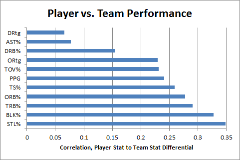
In this post from my Rodman series, I speculated that “individual TRB% probably has a more causative effect on team TRB% than individual PPG does on team PPG.”  Now, using player/team differential statistics (first deployed in my last Rodman post), I think I can finally test this hypothesis:

image

Note: As before, this dataset includes all regular season NBA games from 1986-2010.  For each player who both played and missed at least 20 games in the same season (and averaged at least 20 minutes per game played), differentials are calculated for each team stat with the player in and out of the lineup, weighted by the smaller of games played or games missed that season.  The filtered data includes 1341 seasons and a total of 39,162 weighted games.

This graph compares individual player statistics to his in/out differential for each corresponding team statistic.  For example, a player’s points per game is correlated to his team’s points per game with him in the lineup minus their points per game with him out of the lineup.  Unlike direct correlations to team statistics, this technique tells us how much a player’s performance for a given metric actually causes his team to be better at the thing that metric measures.

Lower values on this scale can potentially indicate a number of things, particularly two of my favorites: duplicability (stat reflects player “contributions” that could have happened anyway—likely what’s going on with Defensive Rebounding %), and/or entanglement (stat is caused by team performance more than it contributes to team performance—likely what’s going on with Assist %).

In any case, the data definitely appears to support my hypothesis: Player TRB% does seem to have a stronger causative effect on team TRB% than player PPG does on team PPG.

The Case for Dennis Rodman, Part 2/4 (a)(ii)—Player Valuation and Unconventional Wisdom

In my last post in this series, I outlined and criticized the dominance of gross points (specifically, points per game) in the conventional wisdom about player value. Of course, serious observers have recognized this issue for ages, responding in a number of ways—the most widespread still being ad hoc (case by case) analysis. Not satisfied with this approach, many basketball statisticians have developed advanced “All in One” player valuation metrics that can be applied broadly.

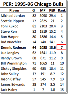
In general, Dennis Rodman has not benefitted much from the wave of advanced “One Size Fits All” basketball statistics. Perhaps the most notorious example of this type of metric—easily the most widely disseminated advanced player valuation stat out there—is John Hollinger’s Player Efficiency Rating:

image_thumb13_thumb

In addition to ranking Rodman as the 7th best player on the 1995-96 Bulls championship team, PER is weighted to make the league average exactly 15—meaning that, according to this stat, Rodman (career PER: 14.6) was actually a below average player. While Rodman does significantly better in a few predictive stats (such as David Berri’s Wages of Wins) that value offensive rebounding very highly, I think that, generally, those who subscribe to the Unconventional Wisdom typically accept one or both of the following: 1) that despite Rodman’s incredible rebounding prowess, he was still just a very good a role-player, and likely provided less utility than those who were more well-rounded, or 2) that, even if Rodman was valuable, a large part of his contribution must have come from qualities that are not typically measurable with available data, such as defensive ability.

My next two posts in this series will put the lie to both of those propositions. In section (b) of Part 2, I will demonstrate Rodman’s overall per-game contributions—not only their extent and where he fits in the NBA’s historical hierarchy, but exactly where they come from. Specifically, contrary to both conventional and unconventional wisdom, I will show that his value doesn’t stem from quasi-mystical unmeasurables, but from exactly where we would expect: extra possessions stemming from extra rebounds. In part 3, I will demonstrate (and put into perspective) the empirical value of those contributions to the bottom line: winning. These two posts are at the heart of The Case for Dennis Rodman, qua “case for Dennis Rodman.”

But first, in line with my broader agenda, I would like to examine where and why so many advanced statistics get this case wrong, particularly Hollinger’s Player Efficiency Rating. I will show how, rather than being a simple outlier, the Rodman data point is emblematic of major errors that are common in conventional unconventional sports analysis – both as a product of designs that disguise rather than replace the problems they were meant to address, and as a product of uncritically defending and promoting an approach that desperately needs reworking.

Player Efficiency Ratings

John Hollinger deserves much respect for bringing advanced basketball analysis to the masses. His Player Efficiency Ratings are available on ESPN.com under Hollinger Player Statistics, where he uses them as the basis for his Value Added (VA) and Expected Wins Added (EWA) stats, and regularly features them in his writing (such as in this article projecting the Miami Heat’s 2010-11 record), as do other ESPN analysts. Basketball Reference includes PER in their “Advanced” statistical tables (present on every player and team page), and also use it to compute player Value Above Average and Value Above Replacement (definitions here).

The formula for PER is extremely complicated, but its core idea is simple: combine everything in a player’s stat-line by rewarding everything good (points, rebounds, assists, blocks, and steals), and punishing everything bad (missed shots, turnovers). The value of particular items are weighted by various league averages—as well as by Hollinger’s intuitions—then the overall result is calculated on a per-minute basis, adjusted for league and team pace, and normalized on a scale averaging 15.

Undoubtedly, PER is deeply flawed. But sometimes apparent “flaws” aren’t really “flaws,” but merely design limitations. For example: PER doesn’t account for defense or “intangibles,” it is calculated without resort to play-by-play data that didn’t exist prior to the last few seasons, and it compares players equally, regardless of position or role. For the most part, I will refrain from criticizing these constraints, instead focusing on a few important ways that it fails or even undermines its own objectives.

Predictivity (and: Introducing Win Differential Analysis)

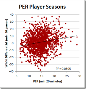
Though Hollinger uses PER in his “wins added” analysis, its complete lack of any empirical component suggests that it should not be taken seriously as a predictive measure. And indeed, empirical investigation reveals that it is simply not very good at predicting a player’s actual impact:

image4_thumb3

This bubble-graph is a product of a broader study I’ve been working on that correlates various player statistics to the difference in their team’s per-game performance with them in and out of the line-up.  The study’s dataset includes all NBA games back to 1986, and this particular graph is based on the 1300ish seasons in which a player who averaged 20+ minutes per game both missed and played at least 20 games.  Win% differential is the difference in the player’s team’s winning percentage with and without him (for the correlation, each data-point is weighted by the smaller of games missed or played.  I will have much more to write about nitty-gritty of this technique in separate posts).

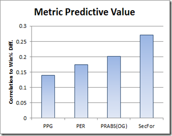
So PER appears to do poorly, but how does it compare to other valuation metrics?
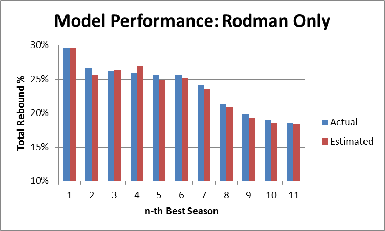
image_thumb1

SecFor (or “Secret Formula”) is the current iteration of an empirically-based “All in One” metric that I’m developing—but there is no shame in a speculative purely a priori metric losing (even badly) as a predictor to the empirical cutting-edge.

However, as I admitted in the introduction to this series, my statistical interest in Dennis Rodman goes way back. One of the first spreadsheets I ever created was in the early 1990’s, when Rodman still played for San Antonio. I knew Rodman was a sick rebounder, but rarely scored—so naturally I thought: “If only there were a formula that combined all of a player’s statistics into one number that would reflect his total contribution.” So I came up with this crude, speculative, purely a priori equation:

Points + Rebounds + 2*Assists + 1.5*Blocks + 2*Steals – 2*Turnovers.

Unfortunately, this metric (which I called “PRABS”) failed to shed much light on the Rodman problem, so I shelved it.  PER shares the same intention and core technique, albeit with many additional layers of complexity.  For all of this refinement, however, Hollinger has somehow managed to make a bad metric even worse, getting beaten by my OG PRABS by nearly as much as he is able to beat points per game—the Flat Earth of basketball valuation metrics.  So how did this happen?

Minutes

The trend in much of basketball analysis is to rate players by their per-minute or per-possession contributions.  This approach does produce interesting and useful information, and they may be especially useful to a coach who is deciding who to give more minutes to, or to a GM who is trying to evaluate which bench player to sign in free agency.

But a player’s contribution to winning is necessarily going to be a function of how much extra “win” he is able to get you per minute and the number of minutes you are able to get from him.  Let’s turn again to win differential:

image19_thumb

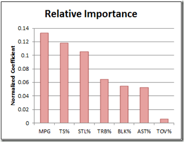
For this graph, I set up a regression using each of the major rate stats, plus minutes played (TS%=true shooting percentage, or one half of average points per shot, including free throws and 3 pointers).  If you don’t know what a “normalized coefficient” is, just think of it as a stat for comparing the relative importance of regression elements that come in different shapes and sizes. The sample is the same as above: it only includes players who average 20+ minutes per game.

Unsurprisingly, “minutes per game” is more predictive than any individual rate statistic, including true shooting.  Simply multiplying PER by minutes played significantly improves its predictive power, managing to pull it into a dead-heat with PRABS (which obviously wasn’t minute-adjusted to begin with).

I’m hesitant to be too critical of the “per minute” design decision, since it is clearly an intentional element that allows PER to be used for bench or rotational player valuation, but ultimately I think this comes down to telos: So long as PER pretends to be an arbiter of player value—which Hollinger himself relies on for making actual predictions about team performance—then minutes are simply too important to ignore. If you want a way to evaluate part-time players and how they might contribute IF they could take on larger roles, then it is easy enough to create a second metric tailored to that end.

Here’s a similar example from baseball that confounds me: Rate stats are fine for evaluating position players, because nearly all of them are able to get you an entire game if you want—but when it comes to pitching, how often someone can play and the number of innings they can give you is of paramount importance. E.g., at least for starting pitchers, it seems to me that ERA is backwards: rather than calculate runs allowed per inning, why don’t they focus on runs denied per game? Using a benchmark of 4.5, it would be extremely easy to calculate: Innings Pitched/2 – Earned Runs. So, if a pitcher gets you 7 innings and allows 2 runs, their “Earned Runs Denied” (ERD) for the game would be 1.5. I have no pretensions of being a sabermetrician, and I’m sure this kind of stat (and much better) is common in that community, but I see no reason why this kind of statistic isn’t mainstream.

More broadly, I think this minutes SNAFU is reflective of an otherwise reasonable trend in the sports analytical community—to evaluate everything in terms of rates and quality instead of quantity—that is often taken too far. In reality, both may be useful, and the optimal balance in a particular situation is an empirical question that deserves investigation in its own right.

PER Rewards Shooting (and Punishes Not Shooting)

As described by David Berri, PER is well-known to reward inefficient shooting:

“Hollinger argues that each two point field goal made is worth about 1.65 points. A three point field goal made is worth 2.65 points. A missed field goal, though, costs a team 0.72 points. Given these values, with a bit of math we can show that a player will break even on his two point field goal attempts if he hits on 30.4% of these shots. On three pointers the break-even point is 21.4%. If a player exceeds these thresholds, and virtually every NBA player does so with respect to two-point shots, the more he shoots the higher his value in PERs. So a player can be an inefficient scorer and simply inflate his value by taking a large number of shots.”

The consequences of this should be properly understood: Since this feature of PER applies to every shot taken, it is not only the inefficient players who inflate their stats.  PER gives a boost to everyone for every shot: Bad players who take bad shots can look merely mediocre, mediocre players who take mediocre shots can look like good players, and good players who take good shots can look like stars. For Dennis Rodman’s case—as someone who took very few shots, good or bad— the necessary converse of this is even more significant: since PER is a comparative statistic (even directly adjusted by league averages), players who don’t take a lot of shots are punished.
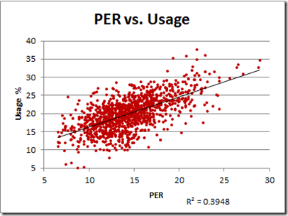
Structurally, PER favors shooting—but to what extent? To get a sense of it, let’s plot PER against usage rate:

image_thumb10

Note: Data includes all player seasons since 1986. Usage % is the percentage of team possessions that end with a shot, free throw attempt, or turnover by the player in question. For most practical purposes, it measures how frequently the player shoots the ball.

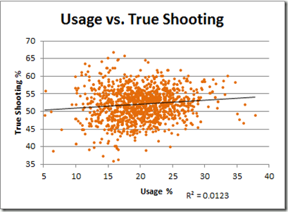
That R-squared value corresponds to a correlation of .628, which might seem high for a component that should be in the denominator. Of course, correlations are tricky, and there are a number of reasons why this relationship could be so strong. For example, the most efficient shooters might take the most shots. Let’s see:

image_thumb13

Actually, that trend-line doesn’t quite do it justice: that R-squared value corresponds to a correlation of .11 (even weaker than I would have guessed).

I should note one caveat: The mostly flat relationship between usage and shooting may be skewed, in part, by the fact that better shooters are often required to take worse shots, not just more shots—particularly if they are the shooter of last resort. A player that manages to make a mediocre shot out of a bad situation can increase his team’s chances of winning, just as a player that takes a marginally good shot when a slam dunk is available may be hurting his team’s chances.  Presently, no well-known shooting metrics account for this (though I am working on it), but to be perfectly clear for the purposes of this post: neither does PER. The strong correlation between usage rate and PER is unrelated.  There is nothing in its structure to suggest this is an intended factor, and there is nothing in its (poor) empirical performance that would suggest it is even unintentionally addressed. In other words, it doesn’t account for complex shooting dynamics either in theory or in practice.

Duplicability and Linearity

PER strongly rewards broad mediocrity, and thus punishes lack of the same. In reality, not every point that a player scores means their team will score one more point, just as not every rebound grabbed means that their team will get one more possession.  Conversely—and especially pertinent to Dennis Rodman—not every point that a player doesn’t score actually costs his team a point.  What a player gets credit for in his stat line doesn’t necessarily correspond with his actual contribution, because there is always a chance that the good things he played a part in would have happened anyway. This leads to a whole set of issues that I typically file under the term “duplicability.”

A related (but sometimes confused) effect that has been studied extensively by very good basketball analysts is the problem of “diminishing returns” – which can be easily illustrated like this:  if you put a team together with 5 players that normally score 25 points each, it doesn’t mean that your team will suddenly start scoring 125 points a game.  Conversely—and again pertinent to Rodman—say your team has 5 players that normally score 20 points each, and you replace one of them with somebody that normally only scores 10, that does not mean that your team will suddenly start scoring only 90. Only one player can take a shot at a time, and what matters is whether the player’s lack of scoring hurts his team’s offense or not.  The extent of this effect can be measured individually for different basketball statistics, and, indeed, studies have showed wide disparities.

As I will discuss at length in Part 2(c), despite hardly ever scoring, differential stats show that Rodman didn’t hurt his teams offenses at all: even after accounting for extra possessions that Rodman’s teams gained from offensive rebounds, his effect on offensive efficiency was statistically insignificant.  In this case (as with Randy Moss), we are fortunate that Rodman had such a tumultuous career: as a result, he missed a significant number of games in a season several times with several different teams—this makes for good indirect data.  But, for this post’s purposes, the burning question is: Is there any direct way to tell how likely a player’s statistical contributions were to have actually converted into team results?

This is an extremely difficult and intricate problem (though I am working on it), but it is easy enough to prove at least one way that a metric like PER gets it wrong: it treats all of the different components of player contribution linearly.  In other words, one more point is worth one more point, whether it is the 15th point that a player scores or the 25th, and one more rebound is worth one more rebound, whether it is the 8th or the 18th. While this equivalency makes designing an all-in one equation much easier (at least for now, my Secret Formula metric is also linear), it is ultimately just another empirically testable assumption.

I have theorized that one reason Rodman’s PER stats are so low compared to his differential stats is that PER punishes his lack of mediocre scoring, while failing to reward the extremeness of his rebounding.  This is based on the hypothesis that certain extreme statistics would be less “duplicable” than mediocre ones.  As a result, the difference between a player getting 18 rebounds per game vs. getting 16 per game could be much greater than the difference between them getting 8 vs. getting 6.  Or, in other words, the marginal value of rebounds would (hypothetically) be increasing.

Using win percentage differentials, this is a testable theory. Just as we can correlate an individual player’s statistics to the win differentials of his team, we can also correlate hypothetical statistics the same way.  So say we want to test a metric like rebounds, except one that has increasing marginal value built in: a simple way to approximate that effect is to make our metric increase exponentially, such as using rebounds squared. If we need even more increasing marginal value, we can try rebounds cubed, etc.  And if our metric has several different components (like PER), we can do the same for the individual parts:  the beauty is that, at the end of the day, we can test—empirically—which metrics work and which don’t.

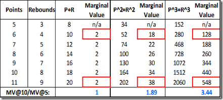
For those who don’t immediately grasp the math involved, I’ll go into a little detail: A linear relationship is really just an exponential relationship with an exponent of 1.  So let’s consider a toy metric, “PR,” which is calculated as follows: Points + Rebounds.  This is a linear equation (exponent = 1) that could be rewritten as follows: (Points)^1 + (Rebounds)^1.  However, if, as above, we thought that both points and rebounds should have increasing marginal values, we might want to try a metric (call it “PRsq”) that combined points and rebounds squared, as follows:  (Points)^2 + (Rebounds)^2.  And so on.  Here’s an example table demonstrating the increase in marginal value:

image1_thumb1

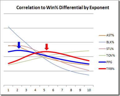
The fact that each different metric leads to vastly different magnitudes of value is irrelevant: for predictive purposes, the total value for each component will be normalized — the relative value is what matters (just as “number of pennies” and “number of quarters” are equally predictive of how much money you have in your pocket).  So applying this concept to an even wider range of exponents for several relevant individual player statistics, we can empirically examine just how “exponential” each statistic really is:

image8_thumb

For this graph, I looked at each of the major rate metrics (plus points per game) individually.  So, for each player-season in my (1986-) sample, I calculated the number of points, points squared, points^3rd. . . points^10th power, and then correlated all of these to that player’s win percentage differential.  From those calculations, we can find roughly how much the marginal value for each metric increases, based on what exponent produces the best correlation:  The smaller the number at the peak of the curve, the more linear the metric is—the higher the number, the more exponential (i.e., extreme values are that much more important).  When I ran this computation, the relative shape of each curve fit my intuitions, but the magnitudes surprised me:  That is, many of the metrics turned out to be even more exponential than I would have guessed.

As I know this may be confusing to many of my readers, I need to be absolutely clear:  the shape of each curve has nothing to do with the actual importance of each metric.  It only tells us how much that particular metric is sensitive to very large values.  E.g., the fact that Blocks and Assists peak on the left and sharply decline doesn’t make them more or less important than any of the others, it simply means that having 1 block in your scoreline instead of 0 is relatively just as valuable as having 5 blocks instead of 4.  On the other extreme, turnovers peak somewhere off the chart, suggesting that turnover rates matter most when they are extremely high.

For now, I’m not trying to draw a conclusive picture about exactly what exponents would make for an ideal all-in-one equation (polynomial regressions are very very tricky, though I may wade into those difficulties more in future blog posts).  But as a minimum outcome, I think the data strongly supports my hypothesis: that many stats—especially rebounds—are exponential predictors.  Thus, I mean this less as a criticism of PER than as an explanation of why it undervalues players like Dennis Rodman.

Gross, and Points

In subsection (i), I concluded that “gross points” as a metric for player valuation had two main flaws: gross, and points. Superficially, PER responds to both of these flaws directly: it attempts to correct the “gross” problem both by punishing bad shots, and by adjusting for pace and minutes. It attacks the “points” problem by adding rebounds, assists, blocks, steals, and turnovers. The problem is, these “solutions” don’t match up particularly well with the problems “gross” and “points” present.
The problem with the “grossness” of points certainly wasn’t minutes (note: for historical comparisons, pace adjustments are probably necessary, but the jury is still out on the wisdom of doing the same on a team-by-team basis within a season). The main problem with “gross” was shooting efficiency: If someone takes a bunch of shots, they will eventually score a lot of points.  But scoring points is just another thing that players do that may or may not help their teams win. PER attempted to account for this by punishing missed shots, but didn’t go far enough. The original problem with “gross” persists: As discussed above, taking shots helps your rating, whether they are good shots or not.

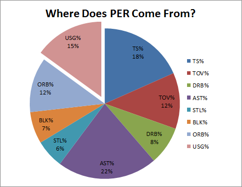
As for “points”: in addition to any problems created by having arbitrary (non-empirical) and linear coefficients, the strong bias towards shooting causes PER to undermine its key innovation—the incorporation of non-point components. This “bias” can be represented visually:

image

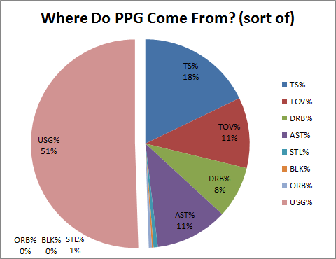
Note: This data comes from a regression to PER including each of the rate stats corresponding to the various components of PER.

This pie chart is based on a linear regression including rate stats for each of PER’s components. Strictly, what it tells us is the relative value of each factor to predicting PER if each of the other factors were known. Thus, the “usage” section of this pie represents the advantage gained by taking more shots—even if all your other rate stats were fixed.  Or, in other words, pure bias (note that the number of shots a player takes is almost as predictive as his shooting ability).

For fun, let’s compare that pie to the exact same regression run on Points Per Game rather than PER:

image

Note: These would not be the best variables to select if you were actually trying to predict a player’s Points Per Game.  Note also that “Usage” in these charts is NOT like “Other”—while other variables may affect PPG, and/or may affect the items in this regression, they are not represented in these charts.

Interestingly, Points Per Game was already somewhat predictable by shooting ability, turnovers, defensive rebounding, and assists. While I hesitate to draw conclusions from the aesthetic comparison, we can guess why perhaps PER doesn’t beat PPG as significantly as we might expect: it appears to share much of the same DNA. (My more wild and ambitious thoughts suspect that these similarities reflect the strength of our broader pro-points bias: even when designing an All-in-One statistic, even Hollinger’s linear, non-empirical, a priori coefficients still mostly reflect the conventional wisdom about the importance of many of the factors, as reflected in the way that they relate directly to points per game).

I could make a similar pie-chart for Win% differential, but I think it might give the wrong impression: these aren’t even close to the best set of variables to use for that purpose.  Suffice it to say that it would look very, very different (for an imperfect picture of how much so, you can compare to the values in the Relative Importance chart above).

Conclusions

The deeper irony with PER is not just that it could theoretically be better, but that it adds many levels of complexity to the problem it purports to address, ultimately failing in strikingly similar ways.  It has been dressed up around the edges with various adjustments for team and league pace, incorporation of league averages to weight rebounds and value of possession, etc. This is, to coin a phrase, like putting lipstick on a pig. The energy that Hollinger has spent on dressing up his model could have been better spent rethinking the core of it.

In my estimation, this pattern persists among many extremely smart people who generate innovative models and ideas: once created, they spend most of their time—entire careers even—in order: 1) defending it, 2) applying it to new situations, and 3) tweaking it.  This happens in just about every field: hard and soft sciences, economics, history, philosophy, even literature. Give me an academic who creates an interesting and meaningful model, and then immediately devotes their best efforts to tearing it apart! In all my education, I have had perhaps two professors who embraced this approach, and I would rank both among my very favorites.

This post and the last were admittedly relatively light on Rodman-specific analysis, but that will change with a vengeance in the next two.  Stay tuned.


Update (5/13/11): Commenter “Yariv” correctly points out that an “exponential” curve is technically one in the form y^x (such as 2^x, 3^x, etc), where the increasing marginal value I’m referring to in the “Linearity” section above is about terms in the form x^y (e.g., x^2, x^3, etc), or monomial terms with an exponent not equal to 1.  I apologize for any confusion, and I’ll rewrite the section when I have time.

Graph of the Day: Tim Duncan’s Erstwhile(?) Consistency

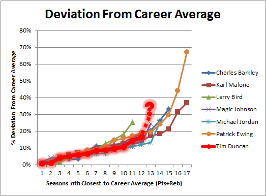
While San Antonio is having a great season, Tim Duncan is on the verge of posting career lows in scoring and rebounding (by wide margins).  He’s getting a bit older and playing fewer minutes, for sure, but before this year he was one of the most consistent players in NBA history:

image

Note: Data excludes any seasons where player started fewer than 42 games.

If that graph is kind of confusing, ignore the axes:  more flat means more consistent.  Spikes don’t necessarily represent decline, as a bad/great year can come at any time.  Question mark is where Duncan projects for 2010-11.

C.R.E.A.M. (Or, “How to Win a Championship in Any Sport”)

Does cash rule everything in professional sports?  Obviously it keeps the lights on, and it keeps the best athletes in fine bling, but what effect does the root of all evil have on the competitive bottom line—i.e., winning championships?

For this article, let’s consider “economically predictable” a synonym for “Cash Rules”:  I will use extremely basic economic reasoning and just two variables—presence of a salary cap and presence of a salary max in a sport’s labor agreement—to establish, ex ante, which fiscal strategies we should expect to be the most successful.  For each of the 3 major sports, I will then suggest (somewhat) testable hypotheses, and attempt to examine them.  If the hypotheses are confirmed, then Method Man is probably right—dollar dollar bill, etc.

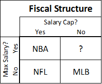
Conveniently, on a basic yes/no grid of these two variables, our 3 major sports in the U.S. fall into 3 different categories:

image

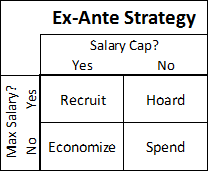
So before treating those as anything but arbitrary arrangements of 3 letters, we should consider the dynamics each of these rules creates independently.  If your sport has a team salary cap, getting “bang for your buck” and ferreting out bargains is probably more important to winning than overall spending power.  And if your sport has a low maximum individual salary, your ability to obtain the best possible players—in a market where everyone knows their value but must offer the same amount—will also be crucial.  Considering permutations of thriftiness and non-economic acquisition ability, we end up with a simple ex ante strategy matrix that looks like this:

image

These one-word commandments may seem overly simple—and I will try to resolve any ambiguity looking at the individual sports below—but they are only meant to describe the most basic and obvious economic incentives that salary caps and salary maximums should be expected to create in competitive environments.

Major League Baseball: Spend

Hypothesis:  With free-agency, salary arbitration, and virtually no payroll restrictions, there is no strategic downside to spending extra money.  Combined with huge economic disparities between organizations, this means that teams that spend the most will win the most.

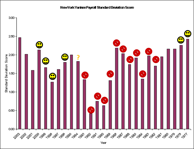
Analysis:  Let’s start with the New York Yankees (shocker!), who have been dominating baseball since 1920, when they got Babe Ruth from the Red Sox for straight cash, homey.  Note that I take no position on whether the Yankees filthy lucre is destroying the sport of Baseball, etc.  Also, I know very little about the Yankees payroll history, prior to 1988 (the earliest the USA Today database goes).  But I did come across this article from several years ago, which looks back as far as 1977.  For a few reasons, I think the author understates the case.  First, the Yankees low-salary period came at the tail end of a 12 year playoff drought (I don’t have the older data to manipulate, but I took the liberty to doodle on his original graph):

image

Note: Smiley-faces are Championship seasons.  The question mark is for the 1994 season, which had no playoffs.

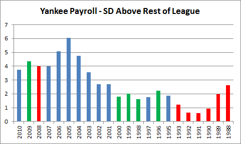
Also, as a quirk that I’ve discussed previously, I think including the Yankees in the sample from which the standard deviation is drawn can be misleading: they have frequently been such a massive outlier that they’ve set their own curve.  Comparing the Yankees to the rest of the league, from last season back to 1988, looks like this:

image

Note: Green are Championship seasons.  Red are missed playoffs.

In 2005 the rest-of-league average payroll was ~$68 million, and the Yankees’ was ~$208 million (the rest-of-league standard deviation was $23m, but including the Yankees, it would jump to $34m).

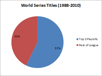
While they failed to win the World Series in some of their most expensive seasons, don’t let that distract you:  money can’t guarantee a championship, but it definitely improves your chances.  The Yankees have won roughly a quarter of the championships over the last 20 years (which is, astonishingly, below their average since the Ruth deal).  But it’s not just them.  Many teams have dramatically increased their payrolls in order to compete for a World Series title—and succeeded! Over the past 22 years, the top 3 payrolls (per season) have won a majority of titles:

image

As they make up only 10% of the league, this means that the most spendy teams improved their title chances, on average, by almost a factor of 6.

National Basketball Association: Recruit (Or: “Press Your Bet”)

Hypothesis:  A fairly strict salary cap reigns in spending, but equally strict salary regulations mean many teams will enjoy massive surplus value by paying super-elite players “only” the max.  Teams that acquire multiple such players will enjoy a major championship advantage.

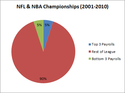
Analysis: First, in case you were thinking that the 57% in the graph above might be caused by something other than fiscal policy, let’s quickly observe how the salary cap kills the “spend” strategy: image

Payroll information from USA Today’s NBA and NFL Salary Databases (incidentally, this symmetry is being threatened, as the Lakers, Magic, and Mavericks have the top payrolls this season).

I will grant there is a certain apples-to-oranges comparison going on here: the NFL and NBA salary-cap rules are complex and allow for many distortions.  In the NFL teams can “clump” their payroll by using pro-rated signing bonuses (essentially sacrificing future opportunities to exceed the cap in the present), and in the NBA giant contracts are frequently moved to bad teams that want to rebuild, etc.  But still: 5%.  Below expectation if championships were handed out randomly.
And basketball championships are NOT handed out randomly.  My hypothesis predicts that championship success will be determined by who gets the most windfall value from their star player(s).  Fifteen of the last 20 NBA championships have been won by Kobe Bryant, Tim Duncan, or Michael Jordan.  Clearly star-power matters in the NBA, but what role does salary play in this?

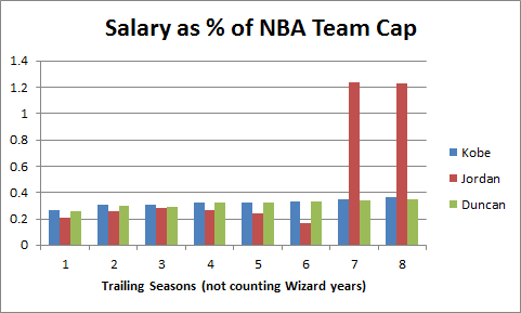
Prior to 1999, the NBA had no salary maximum, though salaries were regulated and limited in a variety of ways.  Teams had extreme advantages signing their own players (such as Bird rights), but lack of competition in the salary market mostly kept payrolls manageable.  Michael Jordan famously signed a lengthy $25 million contract extension basically just before star player salaries exploded, leaving the Bulls with the best player in the game for a song (note: Hakeem Olajuwon’s $55 million payday came after he won 2 championships as well).  By the time the Bulls were forced to pay Jordan his true value, they had already won 4 championships and built a team around him that included 2 other All-NBA caliber players (including one who also provided extreme surplus value).  Perhaps not coincidentally, year 6 in the graph below is their record-setting 72-10 season:
image

Note: Michael Jordan’s salary info found here.  Historical NBA salary cap found here.

The star player salary situation caught the NBA off-guard.  Here’s a story from Time magazine in 1996 that quotes league officials and executives:

“It’s a dramatic, strategic judgment by a few teams,” says N.B.A. deputy commissioner Russ Granik. .
Says one N.B.A. executive: “They’re going to end up with two players making about two-thirds of the salary cap, and another pair will make about 20%. So that means the rest of the players will be minimum-salary players that you just sign because no one else wants them.” . . .
Granik frets that the new salary structure will erode morale. “If it becomes something that was done across the league, I don’t think it would be good for the sport,” he says.

What these NBA insiders are explaining is basic economics:  Surprise!  Paying better players big money means less money for the other guys.  Among other factors, this led to 2 lockouts and the prototype that would eventually lead to the current CBA (for more information than you could ever want about the NBA salary cap, here is an amazing FAQ).

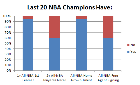
The fact that the best players in the NBA are now being underpaid relative to their value is certain.  As a back of the envelope calculation:  There are 5 players each year that are All-NBA 1st team, while 30+ players each season are paid roughly the maximum.  So how valuable are All-NBA 1st team players compared to the rest?  Let’s start with: How likely is an NBA team to win a championship without one?

image

In the past 20 seasons, only the 2003-2004 Detroit Pistons won the prize without a player who was a 1st-Team All-NBAer in their championship year.
To some extent, these findings are hard to apply strategically.  All but those same Pistons had at least one home-grown All-NBA (1st-3rd team) talent—to win, you basically need the good fortune to catch a superstar in the draft.  If there is an actionable take-home, however, it is that most (12/20) championship teams have also included a second All-NBA talent acquired through trade or free agency: the Rockets won after adding Clyde Drexler, the second Bulls 3-peat added Dennis Rodman (All-NBA 3rd team with both the Pistons and the Spurs), the Lakers and Heat won after adding Shaq, the Celtics won with Kevin Garnett, and the Lakers won again after adding Pau Gasol.

Each of these players was/is worth more than their market value, in most cases as a result of the league’s maximum salary constraints.  Also, in most of these cases, the value of the addition was well-known to the league, but the inability of teams to outbid each other meant that basketball money was not the determinant factor in the players choosing their respective teams.  My “Recruit” strategy anticipated this – though it perhaps understates the relative importance of your best player being the very best.  This is more a failure of the “recruit” label than of the ex ante economic intuition, the whole point of which was that cap+max –> massive importance of star players.

National Football League: Economize (Or: “WWBBD?”)

Hypothesis:  The NFL’s strict salary cap and lack of contract restrictions should nullify both spending and recruiting strategies.  With elite players paid closer to what they are worth, surplus value is harder to identify.  We should expect the most successful franchises to demonstrate both cunning and wise fiscal policy.

Analysis: Having a cap and no max salaries is the most economically efficient fiscal design of any of the 3 major sports.  Thus, we should expect that massively dominating strategies to be much harder to identify.  Indeed, the dominant strategies in the other sports are seemingly ineffective in the NFL: as demonstrated above, there seems to be little or no advantage to spending the most, and the abundant variance in year-to-year team success in the NFL would seem to rule out the kind of individual dominance seen in basketball.

Thus, to investigate whether cunning and fiscal sense are predominant factors, we should imagine what kinds of decisions a coach or GM would make if his primary qualities were cunning and fiscal sensibility.  In that spirit, I’ve come up with a short list of 5 strategies that I think are more or less sound, and that are based largely on classically “economic” considerations:

1.  Beg, borrow, or steal yourself a great quarterback:
Superstar quarterbacks are probably underpaid—even with their monster contracts—thus making them a good potential source for surplus value.  Compare this:

Note: WPA (wins added) stats from here.

With this:

The obvious caveat here is that the entanglement question is still empirically open:  How much do good QB’s make their teams win v. How much do winning teams make their QB’s look good?  But really quarterbacks only need to be responsible for a fraction of the wins reflected in their stats to be worth more than what they are being paid. (An interesting converse, however, is this: the fact that great QB’s don’t win championships with the same regularity as, say, great NBA players, suggests that a fairly large portion of the “value” reflected by their statistics is not their responsibility).

2. Plug your holes with the veteran free agents that nobody wants, not the ones that everybody wants:
If a popular free agent intends to go to the team that offers him the best salary, his market will act substantially like a “common value” auction.  Thus, beware the Winner’s Curse. In simple terms: If 1) a player’s value is unknown, 2) each team offers what they think the player is worth, and 3) each team is equally likely to be right; then: 1) The player’s expected value will correlate with the average bid, and 2) the “winning” bid probably overpaid.

Moreover, even if the winner’s bid is exactly right, that just means they will have successfully gained nothing from the transaction.  Assuming equivalent payrolls, the team with the most value (greatest chance of winning the championship) won’t be the one that pays the most correct amount for its players, it will—necessarily—be the one that pays the least per unit of value.  To accomplish this goal, you should avoid common value auctions as much as possible!  In free agency, look for the players with very small and inefficient markets (for which #3 above is least likely to be true), and then pay them as little as you can get away with.

3. Treat your beloved veterans with cold indifference.
If a player is beloved, they will expect to be paid.  If they are not especially valuable, they will expect to be paid anyway, and if they are valuable, they are unlikely to settle for less than they are worth.  If winning is more important to you than short-term fan approval, you should be both willing and prepared to let your most beloved players go the moment they are no longer a good bargain.

4. Stock up on mid-round draft picks.
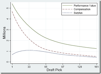
Given the high cost of signing 1st round draft picks, 2nd round draft picks may actually be more valuable.  Here is the crucial graph from the Massey-Thaler study of draft pick value (via Advanced NFL Stats):

image
The implications of this outcome are severe.  All else being equal, if someone offers you an early 2nd round draft pick for your early 1st round draft pick, they should be demanding compensation from you (of course, marginally valuable players have diminishing marginal value, because you can only have/play so many of them at a time).

5. When the price is right: Gamble.

This rule applies to fiscal decisions, just as it does to in-game ones.  NFL teams are notoriously risk-averse in a number of areas: they are afraid that someone after one down season is washed up, or that an outspoken player will ‘disrupt’ the locker room, or that a draft pick might have ‘character issues’.  These sorts of questions regularly lead to lengthy draft slides and dried-up free agent markets.  And teams are right to be concerned: these are valid possibilities that increase uncertainty.  Of course, there are other possibilities. Your free agent target simply may not be as good as you hope they are, or your draft pick may simply bust out.  Compare to late-game 4th-down decisions: Sometimes going for it on 4th down will cause you to lose immediately and face a maelstrom of criticism from fans and press, where punting or kicking may quietly lead to losing more often.  Similarly, when a team takes a high-profile personnel gamble and it fails, they may face a maelstrom of criticism from fans and press, where the less controversial choice might quietly lead to more failure.

The economizing strategy here is to favor risks when they are low cost but have high upsides.  In other words, don’t risk a huge chunk of your cap space on an uncertain free agent prospect, risk a tiny chunk of your cap space on an even more uncertain prospect that could work out like gangbusters.

Evaluation:

Now, if only there were a team and coach dedicated to these principles—or at least, for contrapositive’s sake, a team that seemed to embrace the opposite.

Oh wait, we have both!  In the last decade, Bill Belichick and the New England Patriots have practically embodied these principles, and in the process they’ve won 3 championships, have another 16-0/18-1 season, have set the overall NFL win-streak records, and are presently the #1 overall seed in this year’s playoffs. OTOH, the Redskins have practically embodied the opposite, and they have… um… not.
Note that the Patriots’ success has come despite a league fiscal system that allows teams to “load up” on individual seasons, distributing the cost onto future years (which, again, helps explain the extreme regression effect present in the NFL).  Considering the long odds of winning a Super Bowl—even with a solid contender—this seems like an unwise long-run strategy, and the most successful team of this era has cleverly taken the long view throughout.

Conclusions

The evidence in MLB and in the NBA is ironclad: Basic economic reasoning is extremely probative when predicting the underlying dynamics behind winning titles.  Over the last 20 years of pro baseball, the top 3 spenders in the league each year win 57% of the championships.  Over a similar period in basketball, the 5 (or fewer) teams with 1st-Team All-NBA players have won 95%.

In the NFL, the evidence is more nuance and anecdote than absolute proof.  However, our ex ante musing does successfully predict that neither excessive spending nor recruiting star players at any cost (excepting possibly quarterbacks) is a dominant strategy.

On balance, I would say that the C.R.E.A.M. hypothesis is substantially more supported by the data than I would have guessed.

The Case for Dennis Rodman, Part 2/4 (a)(i)—Player Valuation and Conventional Wisdom

Dennis Rodman is a – perhaps the – classic hard case for serious basketball valuation analysis.  The more you study him, the more you are forced to engage in meta-analysis: that is, examining the advantages and limitations of the various tools in the collective analytical repertoire.  Indeed, it’s even more than a hard case, it’s an extremely important one: it is just these conspicuously difficult situations where reliable analytical insight could be most useful, yet depending on which metric you choose, Rodman is either a below-average NBA player or one of the greatest of all time.  Moreover, while Rodman may be an “extreme” of sorts, this isn’t Newtonian Physics: the problems with player valuation modeling that his case helps reveal – in both conventional and unconventional forms – apply very broadly.

This section will use Dennis Rodman as a case study for my broader critique of both conventional and unconventional player valuation methods.  Sub-section (i) introduces my criticism and deals with conventional wisdom, and sub-section (ii) deals with unconventional wisdom and beyond.  Section (b) will then examine how valuable Rodman was specifically, and why.  Background here, here, here, here, and here.

First – A Quick Meta-Critique:

Why is it that so many sports-fans pooh-pooh advanced statistical analysis, yet, when making their own arguments, spout nothing but statistics?

  • [So-and-so] scored 25 points per game last season, solidifying their position in the NBA elite.
  • [Random QB] had ten 3000-yard passing seasons, he is sooo underrated.
  • [Player x]’s batting average is down 50 points, [team y] should trade him while they still can.

Indeed, the vast majority of people are virtually incapable of making sports arguments that aren’t stats-based in one way or another.  Whether he knows it or not, Joe Average is constantly learning and refining his preferred models, which he then applies to various problems, for a variety of purposes — not entirely unlike Joe Academic.  Yet chances are he remains skeptical of the crazy-talk he hears from the so-called “statistical experts” — and there is truth to this skepticism: a typical “fan” model is extremely flexible, takes many more variables from much more diverse data into account, and ultimately employs a very powerful neural network to arrive at its conclusions.  Conversely, the “advanced” models are generally rigid, naïve, over-reaching, hubristic, prove much less than their creators believe, and claim even more.  Models are to academics like screenplays are to Hollywood waiters: everyone has one, everyone thinks theirs is the best, and most of them are garbage.  The broad reliability of “common sense” over time has earned it the benefit of the doubt, despite its high susceptibility to bias and its abundance of easily-provable errors.

The key is this: While finding and demonstrating such error is easy enough, successfully doing so should not – as it so often does – lead one (or even many) to presume that it qualifies them to replace that wisdom, in its entirety, with their own.

I believe something like this happened in the basketball analytic community:  reacting to the manifest error in conventional player valuation, the statisticians have failed to recognize the main problem – one which I will show actually limits their usefulness – and instead have developed an “unconventional” wisdom that ultimately makes many of the same mistakes.

Conventional Wisdom – Points, Points, Points:

The standard line among sports writers and commentators today is that Dennis Rodman’s accomplishments “on the court” would easily be sufficient to land him in the Hall of Fame, but that his antics “off the court” may give the voters pause.  This may itself be true, but it is only half the story:  If, in addition to his other accomplishments, Rodman had scored 15 points a game, I don’t think we’d be having this discussion, or really even close to having this discussion (note, this would be true whether or not those 15 points actually helped his teams in any way).  This is because the Hall of Fame reflects the long-standing conventional wisdom about player valuation: that points (especially per game) are the most important measure of a player’s (per game) contribution.
Whether most people would explicitly endorse this proposition or not, it is still reflected in systematic bias.  The story goes something like this:  People watch games to see the players do cool things, like throw a ball from a long distance through a tiny hoop, and experience pleasure when it happens.  Thus, because pleasure is good, they begin to believe that those players must be the best players, which is then reinforced by media coverage that focuses on point totals, best dunks plays of the night, scoring streaks, scoring records, etc.  This emphasis makes them think these must also be the most important players, and when they learn about statistics, that’s where they devote their attention.  Everyone knows about Kobe’s 81 points in a game, but how many people know about Scott Skiles’s 30 assists? or Charles Oakley’s 35 rebounds? or Rodman’s 18 offensive boards? or Shaq’s 15 blocks?  Many fans even know that Mark Price is the all-time leader in free throw percentage, or that Steve Kerr is the all-time leader in 3 point percentage, but most have never even heard of rebound percentage, much less assist percentage or block percentage.  And, yes, for those who vote for the Hall of Fame, it is also reflected in their choices.  Thus, before dealing with any fall-out for his off-court “antics,” the much bigger hurdle to Dennis Rodman’s induction looks like this:

image

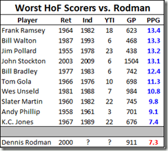
This list is the bottom-10 per-game scorers (of players inducted within 25 years of their retirement).  If Rodman were inducted, he would be the single lowest point-scorer in HoF history.  And looking at the bigger picture, it may even be worse than that.  Here’s a visual of all 89 Hall of Famers with stats (regardless of induction time), sorted from most points to fewest:

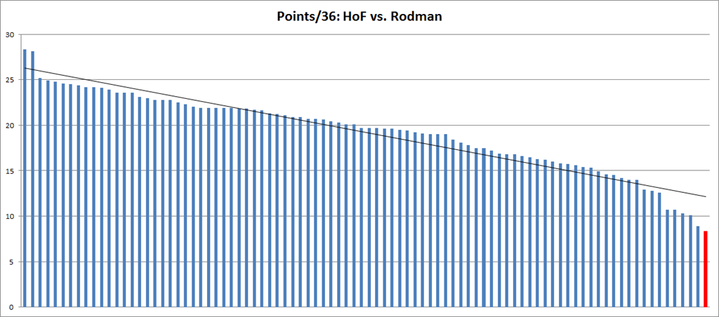
image

So not only would he be the lowest point scorer, he would actually have significantly fewer points than a (linear) trend-line would predict the lowest point scorer to have (and most of the smaller bars just to the left of Rodman were Veteran’s Committee selections).  Thus, if historical trends reflect the current mood of the HoF electorate, resistance is to be expected.

The flip-side, of course, is the following:

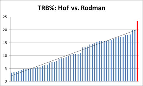
imageNote: this graphic only contains the players for whom this stat is available, though, as I demonstrated previously, there is no reason to believe that earlier players were any better.
Clearly, my first thought when looking at this data was, “Who the hell is this guy with a TRB% of only 3.4?”  That’s only 1 out of every *30* rebounds!* The league average is (obviously) 1 out of 10.  Muggsy Bogues — the shortest player in the history of the NBA (5’3”) — managed to pull in 5.1%, about 1 out of every 20.  On the other side, of course, Rodman would pace the field by a wide margin – wider, even, than the gap between Jordan/Chamberlain and the field for scoring (above).  Of course, the Hall of Fame traditionally doesn’t care that much about rebounding percentages:

image

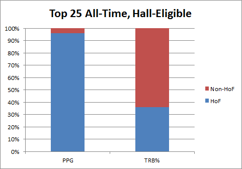
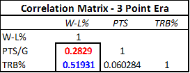
So, of eligible players, 24 of the top 25 leaders in points per game are presently in the Hall (including the top 19 overall), while only 9 of the top 25 leaders in total rebound percentage can say the same.  This would be perfectly rational if, say, PPG was way way more important to winning than TRB%.  But this seems unlikely to me, for at least two reasons: 1) As a rate stat, TRB% shouldn’t be affected significantly by game or team pace, as PPG is; and 2) TRB% has consequences on both offense and defense, whereas PPG is silent about the number of points the player/team has given up.  To examine this question, I set up a basic correlation of team stats to team winning percentage for the set of every team season since the introduction of the 3-point shot.  Lo and behold, it’s not really close:

image

Yes, correlation does not equal causation, and team scoring and rebounding are not the same as individual scoring and rebounding.  This test isn’t meant to prove conclusively that rebounding is more important than scoring, or even gross scoring — though, at the very least, I do think it strongly undermines the necessity of the opposite: that is, the assumption that excellence in gross point-scoring is indisputably more significant than other statistical accomplishments.
Though I don’t presently have the data to confirm, I would hypothesize (or, less charitably, guess) that individual TRB% probably has a more causative effect on team TRB% than individual PPG does on team PPG [see addendum] (note, to avoid any possible misunderstanding, I mean this only w/r/t PPG, not points-per-possession, or anything having to do with shooting percentages, true or otherwise).  Even with the proper data, this could be a fairly difficult hypothesis to test, since it can be hard to tell (directly) whether a player scoring a lot of points causes his team to score a lot of points, or vice versa.  However, that hypothesis seems to be at least partially supported by studies that others have conducted on rebound rates – especially on the offensive side (where Rodman obviously excelled).

The conventional wisdom regarding the importance of gross points is demonstrably flawed on at least two counts: gross, and points.  In sub-section (ii), I will look at how the analytical community attempted to deal with these problems, as well as at how they repeated them.
*(It’s Tiny Archibald)


Addendum (4/20/11):

I posted this as a Graph of the Day a while back, and thought I should add it here:
image

More info in the original post, but the upshot is that my hypothesis that “individual TRB% probably has a more causative effect on team TRB% than individual PPG does on team PPG” appears to be confirmed (the key word is “differential”).

The Case for Dennis Rodman, Part 1/4 (c)—Rodman v. Ancient History

One of the great false myths in basketball lore is that Wilt Chamberlain and Bill Russell were Rebounding Gods who will never be equaled, and that dominant rebounders like Dennis Rodman should count their blessings that they got to play in a era without those two deities on the court.  This myth is so pervasive that it is almost universally referenced as a devastating caveat whenever sports commentators and columnists discuss Rodman’s rebounding prowess.  In this section, I will attempt to put that caveat to death forever.

The less informed version of the “Chamberlain/Russell Caveat” (CRC for short) typically goes something like this: “Rodman led the league in rebounding 7 times, making him the greatest re bounder of his era, even though his numbers come nowhere near those of Chamberlain and Russell.”  It is true that, barring some dramatic change in the way the game is played, Chamberlain’s record of 27.2 rebounds per game, set in the 1960-61 season, will stand forever.  This is because, due to the fast pace and terrible shooting, the typical game in 1960-61 featured an average of 147 rebounding opportunities.  During Rodman’s 7-year reign as NBA rebounding champion (from 1991-92 through 1997-98), the typical game featured just 84 rebounding opportunities.  Without further inquiry, this difference alone means that Chamberlain’s record 27.2 rpg would roughly translate to 15.4 in Rodman’s era – over a full rebound less than Rodman’s ~16.7 rpg average over that span.

The slightly more informed (though equally wrong) version of the CRC is a plea of ignorance, like so: “Rodman has the top 7 rebounding percentages since the NBA started to keep the necessary statistics in 1970.  Unfortunately, there is no game-by-game or individual opponent data prior to this, so it is impossible to tell whether Rodman was as good as Russell or Chamberlain” (this point also comes in many degrees of snarky, like, “I’ll bet Bill and Wilt would have something to say about that!!!”).  We may not have the necessary data to calculate Russell and Chamberlain’s rebounding rates, either directly or indirectly.  But, as I will demonstrate, there are quite simple and extremely accurate ways to estimate these figures within very tight ranges (which happen to come nowhere close to Dennis Rodman).

Before getting into rebounding percentages, however, let’s start with another way of comparing overall rebounding performance: Team Rebound Shares.  Simply put, this metric is the percentage of team rebounds that were gotten by the player in question.  This can be done for whole seasons, or it can be approximated over smaller periods, such as per-game or per-minute, even if you don’t have game-by-game data.  For example, to roughly calculate the stat on a per-game basis, you can simply take a player’s total share of rebounds (their total rebounds/team’s total rebounds), and divide by the percentage of games they played (player gms/team gms).  I’ve done this for all of Rodman, Russell and Chamberlain’s seasons, and organized the results as follows:

Wilt and Bill_28675_image001

As we can see, Rodman does reasonably well in this metric, still holding the top 4 seasons and having a better average through 7.  This itself is impressive, considering Rodman averaged about 35 minutes per game and Wilt frequently averaged close to 48.

I should note, in Chamberlain’s favor, that one of the problems I have with PER and its relatives is that they don’t give enough credit for being able to contribute extra minutes, as Wilt obviously could.  However, since here I’m interested more in each player’s rebounding ability than in their overall value, I will use the same equation as above (plus dividing by 5, corresponding to the maximum minutes for each player) to break the team rebounding shares down by minute:

Wilt and Bill_28675_image002

This is obviously where Rodman separates himself from the field, even pulling in >50% of his team’s rebounds in 3 different seasons.  Of course, this only tells us what it tells us, and we’re looking for something else: Total Rebounding percentage.  Thus, the question naturally arises: how predictive of TRB% are “minute-based team rebound shares”?

In order to answer this question, I created a slightly larger data-set, by compiling relevant full-season statistics from the careers of Dennis Rodman, Dwight Howard, Tim Duncan, David Robinson, and Hakeem Olajuwon (60 seasons overall).  I picked these names to represent top-level rebounders in a variety of different situations (and though these are somewhat arbitrary, this analysis doesn’t require a large sample).  I then calculated TRS by minute for each season and divided by 2 — roughly corresponding to the player’s share against 10 players instead of 5.  Thus, all combined, my predictive variable is determined as follows:

PV=\frac{Player Rebounds/Team Rebounds}{Player Minutes/Team Minutes}/10

Note that this formula may have flaws as an independent metric, but if it’s predictive enough of the metric we really care about — Total Rebound % — those no longer matter.  To that end, I ran a linear regression in Excel comparing this new variable to the actual values for TRB%, with the following output:

image

If you don’t know how to read this, don’t sweat it.  The “R Square” of .98 pretty much means that our variable is almost perfectly predictive of TRB%.  The two numbers under “Coefficients” tell us the formula we should use to make predictions based on our variable:

Predicted TRB\% = 1.08983*PV - .01154

Putting the two equations together, we have a model that predicts a player’s rebound percentage based on 4 inputs:

TRB\% = 1.08983 * \frac{Player Rebounds/Team Rebounds}{Player Minutes/Team Minutes} /10 - .0115

Now again, if you’re familiar with regression output, you can probably already see that this model is extremely accurate.  But to demonstrate that fact, I’ve created two graphs that compare the predicted values with actual values, first for Dennis Rodman alone:

Wilt and Bill_28675_image005

And then for the full sample:

Wilt and Bill_28675_image007

So, the model seems solid.  The next step is obviously to calculate the predicted total rebound percentages for each of Wilt Chamberlain and Bill Russell’s seasons.  After this, I selected the top 7 seasons for each of the three players and put them on one graph (Chamberlain and Russell’s estimates vs. Rodman’s actuals):

Wilt and Bill_28675_image009

It’s not even close.  It’s so not close, in fact, that our model could be way off and it still wouldn’t be close.  For the next two graphs, I’ve added error bars to the estimation lines that are equal to the single worst prediction from our entire sample (which was a 1.21% error, or 6.4% of the underlying number):  [I should add a technical note, that the actual expected error should be slightly higher when applied to “outside” situations, since the coefficients for this model were “extracted” from the same data that I tested the model on.  Fortunately, that degree of precision is not necessary for our purposes here.]  First Rodman vs. Chamberlain:

Then Rodman vs. Russell:

In other words, if the model were as inaccurate in Russell and Chamberlain’s favor as it was for the worst data point in our data set, they would still be crushed.  In fact, over these top 7 seasons, Rodman beats R&C by an average of 7.2%, so if the model understated their actual TRB% every season by 5 times as much as the largest single-season understatement in our sample, Rodman would still be ahead [edit: I’ve just noticed that Pro Basketball Reference has a TRB% listed for each of Chamberlain’s last 3 seasons.  FWIW, this model under-predicts one by about 1%, over-predicts one by about 1%, and gets the third almost on the money (off by .1%)].

To stick one last dagger in CRC’s heart, I should note that this model predicts that Chamberlain’s best TRB% season would have been around 20.16%, which would rank 67th on the all-time list.  Russell’s best of 20.08 would rank 72nd.  Arbitrarily giving them 2% for the benefit of the doubt, their best seasons would still rank 22nd and 24th respectively.