Graph of the Day: NBA Player Stats v. Team Differentials (Follow-Up)

In this post from my Rodman series, I speculated that “individual TRB% probably has a more causative effect on team TRB% than individual PPG does on team PPG.”  Now, using player/team differential statistics (first deployed in my last Rodman post), I think I can finally test this hypothesis:

image

Note: As before, this dataset includes all regular season NBA games from 1986-2010.  For each player who both played and missed at least 20 games in the same season (and averaged at least 20 minutes per game played), differentials are calculated for each team stat with the player in and out of the lineup, weighted by the smaller of games played or games missed that season.  The filtered data includes 1341 seasons and a total of 39,162 weighted games.

This graph compares individual player statistics to his in/out differential for each corresponding team statistic.  For example, a player’s points per game is correlated to his team’s points per game with him in the lineup minus their points per game with him out of the lineup.  Unlike direct correlations to team statistics, this technique tells us how much a player’s performance for a given metric actually causes his team to be better at the thing that metric measures.

Lower values on this scale can potentially indicate a number of things, particularly two of my favorites: duplicability (stat reflects player “contributions” that could have happened anyway—likely what’s going on with Defensive Rebounding %), and/or entanglement (stat is caused by team performance more than it contributes to team performance—likely what’s going on with Assist %).

In any case, the data definitely appears to support my hypothesis: Player TRB% does seem to have a stronger causative effect on team TRB% than player PPG does on team PPG.

Graph of the Day: Tim Duncan’s Erstwhile(?) Consistency

While San Antonio is having a great season, Tim Duncan is on the verge of posting career lows in scoring and rebounding (by wide margins).  He’s getting a bit older and playing fewer minutes, for sure, but before this year he was one of the most consistent players in NBA history:

image

Note: Data excludes any seasons where player started fewer than 42 games.

If that graph is kind of confusing, ignore the axes:  more flat means more consistent.  Spikes don’t necessarily represent decline, as a bad/great year can come at any time.  Question mark is where Duncan projects for 2010-11.

News and Updates

First, the (Non-)News:

As some of you know, several months ago I applied for a position as a sports analytics specialist (amazing job description, and it even pays money).  The evaluation process has been wild, including *8* rounds of assessments and interviews. I feel like I’ve made my case as about as well as I can, though from what I understand the competition is something fierce — so it could easily go either way.  With a final outcome being (or at least seeming) imminent for quite a while now, I have held off on posting new material.  In truth, this hiatus has been much longer than I expected, so my apologies to Dennis Rodman.

If I get the job, it is not clear what will happen to the blog, as I haven’t yet discussed it with my potential employers.  But if I don’t get the job, I’m happy to report that the blog will proceed with my full commitment as well as my full-time attention.  Specifically — as insisted by my wife – that means no fewer than 40 hours of work and 5 posts per week.

Out of fairness to my loyal reader(s), no matter what happens I will be publishing the remainder of the Rodman series, as well as my long-promised (and recently-revamped) Tennis Service Aggression Calculator, and any necessary follow-ups to other items, such as the following:

Catching Wayne Gretzky:

During the last NHL season, I noted that Alexander Ovechkin and Sidney Crosby had thus-far failed to break Wayne Gretzky’s single-season point-scoring record from 1984, combined.  But I guess records are meant to be broken!  With 109 each, AO and SC’s 218 points in the 09-10 season just edges Gretzky’s 215.  Congrats, new guys!

Tiger Woods Still Needs a Therapist:

Tiger has truly had a terrible year — on the golf course. I’ve updated this older graph to include the full season of data, though the upshot is basically the same:

image

Much has been made of Tiger losing his #1 overall ranking to Lee Westwood, but the situation is actually much more dire: If Tiger continues to play this poorly, he could be in danger of losing his status as an above average PGA golfer.  Take a look at this summary of stats from his 2010 PGA season (from the PGA website):

stat summaries
Eliminating FedEx Cup Points and earnings from the list, he still averaged right around 87th for these measures (there are about 190 PGA regulars).  His adjusted scoring average ranks 28th, which would itself be unthinkable for Tiger, but even 28th may be generous: the weighted figure is bolstered by relatively good showings in strong fields at the Masters and U.S. Open, but Tiger actually performed worse in weaker fields.  Let’s quickly look at his unadjusted scoring (same source):

image

Tiger typically plays a tougher schedule than your average golfer, for sure, but that hasn’t stopped him in the past:  he led the PGA in both adjusted AND unadjusted scoring average each of the past 5 seasons.

The Rams are Definitely Regressing:

The St. Louis Rams are currently 6-6, which, oddly enough, puts them right about on track for 1-15 teams historically:

image
(So maybe my hypothesis has some teeth to it after all.)

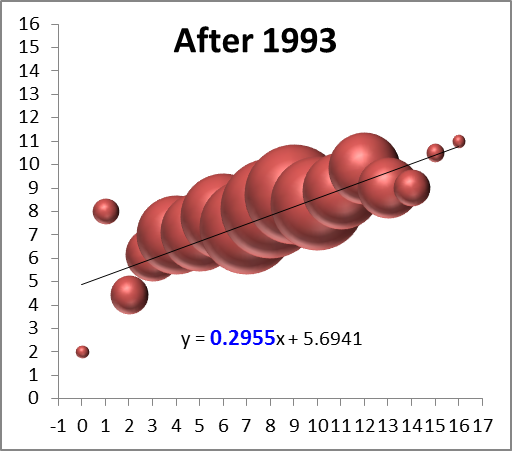
Relatedly, so far this has been a hallmark year for regression to the mean.  Here is a scatterplot of 2010 wins by 2009 wins (functionally equivalent to the bubble charts in the Rams post):

image

That .18 coefficient is very low, even by recent standards.  The coefficient for he equivalent trendline for season to season wins since the implementation of the salary cap in 1993 is .30.

From the “Never Question Bill Belichick” Department:

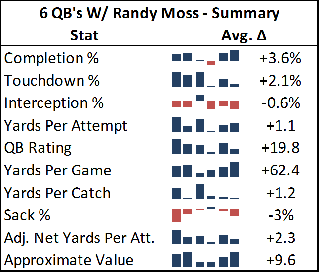
Randy Moss is having a nightmare year.  Granted, he has had to play for 3 different teams and 5 different starting quarterbacks, but there is no evidence of him having his usual impact – either directly or indirectly.  The good news is that he won’t reach 9 games with a single quarterback, and thus won’t spoil his nifty “WOWY” graphs.  The bad news is that the Pats, Vikes, and Titans all have worse records with him in the line-up than without him.

At mid-season, ESPN Stats & Info applied a methodology similar to mine, and things didn’t look so bad.  But Brady’s recent hot streak has mostly killed the disparity:

image

(Recall that even Favre’s 12 point difference in QB Rating is low by Moss’s standards).

Man >> Machine >> Monkey:

Finally, I’ve been tracking the performance of my neural network’s predictions vs. Football Outsiders’ DVOA Projections and Advanced NFL Stats’ Koko model (Recall that in recent years, F.O. has performed the worst).  Since the original metric I was using for comparison was correlation, which is sensitive to the number of games played, I can’t really do a precise analysis until the season is over.  But suffice it to say:  Football Outsiders has struck back — with a vengeance — and has a seemingly insurmountable lead going into the back stretch.  On the other side, Koko is getting demolished.  Since Koko is entirely based on the previous season’s win total, its poor performance is somewhat unsurprising considering the regression graph above (which, incidentally, Koko is not doing much better than).  My neural network, meanwhile, is plugging along just slightly below its previous averages.

Giving credit where it’s due, this range of performance actually makes the F.O. predictions that much more impressive: normally, the previous season is either predictive or it’s not, and the models’ performances tend to move together.  My speculation would be that perhaps the many exogenous variables that F.O. uses and the other models don’t are particularly important this year.

Why Not Balls and Strikes?

To expand a tiny bit on something I tweeted the other day, I swear there’s a rule (perhaps part of the standard licensing agreement with MLB), that any time anyone on television mentions the idea of expanding instant replay (or “use of technology”) in baseball, they are required to qualify their statement by assuring the audience that they do not mean for balls and strikes.  But why not?  If any reason is given, it is usually some variation of the following: 1) Balls and strikes are inherently too subjective, 2) It would slow the game down too much, or 3) The role of the umpire is too important.  None of these seems persuasive to me, at least when applied to the strike zone’s horizontal axis — i.e., the plate:

1. The plate is not subjective.

In little league, we were taught that the strike zone was “elbows to knees and over the plate,” and surprisingly enough, the official major league baseball definition is not that much more complicated (from the Official Baseball Rules 2010, page 22):

A STRIKE is a legal pitch when so called by the umpire, which . . . is not struck at, if any part of the ball passes through any part of the strike zone. . . .
The STRIKE ZONE is that area over home plate the upper limit of which is a horizontal line at the midpoint between the top of the shoulders and the top of the uniform pants, and the lower level is a line at the hollow beneath the kneecap.  The Strike Zone shall be determined from the batter’s stance as the batter is prepared to swing at a pitched ball.

I can understand several reasons why there may be need for a human element in judging the vertical axis of the zone, such as to avoid gamesmanship like crouching or altering your stance while the ball is in the air, or to make reasonable exceptions in cases where someone has kneecaps on their stomach, etc.  But there is nothing subjective about “any part of the ball passes through any part of . . . the area over home plate.”

2. The plate is not hard to check.

I mean, if they can photograph lightning:

lightning

They should be able to tell whether a solid ball passes over a small irregular pentagon.  Yes, replay takes a while when you have to look at 15 different angles to find the right one, or when you have to cognitively construct a 3-dimensional image from several 2-dimensional videos.  It even takes a little while when you have to monitor a long perimeter to see if oddly shaped objects have crossed them (like tennis balls on impact or player’s shoes in basketball).  But checking whether a baseball crossed the plate takes no time at all: they already do it virtually without delay on television, and that process could be sped up at virtually no cost with one dedicated camera: let it take a long-exposure picture of the plate for each pitch, then instantly beam it to an iPhone strapped to the umpire’s wrist.  He can check it in the course of whatever his natural motion for signaling a ball or strike would have been, and he’ll probably save time by not having players and managers up in his face every other pitch.

3. The plate is a waste of the umpire’s time, but not ours.

Umpires are great, they make entertaining gesticulating motions, and maybe in some extremely slight sense, people actually do go to the game to boo and hiss at them — I’m not suggesting MLB puts HAL back there.  But as much as people love officiating controversies generally, umpires are so inconsistent and error-prone about the strike zone (which, you know, only matters like 300 times per game) that fans are too jaded to even care.  There are enough actually subjective calls for umpires to blow, they don’t need to be spending their time and attention on something so objective, so easy to check, and so important.

(Photo Credit: “Lightning on the Columbia River” by phatman.)

Calculator: NFL/NCAA QB Ratings

Recently, I have been working very hard on some exciting behind-the-scenes upgrades for the blog. For example, I’ve been designing a number of web-mining processes to beef up my football and basketball databases, which should lead to more robust content in the future. I’ve also been working on an a much easier way to make interactive posts (without having to hard-code them or use plug-ins). My thinking is, if I lower the difficulty of creating interactive calculators and graph generators enough, then a collection of fun/interesting/useful resources should practically build itself.

To that end, I believe I have found the right tools to make moderately complex interactive charts and data out of spreadsheets, and I have been getting better and better at the process. As a test-run, however, let’s start with something simpler: A calculator for the much-maligned and nigh-impenetrable QB Ratings systems of the NFL and NCAA:

If all is working properly, the rating should re-calculate automatically whenever you change the data (i.e., no need to push a button), provided you have valid numbers in all 5 boxes. Please let me know if you have any difficulty viewing or using it.

From an analytical standpoint, there’s obviously not much to see here — though for certain values I am mildly surprised by the extreme disparity between the NFL and NCAA flavors.

Graph of the Day 2: NFL Regression—Descent Into Chaos

I guess it’s funky graph day here at SSA:
This one corresponds to the bubble-graphs in this post about regression to the mean before and after the introduction of the salary cap.  Each colored ball represents one of the 32 teams, with wins in year n on the x axis and wins in year n+1 on the y axis.  In case you don’t find the visual interesting enough in its own right, you’re supposed to notice that it gets crazier right around 1993.

This Week in Skeptical Sports Analysis

I’ve just returned from a weekend wedding getaway in NoCal, and I’m excited to get back to work on the blog. In this weekly feature (which will normally be posted on Sundays), I will post blog-related news, review some of the site activity from the previous week, give quick previews of what’s to come in the following week and what’s in the works, plus respond to any questions or requests.

Blog news:

  • There is now a sweet iPhone/mobile version of the blog, thanks to the WPTouch plug-in. To see it, just open the blog in any iPhone, Android, Blackberry or Palm Pre device.
  • I’ve added my Twitter feed to the right sidebar, using the Twitter Goodies plug-in. It works nicely, although it currently won’t display my re-tweets. If you happen to know how to fix this, please email me.
  • I added a “praise for Skeptical Sports” section to the “about this blog” page. By default, I assume that public statements of praise (e.g., from Twitter, in the comments, or on a public forum) are OK to duplicate there, but if for whatever reason you don’t want your statement to appear anymore, just let me know and I’ll remove it.
  • There’s a thread on 2+2 (a poker/gambling forum with an excellent sports section) about this blog that contains a decent amount of discussion about some of the topics I’ve posted on, especially Dennis Rodman and Carmello Anthony. It also includes some silly speculation about what my “secret identity” on 2+2 might be, but the sports analysis is interesting. Also, if any of those guys are reading, feel free to post in the comments here as well (and I don’t mind cross-posting).

Last week on the blog:

This week on the blog:

  • I will be posting parts 1(c) and 2 of my Rodman series. The first will examine whether Wilt Chamberlain and Bill Russell were the Gods of Rebounding that Bill Simmons and others always claim they were, and the second will try to pin down exactly how valuable Rodman’s rebounding was to the teams he played for (criticizing PER’s in the process).
  • I will be posting my Tennis Service Aggression Calculator, which will use a tiny bit of calculus to model whether a player should be more aggressive in their service game.
  • I will post something on the NFL, either a model for evaluating pre-season predictions that I’ve been working on, or my long-promised “Show Me a Quarterback that Doesn’t Throw Interceptions and I’ll Show You a Sucky Quarterback” analysis.

In the works:

  • Death, Taxes, and Randy Moss: a discussion of statistical entanglement in the NFL, and the implications for player analysis.
  • A comprehensive criticism of Hollinger statistics: This will probably be my next big series after the one on Rodman. I hate to do basketball back-to-back, but this research is practically done and dying to be published.
  • Is Usain Bolt a natural 400 runner?: An examination of the 10m splits for Bolt’s record-setting runs, and what they say about his top speed advantage and his endurance.

By request:

  • In the comments for Rodman 1(b), Jake asked what the “Ambicourtedness” graph would look like if Rodman were taken out of the sample. This was not difficult, particularly since it looks virtually the same. Here it is:

Top 1000_11343_image003

  • A friend privately asked me what other NBA stars’ Offensive v. Defensive rebound % graphs looked like, suggesting that, while there may be a tradeoff overall, that doesn’t necessarily mean that the particular lack of tradeoff that Rodman shows is rare. This is a very good question, so I looked at similar graphs for virtually every player who had 5 or more seasons in the “Ambicourtedness Top 1000.” There are other players who have positively sloping trend-lines, though none that come close to Rodman’s. I put together a quick graph to compare Rodman to a number of other big name players who were either great rebounders (e.g., Moses Malone), perceived-great rebounders (e.g., Karl Malone, Dwight Howard), or Charles Barkley:

Top 1000_11343_image001

  • If you have requests or questions that you would like me to answer on the blog, let me know. And it doesn’t have to be a follow-up to a post I’ve already made: If you have some completely different topic that you would like to see analyzed, or some article that you would like to see reviewed, let me know and I will try to get to it. I can promise that if I get any topic requests that meet the minimal interestingness threshold (that is, I think “hmm, interesting”), I will address at least one of them every week or so.

Hey, Do You Think Brett Favre is Maybe Like Hamlet?

On a lighter note:  Earlier I was thinking about how tired I am of hearing various ESPN commentators complain about Brett Favre’s “Hamlet impression” – though I was just using the term “Hamlet impression” for the rant in my head, no one was actually saying it (at least this time).  I quickly realized how completely unoriginal my internal dialogue was being, and after scolding myself for a few moments, I resolved to find the identity of the first person to ever make the Favre/Hamlet comparison.

Lo and behold, the earliest such reference in the history of the internet – that is, according to Google – was none other than Gregg Easterbrook, in this TMQ column from August 27th, 2003:

TMQ loves Brett Favre. This guy could wake up from a knee operation and fire a touchdown pass before yanking out the IV line. It’s going to be a sad day when he cuts the tape off his ankles for the final time. And it’s wonderful that Favre has played his entire (meaningful) career in the same place, honoring sports lore and appeasing the football gods, never demanding a trade to a more glamorous media market.

But even as someone who loves Favre, TMQ thinks his Hamlet act on retirement has worn thin. Favre keeps planting, and then denying, rumors that he is about to hang it up. He calls sportswriters saying he might quit, causing them to write stories about how everyone wants him to stay; then he calls more sportswriters denying that he will quit, causing them to write stories repeating how everyone wants him to stay. Maybe Favre needs to join a publicity-addiction recovery group. The retire/unretire stuff got pretty old with Frank Sinatra and Michael Jordan; it’s getting old with Favre.

Ha!