In my last post in this series, I outlined and criticized the dominance of gross points (specifically, points per game) in the conventional wisdom about player value. Of course, serious observers have recognized this issue for ages, responding in a number of ways—the most widespread still being ad hoc (case by case) analysis. Not satisfied with this approach, many basketball statisticians have developed advanced “All in One” player valuation metrics that can be applied broadly.
In general, Dennis Rodman has not benefitted much from the wave of advanced “One Size Fits All” basketball statistics. Perhaps the most notorious example of this type of metric—easily the most widely disseminated advanced player valuation stat out there—is John Hollinger’s Player Efficiency Rating:

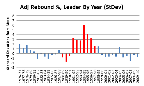
In addition to ranking Rodman as the 7th best player on the 1995-96 Bulls championship team, PER is weighted to make the league average exactly 15—meaning that, according to this stat, Rodman (career PER: 14.6) was actually a below average player. While Rodman does significantly better in a few predictive stats (such as David Berri’s Wages of Wins) that value offensive rebounding very highly, I think that, generally, those who subscribe to the Unconventional Wisdom typically accept one or both of the following: 1) that despite Rodman’s incredible rebounding prowess, he was still just a very good a role-player, and likely provided less utility than those who were more well-rounded, or 2) that, even if Rodman was valuable, a large part of his contribution must have come from qualities that are not typically measurable with available data, such as defensive ability.
My next two posts in this series will put the lie to both of those propositions. In section (b) of Part 2, I will demonstrate Rodman’s overall per-game contributions—not only their extent and where he fits in the NBA’s historical hierarchy, but exactly where they come from. Specifically, contrary to both conventional and unconventional wisdom, I will show that his value doesn’t stem from quasi-mystical unmeasurables, but from exactly where we would expect: extra possessions stemming from extra rebounds. In part 3, I will demonstrate (and put into perspective) the empirical value of those contributions to the bottom line: winning. These two posts are at the heart of The Case for Dennis Rodman, qua “case for Dennis Rodman.”
But first, in line with my broader agenda, I would like to examine where and why so many advanced statistics get this case wrong, particularly Hollinger’s Player Efficiency Rating. I will show how, rather than being a simple outlier, the Rodman data point is emblematic of major errors that are common in conventional unconventional sports analysis – both as a product of designs that disguise rather than replace the problems they were meant to address, and as a product of uncritically defending and promoting an approach that desperately needs reworking.
Player Efficiency Ratings
John Hollinger deserves much respect for bringing advanced basketball analysis to the masses. His Player Efficiency Ratings are available on ESPN.com under Hollinger Player Statistics, where he uses them as the basis for his Value Added (VA) and Expected Wins Added (EWA) stats, and regularly features them in his writing (such as in this article projecting the Miami Heat’s 2010-11 record), as do other ESPN analysts. Basketball Reference includes PER in their “Advanced” statistical tables (present on every player and team page), and also use it to compute player Value Above Average and Value Above Replacement (definitions here).
The formula for PER is extremely complicated, but its core idea is simple: combine everything in a player’s stat-line by rewarding everything good (points, rebounds, assists, blocks, and steals), and punishing everything bad (missed shots, turnovers). The value of particular items are weighted by various league averages—as well as by Hollinger’s intuitions—then the overall result is calculated on a per-minute basis, adjusted for league and team pace, and normalized on a scale averaging 15.
Undoubtedly, PER is deeply flawed. But sometimes apparent “flaws” aren’t really “flaws,” but merely design limitations. For example: PER doesn’t account for defense or “intangibles,” it is calculated without resort to play-by-play data that didn’t exist prior to the last few seasons, and it compares players equally, regardless of position or role. For the most part, I will refrain from criticizing these constraints, instead focusing on a few important ways that it fails or even undermines its own objectives.
Predictivity (and: Introducing Win Differential Analysis)
Though Hollinger uses PER in his “wins added” analysis, its complete lack of any empirical component suggests that it should not be taken seriously as a predictive measure. And indeed, empirical investigation reveals that it is simply not very good at predicting a player’s actual impact:

This bubble-graph is a product of a broader study I’ve been working on that correlates various player statistics to the difference in their team’s per-game performance with them in and out of the line-up. The study’s dataset includes all NBA games back to 1986, and this particular graph is based on the 1300ish seasons in which a player who averaged 20+ minutes per game both missed and played at least 20 games. Win% differential is the difference in the player’s team’s winning percentage with and without him (for the correlation, each data-point is weighted by the smaller of games missed or played. I will have much more to write about nitty-gritty of this technique in separate posts).
So PER appears to do poorly, but how does it compare to other valuation metrics?

SecFor (or “Secret Formula”) is the current iteration of an empirically-based “All in One” metric that I’m developing—but there is no shame in a speculative purely a priori metric losing (even badly) as a predictor to the empirical cutting-edge.
However, as I admitted in the introduction to this series, my statistical interest in Dennis Rodman goes way back. One of the first spreadsheets I ever created was in the early 1990’s, when Rodman still played for San Antonio. I knew Rodman was a sick rebounder, but rarely scored—so naturally I thought: “If only there were a formula that combined all of a player’s statistics into one number that would reflect his total contribution.” So I came up with this crude, speculative, purely a priori equation:
Points + Rebounds + 2*Assists + 1.5*Blocks + 2*Steals – 2*Turnovers.
Unfortunately, this metric (which I called “PRABS”) failed to shed much light on the Rodman problem, so I shelved it. PER shares the same intention and core technique, albeit with many additional layers of complexity. For all of this refinement, however, Hollinger has somehow managed to make a bad metric even worse, getting beaten by my OG PRABS by nearly as much as he is able to beat points per game—the Flat Earth of basketball valuation metrics. So how did this happen?
Minutes
The trend in much of basketball analysis is to rate players by their per-minute or per-possession contributions. This approach does produce interesting and useful information, and they may be especially useful to a coach who is deciding who to give more minutes to, or to a GM who is trying to evaluate which bench player to sign in free agency.
But a player’s contribution to winning is necessarily going to be a function of how much extra “win” he is able to get you per minute and the number of minutes you are able to get from him. Let’s turn again to win differential:

For this graph, I set up a regression using each of the major rate stats, plus minutes played (TS%=true shooting percentage, or one half of average points per shot, including free throws and 3 pointers). If you don’t know what a “normalized coefficient” is, just think of it as a stat for comparing the relative importance of regression elements that come in different shapes and sizes. The sample is the same as above: it only includes players who average 20+ minutes per game.
Unsurprisingly, “minutes per game” is more predictive than any individual rate statistic, including true shooting. Simply multiplying PER by minutes played significantly improves its predictive power, managing to pull it into a dead-heat with PRABS (which obviously wasn’t minute-adjusted to begin with).
I’m hesitant to be too critical of the “per minute” design decision, since it is clearly an intentional element that allows PER to be used for bench or rotational player valuation, but ultimately I think this comes down to telos: So long as PER pretends to be an arbiter of player value—which Hollinger himself relies on for making actual predictions about team performance—then minutes are simply too important to ignore. If you want a way to evaluate part-time players and how they might contribute IF they could take on larger roles, then it is easy enough to create a second metric tailored to that end.
Here’s a similar example from baseball that confounds me: Rate stats are fine for evaluating position players, because nearly all of them are able to get you an entire game if you want—but when it comes to pitching, how often someone can play and the number of innings they can give you is of paramount importance. E.g., at least for starting pitchers, it seems to me that ERA is backwards: rather than calculate runs allowed per inning, why don’t they focus on runs denied per game? Using a benchmark of 4.5, it would be extremely easy to calculate: Innings Pitched/2 – Earned Runs. So, if a pitcher gets you 7 innings and allows 2 runs, their “Earned Runs Denied” (ERD) for the game would be 1.5. I have no pretensions of being a sabermetrician, and I’m sure this kind of stat (and much better) is common in that community, but I see no reason why this kind of statistic isn’t mainstream.
More broadly, I think this minutes SNAFU is reflective of an otherwise reasonable trend in the sports analytical community—to evaluate everything in terms of rates and quality instead of quantity—that is often taken too far. In reality, both may be useful, and the optimal balance in a particular situation is an empirical question that deserves investigation in its own right.
PER Rewards Shooting (and Punishes Not Shooting)
As described by David Berri, PER is well-known to reward inefficient shooting:
“Hollinger argues that each two point field goal made is worth about 1.65 points. A three point field goal made is worth 2.65 points. A missed field goal, though, costs a team 0.72 points. Given these values, with a bit of math we can show that a player will break even on his two point field goal attempts if he hits on 30.4% of these shots. On three pointers the break-even point is 21.4%. If a player exceeds these thresholds, and virtually every NBA player does so with respect to two-point shots, the more he shoots the higher his value in PERs. So a player can be an inefficient scorer and simply inflate his value by taking a large number of shots.”
The consequences of this should be properly understood: Since this feature of PER applies to every shot taken, it is not only the inefficient players who inflate their stats. PER gives a boost to everyone for every shot: Bad players who take bad shots can look merely mediocre, mediocre players who take mediocre shots can look like good players, and good players who take good shots can look like stars. For Dennis Rodman’s case—as someone who took very few shots, good or bad— the necessary converse of this is even more significant: since PER is a comparative statistic (even directly adjusted by league averages), players who don’t take a lot of shots are punished.
Structurally, PER favors shooting—but to what extent? To get a sense of it, let’s plot PER against usage rate:

Note: Data includes all player seasons since 1986. Usage % is the percentage of team possessions that end with a shot, free throw attempt, or turnover by the player in question. For most practical purposes, it measures how frequently the player shoots the ball.
That R-squared value corresponds to a correlation of .628, which might seem high for a component that should be in the denominator. Of course, correlations are tricky, and there are a number of reasons why this relationship could be so strong. For example, the most efficient shooters might take the most shots. Let’s see:

Actually, that trend-line doesn’t quite do it justice: that R-squared value corresponds to a correlation of .11 (even weaker than I would have guessed).
I should note one caveat: The mostly flat relationship between usage and shooting may be skewed, in part, by the fact that better shooters are often required to take worse shots, not just more shots—particularly if they are the shooter of last resort. A player that manages to make a mediocre shot out of a bad situation can increase his team’s chances of winning, just as a player that takes a marginally good shot when a slam dunk is available may be hurting his team’s chances. Presently, no well-known shooting metrics account for this (though I am working on it), but to be perfectly clear for the purposes of this post: neither does PER. The strong correlation between usage rate and PER is unrelated. There is nothing in its structure to suggest this is an intended factor, and there is nothing in its (poor) empirical performance that would suggest it is even unintentionally addressed. In other words, it doesn’t account for complex shooting dynamics either in theory or in practice.
Duplicability and Linearity
PER strongly rewards broad mediocrity, and thus punishes lack of the same. In reality, not every point that a player scores means their team will score one more point, just as not every rebound grabbed means that their team will get one more possession. Conversely—and especially pertinent to Dennis Rodman—not every point that a player doesn’t score actually costs his team a point. What a player gets credit for in his stat line doesn’t necessarily correspond with his actual contribution, because there is always a chance that the good things he played a part in would have happened anyway. This leads to a whole set of issues that I typically file under the term “duplicability.”
A related (but sometimes confused) effect that has been studied extensively by very good basketball analysts is the problem of “diminishing returns” – which can be easily illustrated like this: if you put a team together with 5 players that normally score 25 points each, it doesn’t mean that your team will suddenly start scoring 125 points a game. Conversely—and again pertinent to Rodman—say your team has 5 players that normally score 20 points each, and you replace one of them with somebody that normally only scores 10, that does not mean that your team will suddenly start scoring only 90. Only one player can take a shot at a time, and what matters is whether the player’s lack of scoring hurts his team’s offense or not. The extent of this effect can be measured individually for different basketball statistics, and, indeed, studies have showed wide disparities.
As I will discuss at length in Part 2(c), despite hardly ever scoring, differential stats show that Rodman didn’t hurt his teams offenses at all: even after accounting for extra possessions that Rodman’s teams gained from offensive rebounds, his effect on offensive efficiency was statistically insignificant. In this case (as with Randy Moss), we are fortunate that Rodman had such a tumultuous career: as a result, he missed a significant number of games in a season several times with several different teams—this makes for good indirect data. But, for this post’s purposes, the burning question is: Is there any direct way to tell how likely a player’s statistical contributions were to have actually converted into team results?
This is an extremely difficult and intricate problem (though I am working on it), but it is easy enough to prove at least one way that a metric like PER gets it wrong: it treats all of the different components of player contribution linearly. In other words, one more point is worth one more point, whether it is the 15th point that a player scores or the 25th, and one more rebound is worth one more rebound, whether it is the 8th or the 18th. While this equivalency makes designing an all-in one equation much easier (at least for now, my Secret Formula metric is also linear), it is ultimately just another empirically testable assumption.
I have theorized that one reason Rodman’s PER stats are so low compared to his differential stats is that PER punishes his lack of mediocre scoring, while failing to reward the extremeness of his rebounding. This is based on the hypothesis that certain extreme statistics would be less “duplicable” than mediocre ones. As a result, the difference between a player getting 18 rebounds per game vs. getting 16 per game could be much greater than the difference between them getting 8 vs. getting 6. Or, in other words, the marginal value of rebounds would (hypothetically) be increasing.
Using win percentage differentials, this is a testable theory. Just as we can correlate an individual player’s statistics to the win differentials of his team, we can also correlate hypothetical statistics the same way. So say we want to test a metric like rebounds, except one that has increasing marginal value built in: a simple way to approximate that effect is to make our metric increase exponentially, such as using rebounds squared. If we need even more increasing marginal value, we can try rebounds cubed, etc. And if our metric has several different components (like PER), we can do the same for the individual parts: the beauty is that, at the end of the day, we can test—empirically—which metrics work and which don’t.
For those who don’t immediately grasp the math involved, I’ll go into a little detail: A linear relationship is really just an exponential relationship with an exponent of 1. So let’s consider a toy metric, “PR,” which is calculated as follows: Points + Rebounds. This is a linear equation (exponent = 1) that could be rewritten as follows: (Points)^1 + (Rebounds)^1. However, if, as above, we thought that both points and rebounds should have increasing marginal values, we might want to try a metric (call it “PRsq”) that combined points and rebounds squared, as follows: (Points)^2 + (Rebounds)^2. And so on. Here’s an example table demonstrating the increase in marginal value:

The fact that each different metric leads to vastly different magnitudes of value is irrelevant: for predictive purposes, the total value for each component will be normalized — the relative value is what matters (just as “number of pennies” and “number of quarters” are equally predictive of how much money you have in your pocket). So applying this concept to an even wider range of exponents for several relevant individual player statistics, we can empirically examine just how “exponential” each statistic really is:

For this graph, I looked at each of the major rate metrics (plus points per game) individually. So, for each player-season in my (1986-) sample, I calculated the number of points, points squared, points^3rd. . . points^10th power, and then correlated all of these to that player’s win percentage differential. From those calculations, we can find roughly how much the marginal value for each metric increases, based on what exponent produces the best correlation: The smaller the number at the peak of the curve, the more linear the metric is—the higher the number, the more exponential (i.e., extreme values are that much more important). When I ran this computation, the relative shape of each curve fit my intuitions, but the magnitudes surprised me: That is, many of the metrics turned out to be even more exponential than I would have guessed.
As I know this may be confusing to many of my readers, I need to be absolutely clear: the shape of each curve has nothing to do with the actual importance of each metric. It only tells us how much that particular metric is sensitive to very large values. E.g., the fact that Blocks and Assists peak on the left and sharply decline doesn’t make them more or less important than any of the others, it simply means that having 1 block in your scoreline instead of 0 is relatively just as valuable as having 5 blocks instead of 4. On the other extreme, turnovers peak somewhere off the chart, suggesting that turnover rates matter most when they are extremely high.
For now, I’m not trying to draw a conclusive picture about exactly what exponents would make for an ideal all-in-one equation (polynomial regressions are very very tricky, though I may wade into those difficulties more in future blog posts). But as a minimum outcome, I think the data strongly supports my hypothesis: that many stats—especially rebounds—are exponential predictors. Thus, I mean this less as a criticism of PER than as an explanation of why it undervalues players like Dennis Rodman.
Gross, and Points
In subsection (i), I concluded that “gross points” as a metric for player valuation had two main flaws: gross, and points. Superficially, PER responds to both of these flaws directly: it attempts to correct the “gross” problem both by punishing bad shots, and by adjusting for pace and minutes. It attacks the “points” problem by adding rebounds, assists, blocks, steals, and turnovers. The problem is, these “solutions” don’t match up particularly well with the problems “gross” and “points” present.
The problem with the “grossness” of points certainly wasn’t minutes (note: for historical comparisons, pace adjustments are probably necessary, but the jury is still out on the wisdom of doing the same on a team-by-team basis within a season). The main problem with “gross” was shooting efficiency: If someone takes a bunch of shots, they will eventually score a lot of points. But scoring points is just another thing that players do that may or may not help their teams win. PER attempted to account for this by punishing missed shots, but didn’t go far enough. The original problem with “gross” persists: As discussed above, taking shots helps your rating, whether they are good shots or not.
As for “points”: in addition to any problems created by having arbitrary (non-empirical) and linear coefficients, the strong bias towards shooting causes PER to undermine its key innovation—the incorporation of non-point components. This “bias” can be represented visually:

Note: This data comes from a regression to PER including each of the rate stats corresponding to the various components of PER.
This pie chart is based on a linear regression including rate stats for each of PER’s components. Strictly, what it tells us is the relative value of each factor to predicting PER if each of the other factors were known. Thus, the “usage” section of this pie represents the advantage gained by taking more shots—even if all your other rate stats were fixed. Or, in other words, pure bias (note that the number of shots a player takes is almost as predictive as his shooting ability).
For fun, let’s compare that pie to the exact same regression run on Points Per Game rather than PER:

Note: These would not be the best variables to select if you were actually trying to predict a player’s Points Per Game. Note also that “Usage” in these charts is NOT like “Other”—while other variables may affect PPG, and/or may affect the items in this regression, they are not represented in these charts.
Interestingly, Points Per Game was already somewhat predictable by shooting ability, turnovers, defensive rebounding, and assists. While I hesitate to draw conclusions from the aesthetic comparison, we can guess why perhaps PER doesn’t beat PPG as significantly as we might expect: it appears to share much of the same DNA. (My more wild and ambitious thoughts suspect that these similarities reflect the strength of our broader pro-points bias: even when designing an All-in-One statistic, even Hollinger’s linear, non-empirical, a priori coefficients still mostly reflect the conventional wisdom about the importance of many of the factors, as reflected in the way that they relate directly to points per game).
I could make a similar pie-chart for Win% differential, but I think it might give the wrong impression: these aren’t even close to the best set of variables to use for that purpose. Suffice it to say that it would look very, very different (for an imperfect picture of how much so, you can compare to the values in the Relative Importance chart above).
Conclusions
The deeper irony with PER is not just that it could theoretically be better, but that it adds many levels of complexity to the problem it purports to address, ultimately failing in strikingly similar ways. It has been dressed up around the edges with various adjustments for team and league pace, incorporation of league averages to weight rebounds and value of possession, etc. This is, to coin a phrase, like putting lipstick on a pig. The energy that Hollinger has spent on dressing up his model could have been better spent rethinking the core of it.
In my estimation, this pattern persists among many extremely smart people who generate innovative models and ideas: once created, they spend most of their time—entire careers even—in order: 1) defending it, 2) applying it to new situations, and 3) tweaking it. This happens in just about every field: hard and soft sciences, economics, history, philosophy, even literature. Give me an academic who creates an interesting and meaningful model, and then immediately devotes their best efforts to tearing it apart! In all my education, I have had perhaps two professors who embraced this approach, and I would rank both among my very favorites.
This post and the last were admittedly relatively light on Rodman-specific analysis, but that will change with a vengeance in the next two. Stay tuned.
Update (5/13/11): Commenter “Yariv” correctly points out that an “exponential” curve is technically one in the form y^x (such as 2^x, 3^x, etc), where the increasing marginal value I’m referring to in the “Linearity” section above is about terms in the form x^y (e.g., x^2, x^3, etc), or monomial terms with an exponent not equal to 1. I apologize for any confusion, and I’ll rewrite the section when I have time.