The Aesthetic Case Against 18 Games

By most accounts, the NFL’s plan to expand the regular season from 16 to 18 games is a done deal.  Indulge me for a moment as I take off my Bill-James-Wannabe cap and put on my dusty old Aristotle-Wannabe kausia:  In addition to various practical drawbacks, moving to 18 games risks disturbing the aesthetic harmony—grounded in powerful mathematics—inherent in the 16 game season.
Analytically, it is easy to appreciate the convenience of having the season break down cleanly into 8-game halves and 4-game quarters.  Powers of 2 like this are useful and aesthetically attractive: after all, we are symmetrical creatures who appreciate divisibility.  But we have a possibly even more powerful aesthetic attachment to certain types of asymmetrical relationships:  Mozart’s piano concertos aren’t divided into equally-sized beginnings, middles and ends.  Rather, they are broken into exposition, development, and recapitulation—each progressively shorter than the last.

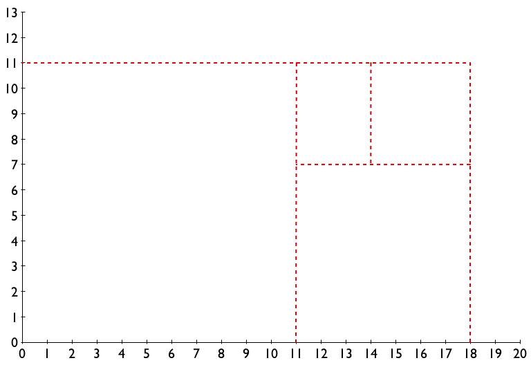
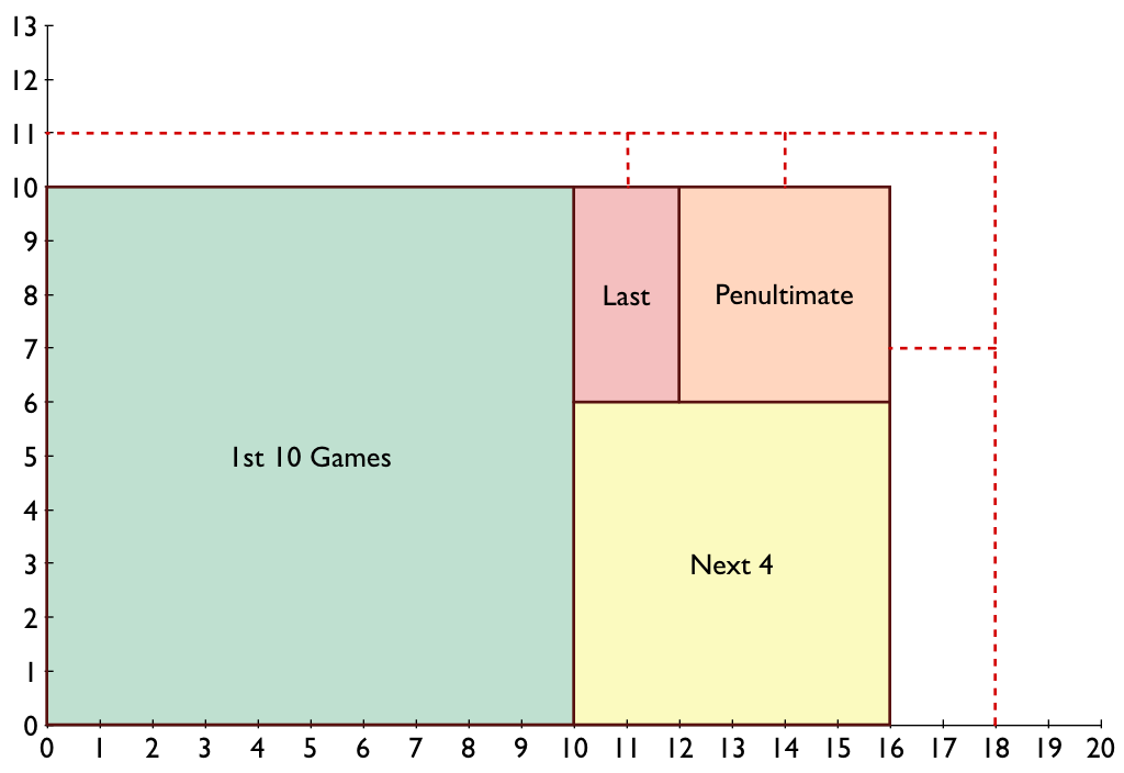
Similarly, the 16 game season can fairly cleanly be broken into 3 or 4 progressively shorter but more important sections.  Using roughly the same proportions that Mozart would, the first 10 games (“exposition”) would set the stage and reveal who we should be paying attention to; the next 3-4 games (“development”) would be where the race for playoff positioning really begins in earnest, and the final 2-3 weeks (“recapitulation”) are where hopes are realized and hearts are broken—including the final weekend when post-season fates are settled.  Now, let’s represent the season as a rectangle with sides 16 (length of the season) and 10 (length of the “exposition”), broken down into consecutively smaller squares representing each section:

image

Note: The “last” game gets the leftover space, though if the season were longer we could obviously keep going.

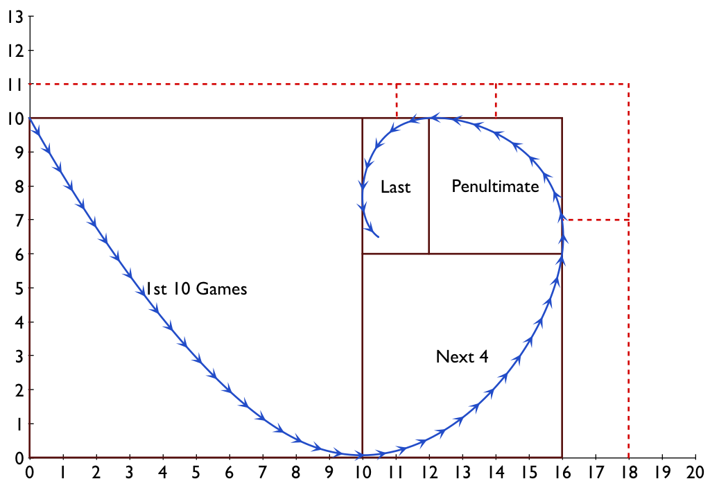
At this point many of you probably know where this is going: The ratio between each square to all of the smaller pieces is roughly equal, corresponding to the “divine proportion,” which is practically ubiquitous in classical music, as well as in everything from book and movie plots to art and architecture to fractal geometry to unifying theories of “all animate and inanimate systems.”  Here it is again (incredibly clumsily-sketched) in the more recognizable spiral form:

image

The golden ratio is represented in mathematics by the irrational constant phi, which is:

1.6180339887…

Which, when divided into 1 gets you:

.6180339887…

Beautiful, right? So the roughly 10/4/1/1 breakdown above is really just 16 multiplied by 1/phi, with the remainder multiplied by 1/phi, etc—9.9, 3.8, 1.4, .9—rounded to the nearest game.  Whether this corresponds to your thinking about the relative significance of each portion of the season is admittedly subjective.  But this is an inescapably powerful force in aesthetics (along with symmetricality and symbols of virility and fertility), and can be found in places most people would never suspect, including in professional sports.  Let’s consider some anecdotal supporting evidence:

  • The length of a Major League Baseball season is 162 games.  Not 160, but 162.  That should look familiar.
  • Both NBA basketball and NHL hockey have 82-game seasons, or roughly half-phi.  Note 81 games would be impractical, because of need for equal number of home and road games (but bonus points if you’ve ever felt like the NBA season was exactly 1 game too long).
  • The “exposition” portion of a half-phi season would be 50 games.  The NHL and NBA All-Star breaks both take place right around game 50, or a little later, each year.
  • Though still solidly in between 1/2 and 2/3 of the way through the season, MLB’s “Summer Classic” usually takes place slightly earlier, around game 90 (though I might submit that the postseason crunch doesn’t really start until after teams build a post-All Star record for people to talk about).
  • The NFL bye weeks typically end after week 10.
  • Fans and even professional sports analysts are typically inclined to value “clutch” players—i.e., those who make their bones in the “Last” quadrant above—way more than a non-aesthetic analytical approach would warrant.

Etc.
So fine, say you accept this argument about how people observe sports, your next question may be: well, what’s wrong with 18 games? any number of games can be divided into phi-sized quadrants, right?  Well, the answer is basically yes, it can, but it’s not pretty:

image

The numbers 162, 82, and 16 all share a couple of nice qualities: first they are all roughly divisible by 4, so you have nice clean quarter-seasons.  Second, they each have aesthetically pleasing “exposition” periods: 100 games in MLB, 50 in the NBA and NHL, and 10 in the NFL.  The “exposition” period in an 18-game season would be 11 games.  Yuck!  These season-lengths balance our competing aesthetic desires for the harmony of symmetry and excitement of asymmetry.  We like our numbers round, but not too round.  We want them dynamic, but workable.

Finally, as to why the NFL should care about vague aesthetic concerns that it takes a mathematician to identify, I can only say: I don’t think these patterns would be so pervasive in science, art, and in broader culture if they weren’t really important to us, whether we know it or not.  Human beings are symmetrical down the middle, but as some guy in Italy noticed, golden rectangles are not only woven into our design, but into the design of the things we love.  Please, NFL, don’t take that away from us.

Graph of the Day: Tim Duncan’s Erstwhile(?) Consistency

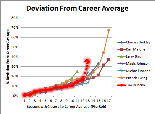
While San Antonio is having a great season, Tim Duncan is on the verge of posting career lows in scoring and rebounding (by wide margins).  He’s getting a bit older and playing fewer minutes, for sure, but before this year he was one of the most consistent players in NBA history:

image

Note: Data excludes any seasons where player started fewer than 42 games.

If that graph is kind of confusing, ignore the axes:  more flat means more consistent.  Spikes don’t necessarily represent decline, as a bad/great year can come at any time.  Question mark is where Duncan projects for 2010-11.

C.R.E.A.M. (Or, “How to Win a Championship in Any Sport”)

Does cash rule everything in professional sports?  Obviously it keeps the lights on, and it keeps the best athletes in fine bling, but what effect does the root of all evil have on the competitive bottom line—i.e., winning championships?

For this article, let’s consider “economically predictable” a synonym for “Cash Rules”:  I will use extremely basic economic reasoning and just two variables—presence of a salary cap and presence of a salary max in a sport’s labor agreement—to establish, ex ante, which fiscal strategies we should expect to be the most successful.  For each of the 3 major sports, I will then suggest (somewhat) testable hypotheses, and attempt to examine them.  If the hypotheses are confirmed, then Method Man is probably right—dollar dollar bill, etc.

Conveniently, on a basic yes/no grid of these two variables, our 3 major sports in the U.S. fall into 3 different categories:
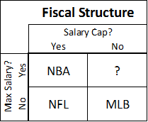
image

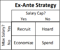
So before treating those as anything but arbitrary arrangements of 3 letters, we should consider the dynamics each of these rules creates independently.  If your sport has a team salary cap, getting “bang for your buck” and ferreting out bargains is probably more important to winning than overall spending power.  And if your sport has a low maximum individual salary, your ability to obtain the best possible players—in a market where everyone knows their value but must offer the same amount—will also be crucial.  Considering permutations of thriftiness and non-economic acquisition ability, we end up with a simple ex ante strategy matrix that looks like this:
image

These one-word commandments may seem overly simple—and I will try to resolve any ambiguity looking at the individual sports below—but they are only meant to describe the most basic and obvious economic incentives that salary caps and salary maximums should be expected to create in competitive environments.

Major League Baseball: Spend

Hypothesis:  With free-agency, salary arbitration, and virtually no payroll restrictions, there is no strategic downside to spending extra money.  Combined with huge economic disparities between organizations, this means that teams that spend the most will win the most.

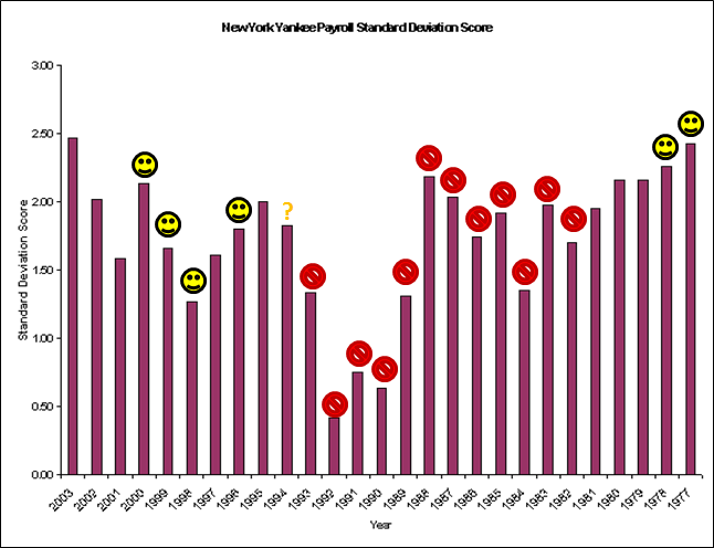
Analysis:  Let’s start with the New York Yankees (shocker!), who have been dominating baseball since 1920, when they got Babe Ruth from the Red Sox for straight cash, homey.  Note that I take no position on whether the Yankees filthy lucre is destroying the sport of Baseball, etc.  Also, I know very little about the Yankees payroll history, prior to 1988 (the earliest the USA Today database goes).  But I did come across this article from several years ago, which looks back as far as 1977.  For a few reasons, I think the author understates the case.  First, the Yankees low-salary period came at the tail end of a 12 year playoff drought (I don’t have the older data to manipulate, but I took the liberty to doodle on his original graph):
image

Note: Smiley-faces are Championship seasons.  The question mark is for the 1994 season, which had no playoffs.

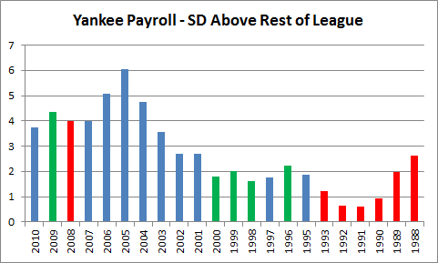
Also, as a quirk that I’ve discussed previously, I think including the Yankees in the sample from which the standard deviation is drawn can be misleading: they have frequently been such a massive outlier that they’ve set their own curve.  Comparing the Yankees to the rest of the league, from last season back to 1988, looks like this:
image

Note: Green are Championship seasons.  Red are missed playoffs.

In 2005 the rest-of-league average payroll was ~$68 million, and the Yankees’ was ~$208 million (the rest-of-league standard deviation was $23m, but including the Yankees, it would jump to $34m).

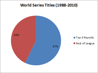
While they failed to win the World Series in some of their most expensive seasons, don’t let that distract you:  money can’t guarantee a championship, but it definitely improves your chances.  The Yankees have won roughly a quarter of the championships over the last 20 years (which is, astonishingly, below their average since the Ruth deal).  But it’s not just them.  Many teams have dramatically increased their payrolls in order to compete for a World Series title—and succeeded! Over the past 22 years, the top 3 payrolls (per season) have won a majority of titles:
image

As they make up only 10% of the league, this means that the most spendy teams improved their title chances, on average, by almost a factor of 6.

National Basketball Association: Recruit (Or: “Press Your Bet”)

Hypothesis:  A fairly strict salary cap reigns in spending, but equally strict salary regulations mean many teams will enjoy massive surplus value by paying super-elite players “only” the max.  Teams that acquire multiple such players will enjoy a major championship advantage.

Analysis: First, in case you were thinking that the 57% in the graph above might be caused by something other than fiscal policy, let’s quickly observe how the salary cap kills the “spend” strategy: image
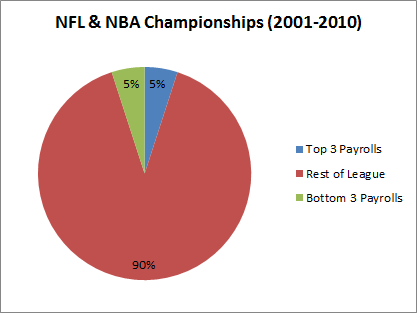
Payroll information from USA Today’s NBA and NFL Salary Databases (incidentally, this symmetry is being threatened, as the Lakers, Magic, and Mavericks have the top payrolls this season).

I will grant there is a certain apples-to-oranges comparison going on here: the NFL and NBA salary-cap rules are complex and allow for many distortions.  In the NFL teams can “clump” their payroll by using pro-rated signing bonuses (essentially sacrificing future opportunities to exceed the cap in the present), and in the NBA giant contracts are frequently moved to bad teams that want to rebuild, etc.  But still: 5%.  Below expectation if championships were handed out randomly.
And basketball championships are NOT handed out randomly.  My hypothesis predicts that championship success will be determined by who gets the most windfall value from their star player(s).  Fifteen of the last 20 NBA championships have been won by Kobe Bryant, Tim Duncan, or Michael Jordan.  Clearly star-power matters in the NBA, but what role does salary play in this?

Prior to 1999, the NBA had no salary maximum, though salaries were regulated and limited in a variety of ways.  Teams had extreme advantages signing their own players (such as Bird rights), but lack of competition in the salary market mostly kept payrolls manageable.  Michael Jordan famously signed a lengthy $25 million contract extension basically just before star player salaries exploded, leaving the Bulls with the best player in the game for a song (note: Hakeem Olajuwon’s $55 million payday came after he won 2 championships as well).  By the time the Bulls were forced to pay Jordan his true value, they had already won 4 championships and built a team around him that included 2 other All-NBA caliber players (including one who also provided extreme surplus value).  Perhaps not coincidentally, year 6 in the graph below is their record-setting 72-10 season:
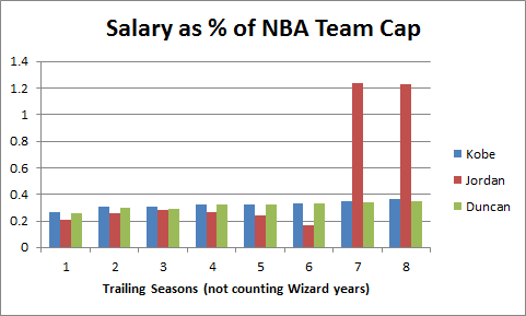
image

Note: Michael Jordan’s salary info found here.  Historical NBA salary cap found here.

The star player salary situation caught the NBA off-guard.  Here’s a story from Time magazine in 1996 that quotes league officials and executives:

“It’s a dramatic, strategic judgment by a few teams,” says N.B.A. deputy commissioner Russ Granik. .
Says one N.B.A. executive: “They’re going to end up with two players making about two-thirds of the salary cap, and another pair will make about 20%. So that means the rest of the players will be minimum-salary players that you just sign because no one else wants them.” . . .
Granik frets that the new salary structure will erode morale. “If it becomes something that was done across the league, I don’t think it would be good for the sport,” he says.

What these NBA insiders are explaining is basic economics:  Surprise!  Paying better players big money means less money for the other guys.  Among other factors, this led to 2 lockouts and the prototype that would eventually lead to the current CBA (for more information than you could ever want about the NBA salary cap, here is an amazing FAQ).

The fact that the best players in the NBA are now being underpaid relative to their value is certain.  As a back of the envelope calculation:  There are 5 players each year that are All-NBA 1st team, while 30+ players each season are paid roughly the maximum.  So how valuable are All-NBA 1st team players compared to the rest?  Let’s start with: How likely is an NBA team to win a championship without one?
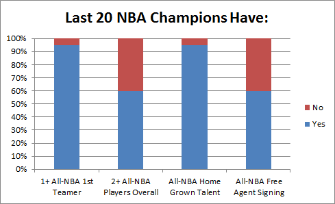
image

In the past 20 seasons, only the 2003-2004 Detroit Pistons won the prize without a player who was a 1st-Team All-NBAer in their championship year.
To some extent, these findings are hard to apply strategically.  All but those same Pistons had at least one home-grown All-NBA (1st-3rd team) talent—to win, you basically need the good fortune to catch a superstar in the draft.  If there is an actionable take-home, however, it is that most (12/20) championship teams have also included a second All-NBA talent acquired through trade or free agency: the Rockets won after adding Clyde Drexler, the second Bulls 3-peat added Dennis Rodman (All-NBA 3rd team with both the Pistons and the Spurs), the Lakers and Heat won after adding Shaq, the Celtics won with Kevin Garnett, and the Lakers won again after adding Pau Gasol.

Each of these players was/is worth more than their market value, in most cases as a result of the league’s maximum salary constraints.  Also, in most of these cases, the value of the addition was well-known to the league, but the inability of teams to outbid each other meant that basketball money was not the determinant factor in the players choosing their respective teams.  My “Recruit” strategy anticipated this – though it perhaps understates the relative importance of your best player being the very best.  This is more a failure of the “recruit” label than of the ex ante economic intuition, the whole point of which was that cap+max –> massive importance of star players.

National Football League: Economize (Or: “WWBBD?”)

Hypothesis:  The NFL’s strict salary cap and lack of contract restrictions should nullify both spending and recruiting strategies.  With elite players paid closer to what they are worth, surplus value is harder to identify.  We should expect the most successful franchises to demonstrate both cunning and wise fiscal policy.

Analysis: Having a cap and no max salaries is the most economically efficient fiscal design of any of the 3 major sports.  Thus, we should expect that massively dominating strategies to be much harder to identify.  Indeed, the dominant strategies in the other sports are seemingly ineffective in the NFL: as demonstrated above, there seems to be little or no advantage to spending the most, and the abundant variance in year-to-year team success in the NFL would seem to rule out the kind of individual dominance seen in basketball.

Thus, to investigate whether cunning and fiscal sense are predominant factors, we should imagine what kinds of decisions a coach or GM would make if his primary qualities were cunning and fiscal sensibility.  In that spirit, I’ve come up with a short list of 5 strategies that I think are more or less sound, and that are based largely on classically “economic” considerations:

1.  Beg, borrow, or steal yourself a great quarterback:
Superstar quarterbacks are probably underpaid—even with their monster contracts—thus making them a good potential source for surplus value.  Compare this:

Note: WPA (wins added) stats from here.

With this:

The obvious caveat here is that the entanglement question is still empirically open:  How much do good QB’s make their teams win v. How much do winning teams make their QB’s look good?  But really quarterbacks only need to be responsible for a fraction of the wins reflected in their stats to be worth more than what they are being paid. (An interesting converse, however, is this: the fact that great QB’s don’t win championships with the same regularity as, say, great NBA players, suggests that a fairly large portion of the “value” reflected by their statistics is not their responsibility).

2. Plug your holes with the veteran free agents that nobody wants, not the ones that everybody wants:
If a popular free agent intends to go to the team that offers him the best salary, his market will act substantially like a “common value” auction.  Thus, beware the Winner’s Curse. In simple terms: If 1) a player’s value is unknown, 2) each team offers what they think the player is worth, and 3) each team is equally likely to be right; then: 1) The player’s expected value will correlate with the average bid, and 2) the “winning” bid probably overpaid.

Moreover, even if the winner’s bid is exactly right, that just means they will have successfully gained nothing from the transaction.  Assuming equivalent payrolls, the team with the most value (greatest chance of winning the championship) won’t be the one that pays the most correct amount for its players, it will—necessarily—be the one that pays the least per unit of value.  To accomplish this goal, you should avoid common value auctions as much as possible!  In free agency, look for the players with very small and inefficient markets (for which #3 above is least likely to be true), and then pay them as little as you can get away with.

3. Treat your beloved veterans with cold indifference.
If a player is beloved, they will expect to be paid.  If they are not especially valuable, they will expect to be paid anyway, and if they are valuable, they are unlikely to settle for less than they are worth.  If winning is more important to you than short-term fan approval, you should be both willing and prepared to let your most beloved players go the moment they are no longer a good bargain.

4. Stock up on mid-round draft picks.
Given the high cost of signing 1st round draft picks, 2nd round draft picks may actually be more valuable.  Here is the crucial graph from the Massey-Thaler study of draft pick value (via Advanced NFL Stats):
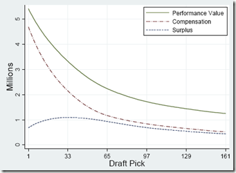
image
The implications of this outcome are severe.  All else being equal, if someone offers you an early 2nd round draft pick for your early 1st round draft pick, they should be demanding compensation from you (of course, marginally valuable players have diminishing marginal value, because you can only have/play so many of them at a time).

5. When the price is right: Gamble.

This rule applies to fiscal decisions, just as it does to in-game ones.  NFL teams are notoriously risk-averse in a number of areas: they are afraid that someone after one down season is washed up, or that an outspoken player will ‘disrupt’ the locker room, or that a draft pick might have ‘character issues’.  These sorts of questions regularly lead to lengthy draft slides and dried-up free agent markets.  And teams are right to be concerned: these are valid possibilities that increase uncertainty.  Of course, there are other possibilities. Your free agent target simply may not be as good as you hope they are, or your draft pick may simply bust out.  Compare to late-game 4th-down decisions: Sometimes going for it on 4th down will cause you to lose immediately and face a maelstrom of criticism from fans and press, where punting or kicking may quietly lead to losing more often.  Similarly, when a team takes a high-profile personnel gamble and it fails, they may face a maelstrom of criticism from fans and press, where the less controversial choice might quietly lead to more failure.

The economizing strategy here is to favor risks when they are low cost but have high upsides.  In other words, don’t risk a huge chunk of your cap space on an uncertain free agent prospect, risk a tiny chunk of your cap space on an even more uncertain prospect that could work out like gangbusters.

Evaluation:

Now, if only there were a team and coach dedicated to these principles—or at least, for contrapositive’s sake, a team that seemed to embrace the opposite.

Oh wait, we have both!  In the last decade, Bill Belichick and the New England Patriots have practically embodied these principles, and in the process they’ve won 3 championships, have another 16-0/18-1 season, have set the overall NFL win-streak records, and are presently the #1 overall seed in this year’s playoffs. OTOH, the Redskins have practically embodied the opposite, and they have… um… not.
Note that the Patriots’ success has come despite a league fiscal system that allows teams to “load up” on individual seasons, distributing the cost onto future years (which, again, helps explain the extreme regression effect present in the NFL).  Considering the long odds of winning a Super Bowl—even with a solid contender—this seems like an unwise long-run strategy, and the most successful team of this era has cleverly taken the long view throughout.

Conclusions

The evidence in MLB and in the NBA is ironclad: Basic economic reasoning is extremely probative when predicting the underlying dynamics behind winning titles.  Over the last 20 years of pro baseball, the top 3 spenders in the league each year win 57% of the championships.  Over a similar period in basketball, the 5 (or fewer) teams with 1st-Team All-NBA players have won 95%.

In the NFL, the evidence is more nuance and anecdote than absolute proof.  However, our ex ante musing does successfully predict that neither excessive spending nor recruiting star players at any cost (excepting possibly quarterbacks) is a dominant strategy.

On balance, I would say that the C.R.E.A.M. hypothesis is substantially more supported by the data than I would have guessed.
The Case for Dennis Rodman, Part 2/4 (a)(i)—Player Valuation and Conventional Wisdom

Dennis Rodman is a – perhaps the – classic hard case for serious basketball valuation analysis.  The more you study him, the more you are forced to engage in meta-analysis: that is, examining the advantages and limitations of the various tools in the collective analytical repertoire.  Indeed, it’s even more than a hard case, it’s an extremely important one: it is just these conspicuously difficult situations where reliable analytical insight could be most useful, yet depending on which metric you choose, Rodman is either a below-average NBA player or one of the greatest of all time.  Moreover, while Rodman may be an “extreme” of sorts, this isn’t Newtonian Physics: the problems with player valuation modeling that his case helps reveal – in both conventional and unconventional forms – apply very broadly.

This section will use Dennis Rodman as a case study for my broader critique of both conventional and unconventional player valuation methods.  Sub-section (i) introduces my criticism and deals with conventional wisdom, and sub-section (ii) deals with unconventional wisdom and beyond.  Section (b) will then examine how valuable Rodman was specifically, and why.  Background here, here, here, here, and here.

First – A Quick Meta-Critique:

Why is it that so many sports-fans pooh-pooh advanced statistical analysis, yet, when making their own arguments, spout nothing but statistics?

  • [So-and-so] scored 25 points per game last season, solidifying their position in the NBA elite.
  • [Random QB] had ten 3000-yard passing seasons, he is sooo underrated.
  • [Player x]’s batting average is down 50 points, [team y] should trade him while they still can.

Indeed, the vast majority of people are virtually incapable of making sports arguments that aren’t stats-based in one way or another.  Whether he knows it or not, Joe Average is constantly learning and refining his preferred models, which he then applies to various problems, for a variety of purposes — not entirely unlike Joe Academic.  Yet chances are he remains skeptical of the crazy-talk he hears from the so-called “statistical experts” — and there is truth to this skepticism: a typical “fan” model is extremely flexible, takes many more variables from much more diverse data into account, and ultimately employs a very powerful neural network to arrive at its conclusions.  Conversely, the “advanced” models are generally rigid, naïve, over-reaching, hubristic, prove much less than their creators believe, and claim even more.  Models are to academics like screenplays are to Hollywood waiters: everyone has one, everyone thinks theirs is the best, and most of them are garbage.  The broad reliability of “common sense” over time has earned it the benefit of the doubt, despite its high susceptibility to bias and its abundance of easily-provable errors.

The key is this: While finding and demonstrating such error is easy enough, successfully doing so should not – as it so often does – lead one (or even many) to presume that it qualifies them to replace that wisdom, in its entirety, with their own.

I believe something like this happened in the basketball analytic community:  reacting to the manifest error in conventional player valuation, the statisticians have failed to recognize the main problem – one which I will show actually limits their usefulness – and instead have developed an “unconventional” wisdom that ultimately makes many of the same mistakes.

Conventional Wisdom – Points, Points, Points:

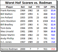
The standard line among sports writers and commentators today is that Dennis Rodman’s accomplishments “on the court” would easily be sufficient to land him in the Hall of Fame, but that his antics “off the court” may give the voters pause.  This may itself be true, but it is only half the story:  If, in addition to his other accomplishments, Rodman had scored 15 points a game, I don’t think we’d be having this discussion, or really even close to having this discussion (note, this would be true whether or not those 15 points actually helped his teams in any way).  This is because the Hall of Fame reflects the long-standing conventional wisdom about player valuation: that points (especially per game) are the most important measure of a player’s (per game) contribution.
Whether most people would explicitly endorse this proposition or not, it is still reflected in systematic bias.  The story goes something like this:  People watch games to see the players do cool things, like throw a ball from a long distance through a tiny hoop, and experience pleasure when it happens.  Thus, because pleasure is good, they begin to believe that those players must be the best players, which is then reinforced by media coverage that focuses on point totals, best dunks plays of the night, scoring streaks, scoring records, etc.  This emphasis makes them think these must also be the most important players, and when they learn about statistics, that’s where they devote their attention.  Everyone knows about Kobe’s 81 points in a game, but how many people know about Scott Skiles’s 30 assists? or Charles Oakley’s 35 rebounds? or Rodman’s 18 offensive boards? or Shaq’s 15 blocks?  Many fans even know that Mark Price is the all-time leader in free throw percentage, or that Steve Kerr is the all-time leader in 3 point percentage, but most have never even heard of rebound percentage, much less assist percentage or block percentage.  And, yes, for those who vote for the Hall of Fame, it is also reflected in their choices.  Thus, before dealing with any fall-out for his off-court “antics,” the much bigger hurdle to Dennis Rodman’s induction looks like this:

image

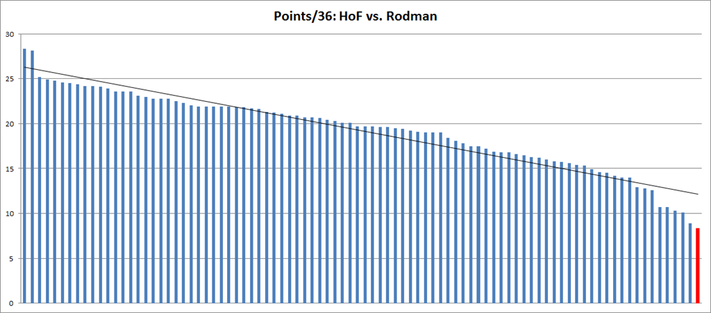
This list is the bottom-10 per-game scorers (of players inducted within 25 years of their retirement).  If Rodman were inducted, he would be the single lowest point-scorer in HoF history.  And looking at the bigger picture, it may even be worse than that.  Here’s a visual of all 89 Hall of Famers with stats (regardless of induction time), sorted from most points to fewest:

image

So not only would he be the lowest point scorer, he would actually have significantly fewer points than a (linear) trend-line would predict the lowest point scorer to have (and most of the smaller bars just to the left of Rodman were Veteran’s Committee selections).  Thus, if historical trends reflect the current mood of the HoF electorate, resistance is to be expected.

The flip-side, of course, is the following:

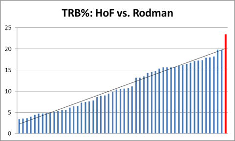
imageNote: this graphic only contains the players for whom this stat is available, though, as I demonstrated previously, there is no reason to believe that earlier players were any better.
Clearly, my first thought when looking at this data was, “Who the hell is this guy with a TRB% of only 3.4?”  That’s only 1 out of every *30* rebounds!* The league average is (obviously) 1 out of 10.  Muggsy Bogues — the shortest player in the history of the NBA (5’3”) — managed to pull in 5.1%, about 1 out of every 20.  On the other side, of course, Rodman would pace the field by a wide margin – wider, even, than the gap between Jordan/Chamberlain and the field for scoring (above).  Of course, the Hall of Fame traditionally doesn’t care that much about rebounding percentages:

image

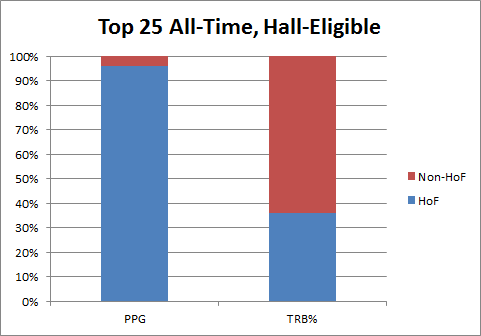
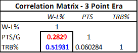
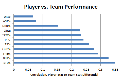
So, of eligible players, 24 of the top 25 leaders in points per game are presently in the Hall (including the top 19 overall), while only 9 of the top 25 leaders in total rebound percentage can say the same.  This would be perfectly rational if, say, PPG was way way more important to winning than TRB%.  But this seems unlikely to me, for at least two reasons: 1) As a rate stat, TRB% shouldn’t be affected significantly by game or team pace, as PPG is; and 2) TRB% has consequences on both offense and defense, whereas PPG is silent about the number of points the player/team has given up.  To examine this question, I set up a basic correlation of team stats to team winning percentage for the set of every team season since the introduction of the 3-point shot.  Lo and behold, it’s not really close:

image

Yes, correlation does not equal causation, and team scoring and rebounding are not the same as individual scoring and rebounding.  This test isn’t meant to prove conclusively that rebounding is more important than scoring, or even gross scoring — though, at the very least, I do think it strongly undermines the necessity of the opposite: that is, the assumption that excellence in gross point-scoring is indisputably more significant than other statistical accomplishments.
Though I don’t presently have the data to confirm, I would hypothesize (or, less charitably, guess) that individual TRB% probably has a more causative effect on team TRB% than individual PPG does on team PPG [see addendum] (note, to avoid any possible misunderstanding, I mean this only w/r/t PPG, not points-per-possession, or anything having to do with shooting percentages, true or otherwise).  Even with the proper data, this could be a fairly difficult hypothesis to test, since it can be hard to tell (directly) whether a player scoring a lot of points causes his team to score a lot of points, or vice versa.  However, that hypothesis seems to be at least partially supported by studies that others have conducted on rebound rates – especially on the offensive side (where Rodman obviously excelled).

The conventional wisdom regarding the importance of gross points is demonstrably flawed on at least two counts: gross, and points.  In sub-section (ii), I will look at how the analytical community attempted to deal with these problems, as well as at how they repeated them.
*(It’s Tiny Archibald)


Addendum (4/20/11):

I posted this as a Graph of the Day a while back, and thought I should add it here:
image

More info in the original post, but the upshot is that my hypothesis that “individual TRB% probably has a more causative effect on team TRB% than individual PPG does on team PPG” appears to be confirmed (the key word is “differential”).

News and Updates

First, the (Non-)News:

As some of you know, several months ago I applied for a position as a sports analytics specialist (amazing job description, and it even pays money).  The evaluation process has been wild, including *8* rounds of assessments and interviews. I feel like I’ve made my case as about as well as I can, though from what I understand the competition is something fierce — so it could easily go either way.  With a final outcome being (or at least seeming) imminent for quite a while now, I have held off on posting new material.  In truth, this hiatus has been much longer than I expected, so my apologies to Dennis Rodman.

If I get the job, it is not clear what will happen to the blog, as I haven’t yet discussed it with my potential employers.  But if I don’t get the job, I’m happy to report that the blog will proceed with my full commitment as well as my full-time attention.  Specifically — as insisted by my wife – that means no fewer than 40 hours of work and 5 posts per week.

Out of fairness to my loyal reader(s), no matter what happens I will be publishing the remainder of the Rodman series, as well as my long-promised (and recently-revamped) Tennis Service Aggression Calculator, and any necessary follow-ups to other items, such as the following:

Catching Wayne Gretzky:

During the last NHL season, I noted that Alexander Ovechkin and Sidney Crosby had thus-far failed to break Wayne Gretzky’s single-season point-scoring record from 1984, combined.  But I guess records are meant to be broken!  With 109 each, AO and SC’s 218 points in the 09-10 season just edges Gretzky’s 215.  Congrats, new guys!

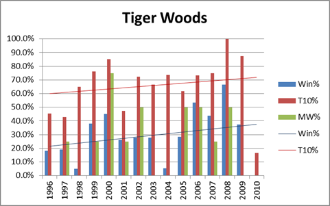
Tiger Woods Still Needs a Therapist:

Tiger has truly had a terrible year — on the golf course. I’ve updated this older graph to include the full season of data, though the upshot is basically the same:

image

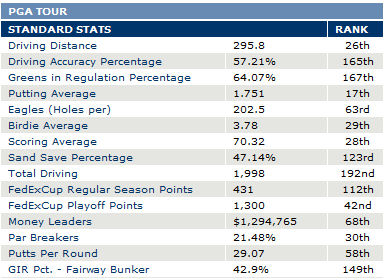
Much has been made of Tiger losing his #1 overall ranking to Lee Westwood, but the situation is actually much more dire: If Tiger continues to play this poorly, he could be in danger of losing his status as an above average PGA golfer.  Take a look at this summary of stats from his 2010 PGA season (from the PGA website):

stat summaries
Eliminating FedEx Cup Points and earnings from the list, he still averaged right around 87th for these measures (there are about 190 PGA regulars).  His adjusted scoring average ranks 28th, which would itself be unthinkable for Tiger, but even 28th may be generous: the weighted figure is bolstered by relatively good showings in strong fields at the Masters and U.S. Open, but Tiger actually performed worse in weaker fields.  Let’s quickly look at his unadjusted scoring (same source):

image

Tiger typically plays a tougher schedule than your average golfer, for sure, but that hasn’t stopped him in the past:  he led the PGA in both adjusted AND unadjusted scoring average each of the past 5 seasons.

The Rams are Definitely Regressing:

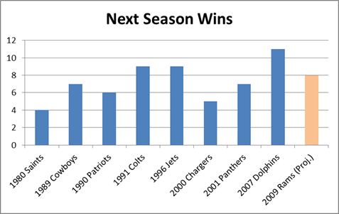
The St. Louis Rams are currently 6-6, which, oddly enough, puts them right about on track for 1-15 teams historically:

image
(So maybe my hypothesis has some teeth to it after all.)

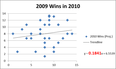
Relatedly, so far this has been a hallmark year for regression to the mean.  Here is a scatterplot of 2010 wins by 2009 wins (functionally equivalent to the bubble charts in the Rams post):

image

That .18 coefficient is very low, even by recent standards.  The coefficient for he equivalent trendline for season to season wins since the implementation of the salary cap in 1993 is .30.

From the “Never Question Bill Belichick” Department:

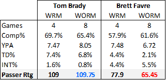
Randy Moss is having a nightmare year.  Granted, he has had to play for 3 different teams and 5 different starting quarterbacks, but there is no evidence of him having his usual impact – either directly or indirectly.  The good news is that he won’t reach 9 games with a single quarterback, and thus won’t spoil his nifty “WOWY” graphs.  The bad news is that the Pats, Vikes, and Titans all have worse records with him in the line-up than without him.

At mid-season, ESPN Stats & Info applied a methodology similar to mine, and things didn’t look so bad.  But Brady’s recent hot streak has mostly killed the disparity:

image

(Recall that even Favre’s 12 point difference in QB Rating is low by Moss’s standards).

Man >> Machine >> Monkey:

Finally, I’ve been tracking the performance of my neural network’s predictions vs. Football Outsiders’ DVOA Projections and Advanced NFL Stats’ Koko model (Recall that in recent years, F.O. has performed the worst).  Since the original metric I was using for comparison was correlation, which is sensitive to the number of games played, I can’t really do a precise analysis until the season is over.  But suffice it to say:  Football Outsiders has struck back — with a vengeance — and has a seemingly insurmountable lead going into the back stretch.  On the other side, Koko is getting demolished.  Since Koko is entirely based on the previous season’s win total, its poor performance is somewhat unsurprising considering the regression graph above (which, incidentally, Koko is not doing much better than).  My neural network, meanwhile, is plugging along just slightly below its previous averages.

Giving credit where it’s due, this range of performance actually makes the F.O. predictions that much more impressive: normally, the previous season is either predictive or it’s not, and the models’ performances tend to move together.  My speculation would be that perhaps the many exogenous variables that F.O. uses and the other models don’t are particularly important this year.

UPDATE: Advanced NFL Stats Admits I Was Right. Sort Of.

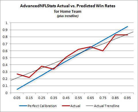
Background:  In January, long before I started blogging in earnest, I made several comments on this Advanced NFL Stats post that were critical of Brian Burke’s playoff prediction model, particularly that, with 8 teams left, it predicted that the Dallas Cowboys had about the same chance of winning the Super Bowl as the Jets, Ravens, Vikings, and Cardinals combined. This seemed both implausible on its face and extremely contrary to contract prices, so I was skeptical.  In that thread, Burke claimed that his model was “almost perfectly calibrated. Teams given a 0.60 probability to win do win 60% of the time, teams given a 0.70 probability win 70%, etc.”  I expressed interest in seeing his calibration data, ”especially for games with considerable favorites, where I think your model overstates the chances of the better team,” but did not get a response.

I brought this dispute up in my monstrously-long passion-post, “Applied Epistemology in Politics and the Playoffs,” where I explained how, even if his model was perfectly calibrated, it would still almost certainly be underestimating the chances of the underdogs.  But now I see that Burke has finally posted the calibration data (compiled by a reader from 2007 on).  It’s a very simple graph, which I’ve recreated here, with a trend-line for his actual data:

image

Now I know this is only 3+ years of data, but I think I can spot a trend:  for games with considerable favorites, his model seems to overstate the chances of the better team.  Naturally, Burke immediately acknowledges this error:

On the other hand, there appears to be some trends. the home team is over-favored in mismatches where it is the stronger team and is under-favored in mismatches where it is the weaker team. It’s possible that home field advantage may be even stronger in mismatches than the model estimates.

Wait, what? If the error were strictly based on stronger-than-expected home-field advantage, the red line should be above the blue line, as the home team should win more often than the model projects whether it is a favorite or not – in other words, the actual trend-line would be parallel to the “perfect” line but with a higher intercept.  Rather, what we see is a trend-line with what appears to be a slightly higher intercept but a somewhat smaller slope, creating an “X” shape, consistent with the model being least accurate for extreme values.  In fact, if you shifted the blue line slightly upward to “shock” for Burke’s hypothesized home-field bias, the “X” shape would be even more perfect: the actual and predicted lines would cross even closer to .50, while diverging symmetrically toward the extremes.

Considering that this error compounds exponentially in a series of playoff games, this data (combined with the still-applicable issue I discussed previously), strongly vindicates my intuition that the market is more trustworthy than Burke’s playoff prediction model, at least when applied to big favorites and big dogs.

Yes ESPN, Professional Kickers are Big Fat Chokers

A couple of days ago, ESPN’s Peter Keating blogged about “icing the kicker” (i.e., calling timeouts before important kicks, sometimes mere instants before the ball is snapped).  He argues that the practice appears to work, at least in overtime.  Ultimately, however, he concludes that his sample is too small to be “statistically significant.”  This may be one of the few times in history where I actually think a sports analyst underestimates the probative value of a small sample: as I will show, kickers are generally worse in overtime than they are in regulation, and practically all of the difference can be attributed to iced kickers.  More importantly, even with the minuscule sample Keating uses, their performance is so bad that it actually is “significant” beyond the 95% level.

In Keating’s 10 year data-set, kickers in overtime only made 58.1% of their 35+ yard kicks following an opponent’s timeout, as opposed to 72.7% when no timeout was called.  The total sample size is only 75 kicks, 31 of which were iced.  But the key to the analysis is buried in the spreadsheet Keating links to: the average length of attempted field goals by iced kickers in OT was only 41.87 yards, vs. 43.84 yards for kickers at room temperature.  Keating mentions this fact in passing, mainly to address the potential objection that perhaps the iced kickers just had harder kicks — but the difference is actually much more significant.
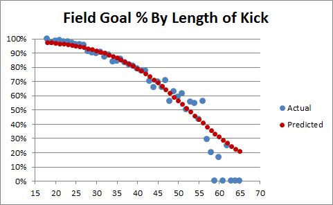
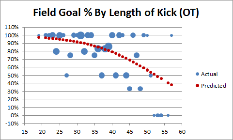
To evaluate this question properly, we first need to look at made field goal percentages broken down by yard-line.  I assume many people have done this before, but in 2 minutes of googling I couldn’t find anything useful, so I used play-by-play data from 2000-2009 to create the following graph:

image

The blue dots indicate the overall field-goal percentage from each yard-line for every field goal attempt in the period (around 7500 attempts total – though I’ve excluded the one 76 yard attempt, for purely aesthetic reasons).  The red dots are the predicted values of a logistic regression (basically a statistical tool for predicting things that come in percentages) on the entire sample.  Note this is NOT a simple trend-line — it takes every data point into account, not just the averages.  If you’re curious, the corresponding equation (for predicted field goal percentage based on yard line x) is as follows:

 \large{1 - \dfrac{e^{-5.5938+0.1066x}} {1+e^{-5.5938+0.1066x}}}

The first thing you might notice about the graph is that the predictions appear to be somewhat (perhaps unrealistically) optimistic about very long kicks.  There are a number of possible explanations for this, chiefly that there are comparatively few really long kicks in the sample, and beyond a certain distance the angle of the kick relative to the offensive and defensive linemen becomes a big factor that is not adequately reflected by the rest of the data (fortunately, this is not important for where we are headed).  The next step is to look at a similar graph for overtime only — since the sample is so much smaller, this time I’ll use a bubble-chart to give a better idea of how many attempts there were at each distance:

image

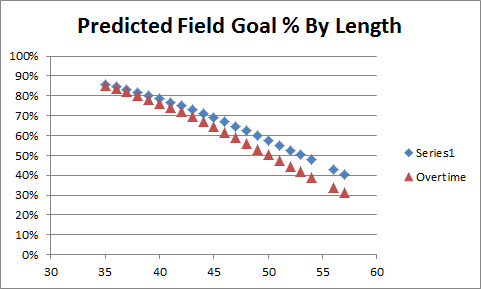
For this graph, the sample is about 1/100th the size of the one above, and the regression line is generated from the OT data only.  As a matter of basic spatial reasoning — even if you’re not a math whiz — you may sense that this line is less trustworthy.  Nevertheless, let’s look at a comparison of the overall and OT-based predictions for the 35+ yard attempts only:

image

Note: These two lines are slightly different from their counterparts above.  To avoid bias created by smaller or larger values, and to match Keating’s sample, I re-ran the regressions using only 35+ yard distances that had been attempted in overtime (they turned out virtually the same anyway).

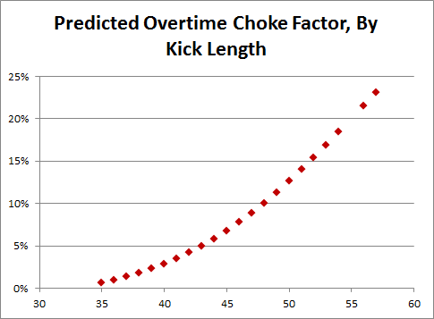
Comparing the two models, we can create a predicted “Choke Factor,” which is the percentage of the original conversion rate that you should knock off for a kicker in an overtime situation:

image

A weighted average (by the number of OT attempts at each distance) gives us a typical Choke Factor of just over 6%.  But take this graph with a grain of salt: the fact that it slopes upward so steeply is a result of the differing coefficients in the respective regression equations, and could certainly be a statistical artifact.  For my purposes however, this entire digression into overtime performance drop-offs is merely for illustration:  The main calculation relevant to Keating’s iced kick discussion is a simple binomial probability:  Given an average kick length of 41.87 yards, which carries a predicted conversion rate of 75.6%, what are the odds of converting only 18 or fewer out of 31 attempts?  OK, this may be a mildly tricky problem if you’re doing it longhand, but fortunately for us, Excel has a BINOM.DIST() function that makes it easy:

image

Note : for people who might not pick:  Yes, the predicted conversion rate for the average length is not going to be exactly the same as the average predicted value for the length of each kick.  But it is very close, and close enough.

As you can see, the OT kickers who were not iced actually did very slightly better than average, which means that all of the negative bias observed in OT kicking stems from the poor performance seen in just 31 iced kick attempts.  The probability of this result occurring by chance — assuming the expected conversion rate for OT iced kicks were equal to the expected conversion rate for kicks overall — would be only 2.4%.  Of course, “probability of occurring by chance” is the definition of statistical significance, and since 95% against (i.e., less than 5% chance of happening) is the typical threshold for people to make bold assertions, I think Keating’s statement that this “doesn’t reach the level of improbability we need to call it statistically significant” is unnecessarily humble.  Moreover, when I stated that the key to this analysis was the 2 yard difference that Keating glossed over, that wasn’t for rhetorical flourish:  if the length of the average OT iced kick had been the same as the length of the average OT regular kick,  the 58.1% would correspond to a “by chance” probability of 7.6%, obviously not making it under the magic number.

A History of Hall of Fame QB-Coach Entanglement

Last week on PTI, Dan LeBatard mentioned an interesting stat that I had never heard before: that 13 of 14 Hall of Fame coaches had Hall of Fame QB’s play for them.  LeBatard’s point was that he thought great quarterbacks make their coaches look like geniuses, and he was none-too-subtle about the implication that coaches get too much credit.  My first thought was, of course: Entanglement, anyone? That is to say, why should he conclude that the QB’s are making their coaches look better than they are instead of the other way around?  Good QB’s help their teams win, for sure, but winning teams also make their QB’s look good.  Thus – at best – LeBatard’s stat doesn’t really imply that HoF Coaches piggyback off of their QB’s success, it implies that the Coach and QB’s successes are highly entangled.  By itself, this analysis might be enough material for a tweet, but when I went to look up these 13/14 HoF coach/QB pairs, I found the history to be a little more interesting than I expected.

First, I’m still not sure exactly which 14 HoF coaches LeBatard was talking about.  According the the official website, there are 21 people in the HoF as coaches.  From what I can tell, 6 of these (Curly Lambeau, Ray Flaherty, Earle Neale, Jimmy Conzelman, Guy Chamberlain and Steve Owen) coached before the passing era, so that leaves 15 to work with.  A good deal of George Halas’s coaching career was pre-pass as well, but he didn’t quit until 1967 – 5 years later than Paul Brown – and he coached a Hall of Fame QB anyway (Sid Luckman).  Of the 15, 14 did indeed coach HoF QB’s, at least technically.

To break the list down a little, I applied two threshold tests:  1) Did the coach win any Super Bowls (or league championships before the SB era) without their HoF QB?  And 2) In the course of his career, did the coach have more than one HoF QB?  A ‘yes’ answer to either of these questions I think precludes the stereotype of a coach piggybacking off his star player (of course, having coached 2 or more Hall of Famer’s might just mean that coach got extra lucky, but subjectively I think the proxy is fairly accurate).  Here is the list of coaches eliminated by these questions:

[table “5” not found /]
Joe Gibbs wins the outlier prize by a mile: not only did he win 3 championships “on his own,” he did it with 3 different non-HoF QB’s.  Don Shula had 3 separate eras of greatness, and I think would have been a lock for the hall even with the Griese era excluded.  George Allen never won a championship, but he never really had a HoF QB either: Jurgensen (HoF) served as Billy Kilmer (non-HoF)’s backup for the 4 years he played under Allen.  Sid Gillman had a long career, his sole AFL championship coming with the Chargers in 1963 – with Tobin Rote (non-HoF) under center.  Weeb Ewbank won 2 NFL championships in Baltimore with Johnny Unitas, and of course won the Super Bowl against Baltimore and Unitas with Joe Namath.  Finally, George Halas won championships with Pard Pearce (5’5”, non-HoF), Carl Brumbaugh (career passer rating: 34.9, non-HoF), Sid Luckman (HoF) and Billy Wade (non-HoF).  Plus, you know, he’s George Halas.
[table “1” not found /]
Though Chuck Noll won all of his championships with Terry Bradshaw (HoF), those Steel Curtain teams weren’t exactly carried by the QB position (e.g., in the 1974 championship season, Bradshaw averaged less than 100 passing yards per game).  Bill Walsh is a bit more borderline: not only did all of his championships come with Joe Montana, but Montana also won a Super Bowl without him.  However, considering Walsh’s reputation as an innovator, and especially considering his incredible coaching tree (which has won nearly half of all the Super Bowls since Walsh retired in 1989), I’m willing to give him credit for his own notoriety.  Finally, Vince Lombardi, well, you know, he’s Vince Lombardi.

Which brings us to the list of the truly entangled:
[table “4” not found /]
I waffled a little on Paul Brown, as he is generally considered an architect of the modern league (and, you know, a team is named after him), but unlike Lombardi, Walsh and Knoll, Brown’s non-Otto-Graham-entangled accomplishments are mostly unrelated to coaching.  I’m sure various arguments could be made about individual names (like, “You crazy, Tom Landry is awesome”), but the point of this list isn’t to denigrate these individuals, it’s simply to say that these are the HoF coaches whose coaching successes are the most difficult to isolate from their quarterback’s.

I don’t really want to speculate about any broader implications, both because the sample is too small to make generalizations, and because my intuition is that coaches probably do get too much credit for their good fortune (whether QB-related or not).  But regardless, I think it’s clear that LeBatard’s 13/14 number is highly misleading.

Why Not Balls and Strikes?

To expand a tiny bit on something I tweeted the other day, I swear there’s a rule (perhaps part of the standard licensing agreement with MLB), that any time anyone on television mentions the idea of expanding instant replay (or “use of technology”) in baseball, they are required to qualify their statement by assuring the audience that they do not mean for balls and strikes.  But why not?  If any reason is given, it is usually some variation of the following: 1) Balls and strikes are inherently too subjective, 2) It would slow the game down too much, or 3) The role of the umpire is too important.  None of these seems persuasive to me, at least when applied to the strike zone’s horizontal axis — i.e., the plate:

1. The plate is not subjective.

In little league, we were taught that the strike zone was “elbows to knees and over the plate,” and surprisingly enough, the official major league baseball definition is not that much more complicated (from the Official Baseball Rules 2010, page 22):

A STRIKE is a legal pitch when so called by the umpire, which . . . is not struck at, if any part of the ball passes through any part of the strike zone. . . .
The STRIKE ZONE is that area over home plate the upper limit of which is a horizontal line at the midpoint between the top of the shoulders and the top of the uniform pants, and the lower level is a line at the hollow beneath the kneecap.  The Strike Zone shall be determined from the batter’s stance as the batter is prepared to swing at a pitched ball.

I can understand several reasons why there may be need for a human element in judging the vertical axis of the zone, such as to avoid gamesmanship like crouching or altering your stance while the ball is in the air, or to make reasonable exceptions in cases where someone has kneecaps on their stomach, etc.  But there is nothing subjective about “any part of the ball passes through any part of . . . the area over home plate.”

2. The plate is not hard to check.

I mean, if they can photograph lightning:

lightning

They should be able to tell whether a solid ball passes over a small irregular pentagon.  Yes, replay takes a while when you have to look at 15 different angles to find the right one, or when you have to cognitively construct a 3-dimensional image from several 2-dimensional videos.  It even takes a little while when you have to monitor a long perimeter to see if oddly shaped objects have crossed them (like tennis balls on impact or player’s shoes in basketball).  But checking whether a baseball crossed the plate takes no time at all: they already do it virtually without delay on television, and that process could be sped up at virtually no cost with one dedicated camera: let it take a long-exposure picture of the plate for each pitch, then instantly beam it to an iPhone strapped to the umpire’s wrist.  He can check it in the course of whatever his natural motion for signaling a ball or strike would have been, and he’ll probably save time by not having players and managers up in his face every other pitch.

3. The plate is a waste of the umpire’s time, but not ours.

Umpires are great, they make entertaining gesticulating motions, and maybe in some extremely slight sense, people actually do go to the game to boo and hiss at them — I’m not suggesting MLB puts HAL back there.  But as much as people love officiating controversies generally, umpires are so inconsistent and error-prone about the strike zone (which, you know, only matters like 300 times per game) that fans are too jaded to even care.  There are enough actually subjective calls for umpires to blow, they don’t need to be spending their time and attention on something so objective, so easy to check, and so important.

(Photo Credit: “Lightning on the Columbia River” by phatman.)