I guess it’s funky graph day here at SSA:
This one corresponds to the bubble-graphs in this post about regression to the mean before and after the introduction of the salary cap. Each colored ball represents one of the 32 teams, with wins in year n on the x axis and wins in year n+1 on the y axis. In case you don’t find the visual interesting enough in its own right, you’re supposed to notice that it gets crazier right around 1993.
Graph of the Day: Rodman, Visualized—An Outlier in Motion
(Just press play.)
The Case for Dennis Rodman, Part 1/4 (c)—Rodman v. Ancient History
One of the great false myths in basketball lore is that Wilt Chamberlain and Bill Russell were Rebounding Gods who will never be equaled, and that dominant rebounders like Dennis Rodman should count their blessings that they got to play in a era without those two deities on the court. This myth is so pervasive that it is almost universally referenced as a devastating caveat whenever sports commentators and columnists discuss Rodman’s rebounding prowess. In this section, I will attempt to put that caveat to death forever.
The less informed version of the “Chamberlain/Russell Caveat” (CRC for short) typically goes something like this: “Rodman led the league in rebounding 7 times, making him the greatest re bounder of his era, even though his numbers come nowhere near those of Chamberlain and Russell.” It is true that, barring some dramatic change in the way the game is played, Chamberlain’s record of 27.2 rebounds per game, set in the 1960-61 season, will stand forever. This is because, due to the fast pace and terrible shooting, the typical game in 1960-61 featured an average of 147 rebounding opportunities. During Rodman’s 7-year reign as NBA rebounding champion (from 1991-92 through 1997-98), the typical game featured just 84 rebounding opportunities. Without further inquiry, this difference alone means that Chamberlain’s record 27.2 rpg would roughly translate to 15.4 in Rodman’s era – over a full rebound less than Rodman’s ~16.7 rpg average over that span.
The slightly more informed (though equally wrong) version of the CRC is a plea of ignorance, like so: “Rodman has the top 7 rebounding percentages since the NBA started to keep the necessary statistics in 1970. Unfortunately, there is no game-by-game or individual opponent data prior to this, so it is impossible to tell whether Rodman was as good as Russell or Chamberlain” (this point also comes in many degrees of snarky, like, “I’ll bet Bill and Wilt would have something to say about that!!!”). We may not have the necessary data to calculate Russell and Chamberlain’s rebounding rates, either directly or indirectly. But, as I will demonstrate, there are quite simple and extremely accurate ways to estimate these figures within very tight ranges (which happen to come nowhere close to Dennis Rodman).
Before getting into rebounding percentages, however, let’s start with another way of comparing overall rebounding performance: Team Rebound Shares. Simply put, this metric is the percentage of team rebounds that were gotten by the player in question. This can be done for whole seasons, or it can be approximated over smaller periods, such as per-game or per-minute, even if you don’t have game-by-game data. For example, to roughly calculate the stat on a per-game basis, you can simply take a player’s total share of rebounds (their total rebounds/team’s total rebounds), and divide by the percentage of games they played (player gms/team gms). I’ve done this for all of Rodman, Russell and Chamberlain’s seasons, and organized the results as follows:

As we can see, Rodman does reasonably well in this metric, still holding the top 4 seasons and having a better average through 7. This itself is impressive, considering Rodman averaged about 35 minutes per game and Wilt frequently averaged close to 48.
I should note, in Chamberlain’s favor, that one of the problems I have with PER and its relatives is that they don’t give enough credit for being able to contribute extra minutes, as Wilt obviously could. However, since here I’m interested more in each player’s rebounding ability than in their overall value, I will use the same equation as above (plus dividing by 5, corresponding to the maximum minutes for each player) to break the team rebounding shares down by minute:

This is obviously where Rodman separates himself from the field, even pulling in >50% of his team’s rebounds in 3 different seasons. Of course, this only tells us what it tells us, and we’re looking for something else: Total Rebounding percentage. Thus, the question naturally arises: how predictive of TRB% are “minute-based team rebound shares”?
In order to answer this question, I created a slightly larger data-set, by compiling relevant full-season statistics from the careers of Dennis Rodman, Dwight Howard, Tim Duncan, David Robinson, and Hakeem Olajuwon (60 seasons overall). I picked these names to represent top-level rebounders in a variety of different situations (and though these are somewhat arbitrary, this analysis doesn’t require a large sample). I then calculated TRS by minute for each season and divided by 2 — roughly corresponding to the player’s share against 10 players instead of 5. Thus, all combined, my predictive variable is determined as follows:
Note that this formula may have flaws as an independent metric, but if it’s predictive enough of the metric we really care about — Total Rebound % — those no longer matter. To that end, I ran a linear regression in Excel comparing this new variable to the actual values for TRB%, with the following output:

If you don’t know how to read this, don’t sweat it. The “R Square” of .98 pretty much means that our variable is almost perfectly predictive of TRB%. The two numbers under “Coefficients” tell us the formula we should use to make predictions based on our variable:

Putting the two equations together, we have a model that predicts a player’s rebound percentage based on 4 inputs:

Now again, if you’re familiar with regression output, you can probably already see that this model is extremely accurate. But to demonstrate that fact, I’ve created two graphs that compare the predicted values with actual values, first for Dennis Rodman alone:

And then for the full sample:

So, the model seems solid. The next step is obviously to calculate the predicted total rebound percentages for each of Wilt Chamberlain and Bill Russell’s seasons. After this, I selected the top 7 seasons for each of the three players and put them on one graph (Chamberlain and Russell’s estimates vs. Rodman’s actuals):

It’s not even close. It’s so not close, in fact, that our model could be way off and it still wouldn’t be close. For the next two graphs, I’ve added error bars to the estimation lines that are equal to the single worst prediction from our entire sample (which was a 1.21% error, or 6.4% of the underlying number): [I should add a technical note, that the actual expected error should be slightly higher when applied to “outside” situations, since the coefficients for this model were “extracted” from the same data that I tested the model on. Fortunately, that degree of precision is not necessary for our purposes here.] First Rodman vs. Chamberlain:

Then Rodman vs. Russell:

In other words, if the model were as inaccurate in Russell and Chamberlain’s favor as it was for the worst data point in our data set, they would still be crushed. In fact, over these top 7 seasons, Rodman beats R&C by an average of 7.2%, so if the model understated their actual TRB% every season by 5 times as much as the largest single-season understatement in our sample, Rodman would still be ahead [edit: I’ve just noticed that Pro Basketball Reference has a TRB% listed for each of Chamberlain’s last 3 seasons. FWIW, this model under-predicts one by about 1%, over-predicts one by about 1%, and gets the third almost on the money (off by .1%)].
To stick one last dagger in CRC’s heart, I should note that this model predicts that Chamberlain’s best TRB% season would have been around 20.16%, which would rank 67th on the all-time list. Russell’s best of 20.08 would rank 72nd. Arbitrarily giving them 2% for the benefit of the doubt, their best seasons would still rank 22nd and 24th respectively.
The Case for Dennis Rodman, Part 1/4 (b)—Defying the Laws of Nature
In this post I will be continuing my analysis of just how dominant Dennis Rodman’s rebounding was. Subsequently, section (c) will cover my analysis of Wilt Chamberlain and Bill Russell, and Part 2 of the series will begin the process of evaluating Rodman’s worth overall.
For today’s analysis, I will be examining a particularly remarkable aspect of Rodman’s rebounding: his ability to dominate the boards on both ends of the court. I believe this at least partially gets at a common anti-Rodman argument: that his rebounding statistics should be discounted because he concentrated on rebounding to the exclusion of all else. This position was publicly articulated by Charles Barkley back when they were both still playing, with Charles claiming that he could also get 18+ rebounds every night if he wanted to. Now that may be true, and it’s possible that Rodman would have been an even better player if he had been more well-rounded, but one thing I am fairly certain of is that Barkley could not have gotten as many rebounds as Rodman the same way that Rodman did.
The key point here is that, normally, you can be a great offensive rebounder, or you can be a great defensive rebounder, but it’s very hard to be both. Unless you’re Dennis Rodman:
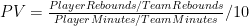
To prepare the data for this graph, I took the top 1000 rebounding seasons by total rebounding percentage (the gold-standard of rebounding statistics, as discussed in section (a)), and ranked them 1-1000 for both offensive (ORB%) and defensive (DRB%) rates. I then scored each season by the higher (larger number) ranking of the two. E.g., if a particular season scored a 25, that would mean that it ranks in the top 25 all-time for offensive rebounding percentage and in the top 25 all-time for defensive rebounding percentage (I should note that many players who didn’t make the top 1000 seasons overall would still make the top 1000 for one of the two components, so to be specific, these are the top 1000 ORB% and DRB% seasons of the top 1000 TRB% seasons).
This score doesn’t necessarily tell us who the best rebounder was, or even who was the most balanced, but it should tell us who was the strongest in the weakest half of their game (just as you might rank the off-hand of boxers or arm wrestlers). Fortunately, however, Rodman doesn’t leave much room for doubt: his 1994-1995 season is #1 all-time on both sides. He has 5 seasons that are dual top-15, while no other NBA player has even a single season that ranks dual top-30. The graph thus shows how far down you have to go to find any player with n number of seasons at or below that ranking: Rodman has 6 seasons register on the (jokingly titled) “Ambicourtedness” scale before any other player has 1, and 8 seasons before any player has 2 (for the record, Charles Barkley’s best rating is 215).
This outcome is fairly impressive alone, and it tells us that Rodman was amazingly good at both ORB and DRB – and that this is rare — but it doesn’t tell us anything about the relationship between the two. For example, if Rodman just got twice as many rebounds as any normal player, we would expect him to lead lists like this regardless of how he did it. Thus, if you believe the hypothesis that Rodman could have dramatically increased his rebounding performance just by focusing intently on rebounds, this result might not be unexpected to you.
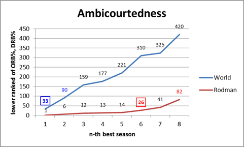
The problem, though, is that there are both competitive and physical limitations to how much someone can really excel at both simultaneously. Not the least of which is that offensive and defensive rebounds literally take place on opposite sides of the floor, and not everyone gets up and set for every possession. Thus, if someone wanted to cheat toward getting more rebounds on the offensive end, it would likely come, at least in some small part, at the expense of rebounds on the defensive end. Similarly, if someone’s playing style favors one, it probably (at least slightly), disfavors the other. Whether or not that particular factor is in play, at the very least you should expect a fairly strong regression to the mean: thus, if a player is excellent at one or the other, you should expect them to be not as good at the other, just as a result of the two not being perfectly correlated. To examine this empirically, I’ve put all 1000 top TRB% seasons on a scatterplot comparing offensive and defensive rebound rates:
Clearly there is a small negative correlation, as evidenced by the negative coefficient in the regression line. Note that technically, this shouldn’t be a linear relationship overall – if we graphed every pair in history from 0,0 to D,R, my graph’s trendline would be parallel to the tangent of that curve as it approaches Dennis Rodman. But what’s even more stunning is the following:
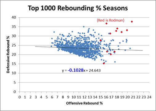
Rodman is in fact not only an outlier, he is such a ridiculously absurd alien-invader outlier that when you take him out of the equation, the equation changes drastically: The negative slope of the regression line nearly doubles in Rodman’s absence. In case you’ve forgotten, let me remind you that Rodman only accounts for 12 data points in this 1000 point sample: If that doesn’t make your jaw drop, I don’t know what will! For whatever reason, Rodman seems to be supernaturally impervious to the trade-off between offensive and defensive rebounding. Indeed, if we look at the same graph with only Rodman’s data points, we see that, for him, there is actually an extremely steep, upward sloping relationship between the two variables:
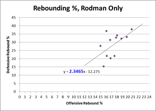
In layman’s terms, what this means is that Rodman comes in varieties of Good, Better, and Best — which is how we would expect this type of chart to look if there were no trade-off at all. Yet clearly the chart above proves that such a tradeoff exists! Dennis Rodman almost literally defies the laws of nature (or at least the laws of probability).
The ultimate point contra Barkley, et al, is that if Rodman “cheated” toward getting more rebounds all the time, we might expect that his chart would be higher than everyone else’s, but we wouldn’t have any particular reason to expect it to slope in the opposite direction. Now, this is slightly more plausible if he was “cheating” on the offensive side on the floor while maintaining a more balanced game on the defensive side, and there are any number of other logical speculations to be made about how he did it. But to some extent this transcends the normal “shift in degree” v. “shift in kind” paradigm: what we have here is a major shift in degree of a shift in kind, and we don’t have to understand it perfectly to know that it is otherworldly. At the very least, I feel confident in saying that if Charles Barkley or anyone else really believes they could replicate Rodman’s results simply by changing their playing styles, they are extremely naive.
Addendum (4/20/11):
Commenter AudacityOfHoops asks:
I don’t know if this is covered in later post (working my way through the series – excellent so far), or whether you’ll even find the comment since it’s 8 months late, but … did you create that same last chart, but for other players? Intuitively, it seems like individual players could each come in Good/Better/Best models, with positive slopes, but that when combined together the whole data set could have a negative slope.
I actually addressed this in an update post (not in the Rodman series) a while back:
A friend privately asked me what other NBA stars’ Offensive v. Defensive rebound % graphs looked like, suggesting that, while there may be a tradeoff overall, that doesn’t necessarily mean that the particular lack of tradeoff that Rodman shows is rare. This is a very good question, so I looked at similar graphs for virtually every player who had 5 or more seasons in the “Ambicourtedness Top 1000.” There are other players who have positively sloping trend-lines, though none that come close to Rodman’s. I put together a quick graph to compare Rodman to a number of other big name players who were either great rebounders (e.g., Moses Malone), perceived-great rebounders (e.g., Karl Malone, Dwight Howard), or Charles Barkley:

By my accounting, Moses Malone is almost certainly the 2nd-best rebounder of all time, and he does show a healthy dose of “ambicourtedness.” Yet note that the slope of his trendline is .717, meaning the difference between him and Rodman’s 2.346 is almost exactly twice the difference between him and the -.102 league average (1.629 v .819).
The 1-15 Rams and the Salary Cap—Watch Me Crush My Own Hypothesis
It is a quirky little fact that 1-15 teams have tended to bounce back fairly well. Since expanding to 16 games in 1978, 9 teams have hit the ignoble mark, including last year’s St. Louis Rams. Of the 8 that did it prior to 2009, all but the 1980 Saints made it back to the playoffs within 5 years, and 4 of the 8 eventually went on to win Super Bowls, combining for 8 total. The median number of wins for a 1-15 team in their next season is 7:


My grand hypothesis about this was that the implementation of the salary cap after the 1993-94 season, combined with some of the advantages I discuss below (especially 2 and 3), has been a driving force behind this small-but-sexy phenomenon: note that at least for these 8 data points, there seems to be an upward trend for wins and downward trend for years until next playoff appearance. Obviously, this sample is way too tiny to generate any conclusions, but before looking at harder data, I’d like to speculate a bit about various factors that could be at play. In addition to normally-expected regression to the mean, the chain of consequences resulting from being horrendously bad is somewhat favorable:
- The primary advantages are explicitly structural: Your team picks at the top of each round in the NFL draft. According to ESPN’s “standard” draft-pick value chart, the #1 spot in the draft is worth over twice as much as the 16th pick [side note: I don’t actually buy this chart for a second. It massively overvalue 1st round picks and undervalues 2nd round picks, particularly when it comes to value added (see a good discussion here)]:

- The other primary benefit, at least for one year, comes from the way the NFL sets team schedules: 14 games are played in-division and against common divisional opponents, but the last two games are set between teams that finished in equal positions the previous year (this has obviously changed many times, but there have always been similar advantages). Thus, a bottom-feeder should get a slightly easier schedule, as evidenced by the Rams having the 2nd-easiest schedule for this coming season.
- There are also reliable secondary benefits to being terrible, some of which get greater the worse you are. A huge one is that, because NFL statistics are incredibly entangled (i.e., practically every player on the team has an effect on every other player’s statistics), having a bad team tends to drag everyone’s numbers down. Since the sports market – and the NFL’s in particular – is stats-based on practically every level, this means you can pay your players less than what they’re worth going forward. Under the salary cap, this leaves you more room to sign and retain key players, or go for quick fixes in free agency (which is generally unwise, but may boost your performance for a season or two).
- A major tertiary effect – one that especially applies to 1-15 teams, is that embarrassed clubs tend to “clean house,” meaning, they fire coaches, get rid of old and over-priced veterans, make tough decisions about star players that they might not normally be able to make, etc. Typically they “go young,” which is advantageous not just for long-term team-building purposes, but because young players are typically the best value in the short term as well.
- An undervalued quaternary effect is that new personnel and new coaching staff, in addition to hopefully being better at their jobs than their predecessors, also make your team harder to prepare for, just by virtue of being new (much like the “backup quarterback effect,” but for your whole team).
- A super-important quinary effect is that. . . Ok, sorry, I can’t do it.
Of course, most of these effects are relevant to more than just 1-15 teams, so perhaps it would be better to expand the inquiry a tiny bit. For this purpose, I’ve compiled the records of every team since the merger, so beginning in 1970, and compared them to their record the following season (though it only affects one data point, I’ve treated the first Ravens season as a Browns season, and treated the new Browns as an expansion team). I counted ties as .5 wins, and normalized each season to 16 games (and rounded). I then grouped the data by wins in the initial season and plotted it on a “3D Bubble Chart.” This is basically a scatter-plot where the size of each data-point is determined by the number of examples (e.g., only 2 teams have gone undefeated, so the top-right bubble is very small). The 3D is not just for looks: the size of each sphere is determined by using the weights for volume, which makes it much less “blobby” than 2D, and it allows you to see the overlapping data points instead of just one big ink-blot:

*Note: again, the x-axis on this graph is wins in year n, and the y axis is wins in year n+1. Also, note that while there are only 16 “bubbles,” they represent well over a thousand data points, so this is a fairly healthy sample.
The first thing I can see is that there’s a reasonably big and fat outlier there for 1-15 teams (the 2nd bubble from the left)! But that’s hardly a surprise considering we started this inquiry knowing that group had been doing well, and there are other issues at play: First, we can see that the graph is strikingly linear. The equation at the bottom means that to predict a team’s wins for one year, you should multiply their previous season’s win total by ~.43 and add ~4.7 (e.g.’s: an 8-win team should average about 8 wins the next year, a 4-win team should average around 6.5, and a 12-win team should average around 10). The number highlighted in blue tells you how important the previous season’s win’s are as a predictor: the higher the number, the more predictive.
So naturally the next thing to see is a breakdown of these numbers between the pre- and post-salary cap eras:


Again, these are not small sample-sets, and they both visually and numerically confirm that the salary-cap era has greatly increased parity: while there are still plenty of excellent and terrible teams overall, the better teams regress and the worse teams get better, faster. The equations after the split lead to the following predictions for 4, 8, and 12 win teams (rounded to the nearest .25):
| W | Pre-SC | Post-SC |
| 4 | 6.25 | 7 |
| 8 | 8.25 | 8 |
| 12 | 10.5 | 9.25 |
Yes, the difference in expected wins between a 4-win team and a 12-win team in the post-cap era is only just over 2 wins, down from over 4.
While this finding may be mildly interesting in its own right, sadly this entire endeavor was a complete and utter failure, as the graphs failed to support my hypothesis that the salary cap has made the difference for 1-15 teams specifically. As this is an uncapped season, however, I guess what’s bad news for me is good news for the Rams.
The Case for Dennis Rodman, Part 1/4 (a)—Rodman v. Jordan
For reasons which should become obvious shortly, I’ve split Part 1 of this series into sub-parts. This section will focus on rating Rodman’s accomplishments as a rebounder (in painstaking detail), while the next section(s) will deal with the counterarguments I mentioned in my original outline.
For the uninitiated, the main stat I will be using for this analysis is “rebound rate,” or “rebound percentage,” which represents the percentage of available rebounds that the player grabbed while he was on the floor. Obviously, because there are 10 players on the floor for any given rebound, the league average is 10%. The defensive team typically grabs 70-75% of rebounds overall, meaning the average rates for offensive and defensive rebounds are approximately 5% and 15% respectively. This stat is a much better indicator of rebounding skill than rebounds per game, which is highly sensitive to factors like minutes played, possessions per game, and team shooting and shooting defense. Unlike many other “advanced” stats out there, it also makes perfect sense intuitively (indeed, I think the only thing stopping it from going completely mainstream is that the presently available data can technically only provide highly accurate “estimates” for this stat. When historical play-by-play data becomes more widespread, I predict this will become a much more popular metric).
Dennis Rodman has dominated this stat like few players have dominated any stat. For overall rebound % by season, not only does he hold the career record, he led the league 8 times, and holds the top 7 spots on the all-time list (red bars are Rodman):
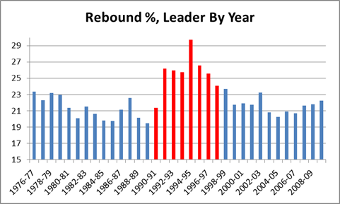
Note this chart only goes back as far as the NBA/ABA merger in 1976, but going back further makes no difference for the purposes of this argument. As I will explain in my discussion of the “Wilt Chamberlain and Bill Russell Were Rebounding Gods” myth, the rebounding rates for the best rebounders tend to get worse as you go back in time, especially before Moses Malone.
As visually impressive as that chart may seem, it is only the beginning of the story. Obviously we can see that the Rodman-era tower is the tallest in the skyline, but our frame of reference is still arbitrary: e.g., if the bottom of the chart started at 19 instead of 15, his numbers would look even more impressive. So one thing we can do to eliminate bias is put the average in the middle, and count percentage points above or below, like so:
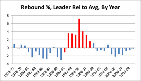
With this we get a better visual sense of the relative greatness of each season. But we’re still left with percentage points as our unit of measurement, which is also arbitrary: e.g., how much better is “6%” better? To answer this question, in addition to the average, we need to calculate the standard deviation of the sample (if you’re normally not comfortable working with standard deviations, just think of them as standardized units of measurement that can be used to compare stats of different types, such as shooting percentages against points per game). Then we re-do the graph using standard deviations above or below the mean, like so:
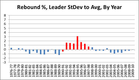
Note this graph is actually exactly the same shape as the one above, it’s just compressed to fit on a scale from –3 to +8 for easy comparison with subsequent graphs. The SD for this graph is 2.35%.
There is one further, major, problem with our graph: As strange as it may sound, Dennis Rodman’s own stats are skewing the data in a way that biases the comparison against him. Specifically, with the mean and standard deviation set where they are, Rodman is being compared to himself as well as to others. E.g., notice that most of the blue bars in the graph are below the average line: this is because the average includes Rodman. For most purposes, this bias doesn’t matter much, but Rodman is so dominant that he raises the league average by over a percent, and he is such an outlier that he alone nearly doubles the standard deviation. Thus, for the remaining graphs targeting individual players, I’ve calculated the average and standard deviations for the samples from the other players only:
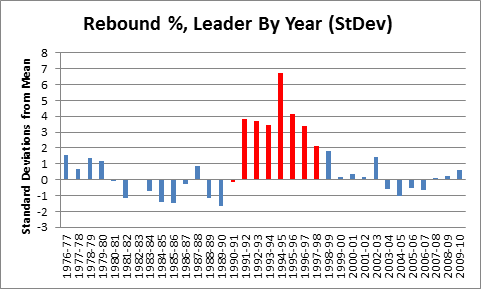
Note that a negative number in this graph is not exactly a bad thing: that person still led the league in rebounding % that year. The SD for this graph is 1.22%.
But not all rebounding is created equal: Despite the fact that they get lumped together in both conventional rebounding averages and in player efficiency ratings, offensive rebounding is worth considerably more than defensive rebounding. From a team perspective, there is not much difference (although not necessarily *no* difference – I suspect, though I haven’t yet proved, that possessions beginning with offensive rebounds have higher expected values than those beginning with defensive rebounds), but from an individual perspective, the difference is huge. This is because of what I call “duplicability”: simply put, if you failed to get a defensive rebound, there’s a good chance that your team would have gotten it anyway. Conversely, if you failed to get an offensive rebound, the chances of your team having gotten it anyway are fairly small. This effect can be very crudely approximated by taking the league averages for offensive and defensive rebounding, multiplying by .8, and subtracting from 1. The .8 comes from there being 4 other players on your team, and the subtraction from 1 gives you the value added for each rebound: The league averages are typically around 25% and 75%, so, very crudely, you should expect your team to get around 20% of the offensive and 60% of the defensive rebounds that you don’t. Thus, each offensive rebound is adding about .8 rebounds to your team’s total, and each defensive rebound is adding about .4. There are various factors that can affect the exact values one way or the other, but on balance I think it is fair to assume that offensive rebounds are about twice as valuable overall.
To that end, I calculated an adjusted rebounding % for every player since 1976 using the formula (2ORB% + DRB%)/3, and then ran it through all of the same steps as above:
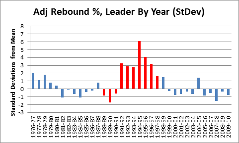
Mindblowing, really. But before putting this graph in context, a quick mathematical aside: If these outcomes were normally distributed, a 6 standard deviation event like Rodman’s 1994-1995 season would theoretically happen only about once every billion seasons. But because each data point on this chart actually represents a maximum of a large sample of (mostly) normally distributed seasonal rebounding rates, they should instead be governed by the Gumbel distribution for extreme values: this leads to a much more manageable expected frequency of approximately once every 400 years (of course, that pertains to the odds of someone like Rodman coming along in the first place; now that we’ve had Rodman, the odds of another one showing up are substantially higher). In reality, there are so many variables at play from era to era, season to season, or even team to team, that a probability model probably doesn’t tell us as much as we would like (also, though standard deviations converge fairly quickly, the sample size is relatively modest).
Rather than asking how abstractly probable or improbable Rodman’s accomplishments were, it may be easier to get a sense of his rebounding skill by comparing this result to results of the same process for other statistics. To start with, note that weighting the offensive rebounding more heavily cuts both ways for Rodman: after the adjustment, he only holds the top 6 spots in NBA history, rather than the top 7. On the other hand, he led the league in this category 10 times instead of 8, which is perfect for comparing him to another NBA player who led a major statistical category 10 times — Michael Jordan:
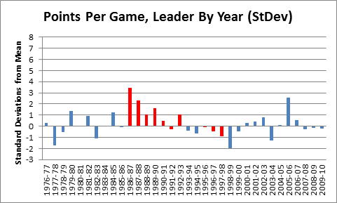
Red bars are Jordan. Mean and standard deviation are calculated from 1976, excluding MJ, as with Rodman above.
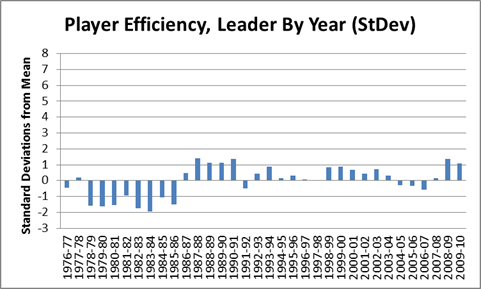
As you can see, the data suggests that Rodman was a better rebounder than Jordan was a scorer. Of course, points per game isn’t a rate stat, and probably isn’t as reliable as rebounding %, but that cuts in Rodman’s favor. Points per game should be more susceptible to varying circumstances that lead to extreme values. Compare, say, to a much more stable stat, Hollinger’s player efficiency rating:
Actually, it is hard to find any significant stat where someone has dominated as thoroughly as Rodman. One of the closest I could find is John Stockton and the extremely obscure “Assist %” stat:
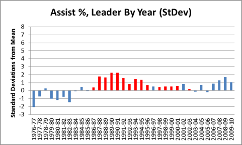
Red bars are Stockton, mean and SD are calculated from the rest.
Stockton amazingly led the league in this category 15 times, though he didn’t dominate individual seasons to the extent that Rodman did. This stat is also somewhat difficult to “detangle” (another term/concept I will use frequently on this blog), since assists always involve more than one player. Regardless, though, this graph is the main reason John Stockton is (rightfully) in the Hall of Fame today. Hmm…
Tiger Woods Needs to Need a Therapist (and Probably Does)
Tiger Woods is obviously having a terrible season. His scoring average so far (71.66) is almost 2 strokes higher than his previous worst year (69.75 in 1997). He has no wins, no top 3’s, and has only finished top 10 in 2 of 9 tournaments. That 22%, if it holds up, would be the worst of his career by 20%. For the first time basically ever, his eventually capturing the all-time major championships record is in doubt. Of course, 9 tournaments is not a large sample, and this could just be a slump. As I see it, there are basically 4 possibilities:
- Tiger is running very badly.
- Tiger is in serious decline.
- Tiger is declining somewhat and running somewhat badly.
- Tiger needs a shrink.
So the questions of the day are: a) How likely are each of these possibilities? and b) What does each say about his chances of winning 19 majors? For reasons I will explain, I believe 1 and 2 are very unlikely, and 3 is somewhat unlikely. Which is fine, since Tiger should basically pray this is all in his head, because otherwise his chances of catching and passing Nicklaus are diminishing considerably.
I would normally be the first to promote a “bad variance” explanation of this kind of phenomena, but in this case: a) Tiger doesn’t really have slumps like this; and b) the timing is too much of a coincidence. For some historical perspective, here’s a graph of Tiger’s overall winning %, top-10 finish %, and winning % in majors, by year:

For the record, his averages are 28.4%, 66.4% and 24.6%, respectively. As should be obvious, not only is his 2010 historically awful, but there is nothing to suggest that he was in decline beforehand. Despite having recently run slightly worse in majors than he did in the early 2000’s, his Win% and Top-10% trendlines have still been sloping upwards.
Of course, 2/3 of a season is still a small sample, and it is certainly possible that this is variance, but just because something *could* be a statistical artifact doesn’t mean that it is *likely* to be. In fact, one problem with statistically-oriented sports analysis is that its proponents can sometimes be overly (even dogmatically) committed to neutral or variance-based explanations for observed anomalies, even when the conventional explanation is highly plausible (ironically, I think this happens because people often apply Bayes’ Theorem-style reasoning implicitly, even if the statisticians forget to apply it explicitly). I believe this is one of those situations.
That said, whether it stems from diminishing skills or ongoing psychological unrest, a significant and continuing Tiger decline is still a realistic possibility. From the chart above, it should be clear that Tiger circa 2009 shouldn’t have any problem blowing past Jack, but what would happen if he were a different Tiger? Fortunately for him, he has a long way to drop before being a non-factor. For comparison, let’s look at the same graph as above, but for the 2nd-best player of the recent era, Phil Mickelson:

Mickleson’s averages are 9.2%, 35.8%, and 5.6%, respectively. Half a Tiger would still be much better. Of course, Mickelson has won 4 majors in recent years, but has still been much worse than Tiger: over that period his averages are 12.2%, 40.1%, and 14.3%. It should not go without notice that if Tiger transformed into Phil Mickelson, played 7 more years, and won majors at the same rate that Mickelson has over the last 7 (Phil is about 6 years older), it would put him at exactly the magic number: 18.
Finally, let’s look at the graph for the man himself — Jack Nicklaus:

Note: For years prior to 1970, only official PGA Tour events are included.
Jack’s averages over this span (from the year he turned pro to the year of his final major) are 15.5%, 63.4%, and 18%. These numbers are slightly understated, since in truth Jack was well past his prime when he won the Masters in ’86. As we can see, Jack began to decline significantly around 1979, but still won 3 more majors after that point. A similar pattern for Woods would put him at 17, and at least in contention for the record. On the other hand, not everyone is Jack Nicklaus. Nicklaus, incredibly, won a higher percentage of majors than tournaments overall. This is especially apparent in his post-decline career: note the small amount of blue compared to the amount of green from 1979 on. Whether he just ran well in the right spots, or whether he had preternatural competitive spirit, not even Tiger Woods can count on having Nicklaus’s knack for winning majors. So if Tiger hopes to catch up, he had better be out of his mind.
The Case for Dennis Rodman, Part 0/4—Outline
[Note: Forgive the anachronisms, but since this page is still the landing-spot for a lot of new readers, I’ve added some links to the subsequent articles into this post. There is also a much more comprehensive outline of the series, complete with a table of relevant points and a selection of charts and graphs available in The Case for Dennis Rodman: Guide.]
If you’ve ever talked to me about sports, you probably know that one of my pet issues (or “causes” as my wife calls them), is proving the greatness of Dennis Rodman. I admit that since I first saw Rodman play — and compete, and rebound, and win championships — I have been fascinated. Until recently, however, I thought of him as the ultimate outlier: someone who seemed to have unprecedented abilities in some areas, and unprecedented lack of interest in others. He won, for sure, but he also played for the best teams in the league. His game was so unique — yet so enigmatic — that despite the general feeling that there was something remarkable going on there, opinions about his ultimate worth as a basketball player varied immensely — as they continue to today. In this four-part series, I will attempt to end the argument.
While there may be room for reasonable disagreement about his character, his sportsmanship, or how and whether to honor his accomplishments, my research and analysis has led me to believe — beyond a reasonable doubt — that Rodman is one of the most undervalued players in NBA history. From an analytical perspective, leaving him off of the Hall of Fame nominee list this past year was truly a crime against reason. But what makes this issue particularly interesting to me is that it cuts “across party lines”: the conventional wisdom and the unconventional wisdom both get it very wrong. Thus, by examining the case of Dennis Rodman, not only will I attempt to solve a long-standing sports mystery, but I will attempt to illustrate a few flaws with the modern basketball-analytics movement.
In this post I will outline the major prongs of my argument. But first, I would like to list the frequently-heard arguments I will *not* be addressing:
- “Rodman won 5 NBA titles! Anyone who is a starter on 5 NBA champions deserves to be in the Hall of Fame!” [As an intrinsic matter, I really don’t care that he won 5 NBA championships, except inasmuch as I’d like to know how much he actually contributed. I.e., is he more like Robert Horry, or more like Tim Duncan?]
- “Rodman led the league in rebounding *7 times*: Anyone who leads the league in a major statistical category that many times deserves to be in the Hall of Fame!” [This is completely arbitrary. Rodman’s rebounding prowess is indeed an important factor in this inquiry, but “leading the league” in some statistical category has no intrinsic value, except inasmuch as it actually contributed to winning games.]
- “Rodman was a great defender! He could effectively defend Michael Jordan and Shaquille O’Neal in their primes! Who else could do that?” [Actually, I love this argument as a rhetorical matter, but unfortunately I think defensive skill is still too subjective to be quantified directly. Of course all of his skills — or lack thereof — are relevant to the bottom line.]
- “Rodman was such an amazing rebounder, despite being only 6 foot 7!” [Who cares how tall he was, seriously?]
Rather, in the subsequent parts in this series, these are the arguments I will be making:
- Rodman was a better rebounder than you think: Rodman’s ability as a rebounder is substantially underrated. Rodman was a freak, and is unquestionably — by a wide margin — the greatest rebounder in NBA history. In this section I will use a number of statistical metrics to demonstrate this point (preview factoid: Kevin Garnett’s career rebounding percentage is lower than Dennis Rodman’s career *offensive* rebounding percentage). I will also specifically rebut two common counterarguments: 1) that Rodman “hung out around the basket”, and only got so many rebounds because he focused on it exclusively [he didn’t], and 2) that Bill Russell and Wilt Chamberlain were better rebounders [they weren’t].
- Rodman’s rebounding was more valuable than you think: The value of Rodman’s rebounding ability is substantially underrated. Even/especially by modern efficiency metrics that do not accurately reward the marginal value of extra rebounds. Conversely, his lack of scoring ability is vastly overrated, even/especially by modern efficiency metrics that inaccurately punish the marginal value of not scoring.
- Rodman was a bigger winner than you think: By examining Rodman’s +/- with respect to wins and losses — i.e., comparing his teams winning percentages with him in the lineup vs. without him in the lineup — I will show that the outcomes suggest he had elite-level value. Contrary to common misunderstanding, this actually becomes *more* impressive after adjusting for the fact that he played on very good teams to begin with.
- Rodman belongs in the Hall of Fame [or not]: [Note this section didn’t go off as planned. Rodman was actually selected for the HoF before I finished the series, so section 4 is devoted to slightly more speculative arguments about Rodman’s true value.] Having wrapped up the main quantitative prongs, I will proceed to audit the various arguments for and against Rodman’s induction into the Hall of Fame. I believe that both sides of the debate are rationalizable — i.e., there exist reasonable sets of preferences that would justify either outcome. Ultimately, however, I will argue that the most common articulated preferences, when combined with a proper understanding of the available empirical evidence, should compel one to support Rodman‘s induction. To be fair, I will also examine which sets of preferences could rationally compel you to the opposite conclusion.
Stay tuned….
A Decade of Hot Teams in the Playoffs
San Diego and Dallas were the Super Bowl-pick darlings of many sports writers and commentators heading into this postseason, in no small part because they were the two “hottest” teams in the NFL, having finished the regular season with the two longest winning streaks of any contenders (at 11 and 3, respectively). Routinely, year after year, I think that the prediction-makers in the media overvalue season-ending rushes. My reasons for believing this include:
- The seeding of many teams are frequently sealed or near-sealed weeks before the playoffs begin, leaving them with little incentive to compete fully.
- Teams that are eliminated from playoff contention may be dispirited, and/or players may not be giving 100% effort to winning, instead focusing on padding statistics or avoiding injury.
- When non-contenders do give maximum effort, it may more often be to play the role of “spoiler,” or to save face for their season by trying to beat the most high-profile contenders.
- Variance.
So the broader question to ask is “does late-season success correlate any more strongly with postseason performance than middle or early season success?” But in this case, I’m interested only in winning streaks — i.e., the “hottest” teams, for which any relevant sample would probably be too small to draw any meaningful conclusions. However, I thought it might be interesting to look at how the teams with the longest winning streaks have performed in the last decade:
2009:
AFC: San Diego: Won 11, lost divisional
NFC: Dallas: Won 3, lost divisional2008:
AFC: Indianapolis: Won 9, lost wildcard
NFC: Atlanta: Won 3, lost wildcard2007:
AFC: New England: Won 16, lost Superbowl
NFC: Washington: Won 4, lost wildcard2006:
AFC: San Diego: Won 10, lost divisional
NFC: Philadelphia: Won 5, lost divisional2005:
NFC: Redskins: Won 5, lost divisional
AFC: Tie: Won 4: Denver: lost AFC championship; Pittsburg: won Superbowl
(the hottest team overall, Miami, won 6 but didn’t make the playoffs)2004:
NFC: Pittsburg: Won 14, lost AFC championship
AFC: Tie: Won 2: Seattle: lost Superbowl; St. Louis: lost divisional; Green Bay: lost wildcard
2003:
AFC: New England: Won 12, won Superbowl
NFC: Green Bay: Won 4, lost divisional2002:
AFC: Tennessee: Won 5, lost AFC championship
NFC: NY Giants: Won 4, lost wildcard2001:
AFC: Patriots: Won 6, won Superbowl
NFC: Rams: Won 6, lost Superbowl2000:
AFC: Baltimore: Won 7, won Superbowl
NFC: NY Giants: Won 5, lost Superbowl
From 2006 on, the hottest teams have obviously done terribly, with the undefeated Patriots being the only team to make it out of the divisional round. Prior to that, the results seem more normal: In 2005, Pittsburg won the Superbowl after tying for the longest winning streak among AFC playoff teams (though they trailed Washington in the NFC and Miami who didn’t make the playoffs). New England won the Superbowl as the hottest team twice: in 2001 and 2003 — although both times they were one of the top seeds in their conference as well. The last hottest team to play on wildcard weekend AND win the Superbowl was the Baltimore Ravens in 2000.
So what does that tell us? Well, a decent anecdote — and not much more. The sample is small and the numbers inconclusive. On the one hand, the particular species of Cinderella team that gets predicted to win the Superbowl year after year by some — one that starts the season weakly but catches fire late and rides their momentum to the championship — has been a rarity (and going back further, it doesn’t get any more common). On the other hand, if you simply picked the hottest team to win the Superbowl every year in this decade, you would have correctly picked 3 winners out of 10, which would not be a terrible record.