Perhaps Baseball is truly America’s Sport, but it didn’t take the title of “most written about” until the mid-1980’s:

(Created with Google Books Ngram Viewer.)
Perhaps Baseball is truly America’s Sport, but it didn’t take the title of “most written about” until the mid-1980’s:
(Created with Google Books Ngram Viewer.)
A couple of days ago, ESPN’s Peter Keating blogged about “icing the kicker” (i.e., calling timeouts before important kicks, sometimes mere instants before the ball is snapped). He argues that the practice appears to work, at least in overtime. Ultimately, however, he concludes that his sample is too small to be “statistically significant.” This may be one of the few times in history where I actually think a sports analyst underestimates the probative value of a small sample: as I will show, kickers are generally worse in overtime than they are in regulation, and practically all of the difference can be attributed to iced kickers. More importantly, even with the minuscule sample Keating uses, their performance is so bad that it actually is “significant” beyond the 95% level.
In Keating’s 10 year data-set, kickers in overtime only made 58.1% of their 35+ yard kicks following an opponent’s timeout, as opposed to 72.7% when no timeout was called. The total sample size is only 75 kicks, 31 of which were iced. But the key to the analysis is buried in the spreadsheet Keating links to: the average length of attempted field goals by iced kickers in OT was only 41.87 yards, vs. 43.84 yards for kickers at room temperature. Keating mentions this fact in passing, mainly to address the potential objection that perhaps the iced kickers just had harder kicks — but the difference is actually much more significant.
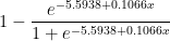
To evaluate this question properly, we first need to look at made field goal percentages broken down by yard-line. I assume many people have done this before, but in 2 minutes of googling I couldn’t find anything useful, so I used play-by-play data from 2000-2009 to create the following graph:

The blue dots indicate the overall field-goal percentage from each yard-line for every field goal attempt in the period (around 7500 attempts total – though I’ve excluded the one 76 yard attempt, for purely aesthetic reasons). The red dots are the predicted values of a logistic regression (basically a statistical tool for predicting things that come in percentages) on the entire sample. Note this is NOT a simple trend-line — it takes every data point into account, not just the averages. If you’re curious, the corresponding equation (for predicted field goal percentage based on yard line x) is as follows:
The first thing you might notice about the graph is that the predictions appear to be somewhat (perhaps unrealistically) optimistic about very long kicks. There are a number of possible explanations for this, chiefly that there are comparatively few really long kicks in the sample, and beyond a certain distance the angle of the kick relative to the offensive and defensive linemen becomes a big factor that is not adequately reflected by the rest of the data (fortunately, this is not important for where we are headed). The next step is to look at a similar graph for overtime only — since the sample is so much smaller, this time I’ll use a bubble-chart to give a better idea of how many attempts there were at each distance:

For this graph, the sample is about 1/100th the size of the one above, and the regression line is generated from the OT data only. As a matter of basic spatial reasoning — even if you’re not a math whiz — you may sense that this line is less trustworthy. Nevertheless, let’s look at a comparison of the overall and OT-based predictions for the 35+ yard attempts only:

Note: These two lines are slightly different from their counterparts above. To avoid bias created by smaller or larger values, and to match Keating’s sample, I re-ran the regressions using only 35+ yard distances that had been attempted in overtime (they turned out virtually the same anyway).
Comparing the two models, we can create a predicted “Choke Factor,” which is the percentage of the original conversion rate that you should knock off for a kicker in an overtime situation:

A weighted average (by the number of OT attempts at each distance) gives us a typical Choke Factor of just over 6%. But take this graph with a grain of salt: the fact that it slopes upward so steeply is a result of the differing coefficients in the respective regression equations, and could certainly be a statistical artifact. For my purposes however, this entire digression into overtime performance drop-offs is merely for illustration: The main calculation relevant to Keating’s iced kick discussion is a simple binomial probability: Given an average kick length of 41.87 yards, which carries a predicted conversion rate of 75.6%, what are the odds of converting only 18 or fewer out of 31 attempts? OK, this may be a mildly tricky problem if you’re doing it longhand, but fortunately for us, Excel has a BINOM.DIST() function that makes it easy:

Note : for people who might not pick: Yes, the predicted conversion rate for the average length is not going to be exactly the same as the average predicted value for the length of each kick. But it is very close, and close enough.
As you can see, the OT kickers who were not iced actually did very slightly better than average, which means that all of the negative bias observed in OT kicking stems from the poor performance seen in just 31 iced kick attempts. The probability of this result occurring by chance — assuming the expected conversion rate for OT iced kicks were equal to the expected conversion rate for kicks overall — would be only 2.4%. Of course, “probability of occurring by chance” is the definition of statistical significance, and since 95% against (i.e., less than 5% chance of happening) is the typical threshold for people to make bold assertions, I think Keating’s statement that this “doesn’t reach the level of improbability we need to call it statistically significant” is unnecessarily humble. Moreover, when I stated that the key to this analysis was the 2 yard difference that Keating glossed over, that wasn’t for rhetorical flourish: if the length of the average OT iced kick had been the same as the length of the average OT regular kick, the 58.1% would correspond to a “by chance” probability of 7.6%, obviously not making it under the magic number.
Last week on PTI, Dan LeBatard mentioned an interesting stat that I had never heard before: that 13 of 14 Hall of Fame coaches had Hall of Fame QB’s play for them. LeBatard’s point was that he thought great quarterbacks make their coaches look like geniuses, and he was none-too-subtle about the implication that coaches get too much credit. My first thought was, of course: Entanglement, anyone? That is to say, why should he conclude that the QB’s are making their coaches look better than they are instead of the other way around? Good QB’s help their teams win, for sure, but winning teams also make their QB’s look good. Thus – at best – LeBatard’s stat doesn’t really imply that HoF Coaches piggyback off of their QB’s success, it implies that the Coach and QB’s successes are highly entangled. By itself, this analysis might be enough material for a tweet, but when I went to look up these 13/14 HoF coach/QB pairs, I found the history to be a little more interesting than I expected.
First, I’m still not sure exactly which 14 HoF coaches LeBatard was talking about. According the the official website, there are 21 people in the HoF as coaches. From what I can tell, 6 of these (Curly Lambeau, Ray Flaherty, Earle Neale, Jimmy Conzelman, Guy Chamberlain and Steve Owen) coached before the passing era, so that leaves 15 to work with. A good deal of George Halas’s coaching career was pre-pass as well, but he didn’t quit until 1967 – 5 years later than Paul Brown – and he coached a Hall of Fame QB anyway (Sid Luckman). Of the 15, 14 did indeed coach HoF QB’s, at least technically.
To break the list down a little, I applied two threshold tests: 1) Did the coach win any Super Bowls (or league championships before the SB era) without their HoF QB? And 2) In the course of his career, did the coach have more than one HoF QB? A ‘yes’ answer to either of these questions I think precludes the stereotype of a coach piggybacking off his star player (of course, having coached 2 or more Hall of Famer’s might just mean that coach got extra lucky, but subjectively I think the proxy is fairly accurate). Here is the list of coaches eliminated by these questions:
[table “5” not found /]
Joe Gibbs wins the outlier prize by a mile: not only did he win 3 championships “on his own,” he did it with 3 different non-HoF QB’s. Don Shula had 3 separate eras of greatness, and I think would have been a lock for the hall even with the Griese era excluded. George Allen never won a championship, but he never really had a HoF QB either: Jurgensen (HoF) served as Billy Kilmer (non-HoF)’s backup for the 4 years he played under Allen. Sid Gillman had a long career, his sole AFL championship coming with the Chargers in 1963 – with Tobin Rote (non-HoF) under center. Weeb Ewbank won 2 NFL championships in Baltimore with Johnny Unitas, and of course won the Super Bowl against Baltimore and Unitas with Joe Namath. Finally, George Halas won championships with Pard Pearce (5’5”, non-HoF), Carl Brumbaugh (career passer rating: 34.9, non-HoF), Sid Luckman (HoF) and Billy Wade (non-HoF). Plus, you know, he’s George Halas.
[table “1” not found /]
Though Chuck Noll won all of his championships with Terry Bradshaw (HoF), those Steel Curtain teams weren’t exactly carried by the QB position (e.g., in the 1974 championship season, Bradshaw averaged less than 100 passing yards per game). Bill Walsh is a bit more borderline: not only did all of his championships come with Joe Montana, but Montana also won a Super Bowl without him. However, considering Walsh’s reputation as an innovator, and especially considering his incredible coaching tree (which has won nearly half of all the Super Bowls since Walsh retired in 1989), I’m willing to give him credit for his own notoriety. Finally, Vince Lombardi, well, you know, he’s Vince Lombardi.
Which brings us to the list of the truly entangled:
[table “4” not found /]
I waffled a little on Paul Brown, as he is generally considered an architect of the modern league (and, you know, a team is named after him), but unlike Lombardi, Walsh and Knoll, Brown’s non-Otto-Graham-entangled accomplishments are mostly unrelated to coaching. I’m sure various arguments could be made about individual names (like, “You crazy, Tom Landry is awesome”), but the point of this list isn’t to denigrate these individuals, it’s simply to say that these are the HoF coaches whose coaching successes are the most difficult to isolate from their quarterback’s.
I don’t really want to speculate about any broader implications, both because the sample is too small to make generalizations, and because my intuition is that coaches probably do get too much credit for their good fortune (whether QB-related or not). But regardless, I think it’s clear that LeBatard’s 13/14 number is highly misleading.
Two nights ago, as I was watching cable news and reading various online articles and blog posts about Christine O’Donnell’s upset win over Michael Castle in Delaware’s Republican Senate primary, the hasty, almost ferocious emergence of consensus among the punditocracy – to wit, that the GOP now has virtually zero chance of picking up that seat in November – reminded me of an issue that I’ve wanted to blog about since long before I began blogging in earnest: NFL playoff prediction models.
Specifically, I have been critical of those models that project the likelihood of each surviving team winning the Super Bowl by applying a logistic regression model (i.e., “odds of winning based on past performance”) to each remaining game. In January, I posted a number of comments to this article on Advanced NFL Stats, in which I found it absurd that, with 8 teams left, his model predicted that the Dallas Cowboys had about the same chance of winning the Super Bowl as the Jets, Ravens, Vikings, and Cardinals combined. In the brief discussion, I gave two reasons (in addition to my intuition): first, that these predictions were wildly out of whack with contract prices in sports-betting markets, and second, that I didn’t believe the model sufficiently accounted for “variance in the underlying statistics.” Burke suggested that the first point is explained by a massive epidemic of conjunction-fallacyitis among sports bettors. On its face, I think this is a ridiculous explanation: i.e., does he really believe that the market-movers in sports betting — people who put up hundreds of thousands (if not millions) of dollars of their own money — have never considered multiplying the odds of several games together? Regardless, in this post I will put forth a much better explanation for this disparity than either of us proffered at the time, hopefully mooting that discussion. On my second point, he was more dismissive, though I was being rather opaque (and somehow misspelled “beat” in one reply), so I don’t blame him. However, I do think Burke’s intellectual hubris regarding his model (aka “model hubris”) is notable – not because I have any reason to think Burke is a particularly hubristic individual, but because I think it is indicative of a massive epidemic of model-hubrisitis among sports bloggers.
In Section 1 of this post, I will discuss what I personally mean by “applied epistemology” (with apologies to any actual applied epistemologists out there) and what I think some of its more-important implications are. In Section 2, I will try to apply these concepts by taking a more detailed look at my problems with the above-mentioned playoff prediction models.
For those who might not know, “epistemology” is essentially a fancy word for the “philosophical study of knowledge,” which mostly involves philosophers trying to define the word “knowledge” and/or trying to figure out what we know (if anything), and/or how we came to know it (if we do). For important background, read my Complete History of Epistemology (abridged), which can be found here: In Plato’s Theaetetus, Socrates suggests that knowledge is something like “justified true belief.” Agreement ensues. In 1963, Edmund Gettier suggests that a person could be justified in believing something, but it could be true for the wrong reasons. Debate ensues. The End.
A “hot” topic in the field recently has been dealing with the implications of elaborate thought experiments similar to the following:
*begin experiment*
Imagine yourself in the following scenario: From childhood, you have one burning desire: to know the answer to Question X. This desire is so powerful that you dedicate your entire life to its pursuit. You work hard in school, where you excel greatly, and you master every relevant academic discipline, becoming a tenured professor at some random elite University, earning multiple doctorates in the process. You relentlessly refine and hone your (obviously considerable) reasoning skills using every method you can think of, and you gather and analyze every single piece of empirical data relevant to Question X available to man. Finally, after decades of exhaustive research and study, you have a rapid series of breakthroughs that lead you to conclude – not arbitrarily, but completely based on the proof you developed through incredible amounts of hard work and ingenuity — that the answer to Question X is definitely, 100%, without a doubt: 42. Congratulations! To celebrate the conclusion of this momentous undertaking, you decide to finally get out of the lab/house/library and go celebrate, so you head to a popular off-campus bar. You are so overjoyed about your accomplishment that you decide to buy everyone a round of drinks, only to find that some random guy — let’s call him Neb – just bought everyone a round of drinks himself. What a joyous occasion: two middle-aged individuals out on the town, with reason to celebrate (and you can probably see where this is going, but I’ll go there anyway)! As you quickly learn, it turns out that Neb is around your same age, and is also a professor at a similarly elite University in the region. In fact, it’s amazing how much you two have in common: you have relatively similar demographic histories, identical IQ, SAT, and GRE scores, you both won multiple academic awards at every level, you have both achieved similar levels of prominence in your academic community, and you have both been repeatedly published in journals of comparable prestige. In fact, as it turns out, you have both been spent your entire lives studying the same question! You have both read all the same books, you have both met, talked or worked with many comparably intelligent — or even identical — people: It is amazing that you have never met! Neb, of course, is feeling so celebratory because finally, after decades of exhaustive research and study, he has just had a rapid series of breakthroughs that lead him to finally conclude – not arbitrarily, but completely based on the proof he developed through incredible amounts of hard work and ingenuity — that the answer to Question X is definitely, 100%, without a doubt: 54.
You spend the next several hours drinking and arguing about Question X: while Neb seemed intelligent enough at first, everything he says about X seems completely off base, and even though you make several excellent points, he never seems to understand them. He argues from the wrong premises in some areas, and draws the wrong conclusions in others. He massively overvalues many factors that you are certain are not very important, and is dismissive of many factors that you are certain are crucial. His arguments, though often similar in structure to your own, are extremely unpersuasive and don’t seem to make any sense, and though you try to explain yourself to him, he stubbornly refuses to comprehend your superior reasoning. The next day, you stumble into class, where your students — who had been buzzing about your breakthrough all morning — begin pestering you with questions about Question X and 42. In your last class, you had estimated that the chances of 42 being “the answer” were around 90%, and obviously they want to know if you have finally proved 42 for certain, and if not, how likely you believe it is now. What do you tell them?
All of the research and analysis you conducted since your previous class had, indeed, led you to believe that 42 is a mortal lock. In the course of your research, everything you have thought about or observed or uncovered, as well as all of the empirical evidence you have examined or thought experiments you have considered, all lead you to believe that 42 is the answer. As you hesitate, your students wonder why, even going so far as to ask, “Have you heard any remotely persuasive arguments against 42 that we should be considering?” Can you, in good conscience, say that you know the answer to Question X? For that matter, can you even say that the odds of 42 are significantly greater than 50%? You may be inclined, as many have been, to “damn the torpedoes” and act as if Neb’s existence is irrelevant. But that view is quickly rebutted: Say one of your most enterprising students brings a special device to class: when she presses the red button marked “detonate,” if the answer to Question X is actually 42, the machine will immediately dispense $20 bills for everyone in the room; but if the answer is not actually 42, it will turn your city into rubble. And then it will search the rubble, gather any surviving puppies or kittens, and blend them.
So assuming you’re on board that your chance encounter with Professor Neb implies that, um, you might be wrong about 42, what comes next? There’s a whole interesting line of inquiry about what the new likelihood of 42 is and whether anything higher than 50% is supportable, but that’s not especially relevant to this discussion. But how about this: Say the scenario proceeds as above, you dedicate your life, yadda yadda, come to be 100% convinced of 42, but instead of going out to a bar, you decide to relax with a bubble bath and a glass of Pinot, while Neb drinks alone. You walk into class the next day, and proudly announce that the new odds of 42 are 100%. Mary Kate pulls out her special money-dispensing device, and you say sure, it’s a lock, press the button. Yay, it’s raining Andrew Jacksons in your classroom! And then: **Boom** **Meow** **Woof** **Whirrrrrrrrrrrrrr**. Apparently Mary Kate had a twin sister — she was in Neb’s class.
*end experiment*
In reality, the fact that you might be wrong, even when you’re so sure you’re right, is more than a philosophical curiosity, it is a mathematical certainty. The processes that lead you to form beliefs, even extremely strong ones, are imperfect. And when you are 100% certain that a belief-generating process is reliable, the process that led you to that belief is likely imperfect. This line of thinking is sometimes referred to as skepticism — which would be fine if it weren’t usually meant as a pejorative.
When push comes to shove, people will usually admit that there is at least some chance they are wrong, yet they massively underestimate just what those chances are. In political debates, for example, people may admit that there is some miniscule possibility that their position is ill-informed or empirically unsound, but they will almost never say that they are more likely to be wrong than to be right. Yet, when two populations hold diametrically opposed views, either one population is wrong or both are – all else being equal, the correct assessment in such scenarios is that no-one is likely to have it right.
When dealing with beliefs about probabilities, the complications get even trickier: Obviously many people believe some things are close to 100% likely to be true, when the real probability may be some-much if not much-much lower. But in addition to the extremes, people hold a whole range of poorly-calibrated probabilistic beliefs, like believing something is 60% likely when it is actually 50% or 70%. (Note: Some Philosophically trained readers may balk at this idea, suggesting that determinism entails everything having either a 0 or 100% probability of being true. While this argument may be sound in classroom discussions, it is highly unpragmatic: If I believe that I will win a coin flip 60% of the time, it may be theoretically true that the universe has already determined whether the coin will turn up heads or tails, but for all intents and purposes, I am only wrong by 10%).
But knowing that we are wrong so much of the time doesn’t tell us much by itself: it’s very hard to be right, and we do the best we can. We develop heuristics that tend towards the right answers, or — more importantly for my purposes — that allow the consequences of being wrong in both directions even out over time. You may reasonably believe that the probability of something is 30%, when, in reality, the probability is either 20% or 40%. If the two possibilities are equally likely, then your 30% belief may be functionally equivalent under many circumstances, but they are not the same, as I will demonstrate in Section 2 (note to the philosophers: you may have noticed that this is a bit like the Gettier examples: you might be “right,” but for the wrong reasons).
There is a science to being wrong, and it doesn’t mean you have to mope in your study, or act in bad faith when you’re out of it. “Applied Epistemology” (at least as this armchair philosopher defines it) is the study of the processes that lead to knowledge and beliefs, and of the practical implications of their limitations.
Now, let’s finally return to the Advanced NFL Stats playoff prediction model. Burke’s methodology is simple: using a logistic regression based on various statistical indicators, the model estimates a probability for each team to win their first round matchup. It then repeats the process for all possible second round matchups, weighting each by its likelihood of occurring (as determined by the first round projections) and so on through the championship. With those results in hand, a team’s chances of winning the tournament is simply the product of their chances of winning in each round. With 8 teams remaining in the divisional stage, the model’s predictions looked like this:

Burke states that the individual game prediction model has a “history of accuracy” and is well “calibrated,” meaning that, historically, of the teams it has predicted to win 30% of the time, close to 30% of them have won, and so on. For a number of reasons, I remain somewhat skeptical of this claim, especially when it comes to “extreme value” games where the model predicts very heavy favorites or underdogs. (E.g’s: What validation safeguards do they deploy to avoid over-fitting? How did they account for the thinness of data available for extreme values in their calibration method?) But for now, let’s assume this claim is correct, and that the model is calibrated perfectly: The fact that teams predicted to win 30% of the time actually won 30% of the time does NOT mean that each team actually had a 30% chance of winning.
That 30% number is just an average. If you believe that the model perfectly nails the actual expectation for every team, you are crazy. Since there is a large and reasonably measurable amount of variance in the very small sample of underlying statistics that the predictive model relies on, it necessarily follows that many teams will have significantly under or over-performed statistically relative to their true strength, which will be reflected in the model’s predictions. The “perfect calibration” of the model only means that the error is well-hidden.
This doesn’t mean that it’s a bad model: like any heuristic, the model may be completely adequate for its intended context. For example, if you’re going to bet on an individual game, barring any other information, the average of a team’s potential chances should be functionally equivalent to their actual chances. But if you’re planning to bet on the end-result of a series of games — such as in the divisional round of the NFL playoffs — failing to understand the distribution of error could be very costly.
For example, let’s look at what happens to Minnesota and Arizona’s Super Bowl chances if we assume that the error in their winrates is uniformly distributed in the neighborhood of their predicted winrate:

For Minnesota, I created a pool of 11 possible expectations that includes the actual prediction plus teams that were 5% to 25% better or worse. I did the same for Arizona, but with half the deviation. The average win prediction for each game remains constant, but the overall chances of winning the Super Bowl change dramatically. To some of you, the difference between 2% and 1% may not seem like much, but if you could find a casino that would regularly offer you 100-1 on something that is actually a 50-1 shot, you could become very rich very quickly. Of course, this uniform distribution is a crude one of many conceivable ways that the “hidden error” could be distributed, and I have no particular reason to think it is more accurate than any other. But one thing should be abundantly clear: the winrate model on which this whole system rests tells us nothing about this distribution either.
The exact structure of this particular error distribution is mostly an empirical matter that can and should invite further study. But for the purposes of this essay, speculation may suffice. For example, here is an ad hoc distribution that I thought seemed a little more plausible than a uniform distribution:

This table shows the chances of winning the Super Bowl for a generic divisional round playoff team with an average predicted winrate of 35% for each game. In this scenario, there is a 30% chance (3/10) that the prediction gets it right on the money, a 40% chance that the team is around half as good as predicted (the bottom 4 values), a 10% chance that the team is slightly better, a 10% chance that it is significantly better, and a 10% chance that the model’s prediction is completely off its rocker. These possibilities still produce a 35% average winrate, yet, as above, the overall chances of winning the Super Bowl increase significantly (this time by almost double). Of course, 2 random hypothetical distributions don’t yet indicate a trend, so let’s look at a family of distributions to see if we can find any patterns:

This chart compares the chances of a team with a given predicted winrate to win the Super Bowl based on uniform error distributions of various sizes. So the percentages in column 1 are the odds of the team winning the Super Bowl if the predicted winrate is exactly equal to their actual winrate. Then each subsequent column is the chances of them winning the Superbowl if you increase the “pool” of potential actual winrates by one on each side. Thus, the second number after 35% is the odds of winning the Super Bowl if the team is equally likely to be have a 30%, 35%, or 40% chance in reality, etc. The maximum possible change in Super Bowl winning chances for each starting prediction is contained in the light yellow box at the end of each row. I should note that I chose this family of distributions for its ease of cross-comparison, not its precision. I also experimented with many other models that produced a variety of interesting results, yet in every even remotely plausible one of them, two trends – both highly germane to my initial criticism of Burke’s model – endured:
1. Lower predicted game odds lead to greater disparity between predicted and actual chances.
To further illustrate this, here’s a vertical slice of the data, containing the net change for each possible prediction, given a discreet uniform error distribution of size 7:

2. Greater error ranges in the underlying distribution lead to greater disparity between predicted and actual chances.
To further illustrate this, here’s a horizontal slice of the data, containing the net change for each possible error range, given an initial winrate prediction of 35%:

Of course these underlying error distributions can and should be examined further, but even at this early stage of inquiry, we “know” enough (at least with a high degree of probability) to begin drawing conclusions. I.e., We know there is considerable variance in the statistics that Burke’s model relies on, which strongly suggests that there is a considerable amount of “hidden error” in its predictions. We know greater “hidden error” leads to greater disparity in predicted Super Bowl winning chances, and that this disparity is greatest for underdogs. Therefore, it is highly likely that this model significantly under-represents the chances of underdog teams at the divisional stage of the playoffs going on to win the Superbowl. Q.E.D.
This doesn’t mean that these problems aren’t fixable: the nature of the error distribution of the individual game-predicting model could be investigated and modeled itself, and the results could be used to adjust Burke’s playoff predictions accordingly. Alternatively, if you want to avoid the sticky business of characterizing all that hidden error, a Super-Bowl prediction model could be built that deals with that problem heuristically: say, by running a logistical regression that uses the available data to predict each team’s chances of winning the Super Bowl directly.
Finally, I believe this evidence both directly and indirectly supports my intuition that the large disparity between Burke’s predictions and the corresponding contract prices was more likely to be the result of model error than market error. The direct support should be obvious, but the indirect support is also interesting: Though markets can get it wrong just as much or more than any other process, I think that people who “put their money where their mouth is” (especially those with the most influence on the markets) tend to be more reliably skeptical and less dogmatic about making their investments than bloggers, analysts or even academics are about publishing their opinions. Moreover, by its nature, the market takes a much more pluralistic approach to addressing controversies than do most individuals. While this may leave it susceptible to being marginally outperformed (on balance) by more directly focused individual models or persons, I think it will also be more likely to avoid pitfalls like the one above.
The general purpose of post is to demonstrate both the importance and difficulty of understanding and characterizing the ways in which our beliefs – and the processes we use to form them — can get it wrong. This is, at its heart, a delicate but extremely pragmatic endeavor. It involves being appropriately skeptical of various conclusions — even when they seem right to you – and recognizing the implications of the multitude of ways that such error can manifest.
I have a whole slew of ideas about how to apply these principles when evaluating the various pronouncements made by the political commentariat, but the blogosphere already has a Nate Silver (and Mr. Silver is smarter than me anyway), so I’ll leave that for you to consider as you see fit.
[Update: This post from 2010 has been getting some renewed attention in response to Randy Moss’s mildly notorious statement in New Orleans. I’ve posted a follow-up with more recent data here: “Is Randy Moss the Greatest?” For discussion of the broader idea, however, you’re in the right place.]
As we all know, even the best-intentioned single-player statistical metrics will always be imperfect indicators of a player’s skill. They will always be impacted by external factors such as variance, strength of opponents, team dynamics, and coaching decisions. For example, a player’s shooting % in basketball is a function of many variables – such as where he takes his shots, when he takes his shots, how often he is double-teamed, whether the team has perimeter shooters or big space-occupying centers, how often his team plays Oklahoma, etc – only one of which is that player’s actual shooting ability. Some external factors will tend to even out in the long-run (like opponent strength in baseball). Others persist if left unaccounted for, but are relatively easy to model (such as the extra value of made 3 pointers, which has long been incorporated into “true shooting percentage”). Some can be extremely difficult to work with, but should at least be possible to model in theory (such as adjusting a running back’s yards per carry based on the run-blocking skill of their offensive line). But some factors can be impossible (or at least practically impossible) to isolate, thus creating systematic bias that cannot be accurately measured. One of these near-impossible external factors is what I call “entanglement,” a phenomenon that occurs when more than one player’s statistics determine and depend on each other. Thus, when it comes to evaluating one of the players involved, you run into an information black hole when it comes to the entangled statistic, because it can be literally impossible to determine which player was responsible for the relevant outcomes.
While this problem exists to varying degrees in all team sports, it is most pernicious in football. As a result, I am extremely skeptical of all statistical player evaluations for that sport, from the most basic to the most advanced. For a prime example, no matter how detailed or comprehensive your model is, you will not be able to detangle a quarterback’s statistics from those of his other offensive skill position players, particularly his wide receivers. You may be able to measure the degree of entanglement, for example by examining how much various statistics vary when players change teams. You may even be able to make reasonable inferences about how likely it is that one player or another should get more credit, for example by comparing the careers of Joe Montana with Kansas City and Jerry Rice with Steve Young (and later Oakland), and using that information to guess who was more responsible for their success together. But even the best statistics-based guess in that kind of scenario is ultimately only going to give you a probability (rather than an answer), and will be based on a miniscule sample.
Of course, though stats may never be the ultimate arbiter we might want them to be, they can still tell us a lot in particular situations. For example, if only one element (e.g., a new player) in a system changes, corresponding with a significant change in results, it may be highly likely that that player deserves the credit (note: this may be true whether or not it is reflected directly in his stats). The same may be true if a player changes teams or situations repeatedly with similar outcomes each time. With that in mind, let’s turn to one of the great entanglement case-studies in NFL history: Randy Moss.
I’ve often quipped to my friends or other sports enthusiasts that I can prove that Randy Moss is probably the best receiver of all time in 13 words or less. The proof goes like this:
Chad Pennington, Randall Cunningham, Jeff George, Daunte Culpepper, Tom Brady, and Matt Cassell.
The entanglement between QB and WR is so strong that I don’t think I am overstating the case at all by saying that, while a receiver needs a good quarterback to throw to him, ultimately his skill-level may have more impact on his quarterback’s statistics than on his own. This is especially true when coaches or defenses key on him, which may open up the field substantially despite having a negative impact on his stat-line. Conversely, a beneficial implication of such high entanglement is that a quarterback’s numbers may actually provide more insight into a wide receiver’s abilities than the receiver’s own – especially if you have had many quarterbacks throwing to the same receiver with comparable success, as Randy Moss has.
Before crunching the data, I would like to throw some bullet points out there:
With the exception of Kerry Collins, all of the QB’s who have thrown to Moss have had “career” years with him (Collins improved, but not by as much at the others). To illustrate this point, I’ve compiled a number of popular statistics for each quarterback for their Moss years and their other years, in order to figure out the average affect Moss has had. To qualify as a “Moss year,” they had to have been his quarterback for at least 9 games. I have excluded all seasons where the quarterback was primarily a reserve, or was only the starting quarterback for a few games. The “other” seasons include all of that QB’s data in seasons without Moss on his team. This is not meant to bias the statistics, the reason I exclude partial seasons in one case and not the other is that I don’t believe occasional sub work or participation in a QB controversy accurately reflects the benefit of throwing to Moss, but those things reflect the cost of not having Moss just fine. In any case, to be as fair as possible, I’ve included the two Daunte Culpepper seasons where he was seemingly hampered by injury, and the Kerry Collins season where Oakland seemed to be in turmoil, all three of which could arguably not be very representative.
As you can see in the table below, the quarterbacks throwing to Moss posted significantly better numbers across the board:
 [Edit to note: in this table’s sparklines and in the charts below, the 2nd and third positions are actually transposed from their chronological order. Jeff George was Moss’s 2nd quarterback and Culpepper was his 3rd, rather than vice versa. This happened because I initially sorted the seasons by year and team, forgetting that George and Culpepper both came to Minnesota at the same time.]
Note: Adjusted Net Yards Per Attempt incorporates yardage lost due to sacks, plus gives bonuses for TD’s and penalties for interceptions. Approximate Value is an advanced stat from Pro Football Reference that attempts to summarize all seasons for comparison across positions. Details here.
Out of 60 metrics, only 3 times did one of these quarterbacks fail to post better numbers throwing to Moss than in the rest of his career: Kerry Collins had a slightly lower completion percentage and slightly higher sack percentage, and Jeff George had a slightly higher interception percentage for his 10-game campaign in 1999 (though this was still his highest-rated season of his career). For many of these stats, the difference is practically mind-boggling: QB Rating may be an imperfect statistic overall, but it is a fairly accurate composite of the passing statistics that the broader football audience cares the most about, and 19.8 points is about the difference in career rating between Peyton Manning and J.P. Losman.
Though obviously Randy Moss is a great player, I still maintain that we can never truly measure exactly how much of this success was a direct result of Moss’s contribution and how much was a result of other factors. But I think it is very important to remember that, as far as highly entangled statistics like this go, independent variables are rare, and this is just about the most robust data you’ll ever get. Thus, while I can’t say for certain that Randy Moss is the greatest receiver in NFL History, I think it is unquestionably true that there is more statistical evidence of Randy Moss’s greatness than there is for any other receiver.
Full graphs for all 10 stats after the jump:
I guess it’s funky graph day here at SSA:
This one corresponds to the bubble-graphs in this post about regression to the mean before and after the introduction of the salary cap. Each colored ball represents one of the 32 teams, with wins in year n on the x axis and wins in year n+1 on the y axis. In case you don’t find the visual interesting enough in its own right, you’re supposed to notice that it gets crazier right around 1993.
(Just press play.)
In this post I will be continuing my analysis of just how dominant Dennis Rodman’s rebounding was. Subsequently, section (c) will cover my analysis of Wilt Chamberlain and Bill Russell, and Part 2 of the series will begin the process of evaluating Rodman’s worth overall.
For today’s analysis, I will be examining a particularly remarkable aspect of Rodman’s rebounding: his ability to dominate the boards on both ends of the court. I believe this at least partially gets at a common anti-Rodman argument: that his rebounding statistics should be discounted because he concentrated on rebounding to the exclusion of all else. This position was publicly articulated by Charles Barkley back when they were both still playing, with Charles claiming that he could also get 18+ rebounds every night if he wanted to. Now that may be true, and it’s possible that Rodman would have been an even better player if he had been more well-rounded, but one thing I am fairly certain of is that Barkley could not have gotten as many rebounds as Rodman the same way that Rodman did.
The key point here is that, normally, you can be a great offensive rebounder, or you can be a great defensive rebounder, but it’s very hard to be both. Unless you’re Dennis Rodman:
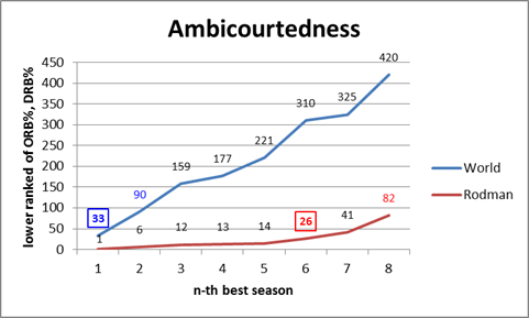
To prepare the data for this graph, I took the top 1000 rebounding seasons by total rebounding percentage (the gold-standard of rebounding statistics, as discussed in section (a)), and ranked them 1-1000 for both offensive (ORB%) and defensive (DRB%) rates. I then scored each season by the higher (larger number) ranking of the two. E.g., if a particular season scored a 25, that would mean that it ranks in the top 25 all-time for offensive rebounding percentage and in the top 25 all-time for defensive rebounding percentage (I should note that many players who didn’t make the top 1000 seasons overall would still make the top 1000 for one of the two components, so to be specific, these are the top 1000 ORB% and DRB% seasons of the top 1000 TRB% seasons).
This score doesn’t necessarily tell us who the best rebounder was, or even who was the most balanced, but it should tell us who was the strongest in the weakest half of their game (just as you might rank the off-hand of boxers or arm wrestlers). Fortunately, however, Rodman doesn’t leave much room for doubt: his 1994-1995 season is #1 all-time on both sides. He has 5 seasons that are dual top-15, while no other NBA player has even a single season that ranks dual top-30. The graph thus shows how far down you have to go to find any player with n number of seasons at or below that ranking: Rodman has 6 seasons register on the (jokingly titled) “Ambicourtedness” scale before any other player has 1, and 8 seasons before any player has 2 (for the record, Charles Barkley’s best rating is 215).
This outcome is fairly impressive alone, and it tells us that Rodman was amazingly good at both ORB and DRB – and that this is rare — but it doesn’t tell us anything about the relationship between the two. For example, if Rodman just got twice as many rebounds as any normal player, we would expect him to lead lists like this regardless of how he did it. Thus, if you believe the hypothesis that Rodman could have dramatically increased his rebounding performance just by focusing intently on rebounds, this result might not be unexpected to you.
The problem, though, is that there are both competitive and physical limitations to how much someone can really excel at both simultaneously. Not the least of which is that offensive and defensive rebounds literally take place on opposite sides of the floor, and not everyone gets up and set for every possession. Thus, if someone wanted to cheat toward getting more rebounds on the offensive end, it would likely come, at least in some small part, at the expense of rebounds on the defensive end. Similarly, if someone’s playing style favors one, it probably (at least slightly), disfavors the other. Whether or not that particular factor is in play, at the very least you should expect a fairly strong regression to the mean: thus, if a player is excellent at one or the other, you should expect them to be not as good at the other, just as a result of the two not being perfectly correlated. To examine this empirically, I’ve put all 1000 top TRB% seasons on a scatterplot comparing offensive and defensive rebound rates:
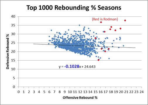
Clearly there is a small negative correlation, as evidenced by the negative coefficient in the regression line. Note that technically, this shouldn’t be a linear relationship overall – if we graphed every pair in history from 0,0 to D,R, my graph’s trendline would be parallel to the tangent of that curve as it approaches Dennis Rodman. But what’s even more stunning is the following:
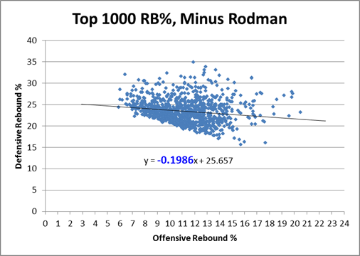
Rodman is in fact not only an outlier, he is such a ridiculously absurd alien-invader outlier that when you take him out of the equation, the equation changes drastically: The negative slope of the regression line nearly doubles in Rodman’s absence. In case you’ve forgotten, let me remind you that Rodman only accounts for 12 data points in this 1000 point sample: If that doesn’t make your jaw drop, I don’t know what will! For whatever reason, Rodman seems to be supernaturally impervious to the trade-off between offensive and defensive rebounding. Indeed, if we look at the same graph with only Rodman’s data points, we see that, for him, there is actually an extremely steep, upward sloping relationship between the two variables:
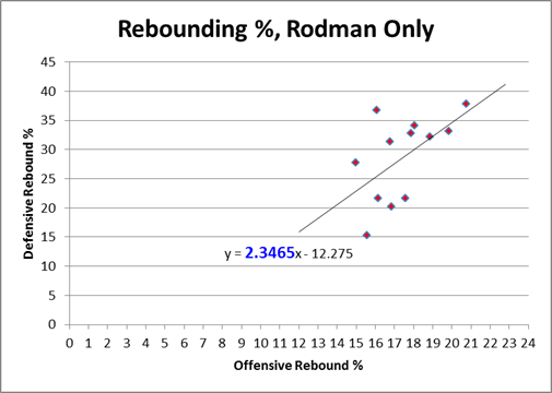
In layman’s terms, what this means is that Rodman comes in varieties of Good, Better, and Best — which is how we would expect this type of chart to look if there were no trade-off at all. Yet clearly the chart above proves that such a tradeoff exists! Dennis Rodman almost literally defies the laws of nature (or at least the laws of probability).
The ultimate point contra Barkley, et al, is that if Rodman “cheated” toward getting more rebounds all the time, we might expect that his chart would be higher than everyone else’s, but we wouldn’t have any particular reason to expect it to slope in the opposite direction. Now, this is slightly more plausible if he was “cheating” on the offensive side on the floor while maintaining a more balanced game on the defensive side, and there are any number of other logical speculations to be made about how he did it. But to some extent this transcends the normal “shift in degree” v. “shift in kind” paradigm: what we have here is a major shift in degree of a shift in kind, and we don’t have to understand it perfectly to know that it is otherworldly. At the very least, I feel confident in saying that if Charles Barkley or anyone else really believes they could replicate Rodman’s results simply by changing their playing styles, they are extremely naive.
Commenter AudacityOfHoops asks:
I don’t know if this is covered in later post (working my way through the series – excellent so far), or whether you’ll even find the comment since it’s 8 months late, but … did you create that same last chart, but for other players? Intuitively, it seems like individual players could each come in Good/Better/Best models, with positive slopes, but that when combined together the whole data set could have a negative slope.
I actually addressed this in an update post (not in the Rodman series) a while back:
A friend privately asked me what other NBA stars’ Offensive v. Defensive rebound % graphs looked like, suggesting that, while there may be a tradeoff overall, that doesn’t necessarily mean that the particular lack of tradeoff that Rodman shows is rare. This is a very good question, so I looked at similar graphs for virtually every player who had 5 or more seasons in the “Ambicourtedness Top 1000.” There are other players who have positively sloping trend-lines, though none that come close to Rodman’s. I put together a quick graph to compare Rodman to a number of other big name players who were either great rebounders (e.g., Moses Malone), perceived-great rebounders (e.g., Karl Malone, Dwight Howard), or Charles Barkley:

By my accounting, Moses Malone is almost certainly the 2nd-best rebounder of all time, and he does show a healthy dose of “ambicourtedness.” Yet note that the slope of his trendline is .717, meaning the difference between him and Rodman’s 2.346 is almost exactly twice the difference between him and the -.102 league average (1.629 v .819).
On a lighter note: Earlier I was thinking about how tired I am of hearing various ESPN commentators complain about Brett Favre’s “Hamlet impression” – though I was just using the term “Hamlet impression” for the rant in my head, no one was actually saying it (at least this time). I quickly realized how completely unoriginal my internal dialogue was being, and after scolding myself for a few moments, I resolved to find the identity of the first person to ever make the Favre/Hamlet comparison.
Lo and behold, the earliest such reference in the history of the internet – that is, according to Google – was none other than Gregg Easterbrook, in this TMQ column from August 27th, 2003:
TMQ loves Brett Favre. This guy could wake up from a knee operation and fire a touchdown pass before yanking out the IV line. It’s going to be a sad day when he cuts the tape off his ankles for the final time. And it’s wonderful that Favre has played his entire (meaningful) career in the same place, honoring sports lore and appeasing the football gods, never demanding a trade to a more glamorous media market.
But even as someone who loves Favre, TMQ thinks his Hamlet act on retirement has worn thin. Favre keeps planting, and then denying, rumors that he is about to hang it up. He calls sportswriters saying he might quit, causing them to write stories about how everyone wants him to stay; then he calls more sportswriters denying that he will quit, causing them to write stories repeating how everyone wants him to stay. Maybe Favre needs to join a publicity-addiction recovery group. The retire/unretire stuff got pretty old with Frank Sinatra and Michael Jordan; it’s getting old with Favre.
Ha!
I was just watching the Phillies v. Mets game on TV, and the announcers were discussing this Outside the Lines study about MLB umpires, which found that 1 in 5 “close” calls were missed over their 184 game sample. Interesting, right?
So I opened up my browser to find the details, and before even getting to ESPN, I came across this criticism of the ESPN story by Nate Silver of FiveThirtyEight, which knocks his sometimes employer for framing the story on “close calls,” which he sees as an arbitrary term, rather than something more objective like “calls per game.” Nate is an excellent quantitative analyst, and I love when he ventures from the murky world of politics and polling to write about sports. But, while the ESPN study is far from perfect, I think his criticism here is somewhat off-base ill-conceived.
The main problem I have with Nate’s analysis is that the study’s definition of “close call” is not as “completely arbitrary” as Nate suggests. Conversely, Nate’s suggested alternative metric – blown calls per game – is much more arbitrary than he seems to think.
First, in the main text of the ESPN.com article, the authors clearly state that the standard for “close” that they use is: “close enough to require replay review to determine whether an umpire had made the right call.” Then in the 2nd sidebar, again, they explicitly define “close calls” as “those for which instant replay was necessary to make a determination.” That may sound somewhat arbitrary in the abstract, but let’s think for a moment about the context of this story: Given the number of high-profile blown calls this season, there are two questions on everyone’s mind: “Are these umps blind?” and “Should baseball have more instant replay?” Indeed, this article mentions “replay” 24 times. So let me be explicit where ESPN is implicit: This study is about instant replay. They are trying to assess how many calls per game could use instant replay (their estimate: 1.3), and how many of those reviews would lead to calls being overturned (their estimate: 20%).
Second, what’s with a quantitative (sometimes) sports analyst suddenly being enamored with per-game rather than rate-based stats? Sure, one blown call every 4 games sounds low, but without some kind of assessment of how many blown call opportunities there are, how would we know? In his post, Nate mentions that NBA insiders tell him that there were “15 or 20 ‘questionable’ calls” per game in their sport. Assuming ‘questionable’ means ‘incorrect,’ does that mean NBA referees are 60 to 80 times worse than MLB umpires? Certainly not. NBA refs may or may not be terrible, but they have to make double or even triple digit difficult calls every night. If you used replay to assess every close call in an NBA game, it would never end. Absent some massive longitudinal study comparing how often officials miss particular types of calls from year to year or era to era, there is going to be a subjective component when evaluating officiating. Measuring by performance in “close” situations is about as good a method as any.
Which is not to say that the ESPN metric couldn’t be improved: I would certainly like to see their guidelines for figuring out whether a call is review-worthy or not. In a perfect world, they might even break down the sets of calls by various proposals for replay implementation. As a journalistic matter, maybe they should have spent more time discussing their finding that only 1.3 calls per game are “close,” as that seems like an important story in its own right. On balance, however, when it comes to the two main issues that this study pertains to (the potential impact of further instant replay, and the relative quality of baseball officiating), I think ESPN’s analysis is far more probative than Nate’s.