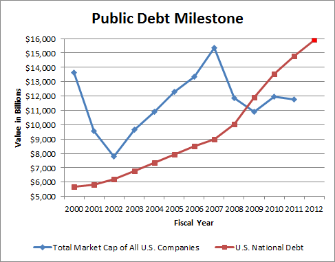
I’m not really into finance, I’m not an economist, and I’m not trying to be Nate Silver, but I was messing around with some data and thought this was pretty interesting:
The blue line is based on the Wilshire 5000, which tracks the total market capitalization (share price times number of shares) of all publicly traded U.S.-based companies. Data points for both measures are as of the close of the fiscal year. The bright red dot is the projected national debt at the end of FY 2012, assuming no new budget deals are reached.

So…. what does it mean? Obviously the market cap of publically traded US companies have taken a hit while the debt has increased, but how does that sit in an historical context (i.e. the Great Depression, or perhaps the 1950s-60s).
I wonder if there’s an estimation of the value of non-publically traded companies out there.
Yeah, so? Any interpretation or opinions about the graph?
Are you saying the U.S. government currently owes more than the value of public companies? Or that there seems to be no relationship between value of public companies and the U.S. debt? Not sure what to make of this graph.
Also, a minor point, but as an economist, you’d probably want to normalize the debt measure somehow, usually by taking the ratio of debt to GDP. And maybe adjust the value of public companies for inflation.
I mostly like it as an intuition pump about the scope of the debt. Most people have no tangible idea what 13 trillion means, and I’d guess that “larger than the value of the entire u.s. stock market” would be surprising to many.
And I kind of like the unadjusted quality: it keeps it accessible, and for comparison’s-sake, I don’t think it really matters.
the problem with the graph is that it doesn’t take historical context or size of the economy into account. contrary to what you say, most people react to $13 trillion not with “huh, waht does that mean?” but with “ZOMG!!!”
if you look at debt-to-gdp ratios throughout history, what we have right now isn’t all that out of line. during WWII we had debt that was 250% of GDP. what lessons do we glean from that factoid?
I don’t think that’s so much a “problem” with the graph as with one of the “lessons” people might infer from it.