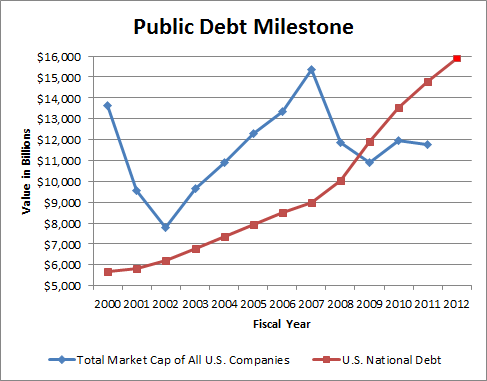
I’m not really into finance, I’m not an economist, and I’m not trying to be Nate Silver, but I was messing around with some data and thought this was pretty interesting:
The blue line is based on the Wilshire 5000, which tracks the total market capitalization (share price times number of shares) of all publicly traded U.S.-based companies. Data points for both measures are as of the close of the fiscal year. The bright red dot is the projected national debt at the end of FY 2012, assuming no new budget deals are reached.
