Don’t Play Baseball With Bill Belichick

[Note: I apologize for missing last Wednesday and Friday in my posting schedule. I had some important business-y things going on Wed and then went to Canada for a wedding over the weekend.]

Last week I came across this ESPN article (citing this Forbes article) about how Bill Belichick is the highest-paid coach in American sports:

Bill Belichick tops the list for the second year in a row following the retirement of Phil Jackson, the only coach to have ever made an eight-figure salary. Belichick is believed to make $7.5 million per year. Doc Rivers is the highest-paid NBA coach at $7 million.

Congrats to Belichick for a worthy accomplishment! Though I still think it probably under-states his actual value, at least relative to NFL players. As I tweeted:

Of course, coaches’ salaries are different from players’: they aren’t constrained by the salary cap, nor are they boosted by the mandatory revenue-sharing in the players’ collective bargaining agreement.  Yet, for comparison, this season Belichick will make a bit more than a third of what Peyton Manning will in Denver. As I’ve said before, I think Belichick and Manning have been (almost indisputably) the most powerful forces in the modern NFL (maybe ever). Here’s the key visual from my earlier post, updated to include last season (press play):

The x axis is wins in season n, y axis is wins in season n+1.

Naturally, Belichick has benefited from having Tom Brady on his team. However, Brady makes about twice as much as Belichick does, and I think you would be hard-pressed to argue that he’s twice as valuable—and I think top QB’s are probably underpaid relative to their value anyway.

But being high on Bill Belichick is about more than just his results. He is well-loved in the analytical community, particularly for some of his high-profile 4th down and other in-game tactical decisions.  But I think those flashy calls are merely a symptom of his broader commitment to making intelligent win-maximizing decisions—a commitment that is probably even more evident in the decisions he has made and strategies he has pursued in his role as the Patriots’ General Manager.

But rather than sorting through everything Belichick has done that I like, I want to take a quick look at one recent adjustment that really impressed me: the Patriots out-of-character machinations in the 2012 draft.

The New Rookie Salary Structure

One of the unheralded elements to the Patriots’ success—perhaps rivaling Tom Brady himself in actual importance—is their penchant for stock-piling draft-picks in the “sweet spot” of the NFL draft (late 1st to mid-2nd round), where picks have the most surplus value. Once again, here’s the killer graph from the famous Massey-Thaler study on the topic:

In the 11 drafts since Belichick took over, the Patriots have made 17 picks between numbers 20 and 50 overall, the most in the NFL (the next-most is SF with 15, league average is obv 11). To illustrate how unusual their draft strategy has been, here’s a plot of their 2nd round draft position vs. their total wins over the same period:

Despite New England having the highest win percentage (not to mention most Super Bowl wins and appearances) over the period, there are 15 teams with lower average draft positions in the 2nd round. For comparison, they have the 2nd lowest average draft position in the 1st round and 7th lowest in the third.

Of course, the new collective bargaining agreement includes a rookie salary scale. Without going into all the details (in part because they’re extremely complicated and not entirely public), the key points are that it keeps total rookie compensation relatively stable while flattening the scale at the top, reducing guaranteed money, and shortening the maximum number of years for each deal.

These changes should all theoretically flatten out the “value curve” above. Here’s a rough sketch of what the changes seem to be attempting:

Since the original study was published, the dollar values have gone up and the top end has gotten more skewed. I adjusted the Y-axis to reflect the new top, but didn’t adjust the curve itself, so it should actually be somewhat steeper than it appears.  I tried to make the new curves as conceptually accurate as I could, but they’re not empirical and should be considered more of an “artist’s rendition” of what I think the NFL is aiming for.

With a couple of years of data, this should be a very interesting issue to revisit.  But, for now, I think it’s unlikely that the curve will actually be flattened very much. If I had to guess, I think it may end up “dual-peaked”: By far the greatest drop in guaranteed money will be for top QB prospects taken with the first few picks. These players already provide the most value, and are the main reason the original M/T performance graph inclines so steeply on the left. Additionally, they provide an opportunity for continued surplus value beyond the length of the initial contract. This should make the top of the draft extremely attractive, at least in years with top QB prospects.

On the other hand, I think the bulk of the effect on the rest of the surplus-value curve will be to shift it to the left. My reasons for thinking this are much more complicated, and include my belief that the original Massey/Thaler study has problems with its valuation model, but the extremely short version is that I have reason to believe that people systematically overvalue upper/middle 1st round picks.

How the Patriots Responded

Since I’ve been following the Patriots’ 2nd-round-oriented drafting strategy for years now, naturally my first thoughts after seeing the details of the new deal went to how this could kill their edge. Here’s a question I tweeted at the Sloan conference:

Actually, my concern about the Patriots drafting strategy was two-fold:

  1. The Patriots favorite place to draft could obviously lose its comparative value under the new system. If they left their strategy as-is, it could lead to their picking sub-optimally. At the very least, it should eliminate their exploitation opportunity.
  2. Though a secondary issue for this post, at some point  taking an extreme bang-for-your-buck approach to player value can run into diminishing returns and cause stagnation. Since you can only have so many players on your roster or on the field at a time, your ability to hoard and exploit “cheap” talent is constrained. This is a particularly big concern for teams that are already pretty good, especially if they already have good “value” players in a lot of positions: At some point, you need players who are less cheap but higher quality, even if their value per dollar is lower than the alternative.

Of course, if you followed the draft, you know that the Patriots, entering the draft with far fewer picks than usual, still traded up in the 1st round, twice.

Taken out of context, these moves seem extremely out of character for the Patriots. Yet the moves are perfectly consistent with an approach that understands and attacks my concerns: Making fewer, higher-quality picks is essentially the correct solution, and if the value-curve has indeed shifted up as I expect it has, the new epicenter of the Patriots’ draft activity may be directly on top of the new sweet spot.

Baseball

The entire affair reminds me of an old piece of poker wisdom that goes something like this: In a mixed game with one truly expert poker player and a bunch of completely outclassed amateurs, the expert’s biggest edge wouldn’t come in the poker variant with which he has the most expertise, but in some ridiculous spontaneous variant with tons of complicated made-up rules.

I forget where I first read the concept, but I know it has been addressed in various ways by many authors, ranging from Mike Caro to David Sklansky. I believe it was the latter (though please correct me if I’m wrong), who specifically suggested a Stud variant some of us remember fondly from childhood:

Several different games played only in low-stakes home games are called Baseball, and generally involve many wild cards (often 3s and 9s), paying the pot for wild cards, being dealt an extra upcard upon receiving a 4, and many other ad-hoc rules (for example, the appearance of the queen of spades is called a “rainout” and ends the hand, or that either red 7 dealt face-up is a rainout, but if one player has both red 7s in the hole, that outranks everything, even a 5 of a kind). These same rules can be applied to no peek, in which case the game is called “night baseball”.

The main ideas are that A) the expert would be able to adapt to the new rules much more quickly, and B) all those complicated rules make it much more likely that he would be able to find profitable exploitations (for Baseball in particular, there’s the added virtue of having several betting rounds per hand).

It will take a while to see how this plays out, and of course the abnormal outcome could just be a circumstances-driven coincidence rather than an explicit shift in the Patriots’ approach. But if my intuitions about the situation are right, Belichick may deserve extra credit for making deft adjustments in a changing landscape, much as you would expect from the Baseball-playing shark.

Stat Geek Smackdown 2012, Round 1: Odds and Ends

So in case any of you haven’t been following, the 2012 edition of the ESPN True Hoop Stat Geek Smackdown  is underway.  Now, obviously this competition shouldn’t be taken too seriously, as it’s roughly the equivalent of picking a weekend’s worth of NFL games, and last year I won only after picking against my actual opinion in the Finals (with good reason, of course).  That said, it’s still a lot of fun to track, and basketball is a deterministic-enough sport that I do think skill is relevant. At least enough that I will talk shit if I win again.

To that end, the first round is going pretty well for me so far.  Like last year, the experts are mostly in agreement. While there is a fair amount of variation in the series length predictions, there are only two matchups that had any dissent as to the likely winner: the 6 actual stat geeks split 4-2 in favor of the Lakers over the Nuggets, and 3-3 between the Clippers and the Grizzlies.  As it happens, I have both Los Angeles teams (yes, I am from Homer), as does Matthew Stahlhut (though my having the Lakers in 5 instead of 7 gives me a slight edge for the moment).  No one has gained any points on anyone else yet, but here is my rough account of possible scenarios:

[table “9” not found /]

On to some odds and ends:

The Particular Challenges of Predicting 2012

Making picks this year was a bit harder than in years past.  At one point I seriously considered picking Dallas against OKC (in part for strategic purposes), before reason got the better of me.  Abbott only published part of my comment on the series, so here’s the full version I sent him:

Throughout NBA history, defending champions have massively over-performed in the playoffs relative to their regular season records, so I wouldn’t count Dallas out.  In fact, the spot Dallas finds itself in is quite similar to Houston’s in 1995, and this season’s short lead -time and compressed schedule should make us particularly wary of the usual battery of predictive models.

Thus, if I had to pick which of these teams is more likely to win the championship, I might take Dallas (or at least it would be a closer call).  But that’s a far different question from who is most likely to win this particular series: Oklahoma City is simply too solid and Dallas too shaky to justify an upset pick. E.g., my generic model makes OKC a >90% favorite, so even a 50:50 chance that Dallas really is the sleeping giant Mark Cuban dreams about probably wouldn’t put them over the top.

That last little bit is important: The “paper gap” between Dallas and OKC is so great that even if Dallas were considerably better than they appeared during the regular season, that would only make them competitive, while if they were about as good as they appeared, they would be a huge dog (this kind of situation should be very familiar to any serious poker players out there).

But why on earth would I think Dallas might be any good in the first place? Well, I’ll discuss more below why champions should never be ignored, but the “paper difference” this year should be particularly inscrutable.  The normal methods for predicting playoff performance (both my own and others) are particularly ill-suited for the peculiar circumstances of this season:

  1. Perhaps most obviously, fewer regular season games means smaller sample sizes.  In turn, this means that sample-sensitive indicators (like regular season statistics) should have less persuasive value relative to non-sensitive ones (like championship pedigree).  It also affects things like head to head record, which is probably more valuable than a lot of stats people think, though less valuable than a lot of non-stats people think.  I’ve been working on some research about this, but for an example, look at this post about how I thought there seemed to be a market error w/r/t Dallas vs. Miami in game 6, partly b/c of the bayesian value of Dallas’s head to head advantage.
  2. Injuries are a bigger factor. This is not just that there are more of them (which is debatable), but there is less flexibility to effectively manage them: e.g., there’s obv less time to rehab players, but also less time to develop new line-ups and workarounds or make other necessary adjustments. In other words, a very good team might be hurt more by a role-player being injured than usual.
  3. What is the most reliable data? Two things I discussed last year were that (contra unconventional wisdom) Win% is more reliable for post-season predictions than MOV-type stats, and that (contra conventional wisdom) early season performance is typically more predictive than late season performance.  But both of these are undermined by the short season.  The fundamental value of MOV is as a proxy for W% that is more accurate for smaller sample sizes. And the predictive power of early-season performance most likely stems from its being more representative of playoff basketball: e.g., players are more rested and everyone tries their hardest.  However, not only are these playoffs not your normal playoffs, but this season was thrown together so quickly that a lot of teams had barely figured out their lineups by the quarter-pole. While late-season records have the same problems as usual, they may be more predictive just from being more similar to years past.
  4. Finally, it’s not just the nature of the data, but the nature of the underlying game as well. For example, in a lockout year, teams concerned with injury may be quicker to pull starting players in less lopsided scenarios than usual, making MOV less useful, etc. I won’t go into every possible difference, but here’s a related Twitter exchange:


Which brings us to the next topic:

The Simplest Playoff Model You’ll Never Beat

The thing that Henry Abbott most highlighted from my Smackdown picks (which he quoted at least 3 times in 3 different places) was my little piece of dicta about the Spurs:

I have a ‘big pot’ playoff model (no matchups, no simulations, just stats and history for each playoff team as input) that produces some quirky results that have historically out-predicted my more conventional models. It currently puts San Antonio above 50 percent. Not just against Utah, but against the field. Not saying I believe it, but there you go.

I really didn’t mean for this to be taken so seriously: it’s just one model.  And no, I’m not going to post it. It’s experimental, and it’s old and needs updating (e.g., I haven’t adjusted it to account for last season yet).

But I can explain why it loves the Spurs so much: it weights championship pedigree very strongly, and the Spurs this year are the only team near the top that has any.

Now some stats-loving people argue that the “has won a championship” variable is unreliable, but I think they are precisely wrong.  Perhaps this will change going forward, but, historically, there are no two ways to cut it: No matter how awesomely designed and complicated your models/simulations are, if you don’t account for championship experience, you will lose to even the most rudimentary model that does.

So case in point, I came up with this 2-step method for picking NBA Champions:

  1. If there are any teams within 5 games of the best record that have won a title within the past 5 years, pick the most recent.
  2. Otherwise, pick the team with the best record.

Following this method, you would correctly pick the eventual NBA Champion in 64.3% of years since the league moved to a 16-team playoff in 1984 (with due respect to the slayer, I call this my “5-by-5” model ).

Of course, thinking back, it seems like picking the winner is sometimes easy, as the league often has an obvious “best team” that is extremely unlikely to ever lose a 7 game series.  So perhaps the better question to ask is: How much do you gain by including the championship test in step 1?

The answer is: a lot. Over the same period, the team with the league’s best record has won only 10/28 championships, or ~35%. So the 5-by-5 model almost doubles your hit rate.

And in case you’re wondering, using Margin of Victory, SRS, or any other advanced stat instead of W-L record doesn’t help: other methods vary from doing slightly worse to slightly better. While there may still be room to beef up the complexity of your predictive model (such as advanced stats, situational simulations, etc), your gains will be (comparatively) marginal at best. Moreover, there is also room for improvement on the other side: by setting up a more formal and balanced tradeoff between regular season performance and championship history, the macro-model can get up to 70+% without danger of significant over-fitting.

In fairness, I should note that the 5-by-5 model has had a bit of a rough patch recently—but, in its defense, so has every other model. The NBA has had some wacky results recently, but there is no indication that stats have supplanted history. Indeed, if you break the historical record into groups of more-predictable and less-predictable seasons, the 5-by-5 model trumps pure statistical models in all of them.

Uncertainty and Series Lengths

Finally, I’d like to quickly address the complete botching of series-length analysis that I put forward last year. Not only did I make a really elementary mistake in my explanation (that an emailer thankfully pointed out), but I’ve come to reject my ultimate conclusion as well.

Aside from strategic considerations, I’m now fairly certain that picking the home team in 5 or the away team in 6 is always right, no matter how close you think the series is. I first found this result when running playoff simulations that included margin for error (in other words, accounting for the fact that teams may be better or worse than their stats would indicate, or that they may match up more or less favorably than the underlying records would suggest), but I had some difficulty getting this result to comport with the empirical data, which still showed “home team in 6” as the most common outcome.  But now I think I’ve figured this problem out, and it has to do with the fact that a lot of those outcomes came in spots where you should have picked the other team, etc. But despite the extremely simple-sounding outcome,  it’s a rich and interesting topic, so I’ll save the bulk of it for another day.

Thoughts on the Packers Yardage Anomaly

In their win over Detroit on Sunday, Green Bay once again managed to emerge victorious despite giving up more yards than they gained. This is practically old hat for them, as it’s the 10th time that they’ve done it this year. Over the course of the season, the 15-1 Packers gave up a stunning 6585 yards, while gaining “just” 6482—thus losing the yardage battle despite being the league’s most dominant team.

This anomaly certainly captures the imagination, and I’ve received multiple requests for comment.  E.g., a friend from my old poker game emails:

Just heard that the Packers have given up more yards than they’ve gained and was wondering how to explain this.  Obviously the Packers’ defense is going to be underrated by Yards Per Game metrics since they get big leads and score quickly yada yada, but I don’t see how this has anything to do with the fact they’re being outgained.  I assume they get better starting field position by a significant amount relative to their opponents so they can have more scoring drives than their opponents while still giving up more yards than they gain, but is that backed up by the stats?

Last week Advanced NFL Stats posted a link to this article from Smart Football looking into the issue in a bit more depth. That author does a good job examining what this stat means, and whether or not it implies that Green Bay isn’t as good as they seem (he more or less concludes that it doesn’t).

But that doesn’t really answer the question of how the anomaly is even possible, much less how or why it came to be.  With that in mind, I set out to solve the problem.  Unfortunately, after having looked at the issue from a number of angles, and having let it marinate in my head for a week, I simply haven’t found an answer that I find satisfying.  But, what the hell, one of my resolutions is to pull the trigger on this sort of thing, so I figure I should post what I’ve got.

How Anomalous?

The first thing to do when you come across something that seems “crazy on its face” is to investigate how crazy it actually is (frequently the best explanation for something unusual is that it needs no explanation).  In this case, however, I think the Packers’ yardage anomaly is, indeed, “pretty crazy.”  Not otherworldly crazy, but, say, on a scale of 1 to “Kurt Warner being the 2000 MVP,” it’s at least a 6.

First, I was surprised to discover that just last year, the New England Patriots also had the league’s best record (14-2), and also managed to lose the yardage battle.  But despite such a recent example of a similar anomaly, it is still statistically pretty extreme.  Here’s a plot of more or less every NFL team season from 1936 through the present, excluding seasons where the relevant stats weren’t available or were too incomplete to be useful (N=1647):

The green diamond is the Packers net yardage vs. Win%, and the yellow triangle is their net yardage vs. Margin of Victory (net points).  While not exactly Rodman-esque outliers, these do turn out to be very historically unusual:

Win %

Using the trendline equation on the graph above (plus basic algebra), we can use a team’s season Win percentage to calculate their expected yardage differential.  With that prediction in hand, we can compare how much each team over or under-performed its “expectation”:

Both the 2011 Packers and the 2010 Patriots are in the top 5 all-time, and I should note that the 1939 New York Giants disparity is slightly overstated, because I excluded tie games entirely (ties cause problems elsewhere b/c of perfect correlation with MOV).

Margin of Victory

Toward the conclusion of that Smart Football article, the author notes that Green Bay’s Margin of Victory isn’t as strong as their overall record, noting that the Packers “Pythagorian Record” (expectation computed from points scored and points allowed) is more like 11-5 or 12-4 than 15-1 (note that getting from extremely high Win % to very high MOV is incidental: 15-win teams are usually 11 or 12 win teams that have experienced good fortune).  Green Bay’s MOV of 12.5 is a bit lower than the historical average for 15-1 teams (13.8) but don’t let this mislead you: the disparity between the yardage differential that we would expect based on Green Bay’s MOV and their actual result (using a linear projection, as above) is every bit as extreme as what we saw from Win %:

And here, in histogram form:

So, while not the most unusual thing to ever happen in sports, this anomaly is certainly unusual enough to look into.

For the record, the Packers’ MOV -> yard diff error is 3.23 standard deviations above the mean, while the Win% -> yard diff is 3.28.  But since MOV correlates more strongly with the target stat (note an average error of only 125 yards instead of 170), a similar degree of abnormality leaves it as the more stable and useful metric to look at.

Thus, the problem can be framed as follows: The 2011 Packers fell around 2000 yards (the 125.7 above * 16 games) short of their expected yardage differential.  Where did that 2000 yard gap come from?

Possible Factors and/or Explanations

Before getting started, I should note that, out of necessity, some of these “explanations” are more descriptive than actually explanatory, and even the ones that seem plausible and significant are hopelessly mixed up with one another.  At the end of the day, I think the question of “What happened?” is addressable, though still somewhat unclear.  The question of “Why did it happen?” remains largely a mystery: The most substantial claim that I’m willing to make with any confidence is that none of the obvious possibilities are sufficient explanations by themselves.

While I’m somewhat disappointed with this outcome, it makes sense in a kind of Fermi Paradox, “Why Aren’t They Here Yet?” kind of way.  I.e., if any of the straightforward explanations (e.g., that their stats were skewed by turnovers or “garbage time” distortions) could actually create an anomaly of this magnitude, we’d expect it to have happened more often.

And indeed, the data is actually consistent with a number of different factors (granted, with significant overlap) being present at once.

Line of Scrimmage, and Friends

As suggested in the email above, one theoretical explanation for the anomaly could be the Packers’ presumably superior field position advantage.  I.e., with their offense facing comparatively shorter fields than their opponents, they could have literally had fewer yards available to gain.  This is an interesting idea, but it turns out to be kind of a bust.

The Packers did enjoy a reciprocal field position advantage of about 5 yards.  But, unfortunately, there doesn’t seem to be a noticeable relationship between average starting field position and average yards gained per drive (which would have to be true ex ante for this “explanation” to have any meaning):

Note: Data is from the Football Outsiders drive stats.

This graph plots both offenses and defenses from 2011.  I didn’t look at more historical data, but it’s not really necessary: Even if a larger dataset revealed a statistically significant relationship, the large error rate (which converges quickly) means that it couldn’t alter expectation in an individual case by more than a fraction of a yard or so per possession.  Since Green Bay only traded 175ish possessions this season, it couldn’t even make a dent in our 2000 missing yards (again, that’s if it existed at all).

On the other hand, one thing in the F.O. drive stats that almost certainly IS a factor, is that the Packers had a net of 10 fewer possessions this season than their opponents.  As Green Bay averaged 39.5 yards per possession, this difference alone could account for around 400 yards, or about 20% of what we’re looking for.

Moreover, 5 of those 10 possessions come from a disparity in “zero yard touchdowns,” or net touchdowns scored by their defense and special teams: The Packers scored 7 of these (5 from turnovers, 2 from returns) while only allowing 2 (one fumble recovery and one punt return).  Such scores widen a team’s MOV without affecting their total yardage gap.

[Warning: this next point is a bit abstract, so feel free to skip to the end.] Logically, however, this doesn’t quite get us where we want to go.  The relevant question is “What would the yardage differential have been if the Packers had the same number of possessions as their opponents?”  Some percentage of our 10 counterfactual drives would result in touchdowns regardless.  Now, the Packers scored touchdowns on 37% of their actual drives, but scored touchdowns on at least 50% of their counterfactual drives (the ones that we can actually account for via the “zero yard touchdown” differential).  Since touchdown drives are, on average, longer than non-touchdown drives, this means that the ~400 yards that can be attributed to the possession gap is at least somewhat understated.

Garbage Time

When considering this issue, probably the first thing that springs to minds is that the Packers have won a lot of games easily.  It seems highly plausible that, having rushed out to so many big leads, the Packers must have played a huge amount of “garbage time,” in which their defense could have given up a lot of “meaningless” yards that had no real consequence other than to confound statisticians.

The proportion of yards on each side of the ball that came after Packers games got out of hand should be empirically checkable—but, unfortunately, I haven’t added 2011 Play-by-Play data to my database yet.  That’s okay, though, because there are other ways—perhaps even more interesting ways—to attack the problem.

In fact, it’s pretty much right up my alley: Essentially, what we are looking for here is yet another permutation of “Reverse Clutch” (first discussed in my Rodman series, elaborated in “Tim Tebow and the Taxonomy of Clutch”). Playing soft in garbage time is a great way for a team to “underperform” in statistical proxies for true strength.  In football, there are even a number of sound tactical and strategic reasons why you should explicitly sacrifice yards in order to maximize your chances of winning.  For example, if you have a late lead, you should be more willing to soften up your defense of non-sideline runs and short passes—even if it means giving up more yards on average than a conventional defense would—since those types of plays hasten the end of the game.  And the converse is true on offense:  With a late lead, you want to run plays that avoid turnovers and keep the clock moving, even if it means you’ll be more predictable and easier to defend.

So how might we expect this scenario to play out statistically?  Recall, by definition, “clutch” and “reverse clutch” look the same in a stat sheet.  So what kind of stats—or relationships between stats—normally indicate “clutchness”?  As it turns out, Brian Burke at Advanced NFL Stats has two metrics pretty much at the core of everything he does: Expected Points Added, and Win Percentage Added.  The first of these (EPA) takes the down and distance before and after each play and uses historical empirical data to model how much that result normally affects a team’s point differential.  WPA adds time and score to the equation, and attempts to model the impact each play has on the team’s chances of winning.

A team with “clutch” results—whether by design or by chance—might be expected to perform better in WPA (which ultimately just adds up to their number of wins) than in EPA (which basically measures generic efficiency).

For most aspects of the game, the relationship between these two is strong enough to make such comparisons possible.  Here are plots of this comparison for each of the 4 major categories (2011 NFL, Green Bay in green), starting with passing offense (note that the comparison is technically between wins added overall and expected points per play):

And here’s passing defense:

Rushing offense:

And rushing defense:

Obviously there’s nothing strikingly abnormal about Green Bay’s results in these graphs, but there are small deviations that are perfectly consistent with the garbage time/reverse clutch theory.  For the passing game (offense and defense), Green Bay seems to hew pretty close to expectation.  But in the rushing game they do have small but noticeable disparities on both sides of the ball.  Note that in the scenario I described where a team intentionally trades efficiency for win potential, we would expect the difference to be most acute in the running game (which would be under-defended on defense and overused on offense).

Specifically: Green Bay’s offensive running game has a WPA of 1.1, despite having an EPA per play of zero (which corresponds to a WPA of .25).  On defense, the Packers’ EPA/p is .07, which should correspond to an expected WPA of 1.0, while their actual result is .59.

Clearly, both of these effects are small, considering there isn’t a perfect correlation.  But before dismissing them entirely, I should note that we don’t immediately know how much of the variation in the graphs above is due to variance for a given team and how much is due to variation between teams.  Moreover, without knowing the balance, the fact that both variance and variation contribute to the “entropy” of the observed relationship between EPA/p and WPA, the actual relationship between the two is likely to be stronger than these graphs would make it seem.

The other potential problem is that this comparison is between wins and points, while the broader question is comparing points to yards.  But there’s one other statistical angle that helps bridge the two, while supporting the speculated scenario to boot: Green Bay gained 3.9 yards per attempt on offense, and allowed 4.7 yards per attempt on defense—while the league average is 4.3 yards per attempt.  So, at least in terms of raw yardage, Green Bay performed “below average” in the running game by about .4 yards/attempt on each side of the ball.  Yet, the combined WPA for the Packers running game is positive! Their net rushing WPA is +.5, despite having an expected combined WPA (actually based on their EPA) of -.75.

So, if we thought this wasn’t a statistical artifact, there would be two obvious possible explanations: 1) That Green Bay has a sub-par running game that has happened to be very effective in important spots, or 2) that Green Bay actually has an average (or better) running game that has appeared ineffective (especially as measured by yards gained/allowed) in less important spots. Q.E.D.

For the sake of this analysis, let’s assume that the observed difference for Green Bay here really is a product of strategic adjustments stemming from (or at least related to) their winning ways, how much of our 2000 yard disparity could it account for?

So let’s try a crazy, wildly speculative, back-of-the-envelope calculation: Give Green Bay and its opponents the same number of rushing attempts that they had this season, but with both sides gaining an average number of yards per attempt.  The Packers had 395 attempts and their opponents had 383, so at .4 yards each, the yardage differential would swing by 311 yards.  So again, interesting and plausibly significant, but doesn’t even come close to explaining our anomaly on its own.

Turnover Effect?

One of the more notable features of the Packers season is their incredible +22 turnover margin.  How they managed that and whether it was simply variance or something more meaningful could be its own issue.  But in this context, give them the +22, how helpful is that as an explanation for the yardage disparity?  Turnovers affect scores and outcomes a ton, but are relatively neutral w/r/t yards, so surely this margin is relevant.  But exactly how much does it neutralize the problem?

Here, again, we can look at the historical data.  To predict yardage differential based on MOV and turnover differential, we can set up an extremely basic linear regression:

The R-Square value of .725 means that this model is pretty accurate (MOV alone achieved around .66).  Both variables are extremely significant (from p value, or absolute value of t-stat).  Based on these coefficients, the resulting predictive equation is

YardsDiff = 7.84*MOV – 23.3*TOdiff/gm

Running the dataset through the same process as above (comparing predictions with actual results and calculating the total error), here’s how the new rankings turns out:

In other words, if we account for turnovers in our predictions, the expected/actual yardage discrepancy drops from ~125 to ~70 yards per game.  This obv makes the results somewhat less extreme, though still pretty significant: 11th of 1647.  Or, in histogram form:

So what’s the bottom line?  At 69.5 yards per game, the total “missing” yardage drops to around 1100.  Therefore, inasmuch as we accept it as an “explanation,” Green Bay’s turnover differential seems to account for about 900 yards.

It’s probably obvious, but important enough to say anyway, that there is extensive overlap between this “explanation” and our others above: E.g., the interception differential contributes to the possession differential, and is exacerbated by garbage time strategy, which causes the EPA/WPA differential, etc.

“Bend But Don’t Break”

Finally, I have to address a potential cause of this anomaly that I would almost rather not: The elusive “Bend But Don’t Break” defense.  It’s a bit like the Dark Matter of this scenario: I can prove it exists, and estimate about how much is there, but that doesn’t mean I have any idea what it is or where it comes from, and it’s almost certainly not as sexy as people think it is.

Typically, “Bend But Don’t Break” is the description that NFL analysts use for bad defenses that get lucky.  As a logical and empirical matter, they mostly don’t make sense: Pretty much every team in history (save, possibly, the 2007 New England Patriots) has a steeply inclined expected points by field position curve.  See, e.g., the “Drive Results” chart in this post.  Any time you “bend” enough to give up first downs, you’re giving up expected points. In other words, barring special circumstances, there is simply no way to trade significant yards for a decreased chance of scoring.

Of course, you can have defenses that are stronger at defending various parts of the field, or certain down/distance combinations, which could have the net effect of allowing fewer points than you would expect based on yards allowed, but that’s not some magical defensive rope-a-dope strategy, it’s just being better at some things than others.

But for whatever reason, on a drive-by-drive basis, did the Green Bay defense “bend” more than it “broke”? In other words, did they give up fewer points than expected?

And the answer is “yes.”  Which should be unsurprising, since it’s basically a minor variant of the original problem.  In other words, it begs the question.

In fact, with everything that we’ve looked at so far, this is pretty much all that is left: if there weren’t a significant “Bend But Don’t Break” effect observable, the yardage anomaly would be literally impossible.

And, in fact, this observation “accounts” for about 650 yards, which, combined with everything else we’ve looked at (and assuming a modest amount of overlap), puts us in the ballpark of our initial 2000 yard discrepancy.

Extremely Speculative Conclusions

Some of the things that seem speculative above must be true, because there has to be an accounting: even if it’s completely random, dumb luck with no special properties and no elements of design, there still has to be an avenue for the anomaly to manifest.

So, given that some speculation is necessary, the best I can do is offer a sort of “death by a thousand cuts” explanation.  If we take the yardage explained by turnovers, the “dark matter” yards of “bend but don’t break”, and then roughly half of our speculated consequences of the fewer drives/zero yard TD’s and the “Garbage Time” reverse-clutch effect (to account for overlap), you actually end up with around 2100 yards, with a breakdown like so:

So why cut drives and reverse clutch in half instead of the others?  Mostly just to be conservative. We have to account for overlap somewhere, and I’d rather leave more in the unknown than in the known.

At the end of the day, the stars definitely had to align for this anomaly to happen: Any one of the contributing factors may have been slightly unusual, but combine them and you get something rare.

A Defense of Sudden Death Playoffs in Baseball

So despite my general antipathy toward America’s pastime, I’ve been looking into baseball a lot lately.  I’m working on a three part series that will “take on” Pythagorean Expectation.  But considering the sanctity of that metric, I’m taking my time to get it right.

For now, the big news is that Major League Baseball is finally going to have realignment, which will most likely lead to an extra playoff team, and a one game Wild Card series between the non–division winners.  I’m not normally one who tries to comment on current events in sports (though, out of pure frustration, I almost fired up WordPress today just to take shots at Tim Tebow—even with nothing original to say), but this issue has sort of a counter-intuitive angle to it that motivated me to dig a bit deeper.

Conventional wisdom on the one game playoff is pretty much that it’s, well, super crazy.  E.g., here’s Jayson Stark’s take at ESPN:

But now that the alternative to finishing first is a ONE-GAME playoff? Heck, you’d rather have an appendectomy than walk that tightrope. Wouldn’t you?

Though I think he actually likes the idea, precisely because of the loco factor:

So a one-game, October Madness survivor game is what we’re going to get. You should set your DVRs for that insanity right now.

In the meantime, we all know what the potential downside is to this format. Having your entire season come down to one game isn’t fair. Period.

I wouldn’t be too sure about that.  What is fair?  As I’ve noted, MLB playoffs are basically a crapshoot anyway.  In my view, any move that MLB can make toward having the more accomplished team win more often is a positive step.  And, as crazy as it sounds, that is likely exactly what a one game playoff will do.

The reason is simple: home field advantage.  While smaller than in other sports, the home team in baseball still wins around 55% of the time, and more games means a smaller percentage of your series games played at home.  While longer series’ eventually lead to better teams winning more often, the margins in baseball are so small that it takes a significant edge for a team to prefer to play ANY road games:

Note: I calculated these probabilities using my favorite binom.dist function in Excel. Specifically, where the number of games needed to win a series is k, this is the sum from x=0 to x=k of the p(winning x home games) times p(winning at least k-x road games).

So assuming each team is about as good as their records (which, regardless of the accuracy of the assumption, is how they deserve to be treated), a team needs about a 5.75% generic advantage (around 9-10 games) to prefer even a seven game series to a single home game.

But what about the incredible injustice that could occur when a really good team is forced to play some scrub?  E.g., Stark continues:

It’s a lock that one of these years, a 98-win wild-card team is going to lose to an 86-win wild-card team. And that will really, really seem like a miscarriage of baseball justice. You’ll need a Richter Scale handy to listen to talk radio if that happens.

But you know what the answer to those complaints will be?

“You should have finished first. Then you wouldn’t have gotten yourself into that mess.”

Stark posits a 12 game edge between two wild card teams, and indeed, this could lead to a slightly worse spot for the better team than a longer series.  12 games corresponds to a 7.4% generic advantage, which means a 7-game series would improve the team’s chances by about 1% (oh, the humanity!).  But the alternative almost certainly wouldn’t be seven games anyway, considering the first round of the playoffs is already only five.  At that length, the “miscarriage of baseball justice” would be about 0.1% (and vs. 3 games, sudden death is still preferable).

If anything, consider the implications of the massive gap on the left side of the graph above: If anyone is getting screwed by the new setup, it’s not the team with the better record, it’s a better team with a worse record, who won’t get as good a chance to demonstrate their actual superiority (though that team’s chances are still around 50% better than they would have been under the current system).  And those are the teams that really did “[get themselves] into that mess.”

Also, the scenario Stark posits is extremely unlikely: basically, the difference between 4th and 5th place is never 12 games.  For comparison, this season the difference between the best record in the NL and the Wild Card Loser was only 13 games, and in the AL it was only seven.  Over the past ten seasons, each Wild Card team and their 5th place finisher were separated by an average of 3.5 games (about 2.2%):

Note that no cases over this span even rise above the seven game “injustice line” of 5.75%, much less to the nightmare scenario of 7.5% that Stark invokes.  The standard deviation is about 1.5%, and that’s with the present imbalance of teams (note that the AL is pretty consistently higher than the NL, as should be expected)—after realignment, this plot should tighten even further.

Indeed, considering the typically small margins between contenders in baseball, on average, this “insane” sudden death series may end up being the fairest round of the playoffs.

Quick Take: Why Winning the NBA Draft Lottery Matters

Andres Alvarez (@NerdNumbers) tweeted the other day: “Opinion question. Does getting the #1 Pick in the Draft Lottery really up your odds at a title?”  To which I responded, “Yes, and it’s not close.”

If you’ve read my “How to Win a Championship in Any Sport,” you can probably guess why I would say that.  The reasoning is pretty simple:

  1. In any salary-capped sport, the key to building a championship contender is to maximize surplus value by underpaying your team as much as possible.
  2. The NBA is dominated by a handful of super-star players who get paid the same amount as regular-star players.
  3. Thus, the easiest way to get massive surplus value in the NBA is to get one or more of those players on your team, by any means necessary.
  4. Not only is the draft a great place to find potentially great players, but because of the ridiculously low rookie pay scale, your benefit to finding one is even greater.
  5. Superstars don’t grown on trees, and drafting #1 ensures you will get the player that you believe is most likely to become one.

I could leave it at that, as it’s almost necessarily true that drafting #1 will improve your chances.  But I suppose what people really want to know is how much does it “up your odds”?  To answer that, we also need to look at the empirical question of how valuable the “most likely to be a superstar” actually is.

Yes, #1 picks often bust out.  Yes, many great players are found in the other 59+ picks.  But it utterly confounds me why so many people seem to think that proving variance in outcomes means we shouldn’t pay attention to distribution of outcomes. [Side-note: It also bugs me that people think that because teams “get it wrong” so often, it must mean that NBA front offices are terrible at evaluating talent. This is logically false: maybe basketball talent is just extremely hard to evaluate!  If so, an incredible scouting department might be one that estimates an individual player’s value with slightly smaller error margins than everyone else—just as a roulette player who could guess the next number just 5% of the time could easily get rich. But I digress.]

So, on average, how much better are #1 draft picks than other high draft picks?  Let’s take a look at some data going back to 1969:

image

Ok, so #1 picks are, on average, a lot better than #2 picks, and it flattens out a bit from there.  For these purposes, I don’t think it’s necessary, but you can mess around with all the advanced stats and you’ll find pretty much the same thing (see, e.g., this old Arturo post). [Also, I won’t get into it here, but the flattening is important in its own right, as it tends to imply a non-linear talent distribution, which is consistent with my hypothesis that, unlike many other sports, basketball is dominated by extreme forces rather than small accumulated edges.]

So, a few extra points (or WPA’s, or WoW’s, or whatevers) here or there, what about championships?  And, specifically, what about championships a player wins for his drafting team?

image

Actually, this even surprised me: Knowing that Michael Jordan won 6 championships for his drafting team, I thought for sure the spike on pick 3 would be an issue.  But it turns out that the top picks still come out easily on top (and, again, the distribution among the rest is comparatively flat).  Also, it may not be obvious from that graph, but a higher proportion of their championships have gone to the teams that draft them as well.  So to recap (and add a little):

image

The bottom line is, at least over the last 40ish years, having the #1 pick in the draft was worth approximately four times as many championships as having a 2 through 8.  I would say that qualifies as “upping your odds.”

The Case for Dennis Rodman, Part 4/4(b): The Finale (Or, “Rodman v. Jordan 2”)

[ADDED: Unsurpisingly, this post has been getting a lot of traffic, which I assume includes a number of new readers who are unfamiliar with my “Case For Dennis Rodman.” So, for the uninitiated, I’d like to (at least temporarily) repeat a few of my late-comer intro points from Part 4(a): “The main things you need to know about this series are that it’s 1) extremely long (sprawling over 13 sections in 4 parts), 2) ridiculously (almost comically) detailed, and 3) only partly about Dennis Rodman.  There is a lot going on, so to help new and old readers alike, I have a newly-updated “Rodman Series Guide,” which includes a broken down list of articles, a sampling of some of the most important graphs and visuals, and a giant table summarizing the entire series by post, including the main points on both sides of the analysis.”]

So it comes down to this: With Rodman securely in the Hall of Fame, and his positive impact conclusively demonstrated by the most skeptical standards of proof I can muster, what more is there to say? Repeatedly, my research on Rodman has led to unexpectedly extreme discoveries: Rodman was not just a great rebounder, but the greatest of all time—bar none. And despite playing mostly for championship contenders, his differential impact on winning was still the greatest measured of any player with data even remotely as reliable as his. The least generous interpretation of the evidence still places Rodman’s value well within the realm of the league’s elite, and in Part 4(a) I explored some compelling reasons why the more generous interpretation may be the most plausible.

Yet even that more generous position has its limitations. Though the pool of players I compared with Rodman was broadly representative of the NBA talent pool on the whole, it lacked a few of the all-time greats—in particular, the consensus greatest: Michael Jordan. Due to that conspicuous absence, as well as to the considerable uncertainty of a process that is better suited to proving broad value than providing precise individual ratings, I have repeatedly reminded my readers that, even though Rodman kept topping these lists and metrics, I did NOT mean to suggest that Rodman was actually greater than the greatest of them all. In this final post of this series, I will consider the opposite position: that there is a plausible argument (with evidence to back it up) that Rodman’s astounding win differentials—even taken completely at face value—may still understate his true value by a potentially game-changing margin.

A Dialogue:

First off, this argument was supposed to be an afterthought. Just a week ago—when I thought I could have it out the next morning—it was a few paragraphs of amusing speculation. But, as often seems to be the case with Dennis Rodman-related research, my digging uncovered a bit more than I expected.

The main idea has its roots in a conversation I had (over bruschetta) with a friend last summer. This friend is not a huge sports fan, nor even a huge stats geek, but he has an extremely sharp analytical mind, and loves, loves to tear apart arguments—and I mean that literally: He has a Ph.D. in Rhetoric. In law school, he was the guy who annoyed everyone by challenging almost everything the profs ever said—and though I wouldn’t say he was usually right, I would say he was usually onto something.

That night, I was explaining my then-brand new “Case for Dennis Rodman” project, which he was naturally delighted to dissect and criticize. After painstakingly laying out most of The Case—of course having to defend and explain many propositions that I had been taking for granted and needing to come up with new examples and explanations on the fly, just to avoid sounding like an idiot (seriously, talking to this guy can be intense)—I decided to try out this rhetorical flourish that made a lot of sense to me intuitively, but which had never really worked for anyone previously:

“Let me put it this way: Rodman was by far the best third-best player in NBA History.”

As I explained, “third best” in this case is sort of a term of art, not referring to quality, but to a player’s role on his team. I.e., not the player a team is built around (1st best), or even the supporting player in a “dynamic duo” (like HOF 2nd-besters Scotty Pippen or John Stockton), but the guy who does the dirty work, who mostly gets mentioned in contexts like, “Oh yeah, who else was on that [championship] team? Oh that’s right, Dennis Rodman”).

“Ah, so how valuable is the best third-best player?”

At the time, I hadn’t completely worked out all of the win percentage differentials and other fancy stats that I would later on, but I had done enough to have a decent sense of it:

“Well, it’s tough to say when it’s hard to even define ‘third-best’ player, but [blah blah, ramble ramble, inarticulate nonsense] I guess I’d say he easily had 1st-best player value, which [blah blah, something about diminishing returns, blah blah] . . . which makes him the best 3rd-best player by a wide margin”.

“How wide?”

“Well, it’s not like he’s as valuable as Michael Jordan, but he’s the best 3rd-best player by a wider margin than Jordan was the best 1st-best player.”

“So you’re saying he was better than Michael Jordan.”

“No, I’m not saying that. Michael Jordan was clearly better.”

“OK, take a team with Michael Jordan and Dennis Rodman on it. Which would hurt them more, replacing Michael Jordan with the next-best primary scoring option in NBA history, or replacing Rodman with the next-best defender/rebounder in NBA history?”

“I’m not sure, but probably Rodman.”

“So you’re saying a team should dump Michael Jordan before it should dump Dennis Rodman?”

“Well, I don’t know for sure, I’m not sure exactly how valuable other defender-rebounders are, but regardless, it would be weird to base the whole argument on who happens to be the 2nd-best player. I mean, what if there were two Michael Jordan’s, would that make him the least valuable starter on an All-Time team?”

“Well OK, how common are primary scoring options that are in Jordan’s league value-wise?”

“There are none, I’m pretty sure he has the most value.”

“BALLPARK.”

“I dunno, there are probably between 0 and 2 in the league at any given time.”

“And how common are defender/rebounder/dirty workers that are in Rodman’s league value-wise?”

“There are none.”

“BALLPARK.”

“There are none. Ballpark.”

“So, basically, if a team had Michael Jordan and Dennis Rodman on it, and they could replace either with some random player ‘in the ballpark’ of the next-best player for their role, they should dump Jordan before they dump Rodman?”

“Maybe. Um. Yeah, probably.”

“And I assume that this holds for anyone other than Jordan?”

“I guess.”

“So say you’re head-to-head with me and we’re drafting NBA All-Time teams, you win the toss, you have first pick, who do you take?”

“I don’t know, good question.”

“No, it’s an easy question. The answer is: YOU TAKE RODMAN. You just said so.”

“Wait, I didn’t say that.”

“O.K., fine, I get the first pick. I’ll take Rodman. . . Because YOU JUST TOLD ME TO.”

“I don’t know, I’d have to think about it. It’s possible.”

Up to this point, I confess, I’ve had to reconstruct the conversation to some extent, but these last two lines are about as close to verbatim as my memory ever gets:

“So there you go, Dennis Rodman is the single most valuable player in NBA History. There’s your argument.”

“Dude, I’m not going to make that argument. I’d be crucified. Maybe, like, in the last post. When anyone still reading has already made up their mind about me.”

And that’s it. Simple enough, at first, but I’ve thought about this question a lot between last summer and last night, and it still confounds me: Could being the best “3rd-best” player in NBA history actually make Rodman the best player in NBA history? For starters, what does “3rd-best” even mean? The argument is a semantic nightmare in its own right, and an even worse nightmare to formalize well enough to investigate. So before going there, let’s take a step back:

The Case Against Dennis Rodman:

At the time of that conversation, I hadn’t yet done my league-wide study of differential statistics, so I didn’t know that Rodman would end up having the highest I could find. In fact, I pretty much assumed (as common sense would dictate) that most star-caliber #1 players with a sufficient sample size would rank higher: after all, they have a greater number of responsibilities, they handle the ball more often, and should thus have many more opportunities for their reciprocal advantage over other players to accumulate. Similarly, if a featured player can’t play—potentially the centerpiece of his team, with an entire offense designed around him and a roster built to supplement him—you would think it would leave a gaping hole (at least in the short-run) that would be reflected heavily in his differentials. Thus, I assumed that Rodman probably wouldn’t even “stat out” as the best Power Forward in the field, making this argument even harder to sell. But as the results revealed, it turns out feature players are replaceable after all, and Rodman does just fine on his own. However, there are a couple of caveats to this outcome:

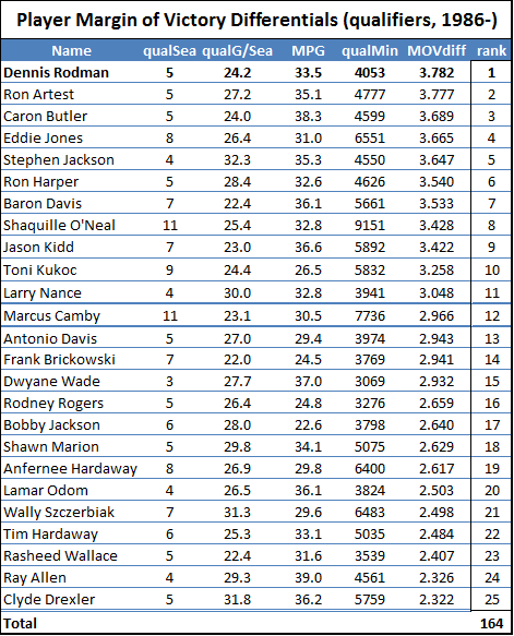
First, without much larger sample sizes, I wouldn’t say that game-by-game win differentials are precise enough to settle disputes between players of similar value. For example, the standard deviation for Rodman’s 22% adjusted win differential is still 5% (putting him less than a full standard deviation above some of the competition). This is fine for concluding that he was extremely valuable, but it certainly isn’t extreme enough to outright prove the seemingly farfetched proposition that he was actually the most valuable player overall. The more unlikely you believe that proposition to be, the less you should find this evidence compelling—this is a completely rational application of Bayes’ Theorem—and I’m sure most of you, ex ante, find the proposition very very unlikely. Thus, to make any kind of argument for Rodman’s superiority that anyone but the biggest Rodman devotees would find compelling, we clearly need more than win differentials.

Second, it really is a shame that a number of the very best players didn’t qualify for the study—particularly the ultimate Big Three: Michael Jordan, Magic Johnson, and Larry Bird (who, in maybe my favorite stat ever, never had a losing month in his entire career). As these three are generally considered to be in a league of their own, I got the idea: if we treated them as one player, would their combined sample be big enough to make an adequate comparison? Well, I had to make a slight exception to my standard filters to allow Magic Johnson’s 1987 season into the mix, but here are the results:

image

Adjusted Win percentage differential is Rodman’s most dominant value stat, and here, finally, Herr Bjordson edges him. Plus this may not fully represent these players’ true strength: the two qualifying Jordan seasons are from his abrupt return in 1994 and his first year with the Wizards in 2001, and both of Bird’s qualifying seasons are from the last two of his career, when his play may have been hampered by a chronic back injury. Of course, just about any more-conventional player valuation system would rank these players above (or way above) Rodman, and even my own proprietary direct “all-in-one” metric puts these three in their own tier with a reasonable amount of daylight between them and the next pack (which includes Rodman) below. So despite having a stronger starting position in this race than I would have originally imagined, I think it’s fair to say that Rodman is still starting with a considerable disadvantage.

Trade-offs and Invisible Value:

So let’s assume that at least a few players offer more direct value than Dennis Rodman. But building a Champion involves more than putting together a bunch of valuable players: to maximize your chances of success, you must efficiently allocate a variety of scare resources, to obtain as much realized value as possible, through a massively complicated set of internal and external constraints.

For example, league rules may affect how much money you can spend and how many players you can carry on your roster. Game rules dictate that you only have so many players on the floor at any given time, and thus only have so many minutes to distribute. Strategic realities require that certain roles and responsibilities be filled: normally, this means you must have a balance of talented players who play different positions—but more broadly, if you hope to be successful, your team must have the ability to score, to defend, to rebound, to run set plays, to make smart tactical maneuvers, and to do whatever else that goes into winning. All of these little things that your team has to do can also be thought of as a limited resource: in the course of a game, you have a certain number of things to be done, such as taking shots, going after loose balls, setting up a screens, contesting rebounds, etc. Maybe there are 500 of these things, maybe 1000, who knows, but there are only so many to go around—and just as with any other scarce resource, the better teams will be the ones that squeeze the most value out of each opportunity.

Obviously, some players are better at some things than others, and may contribute more in some areas than others—but there will always be trade-offs. No matter how good you are, you will always occupy a slot on the roster and a spot on the floor, every shot you take or every rebound you get means that someone else can’t take that shot or get that rebound, and every dollar your team spends on you is a dollar they can’t spend on someone else. Thus, there are two sides to a player’s contribution: how much surplus value he provides, and how much of his team’s scarce resources he consumes.

The key is this: While most of the direct value a player provides is observable, either directly (through box scores, efficiency ratings, etc.) or indirectly (Adjusted +/-, Win Differentials), many of his costs are concealed.

Visible v. Invisible Effects

Two players may provide seemingly identical value, but at different costs. In very limited contexts this can be extremely clear: thought it took a while to catch on, by now all basketball analysts realize that scoring 25 points per game on 20 shots is better than scoring 30 points a game on 40 shots. But in broader contexts, it can be much trickier. For example, with a large enough sample size, Win Differentials should catch almost anything: everything good that a player does will increase his team’s chances of winning when he’s on the floor, and everything bad that he does will decrease his team’s chances of losing when he’s not. Shooting efficiency, defense, average minutes played, psychological impact, hustle, toughness, intimidation—no matter how abstract the skill, it should still be reflected in the aggregate.

No matter how hard the particular skill (or weakness) is to identify or understand, if its consequences would eventually impact a player’s win differentials, (for these purposes) its effects are visible.

But there are other sources of value (or lack thereof) which won’t impact a player’s win differentials—these I will call “invisible.” Some are obvious, and some are more subtle:

Example 1: Money

“Return on Investment” is the prototypical example of invisible value, particularly in a salary-cap environment, where every dollar you spend on one player is a dollar you can’t spend on another. No matter how good a player is, if you give up more to get him than you get from him in return, your team suffers. Similarly, if you can sign a player for much less than he is worth, he may help your team more than other (or even better) players who would cost more money.

This value is generally “invisible” because the benefit that the player provides will only be realized when he plays, but the cost (in terms of limiting salary resources) will affect his team whether he is in the lineup or not. And Dennis Rodman was basically always underpaid (likely because the value of his unique skillset wasn’t fully appreciated at the time):

image

Note: For a fair comparison, this graph (and the similar one below) includes only the 8 qualifying Shaq seasons from before he began to decline.

Aside from the obvious, there are actually a couple of interesting things going on in this graph that I’ll return to later. But I don’t really consider this a primary candidate for the “invisible value” that Rodman would need to jump ahead of Jordan, primarily for two reasons:

First, return on investment isn’t quite as important in the NBA as it is in some other sports: For example, in the NFL, with 1) so many players on each team, 2) a relatively hard salary cap (when it’s in place, anyway), and 3) no maximum player salaries, ROI is perhaps the single most important consideration for the vast majority of personnel decisions.  For this reason, great NFL teams can be built on the backs of many underpaid good-but-not-great players (see my extended discussion of fiscal strategy in major sports here).

Second, as a subjective matter, when we judge a player’s quality, we don’t typically consider factors that are external to their actual athletic attributes. For example, a great NFL quarterback could objectively hurt his team if he is paid too much, but we still consider him great. When we ask “who’s the best point guard in the NBA,” we don’t say, “IDK, how much more does Chris Paul get paid than Jason Kidd?” Note this is basically a social preference: It’s conceivable that in some economically-obsessed culture, this sort of thing really would be the primary metric for player evaluation. But personally, and for the purposes of my argument, I prefer our more traditional values on this one.

Example 2: Position

In the “perfect timing” department, a commenter “Siddy Hall” recently raised a hypothetical very similar to my friend’s:

You get 8 people in a room, all posing as GM’s. We’re allowed to select 5 players each from the entire history of the NBA. Then we’ll have a tournament. At PF, I would grab Rodman. And I’m confident that I’d win because he’s on my team. He’d dominate the glass and harass and shutdown a superstar. I think he’s the finest PF to ever play the game.

Of course, you need to surround him with some scorers, but when is that ever a problem?

The commenter only explicitly goes so far as to say that Rodman would be the most valuable power forward. Yet he says he is “confident” that he would win, with the only caveat being that his team gets other scorers (which is a certainty). So, he thinks Rodman is the best PF by a wide enough margin that his team would be a favorite against the team that got Michael Jordan. Let me play the role of my friend above: whether he means to or not, he’s basically saying that Rodman is more valuable than Jordan.

In this example, “position” is the scarce resource. Just as a player can be valuable for the amount of money the team must spend on him, he can also be valuable for his position. But this value can be visible, invisible, or both.

This is probably easiest to illustrate in the NFL, where positions and responsibilities are extremely rigid. An example I used in response to the commenter is that an NFL kicker who could get you 2 extra wins per season could be incredibly valuable. These two extra wins obviously have visible value: By definition, this is a player for whom we would expect to observe a 2 game per season win differential. But there’s another, very important way in which this player’s value would be much greater. As I said in response to the commenter, a +2 kicker could even be more valuable than a +4 quarterback.

In order to play the 2 win kicker, the only cost is your kicker slot, which could probably only get you a fraction of a win even if you had one of the best in the league on your team (relevant background note: kickers normally don’t contribute much, particularly since bad kickers likely influence their teams to make better tactical decisions, and vice-versa). But to play a 4-win quarterback, the cost is your quarterback slot. While the average QB and the average kicker are both worth approximately 0 games, good quarterbacks are often worth much more, and good kickers are worth very little.

Put most simply, because there are no other +2 kickers, that kicker could get 2 wins for virtually ANY team. The +4 QB would only provide 2 wins for teams who would be unable to acquire a +2 quarterback by other means. Or you can think about it conversely: Team A signs the kicker, and Team B signs the QB. For the moment, Team B might appear better, but the most value they will ever be able to get out of their QB/Kicker tandem is +4 games plus epsilon. Team A, on the other hand, can get more value out of their QB/kicker combo than Team B simply by signing any QB worth +2 or greater, who are relatively common.

Why does this matter? Well, in professional sports, we care about one thing more than any other: championships. Teams that win championships do so by having the best roster with the most value. Players like our special kicker provide unique avenues to surplus value that even great other players can’t.

To generalize a bit, you could say that value vs. a replacement player is generally visible, as it will be represented in win differentials no matter who you play for. But a player’s value relative to the entire distribution of players at his position can lead to substantial invisible benefits, as it can substantially improve his team’s ability to build a championship contender.

Formalizing “I-Factor”

Unfortunately, in basketball, such distinctions are much more nebulous. Sure, there are “positions,” but the spot where you line up on the floor is very different from the role you play. E.g., your primary scoring responsibilities can come from any position. And even then “roles” are dynamic and loosely defined (if at all)—some roles that are crucial to certain teams don’t even exist on others. Plus, teams win in different ways: you can do it by having 5 options on offense with 5 guys that can do everything (OK, this doesn’t happen very often, but the Pistons did it in 03-04), or you can be highly specialized and try to exploit the comparative advantages between your players (this seems to be the more popular model of late).

Rodman was a specialist. He played on teams that, for the most part, didn’t ask him to do more than what he was best at—and that probably helped him fully leverage his talents. But the truly amazing part is how much of a consistent impact he could have, on such a variety of different teams, and with seemingly so few responsibilities.

So let’s posit a particular type of invisible value and call it “I-Factor,” with the following elements:

  1. It improves your team’s chances of building a championship contender.
  2. It wouldn’t be reflected in your game-to-game win differential.
  3. It stems from some athletic or competitive skill or attribute.

In the dialogue above, I suggested that Rodman had an inordinate positive impact for a “3rd-best” player, and my friend suggested (insisted really) that this alone should vault him above great but more ordinary “1st-best” players, even if they had significantly more observable impact. Putting these two statements together, we have an examinable hypothesis: That Dennis Rodman’s value relative to his role constituted a very large “I-Factor.”

Evaluating the Hypothesis:

Because the value we’re looking for is (by definition) invisible, its existence is ridiculously hard—if not impossible—to prove empirically (which is why this argument is the dessert instead of the main course of this series).

However, there could be certain signs and indicators we can look for that would make the proposition more likely: specifically, things that would seem unusual or unlikely if the hypothesis were false, but which could be explainable either as causes or effects of the hypothesis being true.

Since the hypothesis posits both an effect (very large I-Factor), and a cause (unusually high value for his role), we should primarily be on the lookout for two things: 1) any interesting or unusual patterns that could be explainable as a consequence of Rodman having a large I-Factor, and 2) any interesting or unusual anomalies that could help indicate that Rodman had an excessive amount of value for his role.

Evidence of Effect:

To lighten the mood a bit, let’s start this section off with a riddle:

Q. What do you get for the team that has everything?

A. Dennis Rodman.

Our hypothetical Rodman I-Factor is much like that of our hypothetical super-kicker in the NFL example above. The reason that kicker was even more valuable than the 2 wins per season he could get you is that he could get those 2 wins for anyone. Normally, if you have a bunch of good players and you add more good players, the whole is less than the sum of its parts. In the sports analytics community, this is generally referred to as “diminishing returns.” An extremely simple example goes like this: Having a great quarterback on your team is great. Having a second great quarterback is maybe mildly convenient. Having a third great quarterback is a complete waste of space. But if you’re the only kicker in the league who is worth anywhere near 2 wins, your returns will basically never be diminished. In basketball, roles and responsibilities aren’t nearly as wed to positions as they are in football, but the principle is the same. There is only one ball, and there are only so many responsibilities: If the source of one player’s value overlaps the source of another’s, they will both have less impact. Thus, if Rodman’s hypothetical I-Factor were real, one thing we might expect to find is a similar lack of diminishing returns—in other words, an unusual degree of consistency.

And indeed, Rodman’s impact was remarkably consistent. His adjusted win differential held at between 17% and 23% for 4 different teams, all of whom were championship contenders to one extent or another. Obviously the Bulls and Pistons each won multiple championships. The two years that Rodman spent with the pre-Tim-Duncan-era Spurs, they won 55 and 62 games respectively (the latter led the league that season, though the Spurs were eliminated by eventual-champion Houston in the Western Conference Finals). In 1999, Rodman spent roughly half of the strike-shortened season on the Lakers; in that time the Lakers went 17-6, matching San Antonio’s league-leading winning percentage. But, in a move that was somewhat controversial with the Lakers players at the time, Rodman was released before the playoffs began, and the Lakers fell in the 2nd round—to the eventual-champion Spurs.

But consistency should only be evidence of invisible value if it is unusual—that is, if it exists where we wouldn’t expect it to. So let’s look at Rodman’s consistency from a couple of different angles:

Angle 1: Money (again)

The following graph is similar to my ROI graph above, except instead of mapping the player’s salary to his win differential, I’m mapping the rest of the team’s salary to his win differential:

image_thumb21

Note: Though obviously it’s only one data point and doesn’t mean anything, I find it amusing that the one time Shaq played for a team that had a full salary-cap’s worth of players without him, his win differential dropped to the floor.

So, basically, whether Rodman’s teams were broke or flush, his impact remained fairly constant. This is consistent with unusually low diminishing returns.

Angle 2: Position (again)

A potential objection I’ve actually heard a couple of times is that perhaps Rodman was able to have the impact he did because the circumstances he played in were particularly well-suited to never duplicating his skill-set: E.g., both Detroit and Chicago lacked dominant big men. Indeed, it’s plausible that part of his value came from providing the defense/rebounding of a dominant center, maximally leveraging his skill-set, and freeing up his teams to go with smaller, more versatile, and more offense-minded players at other positions (which could help explain why he had a greater impact on offensive efficiency than on defensive efficiency). However, all of this value would be visible. Moreover, the assumption that Rodman only played in these situations is false. Not only did Rodman play on very different teams with very different playing styles, he actually played on teams with every possible combination of featured players (or “1st and 2nd-best” players, if you prefer):

Rodman Teams

As we saw above, Rodman’s impact on all 4 teams was roughly the same. This too is consistent with an unusual lack of diminishing returns.

Evidence of Cause:

As I’ve said earlier, “role” can be very hard to define in the NBA relative to other sports. But to find meaningful evidence that Rodman provided an inordinate amount of value for his role, we don’t necessarily need to solve this intractable problem: we can instead look for “partial” or “imperfect” proxies. If some plausibly related proxy were to provide an unusual enough result, its actual relationship to the posited scenario could be self-reinforced—that is, the most likely explanation for the extremely unlikely result could be that it IS related to our hypothesis AND that our hypothesis is true.

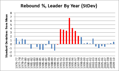
So one scarce resource that is plausibly related to role is “usage.” Usage Rate is the percentage of team possessions that a player “uses” by taking a shot or committing a turnover. Shooters obviously have higher usage rates than defender/rebounders, and usage generally has little correlation with impact. But let’s take a look at a scatter-plot of qualifying players from my initial differential study (limited to just those who have positive raw win differentials):

image_thumb17

The red dot is obviously Dennis Rodman. Bonus points to anyone who said “Holy Crap” in their heads when they saw this graph: Rodman has both the highest win differential and the lowest Usage Rate, once again taking up residence in Outlier Land.

Let’s look at it another way: Treating possessions as the scarce resource, we might be interested in how much win differential we get for every possession that a player uses:
image_thumb19

Let me say this in case any of you forgot to think it this time:

“Holy Crap!”

Yes, the red dot is Dennis Rodman. Oh, if you didn’t see it, don’t follow the blue line, it won’t help.

This chart isn’t doctored, manipulated, or tailored in any way to produce that result, and it includes all qualifying players with positive win differentials. If you’re interested, the Standard Deviation on the non-Rodman players in the pool is .19. Yes, that’s right, Dennis Rodman is nearly 4.5 standard deviations above the NEXT HIGHEST player. Hopefully, you see the picture of what could be going on here emerging:  If value per possession is any kind of proxy (even an imperfect one) for value relative to role, it goes a long way toward explaining how Rodman was able to have such incredible impacts on so many teams with so many different characteristics.

The irony here is that the very aspect of Rodman’s game that frequently causes people to discount his value (“oh, he only does one thing”) may be exactly the quality that makes him a strong contender for first pick on the all-time NBA playground.

Conclusions:

Though the evidence is entirely circumstantial, I find the hypothesis very plausible, which in itself should be shocking. While I may not be ready to conclude that, yes, in fact, Rodman would actually be a more valuable asset to a potential championship contender than Michael freaking Jordan, I don’t think the opposite view is any stronger: That is, when you call that position crazy, conjectural, speculative, or naïve—as some of you inevitably will—I am fairly confident that, in light of the evidence, the default position is really no less so.

In fact, even if this hypothesis isn’t exactly true, I don’t think the next-most-likely explanation is that it’s completely false, and these outlandish outcomes were just some freakishly bizarre coincidence—it would be more likely that there is some alternate explanation that may be even more meaningful. Indeed, on some level, some of the freakish statistical results associated with Rodman are so extreme that it actually makes me doubt that the best explanation could actually stem from his athletic abilities. That is, he’s just a guy, how could he be so unusually good in such an unusual way? Maybe it actually IS more likely that the groupthink mentality of NBA coaches and execs accidentally DID leave a giant exploitable loophole in conventional NBA strategy; a loophole that Rodman fortuitously stumbled upon by having such a strong aversion to doing any of the things that he wasn’t the best at. If that is the case, however, the implications of this series could be even more severe than I intended.


Series Afterword:

Despite having spent time in law school, I’m not a lawyer. Indeed, one of the reasons I chose not to be one is because I get icky at the thought of picking sides first, and building arguments later.

In this case, I had strong intuitions about Rodman based on a variety of beliefs I had been developing about basketball value, combined with a number of seemingly-related statistical anomalies in Rodman’s record. Though I am naturally happy that my research has backed up those intuitions—even beyond my wildest expectations—I felt prepared for it to go the other way. But, of course, no matter how hard we try, we are all susceptible to bias.

Moreover, inevitably, certain non-material choices (style, structure, editorial, etc.) have to be made which emphasize the side of the argument that you are trying to defend. This too makes me slightly queasy, though I recognize it as a necessary evil in the discipline of rhetoric. My point is this: though I am definitely presenting a “case,” and it often appears one-sided, I have tried to conduct my research as neutrally as possible. If there is any area where you think I’ve failed in this regard, please don’t hesitate to let me know. I am willing to correct myself, beef up my research, or present compelling opposing arguments alongside my own; and though I’ve published this series in blog form, I consider this Case to be an ongoing project.

If you have any other questions, suggestions, or concerns, please bring them up in the comments (preferably) or email me and I will do my best to address them.

Finally, I would like to thank Nate Meyvis, Leo Wolpert, Brandon Wall, James Stuart, Dana Powers, and Aaron Nathan for the invaluable help they provided me by analyzing, criticizing, and/or ridiculing my ideas throughout this process. I’d also like to thank Jeff Bennett for putting me on this path, Scott Carder for helping me stay sane, and of course my wife Emilia for her constant encouragement.

The Case for Dennis Rodman, Part 4/4(a): All-Hall?

First of all, congrats to Dennis for his well-deserved selection as a 2011 Hall of Fame inductee—of course, I take full credit.  But seriously, when the finalists were announced, I immediately suspected that he would make the cut, mostly for two reasons:

  1. Making the finalists this year after failing to make the semi-finalists last year made it more likely that last year’s snub really was more about eligibility concerns than general antipathy or lack of respect toward him as a player.
  2. The list of co-finalists was very favorable.  First, Reggie Miller not making the list was a boon, as he could have taken the “best player” spot, and Rodman would have lacked the goodwill to make it as one of the “overdue”—without Reggie, Rodman was clearly the most accomplished name in the field.  Second, Chris Mullen being available to take the “overdue” spot was the proverbial “spoonful of sugar” that allowed the bad medicine of Rodman’s selection go down.

Congrats also to Artis Gilmore and Arvydas Sabonis.  In my historical research, Gilmore’s name has repeatedly popped up as an excellent player, both by conventional measures (11-time All-Star, 1xABA Champion, 1xABA MVP, led league in FG% 7 times), and advanced statistical ones (NBA career leader in True Shooting %, ABA career leader in Win Shares and Win Shares/48, and a great all-around rebounder).  It was actually only a few months ago that I first discovered—to my shock—that he was NOT in the Hall [Note to self: cancel plans for “The Case for Artis Gilmore”].  Sabonis was an excellent international player with a 20+ year career that included leading the U.S.S.R. to an Olympic gold medal and winning 8 European POY awards.  I remember following him closely when he finally came to the NBA, and during his too-brief stint, he was one of the great per-minute contributors in the league (though obviously I’m not a fan of the stat, his PER over his first 5 season—which were from age 31-35—was 21.7, which would place him around 30th in NBA history).  Though his sample size was too small to qualify for my study, his adjusted win percentage differential over his NBA career was a very respectable 9.95%, despite only averaging 24 minutes per game.

I was hesitant to publish Part 4 of this series before knowing whether Rodman made the Hall or not, as obviously the results shape the appropriate scope for my final arguments. So by necessity, this section has changed dramatically from what I initially intended.  But I am glad I waited, as this gives me the opportunity to push the envelope of the analysis a little bit:  Rather than simply wrapping up the argument for Rodman’s Hall-of-Fame candidacy, I’m going to consider some more ambitious ideas.  Specifically, I will articulate two plausible arguments that Rodman may have been even more valuable than my analysis so far has suggested.  The first of these is below, and the second—which is the most ambitious, and possibly the most shocking—will be published Monday morning in the final post of this series.

Introduction

I am aware that I’ve picked up a few readers since joining “the world’s finest quantitative analysts of basketball” in ESPN’s TrueHoop Stat Geek Smackdown.  If you’re new, the main things you need to know about this series are that it’s 1) extremely long (sprawling over 13 sections in 4 parts, plus a Graph of the Day), 2) ridiculously (almost comically) detailed, and 3) only partly about Dennis Rodman.  It’s also a convenient vehicle for me to present some of my original research and criticism about basketball analysis.

Obviously, the series includes a lot of superficially complicated statistics, though if you’re willing to plow through it all, I try to highlight the upshots as much as possible.  But there is a lot going on, so to help new and old readers alike, I have a newly-updated “Rodman Series Guide,” which includes a broken down list of articles, a sampling of some of the most important graphs and visuals, and as of now, a giant new table summarizing the entire series by post, including the main points on both sides of the analysis.  It’s too long to embed here, but it looks kind of like this:

summary

As I’ve said repeatedly, this blog isn’t just called “Skeptical” Sports because the name was available: When it comes to sports analysis—from the mundane to the cutting edge—I’m a skeptic.  People make interesting observations, perform detailed research, and make largely compelling arguments—which is all valuable.  The problems begin when then they start believing too strongly in their results: they defend and “develop” their ideas and positions with an air of certainty far beyond what is objectively, empirically, or logically justified.

With that said, and being completely honest, I think The Case For Dennis Rodman is practically overkill.  As a skeptic, I try to keep my ideas in their proper context: There are plausible hypotheses, speculative ideas, interim explanations requiring additional investigation, claims supported by varying degrees of analytical research, propositions that have been confirmed by multiple independent approaches, and the things I believe so thoroughly that I’m willing to write 13-part series’ to prove them.  That Rodman was a great rebounder, that he was an extremely valuable player, even that he was easily Hall-of-Fame caliber—these propositions all fall into that latter category: they require a certain amount of thoughtful digging, but beyond that they practically prove themselves.

Yet, surely, there must be a whole realm of informed analysis to be done that is probative and compelling but which might fall short of the rigorous standards of “true knowledge.”  As a skeptic, there are very few things I would bet my life on, but as a gambler—even a skeptical one—there are a much greater number of things I would bet my money on.  So as my final act in this production, I’d like to present a couple of interesting arguments for Rodman’s greatness that are both a bit more extreme and a bit more speculative than those that have come before.  Fortunately, I don’t think it makes them any less important, or any less captivating:

Read the rest of this entry »

The Case for Dennis Rodman, Part 3/4(d)—Endgame: Statistical Significance

The many histograms in sections (a)-(c) of Part 3 reflect fantastic p-values (probability that the outcome occurred by chance) for Dennis Rodman’s win percentage differentials relative to other players, but, technically, this doesn’t say anything about the p-values of each metric in itself.  What this means is, while we have confidently established that Rodman’s didn’t just get lucky in putting up better numbers than his peers, we haven’t yet established the extent to which his being one of the best players by this measure actually proves his value.  This is probably a minor distinction to all but my most nitpicky readers, but it is exactly one of those nagging “little insignificant details” that ends up being a key to the entire mystery.

The Technical Part (Feel Free to Skip)

The challenge here is this: My preferred method for rating the usefulness and reliability of various statistics is to see how accurate they are at predicting win differentials.  But, now, the statistic I would like to test actually is win differential.  The problem, of course, is that a player’s win differential is always going to be exactly identical to his win differential. If you’re familiar with the halting problem or Gödel’s incompleteness theorem, you probably know that this probably isn’t directly solvable: that is, I probably can’t design a metric for evaluating metrics that is capable of evaluating itself.

To work around this, our first step must be to independently assess the reliability of win predictions that are based on our inputs.  As in sections (b) and (c), we should be able to do this on a team-by-team basis and adapt the results for player-by-player use.  Specifically, what we need to know is the error distribution for the outcome-predicting equation—but this raises its own problems.

Normally, to get an error distribution of a predictive model, you just run the model a bunch of times and then measure the predicted results versus the actual results (calculating your average error, standard deviation, correlation, whatever).  But, because my regression was to individual games, the error distribution gets “black-boxed” into the single-game win probability.

[A brief tangent: “Black box” is a term I use to refer to situations where the variance of your input elements gets sucked into the win percentage of a single outcome.  E.g., in the NFL, when a coach must decide whether to punt or go for it on 4th down late in a game, his decision one way or the other may be described as “cautious” or “risky” or “gambling” or “conservative.”  But these descriptions are utterly vapid: with respect to winning, there is no such thing as a play that is more or less “risky” than any other—there are only plays that improve your chances of winning and plays that hurt them.  One play may seem like a bigger “gamble,” because there is a larger immediate disparity between its possible outcomes, but a 60% chance of winning is a 60% chance of winning.  Whether your chances comes from superficially “risky” plays or superficially “cautious” ones, outside the “black box” of the game, they are equally volatile.]

For our purposes, what this means is that we need to choose something else to predict: specifically, something that will have an accurate and measurable error distribution.  Thus, instead of using data from 81 games to predict the probability of winning one game, I decided to use data from 41 season-games to predict a team’s winning percentage in its other 41 games.

To do this, I split every team season since 1986 in half randomly, 10 times each, leading to a dataset of 6000ish randomly-generated half-season pairs.  I then ran a logistic regression from each half to the other, using team winning percentage and team margin of victory as the input variables and games won as the output variable.  I then measured the distribution of those outcomes, which gives us a baseline standard deviation for our predicted wins metric for a 41 game sample.

Next, as I discussed briefly in section (b), we can adapt the distribution to other sample sizes, so long as everything is distributed normally (which, at every point in the way so far, it has been).  This is a feature of the normal distribution: it is easy to predict the error distribution of larger and smaller datasets—your standard deviation will be directly proportional to the square-root of the ratio of the new sample size to the original sample size.

Since I measured the original standard deviations in games, I converted each player’s “Qualifying Minutes” into “Qualifying Games” by dividing by 36.  So the sample-size-adjusted standard deviation is calculated like this:

=[41GmStDev]*SQRT([PlQualGames]/41)

Since the metrics we’re testing are all in percentages, we then divide the new standard deviation by the size of the sample, like so:

=([41GmStDev]*SQRT([PlQualGames]/41))/[PlQualGames]

This gives us a standard deviation for actual vs. predicted winning percentages for any sample size.  Whew!

The Good, Better, and Best Part

The good news is: now that we can generate standard deviations for each player’s win differentials, this allows us to calculate p-values for each metric, which allows us to finally address the big questions head on: How likely is it that this player’s performance was due to chance?  Or, put another way: How much evidence is there that this player had a significant impact on winning?

The better news is: since our standard deviations are adjusted for sample size, we can greatly increase the size of the comparison pool, because players with smaller samples are “punished” accordingly.  Thus, I dropped the 3-season requirement and the total minutes requirement entirely.  The only remaining filters are that the player missed at least 15 games for each season in which a differential is computed, and that the player averaged at least 15 minutes per game played in those seasons.  The new dataset now includes 1539 players.

Normally I don’t weight individual qualifying seasons when computing career differentials for qualifying players, because the weights are an evidentiary matter rather than an impact matter: when it comes to estimating a player’s impact, conceptually I think a player’s effect on team performance should be averaged across circumstances equally.  But this comparison isn’t about whose stats indicate the most skill, but whose stats make for the best evidence of positive contribution.  Thus, I’ve weighted each season (by the smaller of games missed or played) before making the relevant calculations.

So without further ado, here are Dennis Rodman’s statistical significance scores for the 4 versions of Win % differential, as well as where he ranks against the other players in our comparison pool:

image_thumb7

Note: I’ve posted a complete table of z scores and p values for all 1539 players on the site.  Note also that due to the weighting, some of the individual differential stats will be slightly different from their previous values.

You should be careful to understand the difference between this table of p-values and ranks vs. similar ones from earlier sections.  In those tables, the p-value was determined by Rodman’s relative position in the pool, so the p-value and rank basically represented the same thing.  In this case, the p-value is based on the expected error in the results.  Specifically, they are the answer to the question “If Dennis Rodman actually had zero impact, how likely would it be for him to have posted these differentials over a sample of this size?”  The “rank” is then where his answer ranks among the answers to the same question for the other 1538 players.  Depending on your favorite flavor of win differential, Rodman ranks anywhere from 1st to 8th.  His average rank among those is 3.5, which is 2nd only to Shaquille O’Neal (whose differentials are smaller but whose sample is much larger).

Of course, my preference is for the combined/adjusted stat.  So here is my final histogram:

image5_thumb

Note: N=1539.

Now, to be completely clear, as I addressed in Part 3(a) and 2(b), so that I don’t get flamed (or stabbed, poisoned, shot, beaten, shot again, mutilated, drowned, and burned—metaphorically): Yes, actually I AM saying that, when it comes to empirical evidence based on win differentials, Rodman IS superior to Michael Jordan.  This doesn’t mean he was the better player: for that, we can speculate, watch the tape, or analyze other sources of statistical evidence all day long.  But for this source of information, in the final reckoning, win differentials provide more evidence of Dennis Rodman’s value than they do of Michael Jordan’s.

The best news is: That’s it.  This is game, set, and match.  If the 5 championships, the ridiculous rebounding stats, the deconstructed margin of victory, etc., aren’t enough to convince you, this should be:  Looking at Win% and MOV differentials over the past 25 years, when we examine which players have the strongest, most reliable evidence that they were substantial contributors to their teams’ ability to win more basketball games, Dennis Rodman is among the tiny handful of players at the very very top.

The Case for Dennis Rodman, Part 3/4(c)—Beyond Margin of Victory

In the conventional wisdom, winning is probably overrated.  The problem ultimately boils down to information quality: You only get one win or loss per game, so in the short-run, great teams, mediocre team, or teams that just get lucky can all achieve the same results.  Margin of victory, on the other hand, has a whole range of possible outcomes that, while imperfectly descriptive of the bottom line, correlate strongly with team strength.  You can think about it like sample size: a team’s margin of victory over a handful of games gives you a lot more data to work with than their won-loss record.  Thus, particularly when the number of games you draw your data from is small, MOV tends to be more probative.

Long ago, the analytic community recognized this fact, and has moved en masse to MOV (and its ilk) as the main element in their predictive statistics.  John Hollinger, for example, uses margin exclusively in his team power ratings—completely ignoring winning percentage—and these ratings are subsequently used for his playoff prediction odds, etc.  Note, Hollinger’s model has a lot of baffling components, like heavily weighting a team’s performance in their last 10 games (or later in their last 25% of games), when there is no statistical evidence that L10 is any more predictive than first 10 (or any other 10).  But this particular choice is of particular interest, especially as it is indicative of an almost uniform tendency among analysts to substitute MOV-style stats for winning percentage entirely.

This is both logically and empirically a mistake.  As your sample size grows, winning percentage becomes more and more valuable.  The reason for this is simple:  Winning percentage is perfectly accurate—that is, it perfectly reflects what it is that we want to know—but has extremely high variance, while MOV is an imperfect proxy, whose usefulness stems primarily from its much lower variance.  As sample sizes increase, the variance for MOV decreases towards 0 (which happens relatively quickly), but the gap between what it measures and what we want to know will persist in perpetuity.  Thus, after a certain point, the “error” in MOV remains effectively constant, while the “error” in winning percentage continuously decreases.  To get a simple intuitive sense of this, imagine the extremes:  after 5 games, clearly you will have more faith in a team that has won 2 but has a MOV of +10 over a team that has won 3 but has a MOV of +1.  But now imagine 1000 games with the same MOV’s and winning percentages: one team has won 400 and the other has won 600.  If you had to place money on one of the two teams to win their next game, you would be a fool to favor the first.  But beyond the intuitive point, this is essentially an empirical matter: with sufficient data, we should be able to establish the relative importance of each for any given sample-size.

So for this post, I’ve employed the same method that I used in section (b) to create our MOV-> Win% formula (logistic regression for all 55,000+ team games since 1986), except this time I included both Win % and MOV (over the team’s other 81 games) as the predictive variables.  Here, first, are the coefficients and corresponding p-values (probability that the variable is not significant):

image_thumb20

It is thus empirically incontrovertible that, even with an 81-game predictive sample, both MOV and Win% are statistically significant predictive factors.  Also, for those who don’t eat logistic regression outputs for breakfast, I should be perfectly clear what this means: It doesn’t just mean that both W% and MOV are good at predicting W%—this is trivially true—it means that, even when you have one, using the other as well will make your predictions substantially better.  To be specific, here is the formula that you would use to predict a team’s winning percentage based on these two variables:

\large{PredictedWin\% = \dfrac{1}{1+e^{-(1.43wp+.081mv-.721)}}}

Note: Again, e is euler’s number, or ~2.72.  wp is the variable for winning % over the other 81 games, and mv is the variable for Margin of Victory over the other 81 games.

And again, for your home-viewing enjoyment, here is the corresponding Excel formula:

=1/(1+EXP(-(1.43*[W%]+.081[MOV]-.721)))

Finally, in order to visualize the relative importance of each variable, we can look at their standardized coefficients (shown here with 95% confidence bars):

image12_thumb1

Note: Standardized coefficients, again, are basically a unit of measurement for comparing the importance of things that come in different shapes and sizes.

For an 81-game sample (which is about as large of a consistent sample as you can get in the NBA), Win% is about 60% as important as MOV when it comes to predicting outcomes.  At the risk of sounding redundant, I need to make this extremely clear again: this does NOT mean that Win% is 60% as good at predicting outcomes as margin of victory (actually, it’s more like 98% as good at that)—it means that, when making your ideal prediction, which incorporates both variables, Win % gets 60% as much weight as MOV (as an aside, I should also note that the importance of MOV drops virtually to zero when it comes to predicting playoff outcomes, largely—though not entirely—because of home court advantage).

This may not sound like much, but I think it’s a pretty significant result:  At the end of the day, this proves that there IS a skill to winning games independent of the rates at which you score and allow points.  This is a non-obvious outcome that is almost entirely dismissed by the analytical community.  If NBA games were a random walk based on possession-to-possession reciprocal advantages, this would not be the case at all.

Now, note that this is formally the same as the scenario discussed in section (b): We want to predict winning percentages, but using MOV alone leaves a certain amount of error.  What this regression proves is that this error can be reduced by incorporating win percentage into our predictions as well.  So consider this proof-positive that X-factors are predictively valuable.  Since the predictive power of Win% and MOV should be equivalent no matter their source, we can now use this regression to make more accurate predictions about each player’s true impact.

Adapting this equation for individual player use is simple enough, though slightly different from before:  Before entering the player’s Win% differential, we have to convert it into a raw win percentage, by adding .5.  So, for example, if a player’s W% differential were 21.6%, we would enter 71.6%.  Then, when a number comes out the other side, we can convert it back into a predicted differential by subtracting .5, etc.

Using this method, Rodman’s predicted win differential comes out to 14.8%.  Here is the new histogram:
image_thumb16

Note: N is still 470.

This histogram is also weighted by the sample size for each player (meaning that a player with 100 games worth of qualifying minutes counts as 100 identical examples in a much larger dataset, etc.).  I did this to get the most accurate distribution numbers to compute P values (which, in this case, work much like a percentile) for individual players.  Here is a summary of the major factors for Dennis Rodman:

image_thumb13

For comparison, I’ve also listed the percentage of eligible players that match the qualifying thresholds of my dataset (minus the games missed) who are in the Hall of Fame.  Specifically, that is, those players who retired in 2004 or earlier and who have at least 3 seasons since 1986 with at least 15 games played in which they averaged at least 15 minutes per game.  This gives us a list of 462 players, of which 23 are presently IN the Hall. The difference in average skill between that set of players and the differential set is minimal, and the reddish box on the histogram above surrounds the top 5% of predicted Win% differentials in our main data.

While we’re at it, let’s check in on the list of “select” players we first saw in section (a) and how they rank in this metric, as well as in some of the others I’ve discussed:

image_thumb27

For fun, I’ve put average rank and rank of ranks (for raw W% diff, adjusted W% diff, MOV-based regression, raw W%/MOV-based regression, raw X-Factor, adjusted X-Factor, and adjusted W%/MOV-based regression) on the far right.  I’ve also uploaded the complete win differential table for all 470 players to the site, including all of the actual values for these metrics and more.  No matter which flavor of metric you prefer (and I believe the highlighted one to be the best), Rodman is solidly in Hall of Fame territory.

Finally, I’m not saying that the Hall of Fame does or must pick players based on their ability to contribute to their team’s winning percentages.  But if they did, and if these numbers were accurate, Rodman would deserve a position with room to spare.  Thus, naturally, one burning question remains: how much can we trust these numbers (and Dennis Rodman’s in particular)?  This is what I will address in section (d) tomorrow.

The Case for Dennis Rodman, Part 3/4(b)—Rodman’s X-Factor

The sports analytical community has long used Margin of Victory or similar metrics as their core component for predicting future outcomes.  In situations with relatively small samples, it generally slightly outperforms win percentages, even when predicting win percentages.

There are several different methods for converting MOV into expected win-rates.  For this series, I took the 55,000+ regular-season team games played since 1986 and compared their outcomes to the team’s Margin of Victory over the other 81 games of the season.  I then ran this data through a logistic regression (a method for predicting things that come in percentages) with MOV as the predictor variable.  Here is the resulting formula:

\large{PredictedWin\% = \dfrac{1}{1+e^{-(.127mv-.004}}}

Note: e is euler’s number, or ~2.72.  mv is the variable for margin of victory.

This will return the probability between 0 and 1, corresponding to the odds of winning the predicted game.  If you want to try it out for yourself, the excel formula is:

1 / (1 + EXP(-(-0.0039+0.1272*[MOV])))

So, for example, if a team’s point differential (MOV) over 81 games is 3.78 points per game, their odds of winning their 82nd game would be 61.7%.

Of course, we can use this same formula to predict a player’s win% differential based on his MOV differential.  If, based on his MOV contribution alone, a player’s team would be expected to win 61.7% of the time, then his predicted win% differential is what his contribution would be above average, in this case 11.7% (this is one reason why, for comparison purposes, I prefer to use adjusted win differentials, as discussed in Part 3(a)).

As discussed in the part 2(b) of this series (“With or Without Worm”), Dennis Rodman’s MOV differential was 3.78 points, which was tops among players with at least a season’s worth of qualifying data, corresponding to the aforementioned win differential of 11.7%.  Yet this under-predicts his actual win percentage differential by 9.9%.  This could be the result of a miscalibrated prediction formula, but as you can see in the following histogram, the mean for win differential minus predicted win differential for our 470 qualifying player dataset is actually slightly below zero at –0.7%:

clip_image002

Rodman has the 2nd highest overall, which is even more crazy considering that he had one of the highest MOV’s (and the highest of anyone with anywhere close to his sample size) to begin with.  Note how much of an outlier he is in this scatterplot (red dot is Rodman):

clip_image003

I call this difference the “X-Factor.”  For my purposes, “X” stands for “unknown”:  That is, it is the amount of a player’s win differential that isn’t explained by the most common method for predicting win percentages.  For any particular player, it may represent an actual skill for winning above and beyond a player’s ability to contribute to his team’s margin of victory (in section (c), I will go about proving that such a skill exists), or it may simply be a result of normal variance.  But considering that Rodman’s sample size is significantly larger than the average in our dataset, the chances of it being “error” should be much smaller.  Consider the following:

clip_image004

Again, Rodman is a significant outlier:  no one with more than 2500 qualifying minutes breaks 7.5%.  Rodman’s combination of large sample with large Margin of Victory differential with large X-Factor is remarkable.  To visualize this, I’ve put together a 3-D scatter plot of all 3 variables:

clip_image005

It can be hard to see where a point stands in space in a 2-D image, but I’ve added a surface grid to try to help guide you: the red point on top of the red mountain is Dennis Rodman.

To get a useful measure of how extreme this is, we can approximate a sample-size adjustment by comparing the number of qualifying minutes for each player to the average for the dataset, and then adjusting the standard deviation for that player accordingly (proportional to the square root of the ratio, a method which I’ll discuss in more detail in section (d)).  After doing this, I can re-make the same histogram as above with the sample-adjusted numbers:clip_image006

No man is an island.  Except, apparently, for Dennis Rodman.  Note that he is about 4 standard deviations above the mean (and observe how the normal distribution line has actually blended with the axis below his data point).

Naturally, of course, this raises the question:

Where does Rodman’s X-Factor come from?

Strictly speaking, what I’m calling “X-Factor” is just the prediction error of this model with respect to players.  Some of that error is random and some of it is systematic.  In section (c), I will prove that it’s not entirely random, though where it comes from for any individual player, I can only speculate.

Margin of Victory treats all contributions to a game’s point spread equally, whether they came at the tail end of a blowout, or in the final seconds of squeaker.  One thing that could contribute to a high X-factor is “clutch”ness.  A “clutch” shooter (like a Robert Horry), for example, might be an average or even slightly below-average player for most of the time he is on the floor, but an extremely valuable one near the end of games that could go either way.  The net effect from the non-close games would be small for both metrics, but the effect of winning close games would be much higher on Win% than MOV.  Of course, “clutch”ness doesn’t have to be limited to shooters:  e.g., if one of a particular player’s skill advantages over the competition is that he makes better tactical decisions near the end of close games (like knowing when to intentionally foul, etc.), that would reflect much more strongly in his W% than in his MOV.

Also, a player who contributes significantly whenever they are on the floor but is frequently taken out of non-close games as a precaution again fatigue or injury may have a Win % that accurately reflects his impact, but a significantly understated MOV.  E.g., in the Boston Celtics “Big 3” championship season, Kevin Garnett was rested constantly—a fact that probably killed his chances of being that season’s MVP—yet the Celtics won by far the most games in the league.  In this case, the player is “clutch” just by virtue of being on the floor more in clutch spots.

The converse possibility also exists:  A player could be “reverse clutch,” meaning that he plays worse when the game is NOT on the line.  This would ultimately have the same statistical effect as if he played better in crunch time.  And indeed, based on completely non-rigorous and anecdotal speculation, I think this is a possible factor in Rodman’s case.  During his time in Chicago, I definitely recall him doing a number of silly things in the 4th quarter of blowout games (like launching up ridiculous 3-pointers) when it didn’t matter—and in a game of small margins, these things add up.

Finally, though it cuts a small amount against the absurdity of Rodman’s rebounding statistics, I would be derelict as an analyst not to mention the possibility that Rodman may have played sub-optimally in non-close games in order to pad his rebounding numbers.  The net effect, of course, would be that his rebounding statistics could be slightly overstated, while his value (which is already quite prodigious) could be substantially understated.  To be completely honest, with his rebounding percentages and his X-Factor both being such extreme outliers, I have to think that at least some relationship existing between the two is likely.

If you’re emotionally attached to the freak-alien-rebounder hypothesis, this might seem to be a bad result for you.  But if you’re interested in Rodman’s true value to the teams he played for, you should understand that, if this theory is accurate, it could put Rodman’s true impact on winning into the stratosphere.  That is, this possibility gives no fuel to Rodman’s potential critics: the worst cases on either side of the spectrum are that Rodman was the sickest rebounder with a great impact on his teams, or that he was a great rebounder with the sickest impact.

In the next section, I will be examining the relative reliability and importance of Margin of Victory vs. Win % generally, across the entire league.  In my “endgame” analysis, this is the balance of factors that I will use.  But the league patterns do not necessarily apply in all situations:  In some cases, a player’s X-factor may be all luck, in some cases it may be all skill, and in most it is probably a mixture of both.  So, for example, if my speculation about Rodman’s X-Factor were true, my final analysis of Rodman’s value could be greatly understated.