Graph of the Day: Alanis Loves Rookie Quarterbacks

Last season I did some analysis of rookie starting quarterbacks and which of their stats are most predictive of future NFL success. One of the most fun and interesting results I found is that rookie interception % is a statistically significant positive indicator—that is, all else being equal, QB’s who throw more interceptions as rookies tend to have more successful careers.  I’ve been going back over this work recently with an eye towards posting something on the blog (coming soon!), and while playing around with examples I stumbled into this:

Note: Data points are QB’s in the Super Bowl era who were drafted #1 overall and started at least half of their team’s games as rookies (excluding Matthew Stafford and Sam Bradford for lack of ripeness). Peyton Manning and Jim Plunkett each threw 4.9% interceptions and won one Super Bowl, so I slightly adjusted their numbers to make them both visible, though the R-squared value of .7287 is accurate to the original (a linear trend actually performs slightly better—with an R-squared of .7411—but I prefer the logarithmic one aesthetically).

Notice the relationship is almost perfectly ironic: Excluding Steve Bartowski (5.9%), no QB with a lower interception percentage has won more Super Bowls than any QB with a higher one. Overall (including Steve B.), the seven QB’s with the highest rates have 12 Super Bowl rings, or an average of 1.7 per (and obv the remaining six have none).  And it’s not just Super Bowls: those seven also have 36 career Pro Bowl selections between them (average of 5.1), to just seven for the remainder (average of 1.2).

As for significance, obviously the sample is tiny, but it’s large enough that it would be an astounding statistical artifact if there were actually nothing behind it (though I should note that the symmetricality of the result would be remarkable even with an adequate explanation for its “ironic” nature).  I have some broader ideas about the underlying dynamics and implications at play, but I’ll wait to examine those in a more robust context. Besides, rank speculation is fun, so here are a few possible factors that spring to mind:

  1. Potential for selection effect: Most rookie QB’s who throw a lot of interceptions get benched.  Teams may be more likely to let their QB continue playing when they have more confidence in his abilities—and presumably such confidence correlates (at least to some degree) with actually having greater abilities.
  2. The San Antonio gambit: Famously, David Robinson missed most of the ’96-97 NBA season with back and foot injuries, allowing the Spurs to bomb their way into getting Tim Duncan, sending the most coveted draft pick in many years to a team that, when healthy, was already somewhat of a contender (also preventing a drool-worthy Iverson/Duncan duo in Philadelphia).  Similarly, if a quality QB prospect bombs out in his rookie campaign—for whatever reason, including just “running bad”—his team may get all of the structural and competitive advantages of a true bottom-feeder (such as higher draft position), despite actually having 1/3 of a quality team (i.e., a good quarterback) in place.
  3. Gunslingers are just better:  This is my favorite possible explanation, natch.  There are a lot of variations, but the most basic idea goes like this: While ultimately a good QB on a good team will end up having lower interception rates, interceptions are not necessarily bad.  Much like going for it on 4th down, often the best win-maximizing choice that a QB can make is to “gamble”—that is, to risking turning the ball over when the reward is appropriate. This can be play-dependent (like deep passes with high upsides and low downsides), or situation-dependent (like when you’re way behind and need to give yourself the chance to get lucky to have a chance to win).  E.g.: In defense of Brett Favre—who, in crunch time, could basically be counted on to deliver you either a win or multiple “ugly” INT’s—I’ve quipped: If a QB loses a game without throwing 4 interceptions, he probably isn’t trying hard enough.  And, of course, this latter scenario should come up a lot for the crappy teams that just drafted #1 overall:  I.e., when your rookie QB is going 4-12 and isn’t throwing 20 interceptions, he’s probably doing something wrong.

[Edit (9/24/2011) to add: Considering David Meyer’s comment below, I thought I should make clear that, while my interests and tastes lie with #3 above, I don’t mean to suggest that I endorse it as the most likely or most significant factor contributing to this particular phenomenon (or even the broader one regarding predictivity of rookie INT%).  While I do find it meaningful and relevant that this result is consistent with and supportive of some of my wilder thoughts about interceptions, risk-taking, and quarterbacking, overall I think that macroscopic factors are more likely to be the driving force in this instance.]

For the record, here are the 13 QB’s and their relevant stats:

[table “7” not found /]
Graph of the Day 2: NFL Regression—Descent Into Chaos

I guess it’s funky graph day here at SSA:
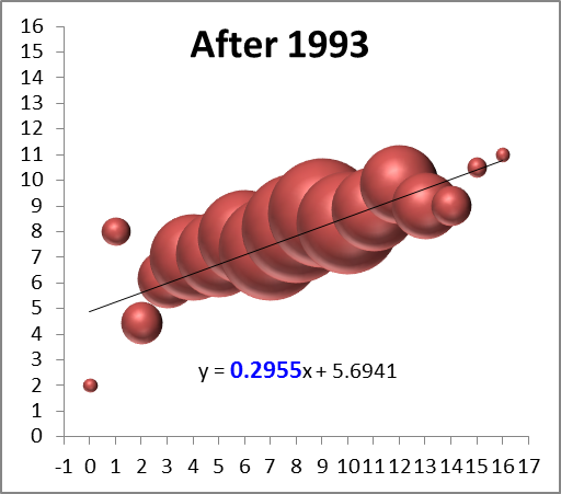
This one corresponds to the bubble-graphs in this post about regression to the mean before and after the introduction of the salary cap.  Each colored ball represents one of the 32 teams, with wins in year n on the x axis and wins in year n+1 on the y axis.  In case you don’t find the visual interesting enough in its own right, you’re supposed to notice that it gets crazier right around 1993.

The 1-15 Rams and the Salary Cap—Watch Me Crush My Own Hypothesis

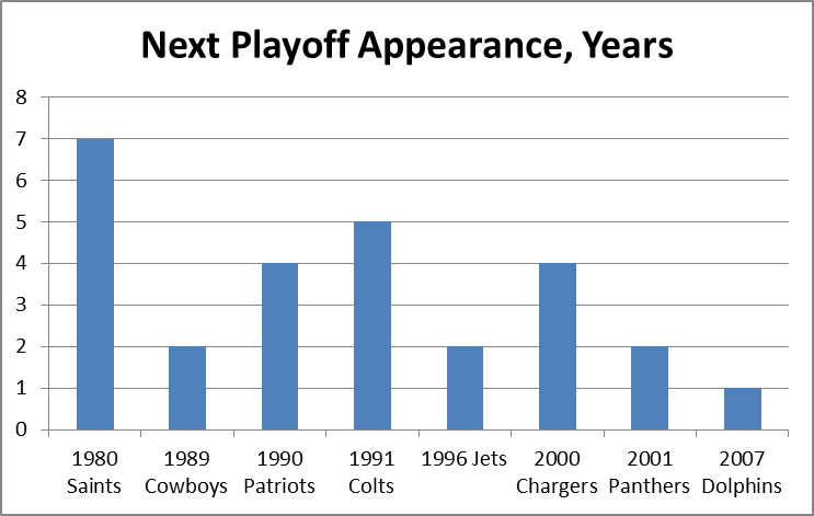
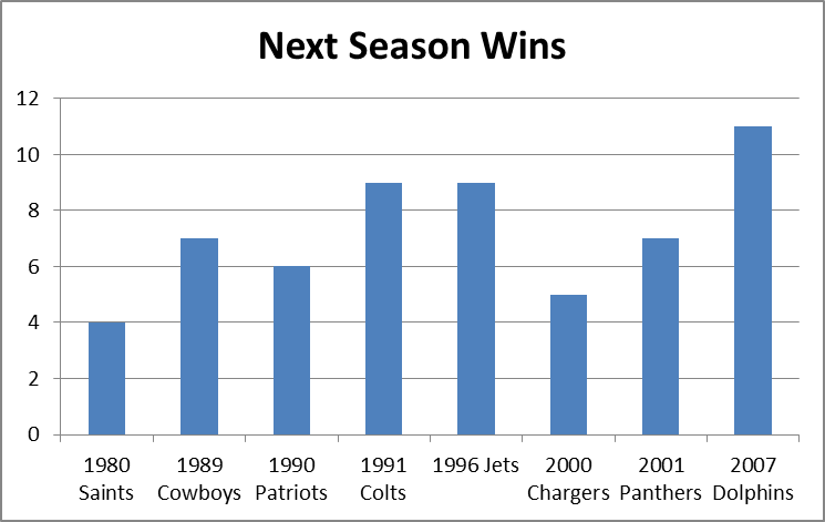
It is a quirky little fact that 1-15 teams have tended to bounce back fairly well.  Since expanding to 16 games in 1978, 9 teams have hit the ignoble mark, including last year’s St. Louis Rams.  Of the 8 that did it prior to 2009, all but the 1980 Saints made it back to the playoffs within 5 years, and 4 of the 8 eventually went on to win Super Bowls, combining for 8 total.  The median number of wins for a 1-15 team in their next season is 7:

1-15 teams_23234_image001

1-15 teams_23234_image003

My grand hypothesis about this was that the implementation of the salary cap after the 1993-94 season, combined with some of the advantages I discuss below (especially 2 and 3), has been a driving force behind this small-but-sexy phenomenon: note that at least for these 8 data points, there seems to be an upward trend for wins and downward trend for years until next playoff appearance.  Obviously, this sample is way too tiny to generate any conclusions, but before looking at harder data, I’d like to speculate a bit about various factors that could be at play.  In addition to normally-expected regression to the mean, the chain of consequences resulting from being horrendously bad is somewhat favorable:

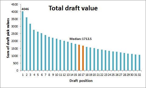
  1. The primary advantages are explicitly structural:  Your team picks at the top of each round in the NFL draft.  According to ESPN’s “standard” draft-pick value chart, the #1 spot in the draft is worth over twice as much as the 16th pick [side note: I don’t actually buy this chart for a second.  It massively overvalue 1st round picks and undervalues 2nd round picks, particularly when it comes to value added (see a good discussion here)]:image
  2. The other primary benefit, at least for one year, comes from the way the NFL sets team schedules: 14 games are played in-division and against common divisional opponents, but the last two games are set between teams that finished in equal positions the previous year (this has obviously changed many times, but there have always been similar advantages).  Thus, a bottom-feeder should get a slightly easier schedule, as evidenced by the Rams having the 2nd-easiest schedule for this coming season.
  3. There are also reliable secondary benefits to being terrible, some of which get greater the worse you are.  A huge one is that, because NFL statistics are incredibly entangled (i.e., practically every player on the team has an effect on every other player’s statistics), having a bad team tends to drag everyone’s numbers down.  Since the sports market – and the NFL’s in particular – is stats-based on practically every level, this means you can pay your players less than what they’re worth going forward.  Under the salary cap, this leaves you more room to sign and retain key players, or go for quick fixes in free agency (which is generally unwise, but may boost your performance for a season or two).
  4. A major tertiary effect – one that especially applies to 1-15 teams, is that embarrassed clubs tend to “clean house,” meaning, they fire coaches, get rid of old and over-priced veterans, make tough decisions about star players that they might not normally be able to make, etc.  Typically they “go young,” which is advantageous not just for long-term team-building purposes, but because young players are typically the best value in the short term as well.
  5. An undervalued quaternary effect is that new personnel and new coaching staff, in addition to hopefully being better at their jobs than their predecessors, also make your team harder to prepare for, just by virtue of being new (much like the “backup quarterback effect,” but for your whole team).
  6. A super-important quinary effect is that. . .  Ok, sorry, I can’t do it.

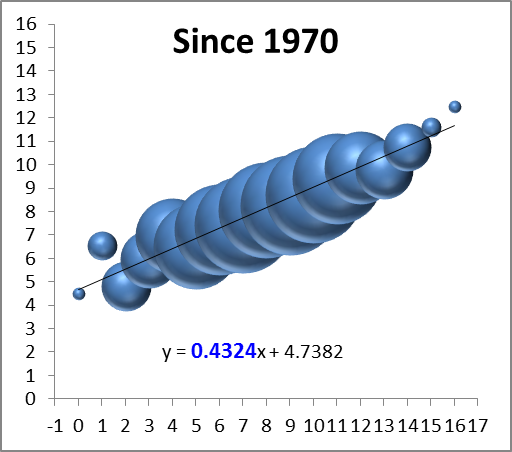
Of course, most of these effects are relevant to more than just 1-15 teams, so perhaps it would be better to expand the inquiry a tiny bit.  For this purpose, I’ve compiled the records of every team since the merger, so beginning in 1970, and compared them to their record the following season (though it only affects one data point, I’ve treated the first Ravens season as a Browns season, and treated the new Browns as an expansion team).  I counted ties as .5 wins, and normalized each season to 16 games (and rounded).  I then grouped the data by wins in the initial season and plotted it on a “3D Bubble Chart.”  This is basically a scatter-plot where the size of each data-point is determined by the number of examples (e.g., only 2 teams have gone undefeated, so the top-right bubble is very small).  The 3D is not just for looks: the size of each sphere is determined by using the weights for volume, which makes it much less “blobby” than 2D, and it allows you to see the overlapping data points instead of just one big ink-blot:

season wins_31685_image001

*Note: again, the x-axis on this graph is wins in year n, and the y axis is wins in year n+1. Also, note that while there are only 16 “bubbles,” they represent well over a thousand data points, so this is a fairly healthy sample.

The first thing I can see is that there’s a reasonably big and fat outlier there for 1-15 teams (the 2nd bubble from the left)!  But that’s hardly a surprise considering we started this inquiry knowing that group had been doing well, and there are other issues at play: First, we can see that the graph is strikingly linear.  The equation at the bottom means that to predict a team’s wins for one year, you should multiply their previous season’s win total by ~.43 and add ~4.7 (e.g.’s: an 8-win team should average about 8 wins the next year, a 4-win team should average around 6.5, and a 12-win team should average around 10).  The number highlighted in blue tells you how important the previous season’s win’s are as a predictor: the higher the number, the more predictive.

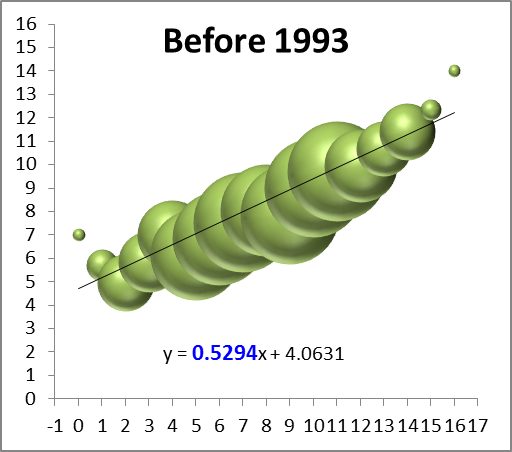
So naturally the next thing to see is a breakdown of these numbers between the pre- and post-salary cap eras:

season wins_31685_image003

season wins_31685_image005

Again, these are not small sample-sets, and they both visually and numerically confirm that the salary-cap era has greatly increased parity: while there are still plenty of excellent and terrible teams overall, the better teams regress and the worse teams get better, faster.  The equations after the split lead to the following predictions for 4, 8, and 12 win teams (rounded to the nearest .25):

W Pre-SC Post-SC
4 6.25 7
8 8.25 8
12 10.5 9.25
Yes, the difference in expected wins between a 4-win team and a 12-win team in the post-cap era is only just over 2 wins, down from over 4.

While this finding may be mildly interesting in its own right, sadly this entire endeavor was a complete and utter failure, as the graphs failed to support my hypothesis that the salary cap has made the difference for 1-15 teams specifically.  As this is an uncapped season, however, I guess what’s bad news for me is good news for the Rams.

Tiger Woods Needs to Need a Therapist (and Probably Does)

Tiger Woods is obviously having a terrible season.  His scoring average so far (71.66) is almost 2 strokes higher than his previous worst year (69.75 in 1997).  He has no wins, no top 3’s, and has only finished top 10 in 2 of 9 tournaments.  That 22%, if it holds up, would be the worst of his career by 20%.  For the first time basically ever, his eventually capturing the all-time major championships record is in doubt.  Of course, 9 tournaments is not a large sample, and this could just be a slump.  As I see it, there are basically 4 possibilities:

  1. Tiger is running very badly.
  2. Tiger is in serious decline.
  3. Tiger is declining somewhat and running somewhat badly.
  4. Tiger needs a shrink.

So the questions of the day are:  a) How likely are each of these possibilities? and b) What does each say about his chances of winning 19 majors?  For reasons I will explain, I believe 1 and 2 are very unlikely, and 3 is somewhat unlikely.  Which is fine, since Tiger should basically pray this is all in his head, because otherwise his chances of catching and passing Nicklaus are diminishing considerably.

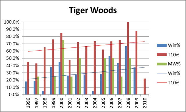
I would normally be the first to promote a “bad variance” explanation of this kind of phenomena, but in this case: a) Tiger doesn’t really have slumps like this; and b) the timing is too much of a coincidence.  For some historical perspective, here’s a graph of Tiger’s overall winning %, top-10 finish %, and winning % in majors, by year:

tiger, phil and jack_3492_image001

For the record, his averages are 28.4%, 66.4% and 24.6%, respectively.  As should be obvious, not only is his 2010 historically awful, but there is nothing to suggest that he was in decline beforehand.  Despite having recently run slightly worse in majors than he did in the early 2000’s, his Win% and Top-10% trendlines have still been sloping upwards.
Of course, 2/3 of a season is still a small sample, and it is certainly possible that this is variance, but just because something *could* be a statistical artifact doesn’t mean that it is *likely* to be.  In fact, one problem with statistically-oriented sports analysis is that its proponents can sometimes be overly (even dogmatically) committed to neutral or variance-based explanations for observed anomalies, even when the conventional explanation is highly plausible (ironically, I think this happens because people often apply Bayes’ Theorem-style reasoning implicitly, even if the statisticians forget to apply it explicitly).  I believe this is one of those situations.

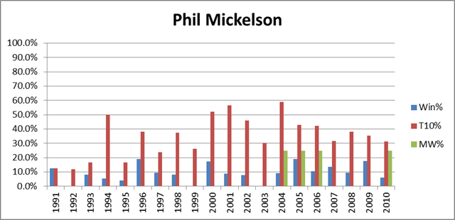
That said, whether it stems from diminishing skills or ongoing psychological unrest, a significant and continuing Tiger decline is still a realistic possibility.  From the chart above, it should be clear that Tiger circa 2009 shouldn’t have any problem blowing past Jack, but what would happen if he were a different Tiger?  Fortunately for him, he has a long way to drop before being a non-factor.  For comparison, let’s look at the same graph as above, but for the 2nd-best player of the recent era, Phil Mickelson:

tiger, phil and jack_3492_image003

Mickleson’s averages are 9.2%, 35.8%, and 5.6%, respectively.  Half a Tiger would still be much better.  Of course, Mickelson has won 4 majors in recent years, but has still been much worse than Tiger: over that period his averages are 12.2%, 40.1%, and 14.3%.  It should not go without notice that if Tiger transformed into Phil Mickelson, played 7 more years, and won majors at the same rate that Mickelson has over the last 7 (Phil is about 6 years older), it would put him at exactly the magic number: 18.

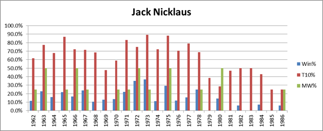
Finally, let’s look at the graph for the man himself — Jack Nicklaus:

tiger, phil and jack_3492_image004

Note: For years prior to 1970, only official PGA Tour events are included.
Jack’s averages over this span (from the year he turned pro to the year of his final major) are 15.5%, 63.4%, and 18%.  These numbers are slightly understated, since in truth Jack was well past his prime when he won the Masters in ’86.  As we can see, Jack began to decline significantly around 1979, but still won 3 more majors after that point.  A similar pattern for Woods would put him at 17, and at least in contention for the record.  On the other hand, not everyone is Jack Nicklaus.  Nicklaus, incredibly, won a higher percentage of majors than tournaments overall.  This is especially apparent in his post-decline career:  note the small amount of blue compared to the amount of green from 1979 on.  Whether he just ran well in the right spots, or whether he had preternatural competitive spirit, not even Tiger Woods can count on having Nicklaus’s knack for winning majors.  So if Tiger hopes to catch up, he had better be out of his mind.